


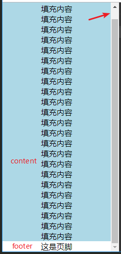
sticky footer是一种布局解决方案,规定屏幕内容在占满一屏幕 / 未占不满一屏幕的情况下,footer出现的位置
内容未超过一屏幕的高度时,footer至于屏幕最下方
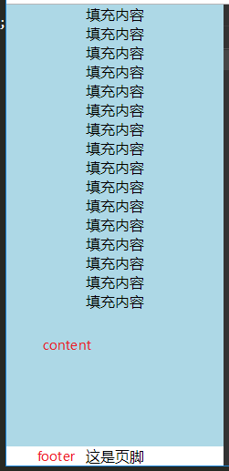
内容超过一屏幕的高度时,footer至于内容的下方
两种常见的解决方案
1.使用min-height、padding-bottom、margin-top
* {
 margin: 0;
 padding: 0;
 text-align: center;
}
html, body {
  height: 100%;
}
body > .wrap {
  min-height: 100%;
  background: lightblue;
}
.content {
  /* padding-bottom 等于 footer 的高度 */
  padding-bottom: 30px;
}
.footer {
  /* margin-top 为 footer 高度的负值 */
  margin-top: -30px;
  width: 100%;
  height: 30px;
  background: gray;
}

<div class="wrap">
  <div class="content">
    <p>填充内容</p>
  </div>
</div>
<div class="footer">
  <p>这是页脚</p>
</div>
2.flex布局
* {
 margin: 0;
 padding: 0;
 text-align: center;
}
html, body {
  display: flex;
  height: 100%;
  flex-direction: column;
}
body .content {
  flex: 1;
  background: lightblue;
}

<div class="content">
  <p>填充内容</p>
</div>
<div class="footer">
  <p>这是页脚</p>
</div>


 82
82


 被折叠的 条评论
为什么被折叠?
被折叠的 条评论
为什么被折叠?
 到【灌水乐园】发言


