


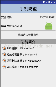
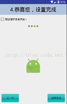
首先贴上效果图
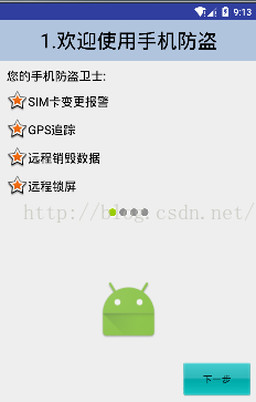
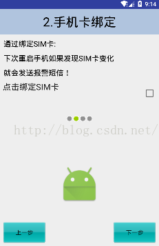
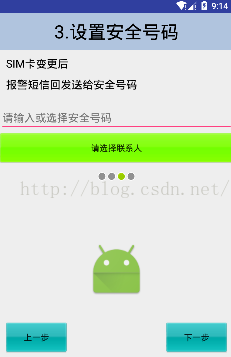

界面比较多 但是都有一些共性 可以用style来简化
比如所有的下一步/上一步 样式均为
<style name="NextStyle" >
<!-- Customize your theme here. -->
<item name="android:layout_margin">10dp</item>
<item name="android:layout_width">wrap_content</item>
<item name="android:layout_height">wrap_content</item>
<item name="android:text">下一步</item>
<item name="android:background">@drawable/button</item>
<item name="android:layout_alignParentBottom">true</item>
<item name="android:layout_alignParentRight">true</item>
<item name="android:onClick">next</item>
</style>
<style name="PreviousStyle" >
<!-- Customize your theme here. -->
<item name="android:layout_margin">10dp</item>
<item name="android:layout_width">wrap_content</item>
<item name="android:layout_height">wrap_content</item>
<item name="android:text">上一步</item>
<item name="android:background">@drawable/button</item>
<item name="android:layout_alignParentBottom">true</item>
<item name="android:layout_alignParentLeft">true</item>
<item name="android:onClick">previous</item>
</style>
可以发现 这里把onClick也写在了style中 只需要在HomeActivity中实现方法就可以了
其次是界面中的五角星 以及 并排的四个小灯 使用的是系统图标
<TextView
style="@style/ContentStyle"
android:text="远程销毁数据"
android:drawableLeft="@android:drawable/star_big_on"
/>
<ImageView
android:layout_width="wrap_content"
android:layout_height="wrap_content"
android:src="@android:drawable/presence_online"/>
后面总结一下系统图标都有哪些~~~~~
界面的搭建就不在赘述
这里记录一下这几个按钮的实现 使用了自定义的样式,如下
<?xml version="1.0" encoding="utf-8"?>
<selector xmlns:android="http://schemas.android.com/apk/res/android">
<!--点击状态-->
<item android:state_pressed="true"
android:drawable="@drawable/btn_pressed"/>
<!--正常状态-->
<item android:drawable="@drawable/btn_normal"/>
</selector>
button使用的style就是上方展示的:
<Button
style="@style/NextStyle"/>
其中background使用的就是 button.xml样式
<item name="android:background">@drawable/button</item>
自行设置按钮在平常状态和点击状态下的样式
这里讲解一下按钮的背景图案的制作
首先需要了解到作为一个大小不定的button的样式 背景图肯定要满足拉伸状态下样式保持不变
所以这里使用九妹图
正产准备一张图片
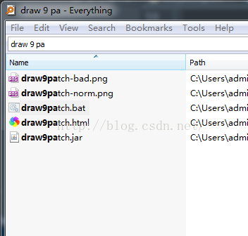
然后使用everything查找电脑中的draw9patch.bat 工具点击进入将图片放入
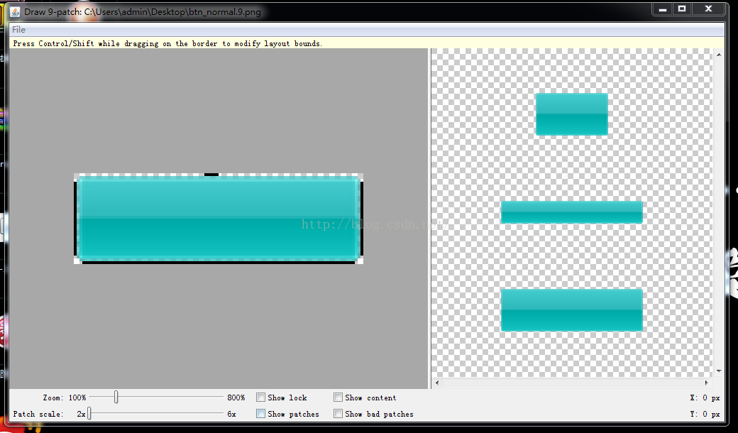
使用方法为 上方区域的边界设定用于指定 横向拉伸区域
左边区域边界的设定用于指定 纵向拉伸区域
下方区域边界的设定用于指定 文字处在图片中的位置的宽
右边区域边界的设定用于指定文字的高
然后保存就获得了图片对应的九妹图/点9图
使用点9图的好处在于设置好拉伸区域之后 无论控件如何变化都不会有很明显的样式变化
当然这里还有shape样式的使用
<?xml version="1.0" encoding="utf-8"?>
<selector xmlns:android="http://schemas.android.com/apk/res/android">
<item android:state_pressed="true"
android:drawable="@drawable/gradient"/>
<item android:drawable="@android:color/transparent"/>
</selector>
<?xml version="1.0" encoding="utf-8"?>
<shape xmlns:android="http://schemas.android.com/apk/res/android"
android:shape="rectangle">
<!--角度-->
<corners android:radius="2dp"/>
<!--渐变-->
<!-- <gradient
android:startColor="#0f0"
android:centerColor="#000"
android:endColor="#f00"/>-->
<!--纯色-->
<solid
android:color="#5000"/>
<!--边框-->
<!--<stroke android:width="0.5dp"
android:color="#5000"
android:dashWidth="5dp"
android:dashGap="3dp"
/>-->
</shape>
当使用这个样式的控件点击时候回有变化


 扫一扫
扫一扫

 被折叠的 条评论
为什么被折叠?
被折叠的 条评论
为什么被折叠?
 到【灌水乐园】发言


