


前言
据说鸿蒙Next,要抛弃Android了,加上最近面试,老是被人问到会鸿蒙吗,所以花了点时间,来学习鸿蒙开发。经过几天的时间学习,自己也根据WanAndroid API写了个APP,感兴趣可以去看下,项目地址我贴到文章最后。
本文是基于 Harmony OS Api 9/ DevEco Studio 3.1.1 Release开发。
基本概念
我们打开鸿蒙开发官网,可以发现,HarmonyOS提供了一套UI开发框架,即方舟开发框架(ArkUI框架)。ArkUI框架不同目的和技术背景的开发者提供了两种开发范式,分别是基于ArkTS的声明式开发范式(简称“声明式开发范式”)和兼容JS的类Web开发范式(简称“类Web开发范式”)。以下是两种开发范式对比:
作为客户端开发的我们,自然选择声明式开发范式(ArkTS语言)。此外鸿蒙还有两种应用模型,我们选择推荐的Stage模型。
常见组件
Talk is cheap,show me code,本文将介绍几个常见组件,带你熟悉鸿蒙开发。
Hello Word
我们学习任何开发语言,大都是从Hello World开始的,本文也不例外。
@Entry
@Component
struct HelloWorld {
  @State message: string = 'Hello World'

  build() {
    Row() {
      Column() {
        Text(this.message)
          .fontSize(50)
          .fontWeight(FontWeight.Bold)
      }
      .width('100%')
    }
    .height('100%')
  }
}
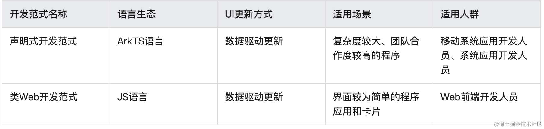
预览效果:
实际就是通过一个垂直布局,实现了一个从上到下,一个文本控件+按钮,可以看到,鸿蒙开发的控件宽高使用的是百分比。
登陆界面
Hello World写完了,咱们来实现一个简单的登陆界面。
@Entry
@Component
struct Login {
  @State userName: string = 'admin'
  @State password: string = '123456'

  build() {
    Column() {

      Image($r('app.media.android_fly'))
        .width(75)
        .height(75)
        .margin({ top: 90 })

      Text('登陆界面')
        .fontSize(20)
        .fontWeight(700)
        .margin({ top: 12 })

      Text('登陆账号以使用更多服务')
        .fontSize(14)
        .fontColor('#999')
        .margin({ top: 6 })

      TextInput(
        {
          placeholder: '请输入用户名'
        }
      ).margin({ top: 30 })
        .onChange((value) => {
          this.userName = value
        })

      TextInput(
        {
          placeholder: '请输入密码'
        }
      ).margin({ top: 30 })
        .type(InputType.Password)
        .onChange((value) => {
          this.password = value
        })

      Button('登陆')
        .width('80%')
        .margin({ top: 30 })
        .onClick(() => {
          if (this.userName == 'admin' && this.password == '123456') {
            router.push({
              url: 'pages/Index'
            })
          } else {
            promptAction.showToast({
              message:'请输入正确的用户名密码'
            })
          }
        })

      Text('注册账号')
        .fontColor('#0078fd')
        .margin({ top: 15 })


    }.width('100%')
    .height('100%')
    .padding(10)
  }
}
这里着重要介绍一下TextInput,onChange接收输入框文字变化,类似Jetpack Compose TextField onValueChange
// EditText
TextField(
    value = "",
    onValueChange = {},
    placeholder = {
        Text(text = "Type something here")
    },
    colors = TextFieldDefaults.textFieldColors(
        containerColor = Color.White
    )
)
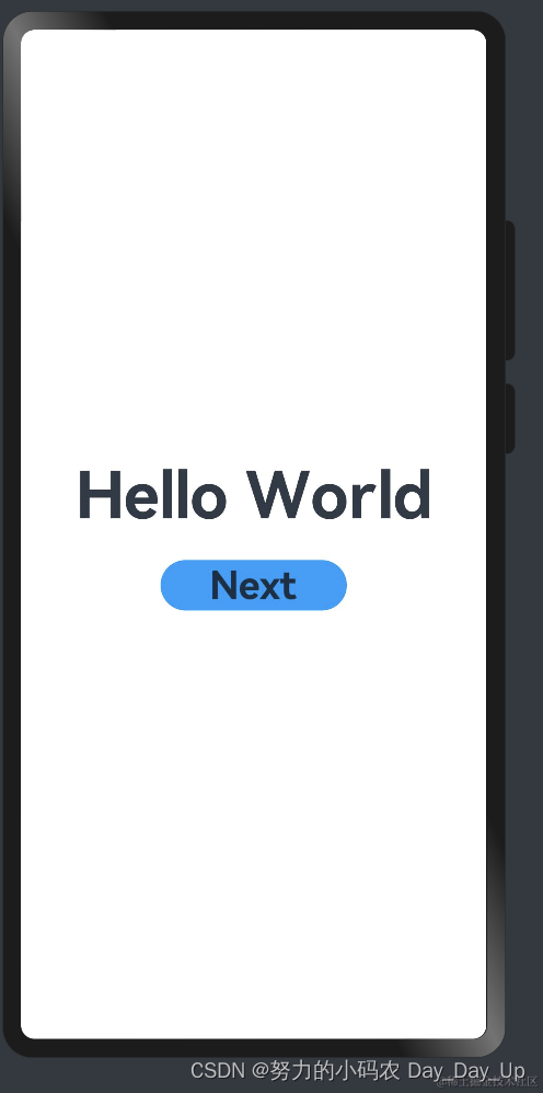
预览效果:
Banner
我们在做android开发,经常在首页会写一个广告轮播组件,鸿蒙直接提供了一个基础组件
Swiper。
@Entry
@Component
struct Banner {
  private control: SwiperController = new SwiperController()

  build() {
    Row() {
      Column() {
        Swiper(this.control) {
          Image($r('app.media.ic_my_respect')).imgStyle()
          Image($r('app.media.ic_my_examine_fail')).imgStyle()
          Image($r('app.media.ic_my_custom_service')).imgStyle()
          Image($r('app.media.ic_my_feedback')).imgStyle()
        }
        .padding(10)
        .loop(true)
        .autoPlay(true)
        .interval(2000)
        // .vertical(true) //纵向轮播

        Row() {
          Button('上一页')
            .onClick(() => {
              this.control.showPrevious()
            })

          Button('下一页').onClick(() => {
            this.control.showNext()
          }).margin({ left: 10 })
        }

      }

    }

  }
}
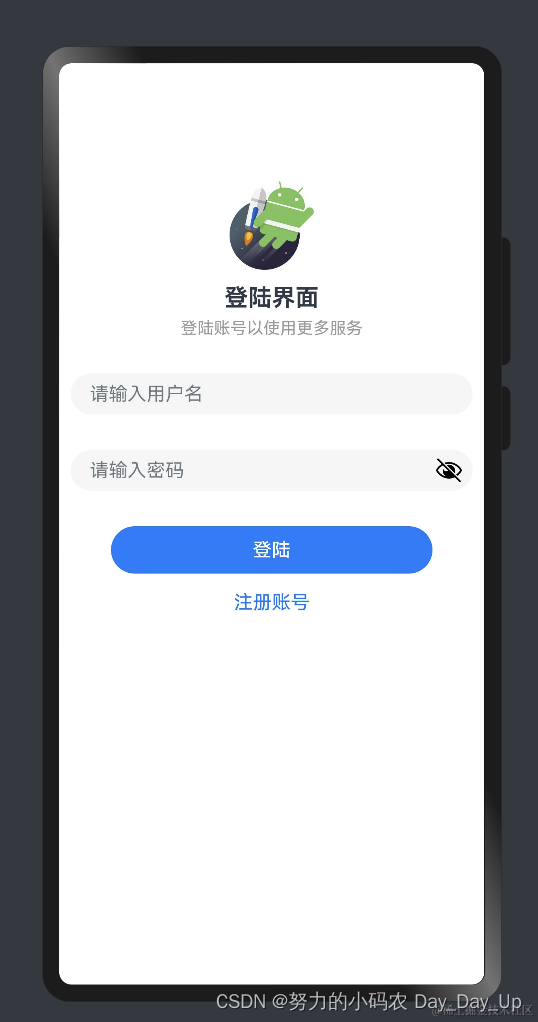
预览效果:
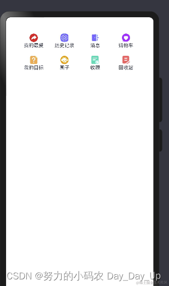
Flex
弹性布局(Flex)提供更加有效的方式对容器中的子元素进行排列、对齐和分配剩余空间。
@Entry
@Component
struct Login {
  @State list: listItem[] = [
    { title: '我的最爱', img: $r('app.media.ic_my_share') },
    { title: '历史记录', img: $r('app.media.ic_my_setting') },
    { title: '消息', img: $r('app.media.ic_my_scan_history') },
    { title: '购物车', img: $r('app.media.ic_my_respect') },
    { title: '我的目标', img: $r('app.media.ic_my_examine_fail') },
    { title: '圈子', img: $r('app.media.ic_my_custom_service') },
    { title: '收藏', img: $r('app.media.ic_my_examine') },
    { title: '回收站', img: $r('app.media.ic_my_feedback') }
  ];

  build() {
    // 换行控制
    Flex({wrap:FlexWrap.Wrap} ) {
      ForEach(this.list,(item:listItem) => {
        Column() {
          Image(item.img).width(24).height(24)
          Text(item.title).fontSize(12)
        }.width('25%')
        .margin({top:'8',bottom:'8'}) // 上下边距
      })
    }
    .padding(10)
    .margin(20)
    .borderRadius(10)
    .backgroundColor('#fff')

  }
}
我们首先定义了一个数组,存放列表的文字和icon,每个item,按剩余空间铺满整个屏幕。
预览效果:
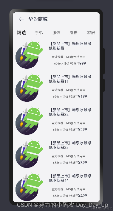
华为商城
最后我们来实现一个简单的华为商城效果,做android开发,我们知道最重要的组件还是列表,同样的鸿蒙提供List组件实现列表效果。
首先我们看下整体的布局:
@Entry
@Component
struct MyList {
  build() {
    Row() {
      Navigation() {
        Column() {
          TabBars()
        }
      }
      .size({ width: '100%', height: '100%' })
      .title('华为商城')
      .titleMode(NavigationTitleMode.Mini) //标题类型
    }
    .height('100%')
    .backgroundColor('#f1f3f5')
  }
}
我们首先使用一个Navigation组件实现导航切换,中间TabBars显示内容。看下TabBars自定义组件:
@Component
export struct TabBars {
  @State tabsIndex: number = 0
  @State initBarData: string[] = [
    '精选', '手机', '服饰', '穿搭', '家居'
  ]

  @Builder
  tabBarBuilder(content: string, index: number) {
    Column() {
      Text(content)
        .fontSize(this.tabsIndex == index ? 20 : 16)
        .fontColor(this.tabsIndex == index ? '#000' : '#666')
    }
  }

  build() {
    Tabs() {
      ForEach(this.initBarData, (item: string, index: number) => {
        TabContent() {
          Column() {
            if(index == 0) {
              GoodsList()
            } else {
              Text(item).fontSize(80)
            }
          }.justifyContent(FlexAlign.Center)
          .width('100%')
          .height('100%')
        }
        .tabBar(this.tabBarBuilder(item, index !== undefined ? index : 0)) // 标题
      })

    }.onChange((index: number) => {
      this.tabsIndex = index
    })
  }
}
这里用到了一个Tabs组件,主要包括TabContent和TabBar,TabContent是内容页,TabBar是导航页签栏,导航栏分为底部导航、顶部导航、侧边导航。我们这里tab第一个条目显示一个商品列表,其他tab页面显示一个文本提示。
我们看下商品列表页如何实现的:
@Component
export struct GoodsList {
  @State list: GoodSItem[] = goodsList

  build() {
    Row() {
      List({ space: 16 }) {
        ForEach(this.list, (item: GoodSItem) => {
          ListItem() {
            Row() {
              Column() {
                Image(item?.goodsImg).width('100%').height('100%')
              }
              .width('40%').height('100%')

              Column() {
                Text(item.goodsName)
                  .fontSize(16).margin({ bottom: 20 })
                Text(item.title)
                  .fontColor('#666').fontSize(12)
                  .margin({ right: 12, bottom: 10 })
                Row() {
                  Text(item.desc).fontSize(12).fontColor('#666')
                  Text(item.price).fontSize(16).fontColor('e92f4f')
                }

              }.width('60%').padding(8).height('100%')

            }.justifyContent(FlexAlign.SpaceBetween)
            .width('100%')
            .height(120)
          }

        })
      }.width('94%')
    }.width('100%')

  }
}
我们引入了一个本地数组,模拟网络请求后的数据,然后根据数据组装了一个列表页面。
本地数据结构:
export class GoodSItem {
  goodsImg: Resource;
  goodsName: string;
  title: string;
  desc: string;
  price: string

  constructor(goodsImg: Resource, goodsName:string, price:string) {
    this.goodsImg = goodsImg
    this.goodsName = goodsName
    this.title = '重磅推荐,MD新品试用中'
    this.desc = '6666人评价 95好评'
    this.price = price
  }
}

export const goodsList: GoodSItem[] = [
  new GoodSItem($r('app.media.android_fly'),'【新品上市】畅乐冰晶绿低脂新品','¥99'),
  new GoodSItem($r('app.media.android_fly'),'【新品上市】畅乐冰晶绿低脂新品11','¥199'),
  new GoodSItem($r('app.media.android_fly'),'【新品上市】畅乐冰晶绿低脂新品22','¥299'),
  new GoodSItem($r('app.media.android_fly'),'【新品上市】畅乐冰晶绿低脂新品33','¥399'),
  new GoodSItem($r('app.media.android_fly'),'【新品上市】畅乐冰晶绿低脂新品44','¥499'),
  new GoodSItem($r('app.media.android_fly'),'【新品上市】畅乐冰晶绿低脂新品','¥599'),
  new GoodSItem($r('app.media.android_fly'),'【新品上市】畅乐冰晶绿低脂新品','¥699'),
  new GoodSItem($r('app.media.android_fly'),'【新品上市】畅乐冰晶绿低脂新品','¥799'),
  new GoodSItem($r('app.media.android_fly'),'【新品上市】畅乐冰晶绿低脂新品','¥899'),
  new GoodSItem($r('app.media.android_fly'),'【新品上市】畅乐冰晶绿低脂新品','¥999'),
  new GoodSItem($r('app.media.android_fly'),'【新品上市】畅乐冰晶绿低脂新品','¥1099'),
]
最终实现效果:
总结
我们通过ArkUi基础组件,实现了一些小的demo效果,通过这些demo,我们对ArkUi声明式UI框架,有个初步的认识,我们再学习一下鸿蒙的网络请求、数据存储这些,差不多算入门了。最后,我想说的是,一项新的技术,没有那么难,花点时间学习一下,还是很好入门,至于想长期从事鸿蒙开发,这点是远远不够的,当然,其实我也是面向面试学习,如果进入公司从事鸿蒙开发的,还是得继续深入学习.


 1939
1939

 被折叠的 条评论
为什么被折叠?
被折叠的 条评论
为什么被折叠?
 到【灌水乐园】发言


