一、定位
1、常见布局方式
(1)标准流
- 块级元素:独占一行,垂直布局
- 行内/行内块元素:一行显示多个,水平布局
(2)浮动
(3)定位
- 可以让元素自由的摆放在网页的任意位置
- 一般用于盒子之间的层叠情况
2、定位的基本使用
(1)设置定位方式
| 定位方式 | 属性值 |
|---|
| 静态定位 | static |
| 相对定位 | relative |
| 绝对定位 | absolute |
| 固定定位 | fixed |
(2)设置偏移值
- 偏移值设置分为两个方向,水平和垂直方向各选一个使用即可
- 选取的原则一般是就近原则
- 如果
left和right都有,以left为准;如果top和bottom都有,以top为准
| 属性名 | 含义 |
|---|
left | 距离左边的距离 |
right | 距离右边的距离 |
top | 距离上边的距离 |
bottom | 距离下边的距离 |
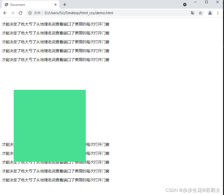
3、相对定位
- 自恋型定位,相对于自己之前的位置进行移动
position:relative- 在页面中占位置,没有脱标
- 具有标签原有的显示模式特点
<!DOCTYPE html>
<html lang="en">

<head>
    <meta charset="UTF-8">
    <meta http-equiv="X-UA-Compatible" content="IE=edge">
    <meta name="viewport" content="width=device-width, initial-scale=1.0">
    <title>Document</title>
    <style>
        .box{
            position: relative;
            left: 50px;
            top: 100px;

            width: 300px;
            height: 300px;
            background-color: rgb(72, 223, 147);
        }
    </style>

</head>

<body>
    <p>才能决定了吃大亏了从地理名词查看端口了美丽的每次打开门窗</p>
    <p>才能决定了吃大亏了从地理名词查看端口了美丽的每次打开门窗</p>
    <p>才能决定了吃大亏了从地理名词查看端口了美丽的每次打开门窗</p>
    <p>才能决定了吃大亏了从地理名词查看端口了美丽的每次打开门窗</p>
    <p>才能决定了吃大亏了从地理名词查看端口了美丽的每次打开门窗</p>
    <div class="box"></div>
    <p>才能决定了吃大亏了从地理名词查看端口了美丽的每次打开门窗</p>
    <p>才能决定了吃大亏了从地理名词查看端口了美丽的每次打开门窗</p>
    <p>才能决定了吃大亏了从地理名词查看端口了美丽的每次打开门窗</p>
    <p>才能决定了吃大亏了从地理名词查看端口了美丽的每次打开门窗</p>
    <p>才能决定了吃大亏了从地理名词查看端口了美丽的每次打开门窗</p>
</body>

</html>
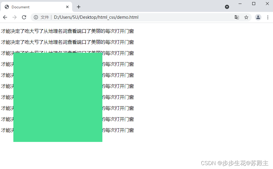
4、绝对定位
- 拼爹型定位,相对于非静态定位的父元素进行定位移动
position:absolute- 默认相对于浏览器可视区域进行移动
- 在页面中不占位置,脱标
- 改变标签原有的显示模式特点,具有行内块特点
- 就近找定位的父级,逐层查找不到,则相对于浏览器可视区域进行移动
(1)父元素为静态定位
<!DOCTYPE html>
<html lang="en">
<head>
    <meta charset="UTF-8">
    <meta http-equiv="X-UA-Compatible" content="IE=edge">
    <meta name="viewport" content="width=device-width, initial-scale=1.0">
    <title>Document</title>
    <style>
        .box{
            position: absolute;
            left: 50px;
            top: 100px;

            width: 300px;
            height: 300px;
            background-color: rgb(72, 223, 147);
        }
    </style>
</head>
<body>
    <p>才能决定了吃大亏了从地理名词查看端口了美丽的每次打开门窗</p>
    <p>才能决定了吃大亏了从地理名词查看端口了美丽的每次打开门窗</p>
    <p>才能决定了吃大亏了从地理名词查看端口了美丽的每次打开门窗</p>
    <p>才能决定了吃大亏了从地理名词查看端口了美丽的每次打开门窗</p>
    <p>才能决定了吃大亏了从地理名词查看端口了美丽的每次打开门窗</p>
    <div class="box"></div>
    <p>才能决定了吃大亏了从地理名词查看端口了美丽的每次打开门窗</p>
    <p>才能决定了吃大亏了从地理名词查看端口了美丽的每次打开门窗</p>
    <p>才能决定了吃大亏了从地理名词查看端口了美丽的每次打开门窗</p>
    <p>才能决定了吃大亏了从地理名词查看端口了美丽的每次打开门窗</p>
    <p>才能决定了吃大亏了从地理名词查看端口了美丽的每次打开门窗</p>
</body>
</html>
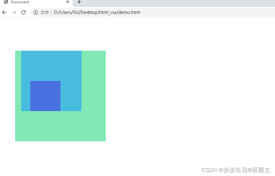
(2)父元素为非静态定位【子绝父相】
- 相对于非静态定位的父元素【表示自己的祖先】进行定位移动
<!DOCTYPE html>
<html lang="en">
<head>
<meta charset="UTF-8">
<meta http-equiv="X-UA-Compatible" content="IE=edge">
<meta name="viewport" content="width=device-width, initial-scale=1.0">
<title>Document</title>
<style>
.father{
position: relative;
left: 50px;
top: 100px;
width: 300px;
height: 300px;
background-color: rgb(130, 233, 181);
}
.son{
margin-left: 20px;
width: 200px;
height: 200px;
background-color: rgb(72, 188, 223);
}
.sun{
position: absolute;
left: 50px;
top: 100px;
width: 100px;
height: 100px;
background-color: rgb(72, 112, 223);
}
</style>
</head>
<body>
<div class="father">
<div class="son">
<div class="sun"></div>
</div>
</div>
</body>
</html>
(3)子绝父相水平居中
- 绝对定位不能使用
margin: 0 auto;居中
    position: absolute;
    left:50%;
    margin-left: -50px;

    top:50%;
    margin-top: -25px;
(4)位移居中
transform: translate(-50%,-50%);
<!DOCTYPE html>
<html lang="en">
<head>
<meta charset="UTF-8">
<meta http-equiv="X-UA-Compatible" content="IE=edge">
<meta name="viewport" content="width=device-width, initial-scale=1.0">
<title>Document</title>
<style>
.father{
position: relative;
margin: 0 auto;
width: 400px;
height: 300px;
background-color: rgb(130, 233, 181);
}
.son{
position: absolute;
left:50%;
top:50%;
transform: translate(-50%,-50%);
width: 100px;
height: 50px;
background-color: rgb(137, 130, 233);
}
</style>
</head>
<body>
<div class="father">
<div class="son"></div>
</div>
</body>
</html>

5、固定定位
- 死心眼型定位,相对于浏览器进行定位移动
position:fixed- 在页面中不占位置,脱标
- 改变标签原有的显示模式特点,具有行内块特点
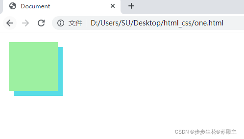
6、元素的层级关系
- 标准流 < 浮动 < 定位
- 相对、绝对、固定默认层级相同,写在下面的元素会覆盖上面的元素,即后来者居上
z-index:整数;取值越大,显示顺序越靠上,默认取值是0,【必须配合定位才生效】
<!DOCTYPE html>
<html lang="en">

<head>
    <meta charset="UTF-8">
    <meta http-equiv="X-UA-Compatible" content="IE=edge">
    <meta name="viewport" content="width=device-width, initial-scale=1.0">
    <title>Document</title>
    <style>
        * {
            margin: 0;
            padding: 0;
        }

        .one {
            position: fixed;
            left:20px;
            top:20px;
            z-index: 1;

            width: 100px;
            height:100px;
            background-color: rgb(157, 240, 161);
        }
        .two {
            position: absolute;
            left:30px;
            top:30px;

            width: 100px;
            height:100px;
            background-color: rgb(88, 220, 230);
        }
    </style>
</head>

<body>
    <div class="one"></div>
    <div class="two"></div>
</body>

</html>
二、装饰
1、垂直对齐方式
- 属性名:
vertical-align - 基线: 浏览器文字类型元素排版中存在用于对齐的基线(baseline)
- 浏览器遇到行内和行内块标签当作文字处理,默认文字是按基线对齐
| 属性值 | 效果 |
|---|
baseline | 默认,基线对齐 |
top | 顶部对齐 |
middle | 中部对齐 |
bottom | 底部对齐 |
2、光标类型
| 属性值 | 效果 |
|---|
default | 默认,通常是箭头 |
pointer | 小手效果,提示用户可以点击 |
text | 工字型,提示用户可以选择文字 |
move | 十字光标,提示用户可以移动 |
3、边框圆角
- 属性名:
border-radius - 常见取值:数字+px、百分比
- 从左上角开始赋值,顺时针赋值,没有赋值的看对角
- 画一个正圆:盒子必须是正方形,然后
border-radius:50%; - 画一个胶囊按钮:盒子必须是长方形,然后
border-radius:盒子高度的一半;
4、overflow溢出部分显示效果
| 属性值 | 效果 |
|---|
visible | 默认,溢出部分可见 |
hidden | 溢出部分隐藏 |
scroll | 无论是否溢出,都显示滚动条 |
auto | 根据是否溢出,自动显示或隐藏滚动条 |
5、元素本身隐藏
- 占位隐藏:
visibility: hidden; - 不占位隐藏:
display: none;
6、元素整体透明度
- 属性名:
opacity - 属性值:0-1之间的数字
- 1表示完全不透明
- 0表示完全透明
- 使元素整体透明,包括里面的文字、子元素等·····


 346
346


 被折叠的 条评论
为什么被折叠?
被折叠的 条评论
为什么被折叠?
 到【灌水乐园】发言


