


DIV水平居中和垂直居中
前言:DIV的水平居中和垂直居中是我们在布局中最常见到的。水平居中应该没有太大的问题,主要对垂直居中做下介绍。
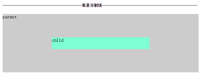
1. 嵌套DIV水平居中
HTML Code
   <div class="parent">
        parent
        <div class="child horizontal-center">
            child
        </div>
    </div>
CSS Code
/* 水平居中 */
.parent{
    width: 50%;
    height: auto;
    background: #cccccc;

    margin: 0 auto;
}

.child{
    padding: 10px;

    width: 80%;
    height: auto;
    background-color: aquamarine;
}

.horizontal-center{
    margin: 0 auto;  /* 必须指定宽度 */
}
需要注意的是 margin:? auto; 必须指定其宽度,百分比和数值都OK。
重要的在下面。
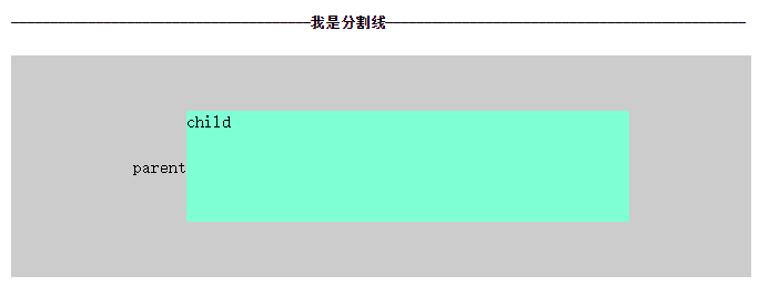
2. 嵌套DIV垂直居中
2.1 这里先罗列一下几种DIV垂直居中方法:
子DIV容器大小未知:
1.table布局(这里不做介绍)
2.绝对布局+transform
3.flex流布局
4.JS代码+绝对布局(不做介绍)
子DIV容器大小确定(不做介绍):
1.子DIV margin
2.父级DIV padding
3.绝对布局
2.2 绝对布局+transform 实现DIV垂直居中
HTML Code
    <div class="parent">
        parent
        <div class="child">
            child
        </div>
    </div>
CSS Code
.parent{
    width: 50%;
    height: 200px;
    background: #cccccc;
    margin: 0 auto;

    position: relative;
}
.child{
    position: absolute;
    left: 50%;
    top:50%;
    height: 20%;
    width: 50%;

    transform: translateX(-50%) translateY(-50%);
    background-color: aquamarine;
}
这里采用绝对布局先使子DIV 代码:top:50% ,因为子DIV有高度,所以再往回移动子DIV高度的50% 代码:transform: translateY(-50%); 至此完成垂直居中的操作。这种做法简单 ,但是只支持IE9+以及IE9。
注意:曾在网上看到用margin的方法代替transform的 ,亲自测试了一下。发现不行,原因呢? 是margin-top/margin-bottom 按百分比来计算的话,是按width来计算的并不是height,所以自然无法实现了。具体这种做法是为什么?有兴趣的可以上知乎看看。
2.3 flex 流布局
HTML Code
    <div class="parent vertical-container">
        parent
        <div class="child ">
            child
        </div>
    </div>
CSS Code
.parent{
    width: 50%;
    height: 200px;
    background: #cccccc;
    margin: 0 auto;
}
.child{
    height: 50%;
    width: 60%;
    background-color: aquamarine;
}

.vertical-container{
    display: -webkit-flex;
    display: flex;
    -webkit-align-items: center;
    align-items: center;
    -webkit-justify-content: center;
    justify-content: center;
}
注意:父级的文字也居中了
Flex 流布局和BootStrap的栅格布局功能类似。这种方法很好,兼容性好像也只支持IE9+,其他主流浏览器基本都支持。
这篇是阮一峰的讲解 Flex 布局教程:语法篇 内容十分详细 ,非常不错。
3.总结
当然还有文字居中,背景图居中等等。
以上还有几种方法没有介绍。希望以后自己能修改并补充。
flex布局 感觉用的很舒服啊 。嗯。加油加油 ,多去学习别人的方法。


 扫一扫
扫一扫
 62
62

 被折叠的 条评论
为什么被折叠?
被折叠的 条评论
为什么被折叠?
 到【灌水乐园】发言


