


第三章 处理数据
在这一章中我们将要学习……
1.绑定数组作为数据
2.绑定对象作为数据
3.绑定函数作为数据
4.处理数组
5.过滤数据
6.分类数据
7.从服务器载入数据
引言
这这一章我们将研究数据可视化最本质的问题,数据是如何在程序的内容结构和视觉上都有表现的。在我们开始这一主题前,有必要探讨一下什么是数据可视化,为了理解什么是数据可视化,首先我们先要明白数据(data)和信息(information)的不同“Data are raw facts. The word raw indicates that the facts have not yet been processed to reveal their meaning... Information is the result of processing raw data to reveal its meaning. (Rob P., S. Morris, and Coronel C. 2009)”翻译过来大概就是“数据是原始的事实,就是事实还没有被处理让其展露出来……信息 是原始数据通过处理后揭露其事实的结果。”
这个是数据和信息在传统数字信息世界的定义,然而数据可视化提供了一个更加丰富的解释那就是信息不仅仅是揭露的事实,而是一个直观呈现的图像。
下面的部分我们会研究d3所提供的将数据可视化的丰富技术。
在此之前我们先要理解enter-update-exit模式,匹配每一个数据和他的可视化代表的任务,比如画柱状图,为你的数据集中的每一个数据画一个柱状图(enter),当数据不同或者改变的时候 需要改变柱状图的大小(updata),最终当数据不再存在的时候需要删除柱状图(exit)。看起来是一个非常复杂和冗长的任务。这就是为什么d3会设计成一种灵活的编程风格。d3的enter-update-exit模式会使这件事情简单化,理解这种模式是非常必要的,我们先来关注这个模式背后的概念,首先让我们看下数据和可视化两个域的抽象图。
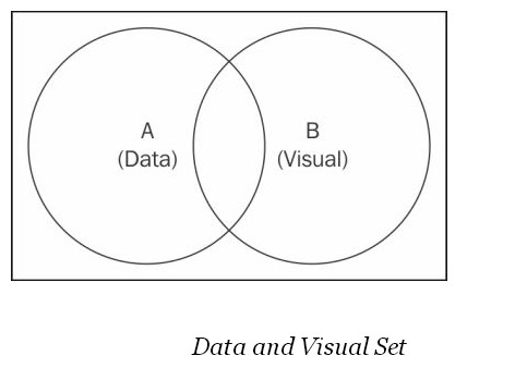
在上面的图中两个圆圈 代表了两个连接的集合,集合A代表了你的可视化的数据,集合B代表了可视化的元素。这些是D3要将你的数据和可视化元素连接起来的基础。你可能会问这种简单的集合理论和数据可视化有什么关系,下面我们就来解释。
首先,让我们思考一个问题,我们如何在图中找到那些确切的代表了相应数据的可视化元素?答案是A∩B,也就是结合A和集合B的交集,那些同时存在于数据和可视化中的元素。
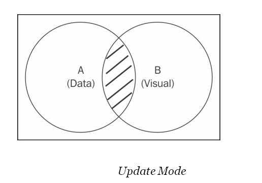
上图的阴影部分即集合A和集合B的交集,在D3中 selection.data方法可以用来选中这一部分。在这个方法中,当调用该方法时建立起数据集合可视化集的联系,这个选择方法返回的是一个新的选择(数据和可视化绑定的元素)即所有阴影中的元素。现在你就可以用修改方法对这个选择的元素进行操作。这种模式通常称为(updata mode)更新模式。
第二个问题就是如何找出还没有被可视化的数据,答案很简单即是集合A与集合B的差集A/B,
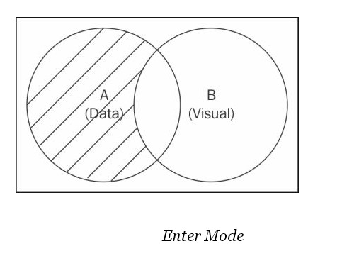
上图中的阴影部分代表了集合A中还没有被可视化的数据。在D3中为了获取这部分的内容,会用到下面的方法
selection.data(data).enter()方法,该方法返回一个新的选择代表了A与B的差集A/B,包含了所有的没有被可视化的数据集合,接下来利用操作函数链接在此选择之后相应的对所有的数据添加对应的可视化元素,完成数据的可视化。该模式就称谓enter mode。
接下来我们要讨论的就是在可视化元素集合中存在的但是没有与数据集中数据相对应的可视化元素。你可能会问怎么会有这样的元素存在在我还没有进行可视化的时候。这种情况通常是因为你修改了数据集,当你在最开始对数据集中的数据进行可视化后,可视化元素和数据是一一对应的,但是当你数据集进行更改或者更新的时候你移出了一些数据,但是与之对应的可视化元素还存在。
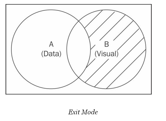
上图中的阴影部分即是我们所说的没有与之对应的数据集元素的可视化元素,这部分我们可以通过selection.exit方法选择到,使用该方法后获得一个选择包含了所有目前没有与之对应的数据集元素的可视化元素的集合,作为一个d3选择对象,操作方法可以链接用来更新和移出这些可视化元素,这种模式被称为exit mode。
总结一下,这三种选择模式,包含了数据集和可视化元素集的联系的所有可能情况,Enter-update-Exit模式是所有d3驱动的基础。在接下来的章节部分我们将讨论这种模式如何实现数据驱动可视化,以及他的高效和便捷之处。
1.绑定数组作为数据
在D3中,最常用也是最流行的定义可视化的数据的方式就是使用javascript数组,比如,你有许多的数据元素存在一个数组中,你想产生相应的可视化元素来代表这些数据,另外,当这些数据改变的时候,你希望你的可视化元素也快速的相应的作出改变,在这一部分我们就实现这个常用的程序。
下面就开始编程部分,我们首先把前面用到的样式表提取出来,存为styles.css,这个样式表在以后的程序中都会用到。
    body {
    font-family: "helvetica";
}

button {
    margin: 0 7px 0 0;
    background-color: #f5f5f5;
    border: 1px solid #dedede;
    border-top: 1px solid #eee;
    border-left: 1px solid #eee;

    font-size: 12px;
    line-height: 130%;
    text-decoration: none;
    font-weight: bold;
    color: #565656;
    cursor: pointer;
}

.box {
    width: 200px;
    height: 200px;
    margin: 40px;
    float: left;
    text-align: center;
    border: #969696 solid thin;
    padding: 5px;
}

.red {
    background-color: #e9967a;
    color: #f0f8ff;
}

.blue {
    background-color: #add8e6;
    color: #f0f8ff;
}

.cell {
    min-width: 40px;
    min-height: 20px;
    margin: 5px;
    float: left;
    text-align: center;
    border: #969696 solid thin;
    padding: 5px;
}

.fixed-cell {
    min-width: 40px;
    min-height: 20px;
    margin: 5px;
    position: fixed;
    text-align: center;
    border: #969696 solid thin;
    padding: 5px;
}

.h-bar {
    min-height: 15px;
    min-width: 10px;
    background-color: steelblue;
    margin-bottom: 2px;
    font-size: 11px;
    color: #f0f8ff;
    text-align: right;
    padding-right: 2px;
}

.v-bar {
    min-height: 1px;
    min-width: 30px;
    background-color: #4682b4;
    margin-right: 2px;
    font-size: 10px;
    color: #f0f8ff;
    text-align: center;
    width: 10px;
    display: inline-block;
}

.baseline {
    height: 1px;
    background-color: black;
}

.clear {
    clear: both;
}

.selected {
    background-color: #f08080;
}

.control-group {
    padding-top: 10px;
    margin: 10px;
}

.table {
    width: 70%;
}

.table td, th {
    padding: 5px;
}

.table-header {
    background-color: #00AFEF;
    font-weight: bold;
}

.table-row-odd {
    background-color: #f0f8ff;
}

.table-row-odd {
    background-color: #d3d3d3;
}

.code {
    display: inline-block;
    font-style: italic;
    background-color: #d3d3d3;
    border: #969696 solid thin;
    padding: 10px;
    margin-top: 10px;
    margin-bottom: 10px;
}

.countdown{
    width: 150px;
    height: 150px;
    font-size: 5em;
    font-weight: bold;
}

.axis path, .axis line {
    fill: none;
    stroke: #000;
    shape-rendering: crispEdges;
}

.axis text {
    font: 10px sans-serif;
}

.axis .grid-line{
    stroke: black;
    shape-rendering: crispEdges;
    stroke-opacity: .2;
}

.line{
    fill: none;
    stroke: steelblue;
    stroke-width: 2;
}

.dot {
  fill: #fff;
  stroke: steelblue;
}

.area {
    stroke: none;
    fill: steelblue;
    fill-opacity: .2;
}

.pie text{
    fill: white;
    font-weight: bold;
}

.circle {
    stroke: none;
    fill: red;
    fill-opacity: .7;
}

.cross {
    stroke: none;
    fill: blue;
    fill-opacity: .7;
}

.diamond {
    stroke: none;
    fill: green;
    fill-opacity: .7;
}

.square{
    stroke: none;
    fill: yellow;
    fill-opacity: .7;
}

.triangle-down{
    stroke: none;
    fill: blueviolet;
    fill-opacity: .7;
}

.triangle-up{
    stroke: none;
    fill: darkred;
    fill-opacity: .7;
}

.bubble{
    fill-opacity: .3;
}

.bar{
    stroke: none;
    fill: steelblue;
}
然后打开你的编辑器输入下面代码
<!DOCTYPE html>
<html>
<head>
    <meta charset="utf-8">
    <title>Array as Data</title>
    <link rel="stylesheet" type="text/css" href="styles.css"/>
    <script type="text/javascript" src="http://d3js.org/d3.v3.min.js"></script>
</head>

<body>

<script type="text/javascript">
    var data = [10, 15, 30, 50, 80, 65, 55, 30, 20, 10, 8]; // <- A

    function render(data) { // <- B
        // Enter
        d3.select("body").selectAll("div.h-bar") // <- C
            .data(data) // <- D
            .enter() // <- E
                .append("div") // <- F
                    .attr("class", "h-bar")
                .append("span"); // <- G

        // Update
        d3.select("body").selectAll("div.h-bar")
            .data(data)
                .style("width", function (d) { // <- H
                    return (d * 3) + "px";
                })
                .select("span") // <- I
                    .text(function (d) {
                        return d;
                    });

        // Exit
        d3.select("body").selectAll("div.h-bar")
            .data(data)
            .exit() // <- J
                .remove();
    }

    setInterval(function () { // <- K
        data.shift();
        data.push(Math.round(Math.random() * 100));
        render(data);
    }, 1500);

    render(data);
</script>

</body>

</html>
保存后用浏览器打开,使用chrome打开的效果如下:
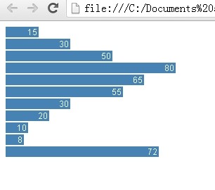
每隔一段时间这些数据和蓝柱条就会相应的改变,那么这种效果是如何实现的呢?如果是熟悉编程的人可能最先想到的是通过循环遍历来为数组中的每个数据添加相应的可视化元素,这确实是一个可行的解决方案,但是在D3中我们前面所讨论的enter-update-exit模式的方案更高效便捷,我们来看看具体是如何实现的。
再来看看实现的代码:
var data = [10, 15, 30, 50, 80, 65, 55, 30, 20, 10, 8]; // <- A
function render(data) { // <- B
// Enter
d3.select("body").selectAll("div.h-bar") // <- C
.data(data) // <- D
.enter() // <- E
.append("div") // <- F
.attr("class", "h-bar")
.append("span"); // <- G
// Update
d3.select("body").selectAll("div.h-bar")
.data(data)
.style("width", function (d) { // <- H
return (d * 3) + "px";
})
.select("span") // <- I
.text(function (d) {
return d;
});
// Exit
d3.select("body").selectAll("div.h-bar")
.data(data)
.exit() // <- J
.remove();
}
setInterval(function () { // <- K
data.shift();
data.push(Math.round(Math.random() * 100));
render(data);
}, 1500);
render(data);
在这段代码中,数据被存储在一个js数组中在注释A处,在B处我们定义了render方法,该方法后来被反复调用来实现对数据的可视化。Enter选择在C处开始,选择了页面中所有class属性为h-bar的div元素,你可能会疑惑为什么我们会选择这些在页面中根本不存在的元素,确实是这样。然后这里的选择,实际上是为了声明我们前面讨论过的可视化元素集合,通过这里的声明我们告诉D3我们的可视化元素集合就是页面中所有class属性为h-bar的div元素。在D处我们使用data方面将前面定义的数据集合可视化元素集绑定,一旦这两个集合被声明(定义),enter()方法就可以被调用来选中所有没有被可视化的数据,当render方法第一次调用时返回的就是整个数据集。
在F处,一个新的div被创建插入到body中并且与enter()中选择的数据元素对应,也就是说为enter()中的每一个元素创建一个对应的div元素,并且插入到body中。然后我们为每个div设置了class属性。在G处,我们创建了一个span元素。在这里我们已经基本完成了数据可视化的骨架,包含了与数据对应的空的div和span元素。下一步我们就根据所提供的数据对这些可视化元素设置属性。
提示:
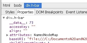
D3为DOM元素引入了一个_data_属性,用来将数据和可视化元素黏合在一起,所以当选择器对数据集进行修改的时候,D3就可以计算出更改的内容,你可以通过浏览器的审查元素功能查看到这些属性:
知道这些对以后调试你的可视化程序将会有很大的帮助。
在上面的代码中,update部分的前面两行和enter部分是一样都是用来声明数据集和可视化元素集,在前面的enter模式中我们已经为数据和可视化建立了联系,此时的data方法返回的是A∩B,在H处,我们为div动态的添加宽度的属性,所有的D3操作方法都适合这种函数来动态设置值,这就是前面提到的数据驱动你的可视化,因此理解这个函数如何用在本例中非常重要。这种动态赋值函数接受参数d,就是数据集中的每一个数据元素。本例中第一个元素是10,那么它对应的div的宽度就应该是10*3。以此类推。还有一点值得注意,我们在div中又添加了span元素,这里span元素和div元素为父子关系,span会继承div绑定的数据。如果在span中再添加元素,那么新的元素也会继承他父元素的数据绑定。
注意:动态赋值函数实际上有两个参数d,i。d就是数据集中确切的数据,i是数据集中数据所处位置的索引,比如数组的第一个数据i为0。
最后是exit模式,在这里也是同样先声明两个集合,然后通过exit()方法选中可视化集合中没有与数据集中数据 想对应的元素,最后调用remove()方法,将这些可视化元素移除,这样就保证了数据元素和可视化元素的时时一致。
K处的代码部分是为了检查这种 enter-updat-exit模式的,才用定时器,每隔1500毫秒就删除数组里面的第一个元素,然后随机生成一个数据插入到数组的最后一个元素,然后再调用render方法完成可视化。最终就可以看到不断变化的div了。


 133
133

 被折叠的 条评论
为什么被折叠?
被折叠的 条评论
为什么被折叠?
 到【灌水乐园】发言


