


写在前面
今天练习的这个效果是一个3D搜索框,这个搜索功能的需求几乎在每个项目中都会遇到,而搜索功能的主要目的就是便于我们查找需要的内容,因此,我们在很多项目中,都会将其放在显眼的位置,同时,又不想让它占据太多页面位置,那怎么办呢?因此,我们就想到让其占一个小位置,在需要的时候进行加载,这个就是我们今天练习的小项目内容。
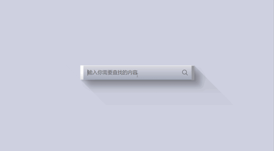
现在,我们一起来看一下它的最终效果:
HTML代码:
<!DOCTYPE html>
<html>
<head>
  <title>【每日一练】33—CSS 3D 搜索框的 UI 实现效果</title>
</head>
<body>
  <div class="inputBox">
    <div class="shadow"></div>
    <input type="text" placeholder="输入你需要查找的内容">
    <ion-icon name="search-outline"></ion-icon>
  </div>
  <script type="module" src="https://unpkg.com/ionicons@5.5.2/dist/ionicons/ionicons.esm.js"></script>
  <script nomodule src="https://unpkg.com/ionicons@5.5.2/dist/ionicons/ionicons.js"></script>
</body>
</html>
CSS代码:
*
{
  margin: 0;
  padding: 0;
  box-sizing: border-box;
  font-family: consolas;
}
body
{
  display: flex;
  justify-content: center;
  align-items: center;
  min-height: 100vh;
  overflow: hidden;
  background: #cfd1e1;
}
.inputBox
{
  position: relative;
  width: 65px;
  height: 50px;
  display: flex;
  justify-content: center;
  align-items: center;
  transition: 0.5s;
}
.inputBox:hover
{
  width: 400px;
}
.inputBox::before
{
  content: '';
  position: absolute;
  top: 0;
  left: 0;
  width: 10px;
  height: 100%;
  z-index: 1;
  background: linear-gradient(#fff,#fff,#e3e3e3);
  filter: blur(1px);
}
.inputBox::after
{
  content: '';
  position: absolute;
  top: 1px;
  right: -1px;
  width: 10px;
  height: 100%;
  z-index: 1;
  background:#9d9d9d;
  filter: blur(1px);
}
.shadow
{
  content: '';
  position: absolute;
  top: 0;
  left: -50px;
  width: calc(100% + 50px);
  height: 300px;
  background: linear-gradient(180deg,rgba(0,0,0,0.1),transparent,transparent);
  transform-origin: top;
  transform: skew(45deg);
  overflow: hidden;
  pointer-events: none;
}
.shadow::before
{
  content: '';
  position: absolute;
  top: 0;
  width: 50px;
  height: 50px;
  background: #cfd1e1;
  z-index: 1;
}
.inputBox input
{
  position: relative;
  width: 100%;
  height: 100%;
  border: none;
  padding: 10px 25px;
  outline: none;
  font-size: 1.1em;
  color: #555;
  background: linear-gradient(#dbdae1,#a3aaba);
  box-shadow:  5px 5px 5px rgba(0,0,0,0.1),
  15px 15px 15px rgba(0,0,0,0.1),
  20px 20px 15px rgba(0,0,0,0.1),
  30px 30px 15px rgba(0,0,0,0.1),
  inset 1px 1px 2px #fff;
}
.inputBox input,
.inputBox input::placeholder
{
  color: transparent;
}
.inputBox:hover input,
.inputBox:hover input::placeholder
{
  color: #555;
}
ion-icon
{
  position: absolute;
  right: 20px;
  font-size: 1.5em;
  cursor: pointer;
  color: #555;
}
写在最后
到今天,我们进行了33个小项目的练习了,不知道你坚持了没有,后面我们可能会做一些静态页面的练习了,每天尝试着去练习一些简单的静态页面。
其实,写页面真的就好像小孩子玩乐高搭积木一样,我们把每块内容练习学会后,然后,再通过一步一步的拼装,把需要的内容装到页面的盒子里,最终,就会出来一个静态页面的效果,最后,再根据自己需要的样子,慢慢调整CSS样式,就算你不会设计,按照一定规则写出来的页面也不会太差。
当然,如果想要视觉效果好,提升美感,这个也需要我们平日里多提升自己的审美能力。
总之,多看,多练,把自己看到的,认为好的东西,都去实现一遍,然后再通过自我不断改善。
好了,以上就是我今天跟你分享的【每日一练】的全部内容,希望你能有所收获,如果你觉得我今分享的内容对你有帮助的话,请点赞我,关注我,并将它分享给你身边做开发的朋友,也许能够帮助到他。
我是杨小爱,我们明天见。
学习更多技能
请点击下方公众号


 573
573


 被折叠的 条评论
为什么被折叠?
被折叠的 条评论
为什么被折叠?
 到【灌水乐园】发言


