


来源 | https://www.jianshu.com/p/6ac3e3e12d61
昨晚用CSS3实现了几种常见的Loading效果,虽然很简单,但还是分享一下,顺便也当是做做笔记……
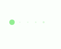
第一种效果

代码如下:
<div class="loading"> <span></span> <span></span> <span></span> <span></span> <span></span></div>
.loading{ width: 80px; height: 40px; margin: 0 auto; margin-top:100px; } .loading span{ display: inline-block; width: 8px; height: 100%; border-radius: 4px; background: lightgreen; -webkit-animation: load 1s ease infinite; } @-webkit-keyframes load{ 0%,100%{ height: 40px; background: lightgreen; } 50%{ height: 70px; margin: -15px 0; background: lightblue; } } .loading span:nth-child(2){ -webkit-animation-delay:0.2s; } .loading span:nth-child(3){ -webkit-animation-delay:0.4s; } .loading span:nth-child(4){ -webkit-animation-delay:0.6s; } .loading span:nth-child(5){ -webkit-animation-delay:0.8s; }
第2种效果:

代码如下:
<div class="loading"> <span></span></div>
.loading{ width: 150px; height: 4px; border-radius: 2px; margin: 0 auto; margin-top:100px; position: relative; background: lightgreen; -webkit-animation: changeBgColor 1.04s ease-in infinite alternate; } .loading span{ display: inline-block; width: 16px; height: 16px; border-radius: 50%; background: lightgreen; position: absolute; margin-top: -7px; margin-left:-8px; -webkit-animation: changePosition 1.04s ease-in infinite alternate; } @-webkit-keyframes changeBgColor{ 0%{ background: lightgreen; } 100%{ background: lightblue; } } @-webkit-keyframes changePosition{ 0%{ background: lightgreen; } 100%{ margin-left: 142px; background: lightblue; } }
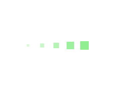
第3-5种效果:


代码如下:
<div class="loading"> <span></span> <span></span> <span></span> <span></span> <span></span></div>
第3-5种效果的css样式分别为:
.loading{ width: 150px; height: 15px; margin: 0 auto; margin-top:100px; } .loading span{ display: inline-block; width: 15px; height: 100%; margin-right: 5px; border-radius: 50%; background: lightgreen; -webkit-animation: load 1.04s ease infinite; } .loading span:last-child{ margin-right: 0px; } @-webkit-keyframes load{ 0%{ opacity: 1; } 100%{ opacity: 0; } } .loading span:nth-child(1){ -webkit-animation-delay:0.13s; } .loading span:nth-child(2){ -webkit-animation-delay:0.26s; } .loading span:nth-child(3){ -webkit-animation-delay:0.39s; } .loading span:nth-child(4){ -webkit-animation-delay:0.52s; } .loading span:nth-child(5){ -webkit-animation-delay:0.65s; }
.loading{ width: 150px; height: 15px; margin: 0 auto; margin-top:100px; } .loading span{ display: inline-block; width: 15px; height: 100%; margin-right: 5px; border-radius: 50%; background: lightgreen; -webkit-animation: load 1.04s ease infinite; } .loading span:last-child{ margin-right: 0px; } @-webkit-keyframes load{ 0%{ opacity: 1; -webkit-transform: scale(1.3); } 100%{ opacity: 0.2; -webkit-transform: scale(.3); } } .loading span:nth-child(1){ -webkit-animation-delay:0.13s; } .loading span:nth-child(2){ -webkit-animation-delay:0.26s; } .loading span:nth-child(3){ -webkit-animation-delay:0.39s; } .loading span:nth-child(4){ -webkit-animation-delay:0.52s; } .loading span:nth-child(5){ -webkit-animation-delay:0.65s; }.loading{ width: 150px; height: 15px; margin: 0 auto; position: relative; margin-top:100px; } .loading span{ position: absolute; width: 15px; height: 100%; border-radius: 50%; background: lightgreen; -webkit-animation: load 1.04s ease-in infinite alternate; } @-webkit-keyframes load{ 0%{ opacity: 1; -webkit-transform: translate(0px); } 100%{ opacity: 0.2; -webkit-transform: translate(150px); } } .loading span:nth-child(1){ -webkit-animation-delay:0.13s; } .loading span:nth-child(2){ -webkit-animation-delay:0.26s; } .loading span:nth-child(3){ -webkit-animation-delay:0.39s; } .loading span:nth-child(4){ -webkit-animation-delay:0.52s; } .loading span:nth-child(5){ -webkit-animation-delay:0.65s; }
第6-8种效果:


代码如下:
<div class="loading"> <span></span> <span></span> <span></span> <span></span> <span></span></div>
第6-8种效果的css样式分别为:
.loading{ width: 150px; height: 15px; margin: 0 auto; margin-top:100px; text-align: center; } .loading span{ display: inline-block; width: 15px; height: 100%; margin-right: 5px; background: lightgreen; -webkit-animation: load 1.04s ease infinite; } .loading span:last-child{ margin-right: 0px; } @-webkit-keyframes load{ 0%{ opacity: 1; } 100%{ opacity: 0; } } .loading span:nth-child(1){ -webkit-animation-delay:0.13s; } .loading span:nth-child(2){ -webkit-animation-delay:0.26s; } .loading span:nth-child(3){ -webkit-animation-delay:0.39s; } .loading span:nth-child(4){ -webkit-animation-delay:0.52s; } .loading span:nth-child(5){ -webkit-animation-delay:0.65s; }.loading{ width: 150px; height: 15px; margin: 0 auto; margin-top:100px; } .loading span{ display: inline-block; width: 15px; height: 100%; margin-right: 5px; background: lightgreen; -webkit-transform-origin: right bottom; -webkit-animation: load 1s ease infinite; } .loading span:last-child{ margin-right: 0px; } @-webkit-keyframes load{ 0%{ opacity: 1; } 100%{ opacity: 0; -webkit-transform: rotate(90deg); } } .loading span:nth-child(1){ -webkit-animation-delay:0.13s; } .loading span:nth-child(2){ -webkit-animation-delay:0.26s; } .loading span:nth-child(3){ -webkit-animation-delay:0.39s; } .loading span:nth-child(4){ -webkit-animation-delay:0.52s; } .loading span:nth-child(5){ -webkit-animation-delay:0.65s; }.loading{ width: 150px; height: 15px; margin: 0 auto; margin-top:100px; } .loading span{ display: inline-block; width: 15px; height: 100%; margin-right: 5px; background: lightgreen; -webkit-transform-origin: right bottom; -webkit-animation: load 1s ease infinite; } .loading span:last-child{ margin-right: 0px; } @-webkit-keyframes load{ 0%{ opacity: 1; -webkit-transform: scale(1); } 100%{ opacity: 0; -webkit-transform: rotate(90deg) scale(.3); } } .loading span:nth-child(1){ -webkit-animation-delay:0.13s; } .loading span:nth-child(2){ -webkit-animation-delay:0.26s; } .loading span:nth-child(3){ -webkit-animation-delay:0.39s; } .loading span:nth-child(4){ -webkit-animation-delay:0.52s; } .loading span:nth-child(5){ -webkit-animation-delay:0.65s; }
第9-10种效果:


代码如下:
<div class="loadEffect"> <span></span> <span></span> <span></span> <span></span> <span></span> <span></span> <span></span> <span></span></div>
CSS样式分别为:
.loadEffect{ width: 100px; height: 100px; position: relative; margin: 0 auto; margin-top:100px; } .loadEffect span{ display: inline-block; width: 16px; height: 16px; border-radius: 50%; background: lightgreen; position: absolute; -webkit-animation: load 1.04s ease infinite; } @-webkit-keyframes load{ 0%{ opacity: 1; } 100%{ opacity: 0.2; } } .loadEffect span:nth-child(1){ left: 0; top: 50%; margin-top:-8px; -webkit-animation-delay:0.13s; } .loadEffect span:nth-child(2){ left: 14px; top: 14px; -webkit-animation-delay:0.26s; } .loadEffect span:nth-child(3){ left: 50%; top: 0; margin-left: -8px; -webkit-animation-delay:0.39s; } .loadEffect span:nth-child(4){ top: 14px; right:14px; -webkit-animation-delay:0.52s; } .loadEffect span:nth-child(5){ right: 0; top: 50%; margin-top:-8px; -webkit-animation-delay:0.65s; } .loadEffect span:nth-child(6){ right: 14px; bottom:14px; -webkit-animation-delay:0.78s; } .loadEffect span:nth-child(7){ bottom: 0; left: 50%; margin-left: -8px; -webkit-animation-delay:0.91s; } .loadEffect span:nth-child(8){ bottom: 14px; left: 14px; -webkit-animation-delay:1.04s; }.loadEffect{ width: 100px; height: 100px; position: relative; margin: 0 auto; margin-top:100px; } .loadEffect span{ display: inline-block; width: 20px; height: 20px; border-radius: 50%; background: lightgreen; position: absolute; -webkit-animation: load 1.04s ease infinite; } @-webkit-keyframes load{ 0%{ -webkit-transform: scale(1.2); opacity: 1; } 100%{ -webkit-transform: scale(.3); opacity: 0.5; } } .loadEffect span:nth-child(1){ left: 0; top: 50%; margin-top:-10px; -webkit-animation-delay:0.13s; } .loadEffect span:nth-child(2){ left: 14px; top: 14px; -webkit-animation-delay:0.26s; } .loadEffect span:nth-child(3){ left: 50%; top: 0; margin-left: -10px; -webkit-animation-delay:0.39s; } .loadEffect span:nth-child(4){ top: 14px; right:14px; -webkit-animation-delay:0.52s; } .loadEffect span:nth-child(5){ right: 0; top: 50%; margin-top:-10px; -webkit-animation-delay:0.65s; } .loadEffect span:nth-child(6){ right: 14px; bottom:14px; -webkit-animation-delay:0.78s; } .loadEffect span:nth-child(7){ bottom: 0; left: 50%; margin-left: -10px; -webkit-animation-delay:0.91s; } .loadEffect span:nth-child(8){ bottom: 14px; left: 14px; -webkit-animation-delay:1.04s; }
第11种效果:

代码如下:
<div class="loading"> <span></span> <span></span> <span></span> <span></span> <span></span></div> .loading{ width: 80px; height: 40px; margin: 0 auto; margin-top:100px; } .loading span{ display: inline-block; width: 8px; height: 100%; border-radius: 4px; background: lightgreen; -webkit-animation: load 1.04s ease infinite; } @-webkit-keyframes load{ 0%,100%{ height: 40px; background: lightgreen; } 50%{ height: 60px; margin-top: -20px; background: lightblue; } } .loading span:nth-child(2){ -webkit-animation-delay:0.13s; } .loading span:nth-child(3){ -webkit-animation-delay:0.26s; } .loading span:nth-child(4){ -webkit-animation-delay:0.39s; } .loading span:nth-child(5){ -webkit-animation-delay:0.52s; }
第12种效果:

代码如下:
<div class="loading"> <span></span></div>.loading{ width: 80px; height: 80px; border-radius: 50%; margin: 0 auto; margin-top:100px; position: relative; border:5px solid lightgreen; -webkit-animation: turn 2s linear infinite; } .loading span{ display: inline-block; width: 30px; height: 30px; border-radius: 50%; background: lightgreen; position: absolute; left: 50%; margin-top: -15px; margin-left: -15px; -webkit-animation: changeBgColor 2s linear infinite; } @-webkit-keyframes changeBgColor{ 0%{ background: lightgreen; } 100%{ background: lightblue; } } @-webkit-keyframes turn{ 0%{ -webkit-transform: rotate(0deg); border-color: lightgreen; } 100%{ -webkit-transform: rotate(360deg); border-color: lightblue; } }
第13种效果:
代码如下:
<div class="loading"> <span></span> <span></span> <span></span> <span></span> <span></span></div>.loading{ width: 150px; height: 15px; margin: 0 auto; margin-top:100px; text-align: center; } .loading span{ display: inline-block; width: 15px; height: 100%; margin-right: 5px; background: lightgreen; -webkit-animation: load 1.04s ease infinite; } .loading span:last-child{ margin-right: 0px; } @-webkit-keyframes load{ 0%{ opacity: 1; -webkit-transform: scale(1.2); } 100%{ opacity: .2; -webkit-transform: scale(.2); } } .loading span:nth-child(1){ -webkit-animation-delay:0.13s; } .loading span:nth-child(2){ -webkit-animation-delay:0.26s; } .loading span:nth-child(3){ -webkit-animation-delay:0.39s; } .loading span:nth-child(4){ -webkit-animation-delay:0.52s; } .loading span:nth-child(5){ -webkit-animation-delay:0.65s; }
第14种效果:

代码如下:
<div class="loading"> <span></span></div>.loading{ width: 150px; height: 8px; border-radius: 4px; margin: 0 auto; margin-top:100px; position: relative; background: lightblue; overflow: hidden; } .loading span{ display:block; width: 100%; height: 100%; border-radius: 3px; background: lightgreen; -webkit-animation: changePosition 4s linear infinite; } @-webkit-keyframes changePosition{ 0%{ -webkit-transform: translate(-150px); } 50%{ -webkit-transform: translate(0); } 100%{ -webkit-transform: translate(150px); } }
第15种效果:

代码如下:
<div class="loading"> <span></span></div>.loading{ width: 200px; height: 60px; margin: 0 auto; margin-top: 100px; position: relative; } .loading span{ width: 50px; height: 30px; border-radius: 50%; background: lightgreen; position: absolute; top: 50%; margin-top: -15px; overflow: hidden; -webkit-animation: changePosition 2.08s linear infinite; } @-webkit-keyframes changePosition{ 0%,100%{ -webkit-transform: translate(70px); } 20%{ width: 50px; height: 30px; margin-top:-15px; -webkit-transform: translate(0px); } 30%{ width: 20px; height: 60px; margin-top:-30px; -webkit-transform: translate(0px); } 35%{ width: 50px; height: 30px; margin-top:-15px; -webkit-transform: translate(5px); background: lightblue; } 70%{ width: 50px; height: 30px; margin-top:-15px; -webkit-transform: translate(160px); } 80%{ width: 20px; height: 60px; margin-top:-30px; -webkit-transform: translate(160px); } 85%{ width: 50px; height: 30px; margin-top:-15px; -webkit-transform: translate(155px); background: lightgreen; } }
第16种效果:

代码如下:
<div class="loadEffect"> <span></span> <span></span> <span></span> <span></span> <span></span> <span></span> <span></span> <span></span></div>.loadEffect{ width: 100px; height: 100px; position: relative; margin: 0 auto; margin-top:100px; } .loadEffect span{ display: inline-block; width: 30px; height: 10px; border-top-left-radius: 5px; border-bottom-left-radius: 5px; background: lightgreen; position: absolute; -webkit-animation: load 1.04s ease infinite; } @-webkit-keyframes load{ 0%{ opacity: 1; } 100%{ opacity: 0.2; } } .loadEffect span:nth-child(1){ left: 0; top: 50%; margin-top:-5px; -webkit-animation-delay:0.13s; } .loadEffect span:nth-child(2){ left: 10px; top: 20px; -webkit-transform: rotate(45deg); -webkit-animation-delay:0.26s; } .loadEffect span:nth-child(3){ left: 50%; top: 10px; margin-left: -15px; -webkit-transform: rotate(90deg); -webkit-animation-delay:0.39s; } .loadEffect span:nth-child(4){ top: 20px; right:10px; -webkit-transform: rotate(135deg); -webkit-animation-delay:0.52s; } .loadEffect span:nth-child(5){ right: 0; top: 50%; margin-top:-5px; -webkit-transform: rotate(180deg); -webkit-animation-delay:0.65s; } .loadEffect span:nth-child(6){ right: 10px; bottom:20px; -webkit-transform: rotate(225deg); -webkit-animation-delay:0.78s; } .loadEffect span:nth-child(7){ bottom: 10px; left: 50%; margin-left: -15px; -webkit-transform: rotate(270deg); -webkit-animation-delay:0.91s; } .loadEffect span:nth-child(8){ bottom: 20px; left: 10px; -webkit-transform: rotate(315deg); -webkit-animation-delay:1.04s; }
第17种效果:

代码如下:
<div class="loadEffect"> <div><span></span></div> <div><span></span></div> <div><span></span></div> <div><span></span></div></div>.loadEffect { width: 100px; height: 100px; margin: 0 auto; margin-top:100px; position: relative; } .loadEffect div{ width: 100%; height: 100%; position: absolute; -webkit-animation: load 2.08s linear infinite; } .loadEffect div span{ display: inline-block; width: 20px; height: 20px; border-radius: 50%; background: lightgreen; position: absolute; left: 50%; margin-top: -10px; margin-left: -10px; } @-webkit-keyframes load{ 0%{ -webkit-transform: rotate(0deg); } 10%{ -webkit-transform: rotate(45deg); } 50%{ opacity: 1; -webkit-transform: rotate(160deg); } 62%{ opacity: 0; } 65%{ opacity: 0; -webkit-transform: rotate(200deg); } 90%{ -webkit-transform: rotate(340deg); } 100%{ -webkit-transform: rotate(360deg); } } .loadEffect div:nth-child(1){ -webkit-animation-delay:0.2s; } .loadEffect div:nth-child(2){ -webkit-animation-delay:0.4s; } .loadEffect div:nth-child(3){ -webkit-animation-delay:0.6s; } .loadEffect div:nth-child(4){ -webkit-animation-delay:0.8s; }
第18种效果:

代码如下:
<div class="loading"> <div><span></span></div> <div><span></span></div> <div><span></span></div></div>.loading{ width: 60px; height: 60px; margin: 0 auto; margin-top:100px; position: relative; -webkit-animation: load 3s linear infinite; } .loading div{ width: 100%; height: 100%; position: absolute; } .loading span{ display: inline-block; width: 20px; height: 20px; border-radius: 50%; background: #99CC66; position: absolute; left: 50%; margin-top: -10px; margin-left: -10px; -webkit-animation: changeBgColor 3s ease infinite; } @-webkit-keyframes load{ 0%{ -webkit-transform: rotate(0deg); } 33.3%{ -webkit-transform: rotate(120deg); } 66.6%{ -webkit-transform: rotate(240deg); } 100%{ -webkit-transform: rotate(360deg); } } @-webkit-keyframes changeBgColor{ 0%,100%{ background: #99CC66; } 33.3%{ background: #FFFF66; } 66.6%{ background: #FF6666; } } .loading div:nth-child(2){ -webkit-transform: rotate(120deg); } .loading div:nth-child(3){ -webkit-transform: rotate(240deg); } .loading div:nth-child(2) span{ -webkit-animation-delay: 1s; } .loading div:nth-child(3) span{ -webkit-animation-delay: 2s; }
PS:CSS样式代码其实很多重复,主要就是动画不一样,但为了方便以后直接拿来用,就先不整理了。


 6059
6059


 被折叠的 条评论
为什么被折叠?
被折叠的 条评论
为什么被折叠?
 到【灌水乐园】发言


