


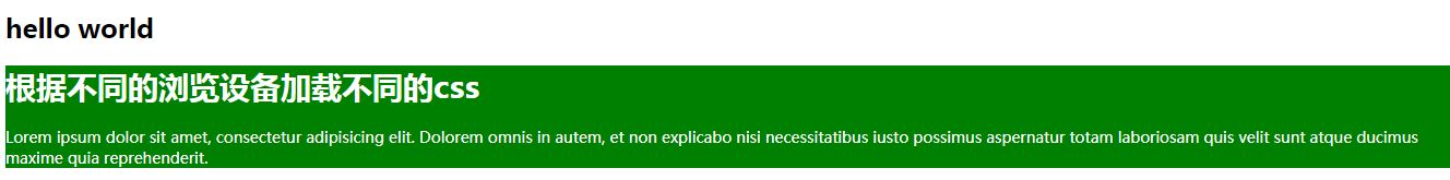
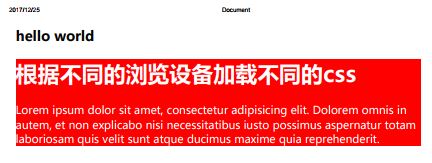
1、根据不同的浏览设备加载不同的css
<!DOCTYPE html>
<html lang="en">
<head>
	<meta charset="UTF-8">
	<title>Document</title>
	<link media="screen" rel="stylesheet" href="css/screen.css">
	<link media="print" rel="stylesheet" href="css/print.css">
</head>
<body>
	<h1>hello world</h1>
	<div class="box">
		<h1>根据不同的浏览设备加载不同的css</h1>
		<p>Lorem ipsum dolor sit amet, consectetur adipisicing elit. Dolorem omnis in autem, et non explicabo nisi necessitatibus iusto possimus aspernatur totam laboriosam quis velit sunt atque ducimus maxime quia reprehenderit.</p>
	</div>
</body>
</html>body{
font-size: 12px;
}
.box{
font-size: 14px;
color: #FFF;
background: green;
}body{
font-size: 12px;
}
.box{
font-size: 19px;
color: #FFF;
background: red;
}(1)浏览器界面下:
(2)打印机下:
------------------------------------------------------------------------
2、根据屏幕尺寸不同,加载不同CSS文件
<!DOCTYPE html>
<html lang="en">
<head>
	<meta charset="UTF-8">
	<title>Document</title>
	<link media="screen and (min-width:992px)" rel="stylesheet" href="css/screen_pc.css">
	<link media="screen and (min-width:768px) and (max-width:991px)" rel="stylesheet" href="css/screen_pad.css">
	<link media="screen and (max-width:767px)" rel="stylesheet" href="css/screen_phone.css">
</head>
<body>
	<h1>hello world</h1>
	<div class="box">
		<h1>根据屏幕尺寸不同,加载不同CSS文件</h1>
		<p>Lorem ipsum dolor sit amet, consectetur adipisicing elit. Dolorem omnis in autem, et non explicabo nisi necessitatibus iusto possimus aspernatur totam laboriosam quis velit sunt atque ducimus maxime quia reprehenderit.</p>
	</div>
</body>
</html>.box{
font-size: 23px;
color: pink;
background: green;
}.box{
font-size: 16px;
color: #FFF;
background: #000;
}.box{
font-size: 12px;
color: orange;
background: #FFF;
}3、根据屏幕尺寸不同,加载不同CSS片段
<!DOCTYPE html>
<html lang="en">
<head>
<meta charset="UTF-8">
<title>Document</title>
<link rel="stylesheet" href="css/screens.css">
</head>
<body>
<h1>hello world</h1>
<div class="box">
<h1>根据屏幕尺寸不同,加载不同CSS片段</h1>
<p>Lorem ipsum dolor sit amet, consectetur adipisicing elit. Dolorem omnis in autem, et non explicabo nisi necessitatibus iusto possimus aspernatur totam laboriosam quis velit sunt atque ducimus maxime quia reprehenderit.</p>
</div>
</body>
</html>screens.css
/* pc */
@media screen and (min-width: 992px){
.box{
	font-size: 23px;
	color: pink;
	background: green;
}
h1{font-size: 2em}
}
/* pad */
@media screen and (min-width: 768px) and (max-width: 991px){
.box{
	font-size: 16px;
	color: #FFF;
	background: #000;
}
h1{font-size: 1em}
}
/* phone */
@media screen and (max-width: 767px){
.box{
	font-size: 12px;
	color: orange;
	background: #FFF;
}
h1{font-size: 0.5em}
}


 1万+
1万+

 被折叠的 条评论
为什么被折叠?
被折叠的 条评论
为什么被折叠?
 到【灌水乐园】发言


