


了解:https://www.cnblogs.com/xiaohuochai/p/5347930.html
帧动画原理:https://www.bilibili.com/video/av12463881/
01-过渡详解
  <style>
    .box {
      width: 300px;
      height: 300px;
      background-color: red;
      margin: 100px auto;
      /*
        过渡: 从A状态到B状态改变的过程

        第一个值: all  需要过渡的属性值  all 代表 所有的属性都参与过渡
        第二个值: 过渡的持续时间  单位是s或者ms  1s = 1000ms
        第三个值: 过渡的延迟时间  单位是s或者ms  1s = 1000ms
        第四个值: 过渡的速度曲线 ease 默认值   linear匀速
      */
      /* transition: all 1s 0s cubic-bezier(1, -1.06, 0.1, 3.14); */

      /* transition: width 1s, height 2s, background-color 3s; */

      /*
        小结:
        1. 过渡的属性  什么属性发生了过渡就写什么属性  可以使用all表示任何属性发生改变都参与过渡
        2. 过渡的持续时间  单位是m或者ms   1s = 1000ms
        3. 过渡的延迟时间  但是是m或者ms   注意: 第一个时间一定代表持续时间
        4. 过渡的速率曲线
          linear 匀速
          ease 荡秋千
          ...
          cubic-bezier()
      */
    }
    /* .box:nth-child(2) {
      transition: all 1s 0s ease;
    } */

    .box:hover {
      width: 600px;
      height: 600px;
      background-color: lime;
    }
  </style>
  <div class="box"></div>
  <div class="box"></div>
02-过渡属性的单一写法
 <style>
    .box {
      width: 200px;
      height: 200px;
      background-color: red;
      /* 过渡的属性 */
      transition-property: all;
      /* 过渡的持续时间 */
      transition-duration: 1s;
      /* 过渡的延迟时间 */
      transition-delay: 1s;
      /* 过渡的速率曲线 */
      transition-timing-function: linear;


      /* 一般单一属性的写法使用的较少  可以用于覆盖简写里面的某一个属性 */
    }

    .box:hover {
      width: 300px;
      height: 300px;
      background-color: lime;
    }
  </style>
  <div class="box"></div>
03-动画的八大参数
<style>
    .box {
      width: 200px;
      height: 200px;
      background-color: pink;
      position: absolute;
      left: 0;
      top: 0;
      /* 调用动画 */

      /*
        动画有八个参数
        1. 动画的名称
        2. 动画的持续时间
        3. 动画的速率曲线
        4. 动画的延迟时间
        5. 动画的执行次数 默认是一次 想要多少次就写数值几  特殊值: infinite 无限循环
        6. 动画正逆序播放 normal 正序播放   reverse 倒叙播放  alternate 交替执行
        7. 动画结束的状态 动画执行完毕默认会回到最开始的位置  forwards: 让动画停留在结束状态
        8. 动画的运行状态 running 动画正在运行  paused 动画暂停 (一般用在当用户做了某一个操作的时候将正在运行的动画暂停)
      */
      animation: go 1s linear 0s alternate forwards paused;
    }

    /* 声明动画 */
    @keyframes go {
      0% {
        left: 0;
        top: 0;
      }

      25% {
        left: 800px;
        top: 0;
      }

      50% {
        left: 800px;
        top: 400px;
      }

      75% {
        left: 0px;
        top: 400px;
      }

      100% {
        left: 0;
        top: 200px;
      }
    }
  </style>
  <div class="box"></div>
06-动画的单一属性写法
	<body>
  <!--
    animation-name:动画名称,由@keyframes定义的
    animation-duration:动画的持续时间
    animation-timing-function:动画的过渡类型
        ease:变速
        linear:匀速
        steps:分步动画
    animation-delay:动画的延迟时间
    animation-iteration-count:动画的循环次数
      infinite:无穷次
    animation-direction:设置动画在循环中是否反向运动
        normal:从from到to
        reverse: 从to到from
        alternate: 交替执行
    animation-fill-mode:设置动画时间之外的状态
      forwards:停留在结束状态
    animation-play-state:设置动画的状态。
      paused: 暂停动画
  -->
</body>
09-帧动画
/* 让动画以步数去完成 帧动画*/
<style>
.box {
width: 174px;
height: 126px;
background: url(imag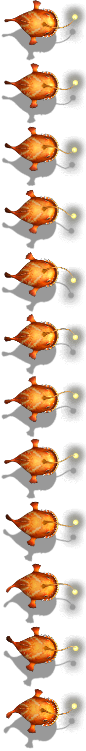
es/fish-12-126.png) 0 -1386px no-repeat;
/* steps的取值是总的画面数 - 1 因为默认情况下就可以看到第一个画面 */
animation: yao 1s steps(11) infinite;
/*
帧动画的使用步骤:
1. 先确定一个画面的大小 将这个大小作为盒子的大小
2. 确定动画的起始画面和结束画面
3. 确定一共有多少个画面 steps的取值是总的画面数 - 1
*/
}
@keyframes yao {
0% {
background-position: 0 0;
}
100% {
background-position: 0 -1386px;
}
}
</style>
<div class="box"></div>
下面这个图是帧动画的图


 扫一扫
扫一扫
 3265
3265

 被折叠的 条评论
为什么被折叠?
被折叠的 条评论
为什么被折叠?
 到【灌水乐园】发言


