


html代码部分
<div class="box1">
    <div class="tabLsit">选项1</div>
    <div class="tabLsit">选项2</div>
    <div class="tabLsit">选项3</div>
    <div class="tabLsit">选项4</div>
    <div class="tabLsit">选项5</div>
</div>
css代码部分
.box1 {
width: 600px;
height: 300px;
border: 1px solid #000;
margin: 0px auto;
display: flex;
justify-content: space-between;
.tabLsit {
width: 20%;
height: 40px;
line-height: 40px;
position: relative;
cursor: pointer;
text-align: center;
}
.tabLsit:before {
content: "";
height: 4px;
background-color: #d70009;
width: 100%;
position: absolute;
left: 0;
bottom: 0;
transform: scaleX(0);
transition: 0.3s;
}
.tabLsit:hover:before {
transform: scaleX(1);
}
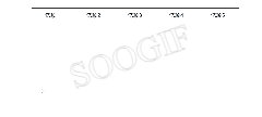
}最终实现效果图


 1848
1848

 被折叠的 条评论
为什么被折叠?
被折叠的 条评论
为什么被折叠?
 到【灌水乐园】发言


