


animation
如何简单的实现一个动画?
1 写上动画所需要的关键帧
2 加上动画名称(animation-name)与完成动画所需时间(animation-duration)即可
<!DOCTYPE html>
<html>
    <head>
        <meta charset="UTF-8">
		<title>CSS3 动画</title>
		<!-- Add some style to the page -->
        <style type="text/css">
			@keyframes test {
				0% { margin-left: 0px;margin-top:0px}
				25% {  margin-left: 0px; margin-top:100px}
				50% { margin-left: 200px;margin-top:100px}
				75% { margin-left: 200px;margin-top:0px}
				100% {margin-left: 0px;margin-top:0px}
			}


			.test1 {
				width: 80px;
				height: 80px;
				background: green;
				/* 动画名称 */
				animation-name: test;
				/* 完成一次动画周期需要的时间 */
				animation-duration: 2s;
			}

        </style>
    </head>
    <body>
        <div class="test1"></div>
    </body>
</html>
动画中另外两个重要的属性配置:
1animation-delay:定义动画开始播放前的延迟时间
2animation-iteration-count:定义动画播放的次数
3animation-timing-function:动画播放的速度曲线
<!DOCTYPE html>
<html>
    <head>
        <meta charset="UTF-8">
		<title>CSS3 动画</title>
		<!-- Add some style to the page -->
        <style type="text/css">
			@keyframes test {
				0% { margin-left: 0px;margin-top:0px}
				25% {  margin-left: 0px; margin-top:100px}
				50% { margin-left: 200px;margin-top:100px}
				75% { margin-left: 200px;margin-top:0px}
				100% {margin-left: 0px;margin-top:0px}
			}


			.test1 {
				width: 80px;
				height: 80px;
				background: green;
				/* 动画名称 */
				animation-name: test;
				/* 完成一次动画周期需要的时间 */
				animation-duration: 2s;
				/* 定义动画开始播放前的延迟时间 */
				animation-delay: 1s;
				/* 定义动画播放的次数 */
				animation-iteration-count: infinite;
				/* 动画播放的速度曲线 */
				animation-timing-function: ease;
			}

        </style>
    </head>
    <body>
        <div class="test1"></div>
    </body>
</html>
动画的其他配置:
1 animation-direction:设置是否在下一周期逆向播放动画,默认为 normal;
2 animation-play-state:设置动画是正在运行还是暂停,默认是 running;
3 animation-fill-mode:设置当动画不播放时(动画播放完或延迟播放时)的状态;
animation属性是animation-name、animation-duration、animation-timing-function、animation-delay、animation-iteration-count、animation-direction、animation-fill-mode、animation-play-state几个属性的简写形式
        /*
            name: 动画名字
            duration: 总时长
            timing-function: 缓动效果
            delay: 延迟时间
            iteration-count: 执行次数,永远执行写infinite,可不写
            direction: 想让动画的2、4、6...(偶数次)自动逆向执行,加上alternate参数即可,可不写
            fill-mode: 想让动画停止在最后结束状态,加上forwards,可不写
         */
        animation: name duration timing-function delay iteration-count direction fill-mode;
        animation: name 3s linear 0s infinite;
transition
过渡的属性与上面动画的相似,我们直接看代码
<!DOCTYPE html>
<html>
    <head>
        <meta charset="UTF-8">
		<title>CSS3 动画</title>
		<!-- Add some style to the page -->
        <style type="text/css">
			.tra1{
				width:80px;
				height: 80px;
				background:orange;
				/* 需要过渡的css属性,默认值为all表示所有属性都过渡(width、height等等) */
				transition-property:all;
				/* 完成一次过渡周期需要的时间 */
				transition-duration:5s;
				/* 过渡播放的速度曲线 */
				transition-timing-function:ease;
				/* 定义过渡前延迟的时间 */
				transition-delay:0s;
				/* 简写属性
				transition: width 5s linear 0s;
				*/
			}

			.tra1:hover{
				width:500px;
			}

        </style>
    </head>
    <body>
        <div class="tra1"></div>
    </body>
</html>
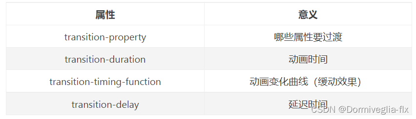
transition简写属性:
transition-propertytransition-durationtransition-timing-functiontransition-delay
			/*
            注意:
            1 所有数值类型的属性,都可以参与过渡,比如width、height、left、top、border-radius
            2 背景颜色和文字颜色都可以被过渡
            3 所有变形(包括2D和3D)都能被过渡
            */

            /*
                width: 什么属性要过渡,例如由正方形变为圆形则为border ,如果要所有属性都参与过渡,可以写all(all尽量少用,会引发效率问题)
                1s: 动画时长,单位是秒
                linear: 变化速度曲线
                0s: 延迟时间,单位是秒
             */
            transition: width 1s linear 0s;
transform

<!DOCTYPE html>
<html>
    <head>
        <meta charset="UTF-8">
		<title>CSS3 动画</title>
		<!-- Add some style to the page -->
        <style type="text/css">
			.t1{
				width: 80px;
				height: 80px;
				background: gray;
			}


			@keyframes test6 {
				0% { transform:rotate(0deg)}
				50% { transform:rotate(90deg)}
				100% {transform:rotate(180deg)}
			}

			.t2{
				/* 动画名称 */
				animation-name: test6;
				/* 完成一次动画周期需要的时间 */
				animation-duration: 2s;
			}


        </style>
    </head>
    <body>
        	<div class='t1'></div>

	        <!-- 旋转 -->
			<div class='t1' style='transform:rotate(30deg);background: blue;margin-top:20px'></div>
	        <!-- 扭曲 -->
			<div class='t1' style='transform:skew(30deg,30deg);margin-top:20px;'></div>
			<!-- 缩放 -->
			<div class='t1' style='transform:scale(2);margin-top:100px;background: blue;'></div>
	        <!-- 移动 -->
			<div class='t1' style='transform:translate(80px,80px);background: blue;margin-top:20px'></div>
            <!-- 与动画结合使用 -->
			<div class='t1 t2' style='margin-top:220px'></div>
    </body>
</html>
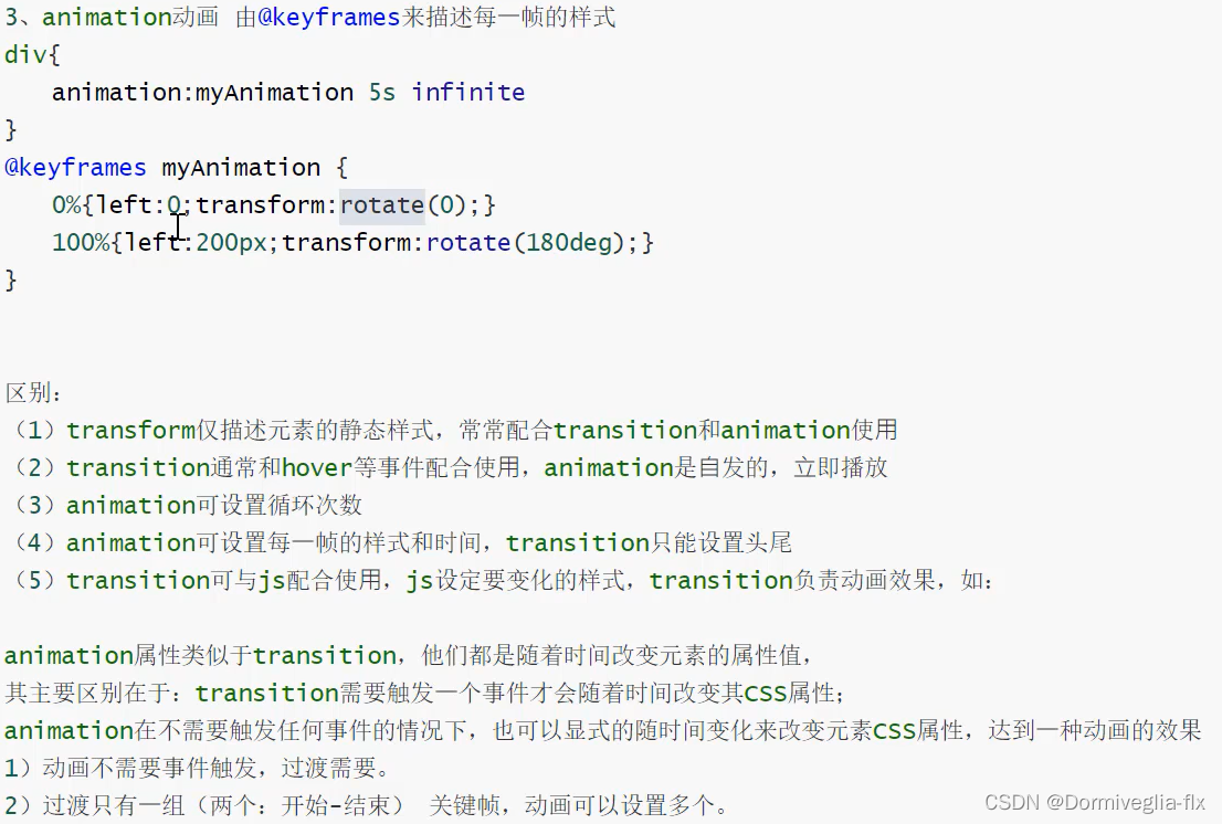
animation 与 transition的区别


 1856
1856


 被折叠的 条评论
为什么被折叠?
被折叠的 条评论
为什么被折叠?
 到【灌水乐园】发言


