


目录
横向排列 android:orientation="horizontal"
纵向排序 android:orientation="vertical"
安卓开发四大组件
1.活动 activity
2.服务 serice
3.广播接收器 BroadcastReceiver
4.内容提供者 Content Provider
安卓的目录结构
└─ASProjectTree
├─.gradle 自动编译工具产生的文件
├─.idea 开发工具产生的文件
├─app module模块,应用相关的东西在里边
├─gradle gradle环境支持文件夹
├─.gitignore Git源码版本管理忽略管理文件
├─build.gradle gradle项目自动编译的配置文件
├─gradle.properties
├─gradlew 自动完成 gradle 环境的linux mac 脚本,配合gradle 文件夹使用
├─gradlew.bat 自动完成 gradle 环境的windows 脚本,配合gradle 文件夹使用 ├─local.properties Android SDK NDK 环境路径配置
└─settings.gradle gradle 项目的子项目管理文件

安卓的基本控件
Textview 文本框
    <TextView
        android:layout_width="wrap_content"
        android:layout_height="wrap_content"
        android:layout_gravity="center_horizontal"
        android:layout_marginBottom="10dp"
        android:text="My name is smile."
        android:textColor="@color/white"
        android:textSize="20dp" />
EditText 文本输入框
    <LinearLayout
        android:layout_width="match_parent"
        android:layout_height="wrap_content">
        <TextView
            android:layout_width="wrap_content"
            android:layout_height="wrap_content"
            android:layout_weight="1"
            android:text="密码:"/>
        <EditText
            android:layout_width="wrap_content"
            android:layout_height="wrap_content"
            android:layout_weight="2"
            />
    </LinearLayout>
ImageView 图像输入框
    <ImageView
        android:layout_width="200dp"
        android:layout_height="200dp"
        android:layout_gravity="center_horizontal"
        android:layout_marginTop="150dp"
        android:background="@color/blue"
        android:src="@mipmap/bf7562daf4567b416d5a72308195f6a" />
Button 按钮
    <Button
        android:id="@+id/button1"
        android:layout_width="wrap_content"
        android:layout_height="wrap_content"
        android:layout_gravity="center_horizontal"
        android:background="#FF4040"
        android:text="TALK TO ME"
        android:textColor="@color/white"
        tools:ignore="TextContrastCheck,TextContrastCheck" />
安卓常用布局
线性布局 LinearLayout
基本框架
<?xml version="1.0" encoding="utf-8"?>
<LinearLayout xmlns:android="http://schemas.android.com/apk/res/android"
    android:layout_width="match_parent"
    android:layout_height="match_parent"
    android:orientation="horizontal">
    <Button
        android:id="@+id/button1"
        android:layout_width="wrap_content"
        android:layout_height="wrap_content"
        android:text="按钮1"
        android:layout_marginTop="20dp"/>

    ...

</LinearLayout>
基本属性
| 属性 | 说明 |
|---|---|
| android:id | 唯一值 |
| android:layout_height | 高,wrap_content:(随内容变化,类似auto),match_parent:(同父元素一样)单元最好是:dp |
| android:layout_width | 宽,同上 |
| android:background | 背景色 |
| android:layout_margin | 外边距 |
| android:layout_padding | 内边距 |
| android:orientation | horizontal水平排列(默认);vertical竖直排列 |
| android:layout_weight | 权重 |
| android:gravity | 排布方式 |
横向排列 android:orientation="horizontal"
<?xml version="1.0" encoding="utf-8"?>
<LinearLayout xmlns:android="http://schemas.android.com/apk/res/android"
    android:layout_width="match_parent"
    android:layout_height="match_parent"
    android:orientation="horizontal">
    <Button
        android:id="@+id/button1"
        android:layout_width="wrap_content"
        android:layout_height="wrap_content"
        android:text="按钮1"
        android:layout_marginTop="20dp"/>
    <Button
        android:id="@+id/button2"
        android:layout_width="wrap_content"
        android:layout_height="wrap_content"
        android:text="按钮2"
        android:layout_marginTop="20dp"
        android:layout_marginLeft="20dp"/>
    <Button
        android:id="@+id/button3"
        android:layout_width="200dp"
        android:layout_height="wrap_content"
        android:text="按钮3"
        android:layout_marginTop="20dp"
        android:layout_marginLeft="20dp"/>
</LinearLayout>
做出来之后效果是

纵向排序 android:orientation="vertical"
<?xml version="1.0" encoding="utf-8"?>
<LinearLayout xmlns:android="http://schemas.android.com/apk/res/android"
android:layout_width="match_parent"
android:layout_height="match_parent"
android:orientation="vertical">
<Button
android:id="@+id/button1"
android:layout_width="wrap_content"
android:layout_height="wrap_content"
android:text="按钮1"
android:layout_marginTop="20dp"/>
<Button
android:id="@+id/button2"
android:layout_width="wrap_content"
android:layout_height="wrap_content"
android:text="按钮2"
android:layout_marginTop="20dp"
android:layout_marginLeft="20dp"/>
<Button
android:id="@+id/button3"
android:layout_width="200dp"
android:layout_height="wrap_content"
android:text="按钮3"
android:layout_marginTop="20dp"
android:layout_marginLeft="20dp"/>
</LinearLayout>
做出来之后效果是

排布方式 gravity
gravity是排序方式
| 常量 | 描述 |
|---|---|
| top | 把view推到容器里的顶部。不会改变view的尺寸。 |
| bottom | 把view推到容器的底部。不会改变view的尺寸。 |
| center | 子view水平与竖直都居中。不会改变view的尺寸。 |
| center_horizonta | 子view水平居中。不会改变view的尺寸。 |
| center_vertical | 子view垂直居中。不会改变view的尺寸。 |
| start | 把view推到容器里最开始的地方。不会改变view的尺寸。 |
| end | 把子view放到容器的最尾部。不改变view的尺寸。 |
| left | 子view从容器的左边开始排布。不会改变view的尺寸。 |
| right | 子view从容器的右边开始排布。不会改变view的尺寸。 |
android:gravity 控制自己内部的子元素。
android:layout_gravity 是控制自己在父类的位置
分割占比layout_weight
    <LinearLayout
        android:layout_width="match_parent"
        android:layout_height="wrap_content"
        android:orientation="horizontal">
        <Button
            android:layout_width="0dp"
            android:layout_height="wrap_content"
            android:layout_weight="1"
            android:text="按钮"/>
        <Button
            android:layout_width="0dp"
            android:layout_height="wrap_content"
            android:layout_weight="1"
            android:text="按钮"/>
    </LinearLayout>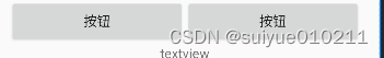
以为父类排序是横向排序,所以他们就按照父类的横向1:1
如果父类排序是纵向排序,他们就是纵向1:1
分割线 divider
在drawable目录里新建一个xml,叫做 divider_linear_1.xml 。

<?xml version="1.0" encoding="utf-8"?>
<shape xmlns:android="http://schemas.android.com/apk/res/android">
  <solid android:color="#7986CB" />
  <size
    android:width="1dp"
    android:height="1dp" />
</shape>
LinearLayout设置divider。
<LinearLayout
    android:layout_width="match_parent"
    android:layout_height="wrap_content"
    android:background="#eaeaea"
    android:divider="@drawable/divider_linear_1"
    android:orientation="vertical"
    android:showDividers="middle">
相对布局 RelativeLayout
相对布局定义
相对布局就是这个相对于哪个处于哪里
基本框架
<RelativeLayout xmlns:android="http://schemas.android.com/apk/res/android"
    xmlns:tools="http://schemas.android.com/tools"
    android:id="@+id/RelativeLayout1"
    android:layout_width="match_parent"
    android:layout_height="match_parent" >

    <ImageView
        android:id="@+id/img1"
        android:layout_width="80dp"
        android:layout_height="80dp"
        android:layout_centerInParent="true"
        android:src="@drawable/pic1"/>

    ...

</RelativeLayout>
相对于兄弟基本属性
| 属性名称 | 属性含义 |
|---|---|
| android:layout_below="@id/aaa" | 在指定View的下方 |
| android:layout_above="@id/aaa" | 在指定View的上方 |
| android:layout_toLeftOf="@id/aaa" | 在指定View的左边 |
| android:layout_toRightOf="@id/aaa" | 在指定View的右边 |
| android:layout_alignTop="@id/aaa" | 与指定View的上边界一致 |
| android:layout_alignBottom="@id/aaa" | 与指定View下边界一致 |
| android:layout_alignLeft="@id/aaa" | 与指定View的左边界一致 |
| android:layout_alignRight="@id/aaa" | 与指定View的右边界一致 |
相对于父元素
| 属性名称 | 属性含义 |
|---|---|
| android:layout_alignParentLeft="true" | 在父元素内左边 |
| android:layout_alignParentRight="true" | 在父元素内右边 |
| android:layout_alignParentTop="true" | 在父元素内顶部 |
| android:layout_alignParentBottom="true" | 在父元素内底部 |
对齐方式
| 属性名称 | 属性含义 |
|---|---|
| android:layout_centerInParent="true" | 居中布局 |
| android:layout_centerVertical="true" | 垂直居中布局 |
| android:layout_centerHorizontal="true" | 水平居中布局 |
间隔
| 属性名称 | 属性含义 |
|---|---|
| android:layout_marginBottom="" | 离某元素底边缘的距离 |
| android:layout_marginLeft="" | 离某元素左边缘的距离 |
| android:layout_marginRight ="" | 离某元素右边缘的距离 |
| android:layout_marginTop="" | 离某元素上边缘的距离 |
| android:layout_paddingBottom="" | 往内部元素底边缘填充距离 |
| android:layout_paddingLeft="" | 往内部元素左边缘填充距离 |
| android:layout_paddingRight ="" | 往内部元素右边缘填充距离 |
| android:layout_paddingTop="" | 往内部元素右边缘填充距离 |
梅花布局

做一个这样子的布局,代码详情是
<?xml version="1.0" encoding="utf-8"?>
<RelativeLayout
    android:layout_width="match_parent"
    android:layout_height="match_parent"
    xmlns:android="http://schemas.android.com/apk/res/android" >
<Button
        android:id="@+id/button1"
        android:layout_width="wrap_content"
        android:layout_height="wrap_content"
        android:layout_centerInParent="true"
        android:text="中间的" />

    <Button
        android:id="@+id/button2"
        android:layout_width="wrap_content"
        android:layout_height="wrap_content"
        android:layout_above="@id/button1"
        android:layout_alignLeft="@id/button1"
        android:layout_marginBottom="20dp"
        android:text="上面的" />
    <Button
        android:id="@+id/button5"
        android:layout_marginTop="20dp"
        android:layout_width="wrap_content"
        android:layout_height="wrap_content"
        android:layout_below="@id/button1"
        android:layout_alignLeft="@id/button1"
        android:layout_marginBottom="20dp"
        android:text="下面的" />
    <Button
        android:layout_marginRight="20dp"
        android:id="@+id/button3"
        android:layout_width="wrap_content"
        android:layout_height="wrap_content"
        android:text="左边的"
        android:layout_toLeftOf="@id/button1"
        android:layout_alignTop="@id/button1"
        />
    <Button
        android:layout_marginLeft="20dp"
        android:id="@+id/button4"
        android:layout_width="wrap_content"
        android:layout_height="wrap_content"
        android:text="右边的"
        android:layout_toRightOf="@id/button1"
        android:layout_alignTop="@id/button1"
        />
</RelativeLayout>
中间按钮是相对于父类的正中间,而左右上下是相对于中间按钮的上下左右
表格布局 TableLayout
基本框架
<?xml version="1.0" encoding="utf-8"?>
<TableLayout xmlns:android="http://schemas.android.com/apk/res/android"
    android:layout_width="match_parent"
    android:layout_height="match_parent">

    <Button
        android:text="Button1"
        android:layout_height="wrap_content"
        android:layout_width="wrap_content"/>


</TableLayout>
表格布局的定义
TableLayout是线性布局LinearLayout的子类,属于线性布局的一个扩展,也就是说TableLayout本质上就是一个线性布局。
如果直接在表格布局里面添加控件的话,他会直接占据一行,这也是表格布局的特点,如果想在一行中添加多个控件的话,就需要添加<TableRow></TableRow>
<?xml version="1.0" encoding="utf-8"?>
<TableLayout xmlns:android="http://schemas.android.com/apk/res/android"
    android:layout_width="match_parent"
    android:layout_height="match_parent">
    <TableRow>
        <Button
            android:text="Button1"
            android:layout_height="wrap_content"
            android:layout_width="wrap_content"/>

        <Button
            android:text="Button2"
            android:layout_height="wrap_content"
            android:layout_width="wrap_content"/>
    </TableRow>
</TableLayout>
基本属性
| 属性 | 解释 |
|---|---|
| android:collapseColumns | 设置需要被隐藏的列的序号 |
| android:shrinkColumns | 设置允许被收缩的列的列序号 |
| android:stretchColumns | 设置运行被拉伸的列的列序号 |
以上这三个属性的列号都是从0开始算的,比如shrinkColunmns = “2”,对应的是第三列.
内部控件属性
| 属性 | 解释 |
|---|---|
| android:layout_column | 该单元格在第几列显示 |
| android:layout_span | 该单元格占据列数,默认为1 |
帧布局 FrameLayout
基本框架
<?xml version="1.0" encoding="utf-8"?>
<FrameLayout
    xmlns:android="http://schemas.android.com/apk/res/android"
    android:layout_width="match_parent"
    android:layout_height="match_parent">

    <TextView
        android:id="@+id/text_view"
        android:layout_width="wrap_content"
        android:layout_height="wrap_content"
        android:text="This is TextView"/>

    <ImageView
        android:id="@+id/image_view"
        android:layout_width="wrap_content"
        android:layout_height="wrap_content"
        android:src="@mipmap/ic_launcher"/>

</FrameLayout>
基本属性
6.2 属性
FrameLayout的属性很少就两个,但是在说之前我们先介绍一个东西:
前景图像:永远处于帧布局最上面,直接面对用户的图像,就是不会被覆盖的图片。
两个属性:
-
android:foreground:*设置改帧布局容器的前景图像
-
android:foregroundGravity:设置前景图像显示的位置
属性的使用
-
android:foreground: 设置 FrameLayout 的前景图像
前景图像会置于 FrameLayout 内部所有 View 的层级之上,直接设置图片的资源 id 即可,如下:
android:foreground="@drawable/emercy"-
android:foregroundGravity: 设置 FrameLayout 前景图片的摆放位置,设置方式与 RelativeLayout 中的 View 一样,如:
android:foregroundGravity="bottom|right"<?xml version="1.0" encoding="utf-8"?>
<FrameLayout xmlns:android="http://schemas.android.com/apk/res/android"
android:layout_width="match_parent"
android:layout_height="match_parent"
android:foreground="@drawable/emercy"
android:foregroundGravity="bottom|right"
android:orientation="vertical">
<ImageView
android:layout_width="wrap_content"
android:layout_height="wrap_content"
android:scaleType="centerCrop"
android:src="@mipmap/ic_launcher" />
<TextView
android:layout_width="match_parent"
android:layout_height="wrap_content"
android:layout_marginTop="40dp"
android:background="#4C374A"
android:padding="10dp"
android:text="Welcome to iMooc"
android:textColor="#FFFFFF"
android:textSize="20sp" />
<TextView
android:layout_width="wrap_content"
android:layout_height="wrap_content"
android:layout_gravity="left|bottom"
android:background="#1E64D8"
android:padding="10dp"
android:text="Emercy Android"
android:textColor="#FFFFFF"
android:textSize="18sp" />
</FrameLayout>约束布局 ConstraintLayout
基本框架
<?xml version="1.0" encoding="utf-8"?>
<androidx.constraintlayout.widget.ConstraintLayout xmlns:android="http://schemas.android.com/apk/res/android"
    xmlns:app="http://schemas.android.com/apk/res-auto"
    xmlns:tools="http://schemas.android.com/tools"
    android:layout_width="match_parent"
    android:layout_height="match_parent"
    tools:context=".MainActivity">

    <TextView
        android:layout_width="wrap_content"
        android:layout_height="wrap_content"
        android:text="Hello World!"
        app:layout_constraintBottom_toBottomOf="parent"
        app:layout_constraintEnd_toEndOf="parent"
        app:layout_constraintStart_toStartOf="parent"
        app:layout_constraintTop_toTopOf="parent" />

</androidx.constraintlayout.widget.ConstraintLayout>
基本属性
| 属性 | 说明 |
|---|---|
| layout_constraintLeft_toLeftOf | 该控件的左边与设置值id的左边对齐 |
| layout_constraintLeft_toRightOf | 该控件的左边与设置值id的右边对齐 |
| layout_constraintRight_toLeftOf | 该控件的右边与设置值id的左边对齐 |
| layout_constraintRight_toRightOf | 该控件的右边与设置值id的右边对齐 |
| layout_constraintTop_toTopOf | 该控件的上边与设置值id的上边对齐 |
| layout_constraintTop_toBottomOf | 该控件的上边与设置值id的下边对齐 |
| layout_constraintBottom_toTopOf | 该控件的底边与设置值id的上边对齐 |
| layout_constraintBottom_toBottomOf | 该控件的底边与设置值id的底边对齐 |
| layout_constraintBaseline_toBaselineOf | 控件间的文本内容基准线对齐 |
| layout_constraintStart_toEndOf | 该控件的起始边与设置值id的尾边对齐 |
| layout_constraintStart_toStartOf | 该控件的起始边与设置值id的起始边对齐 |
| layout_constraintEnd_toStartOf | 该控件的尾边与设置值id的起始边对齐 |
| layout_constraintEnd_toEndOf | 该控件的尾边与设置值id的尾边对齐 |
属性的使用
相对父layout的定位
将子view对齐到父layout的各个边缘位置。
约束的参考对象是 parent 。
<androidx.constraintlayout.widget.ConstraintLayout
    android:id="@+id/c2"
    android:layout_width="match_parent"
    android:layout_height="140dp"
    android:layout_marginTop="20dp"
    android:background="#f0f0f0"
    app:layout_constraintTop_toBottomOf="@id/c1">
    <!-- 相对父layout的边缘定位 -->
    <TextView
      style="@style/ConSampleText"
      android:text="居中"
      app:layout_constraintBottom_toBottomOf="parent"
      app:layout_constraintEnd_toEndOf="parent"
      app:layout_constraintStart_toStartOf="parent"
      app:layout_constraintTop_toTopOf="parent" />
    <TextView
      style="@style/ConSampleText"
      android:text="左上角"
      app:layout_constraintStart_toStartOf="parent"
      app:layout_constraintTop_toTopOf="parent" />
    <TextView
      style="@style/ConSampleText"
      android:text="左下角"
      app:layout_constraintBottom_toBottomOf="parent"
      app:layout_constraintStart_toStartOf="parent" />
    <TextView
      style="@style/ConSampleText"
      android:text="右下角"
      app:layout_constraintBottom_toBottomOf="parent"
      app:layout_constraintEnd_toEndOf="parent" />
    <TextView
      style="@style/ConSampleText"
      android:text="右上角"
      app:layout_constraintEnd_toEndOf="parent"
      app:layout_constraintTop_toTopOf="parent" />
    <TextView
      style="@style/ConSampleText"
      android:text="顶部水平居中"
      app:layout_constraintEnd_toEndOf="parent"
      app:layout_constraintStart_toStartOf="parent"
      app:layout_constraintTop_toTopOf="parent" />
    <TextView
      style="@style/ConSampleText"
      android:text="底部水平居中"
      app:layout_constraintBottom_toBottomOf="parent"
      app:layout_constraintEnd_toEndOf="parent"
      app:layout_constraintStart_toStartOf="parent" />
    <TextView
      style="@style/ConSampleText"
      android:text="左边垂直居中"
      app:layout_constraintBottom_toBottomOf="parent"
      app:layout_constraintStart_toStartOf="parent"
      app:layout_constraintTop_toTopOf="parent" />
    <TextView
      style="@style/ConSampleText"
      android:text="右边垂直居中"
      app:layout_constraintBottom_toBottomOf="parent"
      app:layout_constraintEnd_toEndOf="parent"
      app:layout_constraintTop_toTopOf="parent" />
</androidx.constraintlayout.widget.ConstraintLayout>
边距属性
| 属性 | 说明 |
|---|---|
| android:layout_marginStart | 起始边距 |
| android:layout_marginEnd | 尾边距 |
| android:layout_marginLeft | 左边距 |
| android:layout_marginTop | 上边距 |
| android:layout_marginRight | 右边距 |
| android:layout_marginBottom | 底边距 |


 103
103


 被折叠的 条评论
为什么被折叠?
被折叠的 条评论
为什么被折叠?
 到【灌水乐园】发言


