


由于项目需要刚接触vue不久,发现vue是真的好用,性能又好,做了一个小的demo,详细记录一下:这是个进度条组件{线形进度条和圆形进度条,进度成功显示100%并且颜色会成为绿色,出错是进度条是红色,实时显示%比进度条数字。可直接在项目中使用,引入时在自定义标签上传入相应属性就能得到i想要的效果}
1.开发工具:我的环境是hbuilderX【windows环境】
建议初学者学完基础时不直接接触vue-cli脚手架,做demo时使用vue/cli-serverce-global做组件练习。
2.开始开发
第一步:随便在哪个位置新建一个文件夹(我这里为vueprogress),在里面新建一个App.vue文件作为入口文件,在新建一个progress.vue文件用来编写我们的组件
第二步:wi+r 输入cmd 在命令行里输入npm install -g @vue/cli-serverce-global安装vue-cli的原型编译工具(前提是在你已经安装好了node.js 和 vue环境并且正确配置好了环境变量)提一下vue/cli-serverce-global 他能直接编译 .vue文件 能单独在浏览器中运行
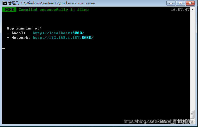
第三步:等待安装完后 在vueprogress文件里面打开cmd窗口输入vue查看vue是否安装正确,报错请自行百度,若正确 输入vue serve xxx.vue(若文件里面有App.vue则xxx.vue可以省略vue serve 否则就是 vue serve 你定义的入口.vue)回车执行
这时会出现一个端口:
第四部:接下来就是编写我们的组件了 在编辑器中打开progress.vue文件,添加如下代码
<template>
	<div
	class="progress"
	:class="[
		status ? `is-${status}` : '',`progress--${type}`
	]"
	>
		<div class="progress-bar" v-if="type === 'line' ">
			<div class="progress-bar__outer" :style="{height:strokeWidth + 'px'}">
				<div class="progress-bar__inner" :style="barStyle">
					<div class="progress-bar__inner__text" v-if="textInside">{{ percentage }}%</div>
				</div>
			</div>
		</div>
		<div v-else
		class="progress-circle"
		:style="{width:width+'px',height:width+'px'}"
		>
			<svg viewBox="0 0 100 100">
				<path
				:d="strokeclass"
				fill="none"
                :stroke-width="relativestrokeWidth"
				stroke="#e5e9f2"
				/>
				<path
				:d="strokeclass"
				fill="none"
				:stroke-width="relativestrokeWidth"
				:stroke="stroke"
				:style="circlepathstyle"
				stroke-linecap="round"
				/>
			</svg>
		</div>
		<div class="progress__text" :style="{fontSize:progressFontSize+'12px'}" v-if="!textInside">
			<template v-if="!status">{{ percentage }}%</template>
			<i v-else class="iconfont" :class="iconclass"></i>
		</div>
	</div>
</template>

<script>
	export default{
		props:{
			strokeWidth:{
				type:Number,
				default:6
			},
			percentage:{
				type:Number,
				default:0,
				required:true,
				validator(value){
					return value>=0 && value<=100;
				}
			},
			status:{
				type:String
			},
			type:{
				type:String,
				default:"line",
				validator:val => ['circle','line'].includes(val)
			},
			textInside:{
				type:Boolean,
				default:false
			},
			width:{
				type:Number,
				default:126
			}
		},
		computed:{
			progressFontSize(){
				return 12+this.strokeWidth*0.4;
			},
			stroke(){
				let color;
				switch(this.status){
					case "success":
					color="#13ce66";
					break;
					case "exception":
					color="#ff4949";
					break;
					default:
					color="#20a0ff";
				}
				return color;
			},
			barStyle(){
				return {
					width:this.percentage+'%',
					backgroundColor:this.stroke
				}
			},
			iconclass(){
				if(this.type === "line"){
					return this.status === 'success' ? 'icon-line-success' : 'icon-line-close'
				}else{
					return this.status === 'success' ? 'icon-circle-success' : 'icon-circle-close'
				}
			},
			strokeclass(){
				const redius = 50-this.relativestrokeWidth/2;
				return `
				M 50 50
				m 0 -${redius}
				a ${redius} ${redius} 0 1 1 0 ${redius * 2}
				a ${redius} ${redius} 0 1 1 0 -${redius * 2}
				`;
			},
			relativestrokeWidth(){
				return 100 * this.strokeWidth/this.width;
			},
			permiter(){
				const redius = 50-this.relativestrokeWidth/2;
				return 2 * Math.PI * redius;
			},
			circlepathstyle(){
				const r = this.permiter;
				return {
					strokeDasharray:`${r}px, ${r}px`,
					strokeDashoffset:(1-this.percentage/100) * r + 'px'
				}
			}
		}
	}
</script>

<style>
@font-face {
	font-family: 'iconfont';
	src: url('./icon/iconfont.eot');
	src: url('./icon/iconfont.eot?#iefix') format('embedded-opentype'),
	url('./icon/iconfont.woff2') format('woff2'),
	url('./icon/iconfont.woff') format('woff'),
	url('./icon/iconfont.ttf') format('truetype'),
	url('./icon/iconfont.svg#iconfont') format('svg');
}
	.iconfont{
		font-family: iconfont !important;
		font-size: 16px;
		font-style: normal;
	}
	.icon-circle-success::before{
		content: '\e609';
	}
	.icon-circle-close::before{
		content: '\e65c';
	}
	.icon-line-success::before{
		content: '\e617';
	}
	.icon-line-close::before{
		content: '\e625';
	}
	.progress.is-success .progress__text{
		color: #67c23a;
	}
	.progress.is-exception .progress__text{
		color: #f56c6c;
	}
	.progress--circle{
		display: inline-block;
		position: relative;
	}
	.progress--circle .progress__text{
		position: absolute;
		top: 50%;
		transform: translateY(-50%);
		width: 100%;
		text-align: center;
		margin-left: 0;
	}
	.progress-bar{
		width: 100%;
		display: inline-block;
		box-sizing: border-box;
		padding-right: 40px;
		margin-right: -40px;
	}
	.progress-bar__outer{
		background-color: #ebeef5;
		border-radius: 100px;
	}
	.progress-bar__inner{
		height: 100%;
		border-radius: 100px;
		transition: width 0.6 ease;
		text-align: right;
		line-height: 1;
	}
	.progress-bar__inner__text{
		color: #fff;
		display: inline-block;
		font-size: 12px;
		margin: 0 5px;
	}
	.progress__text{
		display: inline-block;
		color: #606266;
		margin-left: 10px;
	}
</style>
第五步:接下来就是如何引用这个组件了
在App.vue的<script>中引入import progress.vue组件 然后再export default 中定义该组件 最后就可以在html标签中使用了
代码如下:
/* eslint-disable */
<template>
 <div>
	<h1>线性进度条----百分比外显</h1>
    <Mprogress :percentage="20" status="exception"/>
	<Mprogress :percentage="50"/>
	<Mprogress :percentage="80" status="success"/>
	<h1>线性进度条----百分内外显</h1>
	<Mprogress :percentage="20"  :strokeWidth="18" :textInside="true" status="exception"/>
	<Mprogress :percentage="50"  :strokeWidth="18" :textInside="true"/>
	<Mprogress :percentage="100"  :strokeWidth="18" :textInside="true" status="success"/>
	<h1>环形进度条</h1>
	<Mprogress :percentage="20"  type="circle" status="exception" />
	<Mprogress :percentage="40"  type="circle" />
	<Mprogress :percentage="80"  type="circle" />
	<Mprogress :percentage="100"  type="circle" status="success" />
 </div>
</template>

<script>
 import Mprogress from './Progress.vue';
 export default {
	components:{
	Mprogress
    },
  }
</script>
第六步:打开浏览器输入刚刚cmd窗口给的地址:以下是效果
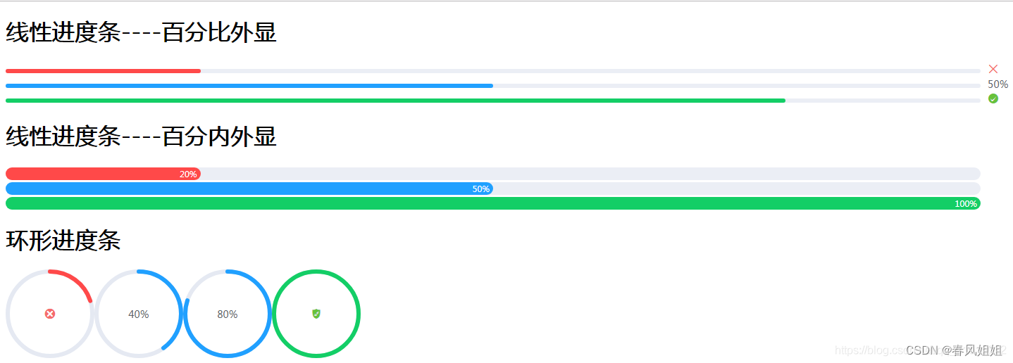
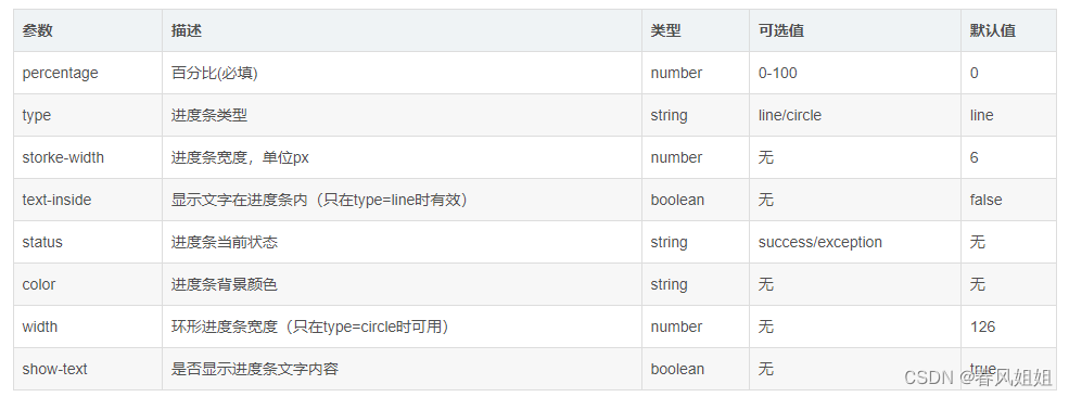
怎么样是不是美滋滋,组件的定义和引用差不多就是这样。接下来给出该组件的属性参数,开发者可根据自己的需求去调整


 560
560


 被折叠的 条评论
为什么被折叠?
被折叠的 条评论
为什么被折叠?
 到【灌水乐园】发言


