


 本文介绍如何利用Echarts的markLine功能在移动端折线图的末尾节点添加标注文字,以增强数据可视化的效果。通过调整markLine的样式、颜色和标签位置,可以定制不同风格的标注线,帮助用户清晰地理解数据分析结果。
在移动端需求中,经常遇到echarts折线图需要在折线图的末尾节点添加标注文字进行显示,使的用户能更加显眼的看到数据分析情况,这就需要使用echarts的markline进行实现:直接贴代码
option ={
xAxis: {
splitLine: {
show: false,
},
axisLabel: {
color: '#fff',
rotate: '35',
fontSize: 10,
},
data: ['2012年', '2013年', '2014年', '2015年', '2016年', '2017年'],
boundaryGap: 0,
},
yAxis: {
name: '(单位/km)',
splitLine: {
show: false,
},
axisLabel: {
color: '#333',
},
axisPointer: {
lineStyle: {
color: '#333',
},
value: '140',
},
},
grid: {
top: '10%',
bottom: '27%',
},
series: [{
data: [12222,222222,322222,433333,566666,53333],
type: 'line',
symbolSize: function (parmas) {
return Math.ceil(parmas[2] / 100);
},
label: {
emphasis: {
show: true,
formatter: function (param) {
return param.data[3] + param.data[4];
},
position: 'top',
},
},
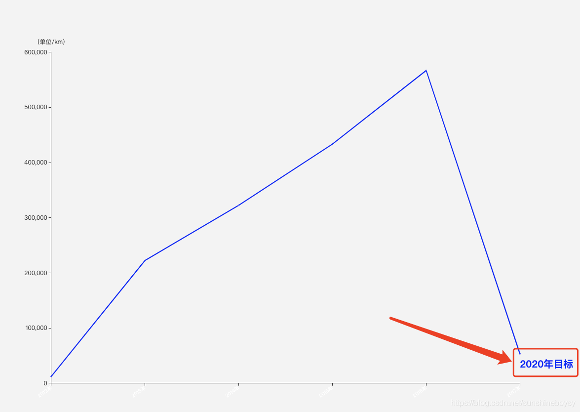
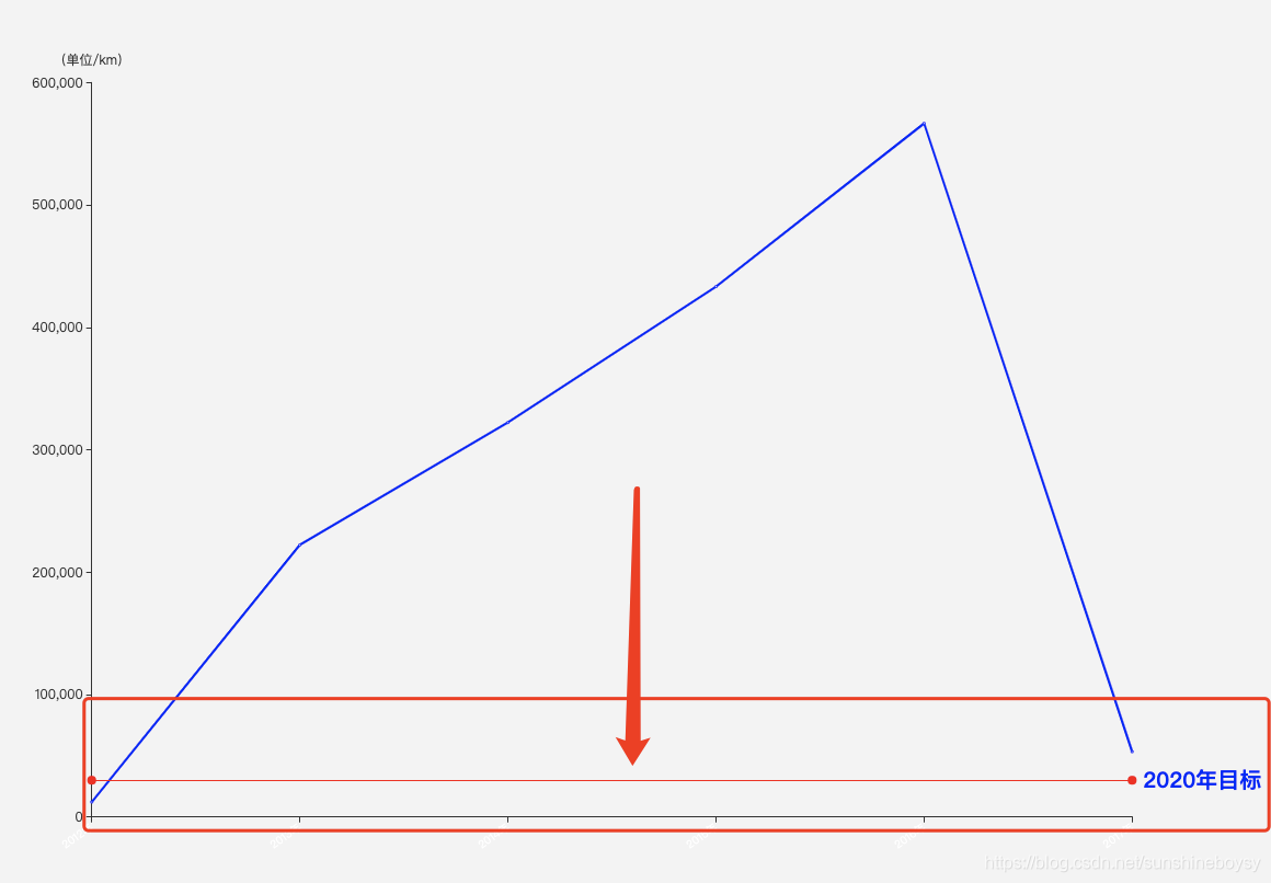
markLine: {
data: [
[
{ name: '标线1起点', xAxis: 0, yAxis: 30000, symbol: 'circle'},
{ name: '标线1终点', xAxis: '2017年', yAxis: 30000, symbol: 'circle' },
],
],
label: {
normal: {
show: true,
position: 'right',
formatter: '2020年目标',
textStyle: {
color: 'black',//标注线终点文字颜色
fontSize:20,
fontWeight:800,
padding: [0, 0, 10, 0],//文字间距
}
},
},
lineStyle: {//标注线样式
normal: {
type: 'solid',
color: 'transparent',//标注线颜色
},
},
},
itemStyle: {
normal: {
color: 'red',//线条颜色
},
},
}],
}
实现的效果如下:
也可以修改标注线的颜色,进行如下效果展示:


 1万+
1万+


 到【灌水乐园】发言


