


弹性布局
弹性布局,也称为flex box,常用于一些自适应网站,可以让网站随浏览器大小变化而变化的网站,从而给用户更好的使用体验。
基本属性
1 . 声明弹性布局
通过display:flex;,可以让元素声明为flex容器,简称“容器”,而它的所有子元素也会自动变成flex item,简称“项目”,从而具备一些额外的属性。
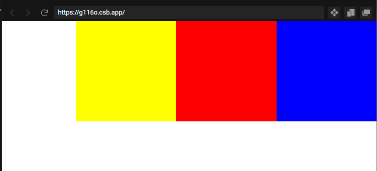
 <div style="display:flex">
    <div style="width:200px;background:blue;height:200px;"></div>
    <div style="width:200px;background:red;height:200px;"></div>
    <div style="width:200px;background:yellow;height:200px;"></div>
  </div>
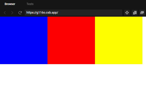
实际效果
可以看到,并排的三个方块随着浏览器的收缩而变小,这就是弹性布局最直观的使用。
2.设置方向
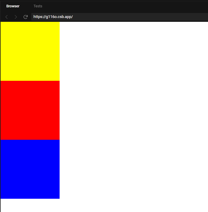
设置了弹性布局的元素,不仅可以水平排列,还可以进行竖直排列。
通过设置flex-direction属性可以设置元素排列方向,如果不设置,就默认是水平排列。
  <div style="display:flex;flex-direction:column;">
    <div style="width:200px;background:blue;height:200px;"></div>
    <div style="width:200px;background:red;height:200px;"></div>
    <div style="width:200px;background:yellow;height:200px;"></div>
  </div>
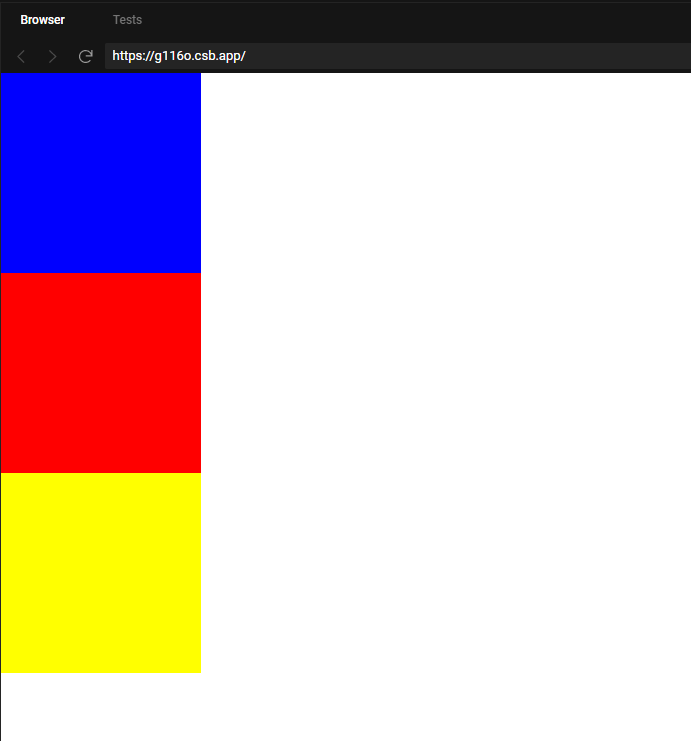
实际效果
竖直的时候是无法进行压缩的。
我们再详细聊一下这个方向的问题。
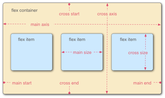
一个容器里面是存在两根轴,一根是水平的主轴(main axis)和一根垂直的交叉轴(cross axis)。而主轴开始的位置叫做main start,结束的位置叫做main end;交叉轴的开始位置叫做cross start,结束位置叫做cross end。
其实说轴就可能太专业了,实际上就是朝不同方向而已,不用想的太复杂。
通过flex-direction属性,就可以控制元素按照哪个方向进行排列,row是水平方向,column方向。
3.设置起点
我们还可以通过该属性设置元素排列的起点,选择从左到右排列,从右到左排列,从上到下或者从下到上。.
弹性布局中默认水平排列,排列方向是从左到右。
我们看看其它方向的例子。
  <div style="display:flex;flex-direction:row-reverse;">
    <div style="width:200px;background:blue;height:200px;"></div>
    <div style="width:200px;background:red;height:200px;"></div>
    <div style="width:200px;background:yellow;height:200px;"></div>
  </div>
如上所述,通过赋值为row-reverse,可以改变元素为从右到左排列,同时紧靠浏览器右侧。
  <div style="display:flex;flex-direction:column-reverse;">
    <div style="width:200px;background:blue;height:200px;"></div>
    <div style="width:200px;background:red;height:200px;"></div>
    <div style="width:200px;background:yellow;height:200px;"></div>
  </div>
我们可以看到,通过设置属性为column-reverse,可以改变元素排列顺序,但是并不会让元素整体靠在容器下部,这个与水平方向不同,需要注意一下。
4. 设置主轴元素对齐方式
如果只是简单的让元素水平排列,那也太没意思了吧,如果借助justify-content属性,我们可以实现更多的排列方式。
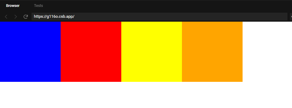
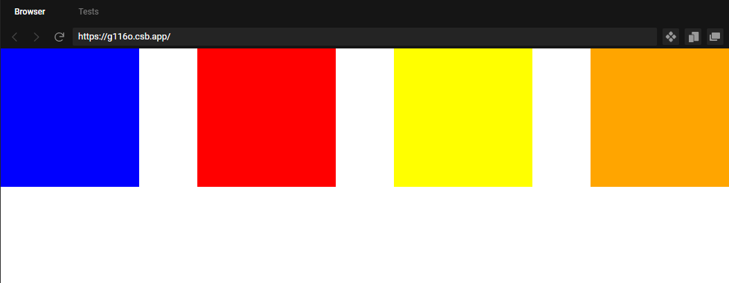
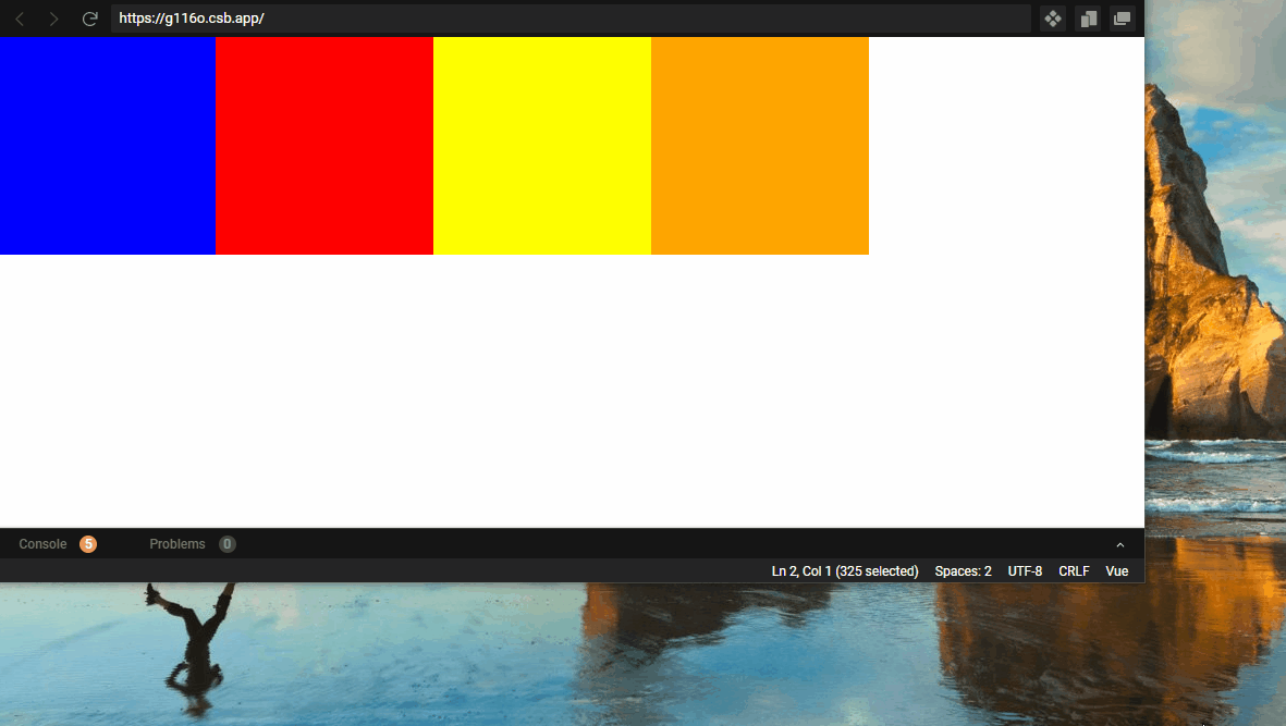
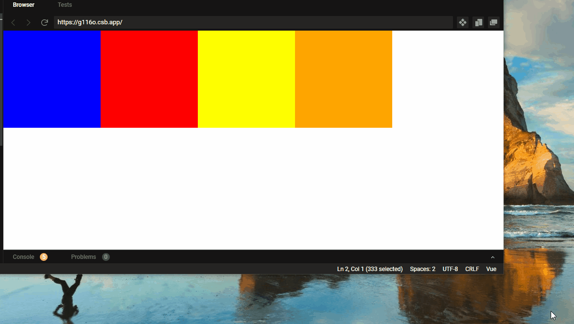
(1)flex-start:左对齐。当没有设置这个属性时,默认以这种方式显示。
  <div style="display:flex;justify-content:flex-start;">
    <div style="width:200px;background:blue;height:200px;"></div>
    <div style="width:200px;background:red;height:200px;"></div>
    <div style="width:200px;background:yellow;height:200px;"></div>
    <div style="width:200px;background:orange;height:200px;"></div>
  </div>
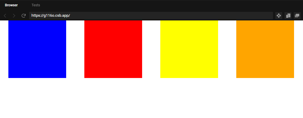
(2)flex-end:右对齐。
   <div style="display:flex;justify-content:flex-end;">
    <div style="width:200px;background:blue;height:200px;"></div>
    <div style="width:200px;background:red;height:200px;"></div>
    <div style="width:200px;background:yellow;height:200px;"></div>
    <div style="width:200px;background:orange;height:200px;"></div>
  </div>
(3)center:居中
     <div style="display:flex;justify-content:center;">
    <div style="width:200px;background:blue;height:200px;"></div>
    <div style="width:200px;background:red;height:200px;"></div>
    <div style="width:200px;background:yellow;height:200px;"></div>
    <div style="width:200px;background:orange;height:200px;"></div>
  </div>
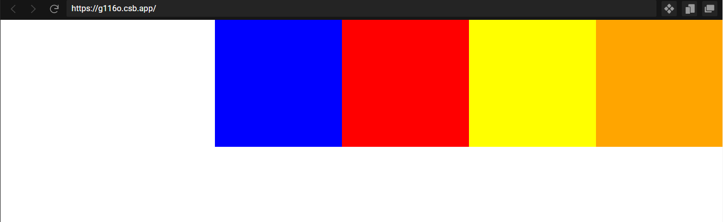
(4)space-between:两边元素靠边,中间每个元素间隔相等。
     <div style="display:flex;justify-content:space-between;">
    <div style="width:200px;background:blue;height:200px;"></div>
    <div style="width:200px;background:red;height:200px;"></div>
    <div style="width:200px;background:yellow;height:200px;"></div>
    <div style="width:200px;background:orange;height:200px;"></div>
  </div>
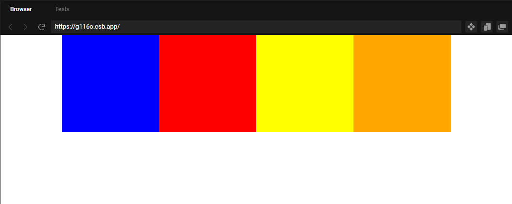
(5)space-around:各个元素均分排列,每个元素只有间隔都相同,但是中间的间隔,比两边元素的间隔大一倍。
  <div style="display:flex;justify-content:space-around;">
    <div style="width:200px;background:blue;height:200px;"></div>
    <div style="width:200px;background:red;height:200px;"></div>
    <div style="width:200px;background:yellow;height:200px;"></div>
    <div style="width:200px;background:orange;height:200px;"></div>
  </div>
5. 设置垂直方向对齐方式
如果各个元素按照特定需求进行垂直方向的对齐?
这就需要依靠align-items属性。
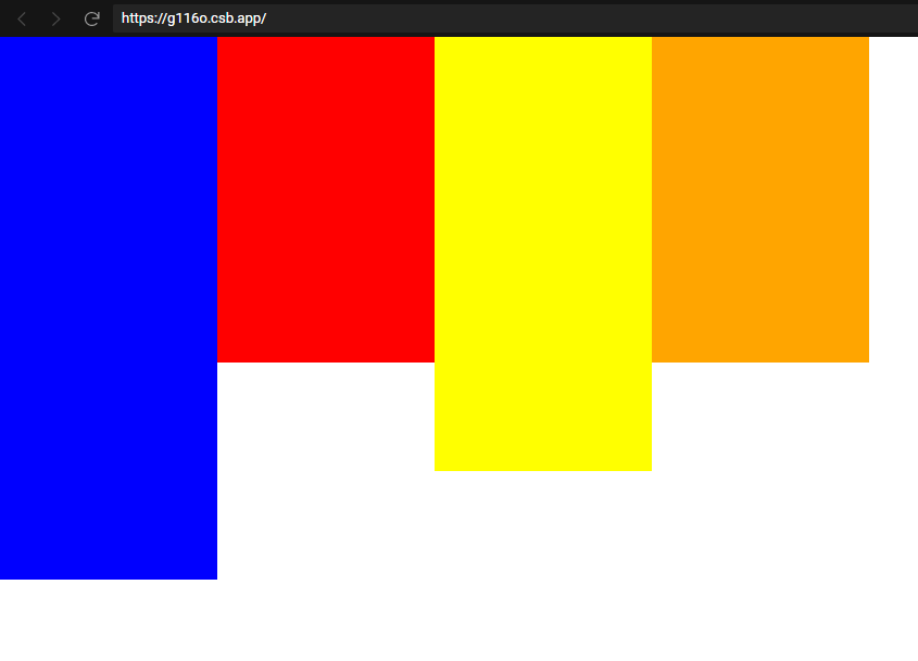
(1)flex-start:让所有元素靠上。这是默认情况,没有设置对应属性则会默认采取这种措施。
  <div style="display:flex;align-items:flex-start;">
    <div style="width:200px;background:blue;height:500px;"></div>
    <div style="width:200px;background:red;height:300px;"></div>
    <div style="width:200px;background:yellow;height:400px;"></div>
    <div style="width:200px;background:orange;height:300px;"></div>
  </div>
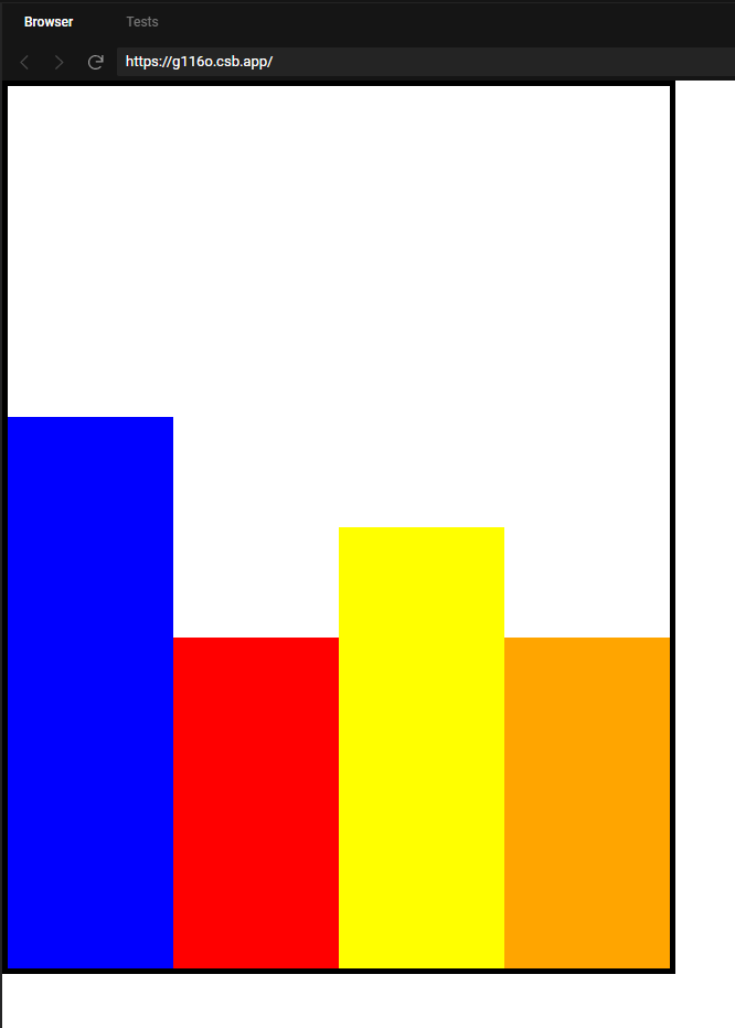
(2)flex-end:让所有元素靠下。
注意了,这里要分两种情况进行探讨,一种是父元素固定大小的,一种是父元素不固定大小的。
父元素固定大小的时候,所有元素紧贴父元素的下边框进行排列。
   <div style="width:600px;height:800px;border:5px solid black;display:flex;align-items:flex-end;">
    <div style="width:200px;background:blue;height:500px;"></div>
    <div style="width:200px;background:red;height:300px;"></div>
    <div style="width:200px;background:yellow;height:400px;"></div>
    <div style="width:200px;background:orange;height:300px;"></div>
  </div>
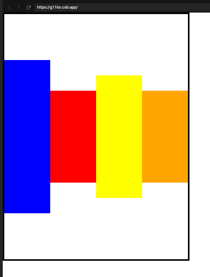
父元素没有固定大小,则以长度最长的元素的下边框为底,所有元素水平排列。如下所示,
      <div style="display:flex;align-items:flex-end;">
    <div style="width:200px;background:blue;height:500px;"></div>
    <div style="width:200px;background:red;height:300px;"></div>
    <div style="width:200px;background:yellow;height:400px;"></div>
    <div style="width:200px;background:orange;height:300px;"></div>
  </div>
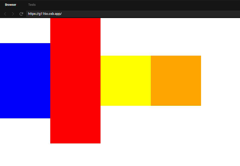
(3)center:让各个元素的中间位置处于同一水平线。
这里也分两种情况,一种是父元素固定大小,另一种是父元素不固定大小。
父元素固定大小,则会让所有元素的中间位置处于父元素的中线上。如下所示,
     <div style="width:600px;height:800px;border:5px solid black;display:flex;align-items:center;">
    <div style="width:200px;background:blue;height:500px;"></div>
    <div style="width:200px;background:red;height:300px;"></div>
    <div style="width:200px;background:yellow;height:400px;"></div>
    <div style="width:200px;background:orange;height:300px;"></div>
  </div>
另一种是父元素大小不固定的,则以最大的元素中心为轴,让所有元素中心点处于同一水平线。如下图所示,
    <div style="display:flex;align-items:center;">
    <div style="width:200px;background:blue;height:300px;"></div>
    <div style="width:200px;background:red;height:500px;"></div>
    <div style="width:200px;background:yellow;height:200px;"></div>
    <div style="width:200px;background:orange;height:200px;"></div>
  </div>
我们可以看到,每个元素的中间点都在同一水平线上,同时所有元素并没有在屏幕中间。
6. 设置自动换行
根据前面的示例,当水平方向放不下所有元素的时候,元素的会被压缩。
那有没有方法可以不压缩,而是自动换行呢?
现在我们可以借助flex-wrap属性实现这个需求。
      <div style="display:flex;flex-wrap:wrap;">
    <div style="width:200px;background:blue;height:200px;"></div>
    <div style="width:200px;background:red;height:200px;"></div>
    <div style="width:200px;background:yellow;height:200px;"></div>
    <div style="width:200px;background:orange;height:200px;"></div>
  </div>
如上所示,当位置不足以容纳所有元素的时候,就会把元素放置到下一行。
flex-wrap的取值还有nowrap,wrap,wrap-reverse。
(1)nowrap:默认值,也就是不换行。
(2)wrap:自动换行,排在后面的元素移到下一行。也就是上面那个示例。
(3)wrap-reverse:自动换行,排在后面的元素移到上一行。示例如下,
   <div style="display:flex;flex-wrap:wrap-reverse;">
    <div style="width:200px;background:blue;height:200px;"></div>
    <div style="width:200px;background:red;height:200px;"></div>
    <div style="width:200px;background:yellow;height:200px;"></div>
    <div style="width:200px;background:orange;height:200px;"></div>
  </div>
我们可以看到,橙色作为最后一个元素,会自动移到上一行。


 3245
3245


 被折叠的 条评论
为什么被折叠?
被折叠的 条评论
为什么被折叠?
 到【灌水乐园】发言


