


实现原理:
使用disabled属性控制el-tooltip的content显示与隐藏;
目标:
1行省略、多行省略、可缩放页面内的文本省略都有效。
实现方式:
1、自定义全局指令,tooltipAutoShow.js代码如下(参考的el-table中的内容超出才显示tooltips的逻辑):
/**
* tooltip-auto-show tooltip不超长则不显示
*/
import Vue from 'vue'
import { getStyle } from 'element-ui/src/utils/dom'
export default {
  inserted(el, binding, vnode) {
    el.__vueOverflowTooltipMouseenter__ = function(e) {
      const defalutSilent = !!Vue.config.silent
      Vue.config.silent = true
      vnode.componentInstance.disabled = true
      const range = document.createRange()
      range.setStart(el, 0)
      range.setEnd(el, el.childNodes.length)
      const rangeWidth = range.getBoundingClientRect().width
      const padding = (parseInt(getStyle(el, 'paddingLeft'), 10) || 0) + (parseInt(getStyle(el, 'paddingRight'), 10) || 0)

      if (binding.value?.canChangeScale && el.offsetWidth < el.getBoundingClientRect().width) { // 可缩放页面:getBoundingClientRect().width值会受scale缩放影响
        const deviationValue = range.getBoundingClientRect().width - el.getBoundingClientRect().width
        if (deviationValue !== 0 && deviationValue > 0.1) { // 忽略0.1以下的偏差
          const elWidth = el.getBoundingClientRect().width
          // 1行省略
          if (rangeWidth + padding > elWidth || el.scrollWidth > elWidth) {
            vnode.componentInstance.disabled = false
          }
        }
      } else {
        const elWidth = el.offsetWidth
        // 1行省略
        if (rangeWidth + padding > elWidth || el.scrollWidth > elWidth) {
          vnode.componentInstance.disabled = false
        }
      }
      // 处理多行省略
      if (getStyle(el, '-webkit-line-clamp') > 1 && el.scrollHeight > el.offsetHeight) {
        vnode.componentInstance.disabled = false
      }
      Vue.config.silent = defalutSilent
    }
    el.addEventListener('mouseenter', el.__vueOverflowTooltipMouseenter__)
  },
  unbind: function(el) {
    el.removeEventListener('mouseenter', el.__vueOverflowTooltipMouseenter__)
    delete el.__vueOverflowTooltipMouseenter__
  }
}
import tooltipAutoShow from './module/tooltipAutoShow'

Vue.directive('tooltip-auto-show', tooltipAutoShow)
2、使用方式:
<el-tooltip v-tooltip-auto-show class="" effect="dark" :content="data.name" placement="top-start">
<div>{{ data.name }}</div>
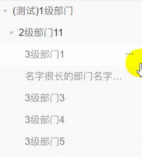
</el-tooltip>3、实现效果:


 4325
4325

 被折叠的 条评论
为什么被折叠?
被折叠的 条评论
为什么被折叠?
 到【灌水乐园】发言


