1.CSS样式:
.wrap	{
	position: relative;
	top: 100px;
	border-radius: 5px;
	width: 300px;
	height: 50px;
	margin: 0 auto;
	background: -webkit-linear-gradient(45deg, rgba(255, 0, 0,.5), rgba( 255, 165, 0, 0.5),rgba(255, 255, 0,.5),rgba(0, 255, 0,.5),rgba(0, 127, 255,.5),rgba(0, 0, 255,.5),rgba(139, 0, 255,.5));
	}
.wrap a {
	position: absolute;
	top: 2px;
	left: 2px;
	display: block;
	width: 296px;
	height: 46px;
	line-height: 46px;
	border-radius: 5px;
	color: #999;
	text-align: center;
	background: #fff;
}
2.Html元素
<div class="wrap">
     <a href="#">按钮</a>
</div>
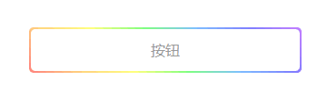
3.效果图


 410
410


 被折叠的 条评论
为什么被折叠?
被折叠的 条评论
为什么被折叠?
 到【灌水乐园】发言


