


定义:
A StateListDrawable is a drawable object defined in XML that uses a several different images to represent the same graphic, depending on the state of the object. For example, a Button widget can exist in one of several different states (pressed, focused, or niether) and, using a state list drawable, you can provide a different background image for each state.

You can describe the state list in an XML file. Each graphic is represented by an <item> element inside a single <selector> element. Each <item> uses various attributes to describe the state in which it should be used as the graphic for the drawable.

During each state change, the state list is traversed top to bottom and the first item that matches the current state is used—the selection is not based on the "best match," but simply the first item that meets the minimum criteria of the state.
StateListDrawable是在XML中定义的一个可绘制(drawable)的对象,它可以根据状态的不同为同一个图形更换不同的图片。比如说,对于一个按钮控件(Button)可以有几种不同的状态(pressed,focused或者其它),你可以使用state list为其中的每一个状态来设置按钮的背景图片。
你可以在XML文件中申明state list。在Selector标签中每一对item标签对应一个图形。每个item标签中都可以设置一个属性值去表示当前状态下图形的样子。
每当状态发生改变时,系统会在state list中从上到下遍历寻找与之相匹配的状态。<span style="color:#ff0000;">注意,这里在遍历时只会取去当前状态相匹配的第一个Item,而不是最匹配的那一个</span>。用法:
<?xml version="1.0" encoding="utf-8"?>
<selector xmlns:android="http://schemas.android.com/apk/res/android"
    android:constantSize=["true" | "false"]
    android:dither=["true" | "false"]
    android:variablePadding=["true" | "false"] >
    <item
        android:drawable="@[package:]drawable/drawable_resource"
        android:state_pressed=["true" | "false"]
        android:state_focused=["true" | "false"]
        android:state_hovered=["true" | "false"]
        android:state_selected=["true" | "false"]
        android:state_checkable=["true" | "false"]
        android:state_checked=["true" | "false"]
        android:state_enabled=["true" | "false"]
        android:state_activated=["true" | "false"]
        android:state_window_focused=["true" | "false"] />
</selector>| 属性 | 作用 | 备注 |
| android:constantSize | 这个是布尔型,false表示各个状态的大小(size)各自不同,true表中所有的状态大小相同(以最大的为准)。默认为false | |
| android:dither | 布尔型。true表示,如果一个屏幕中位图有这不同的像素配置,启用位图的抖动。false表示不启用位图的抖动。默认为true。据度娘:dither,抖动,是一种故意造成的噪音用以随机化量化误差,阻止大幅度拉升图像时导致的像banding(色带)这样的问题。 | |
| android:variablePadding | 布尔型。选择true时,drawable的内边距会根据状态的变化而变化,设置为true时,你必须为不同的状态配置layout,但是通常不建议这么做。选择false时,内边距保持一致,所有状态中最大的内边距。默认为false | |
| android:drawable | 这个属性是必须的,为当前控件指定资源。 | |
| android:state_pressed | 布尔值。true指当用户点击或者触摸该控件的状态。默认为false | |
| android:state_focused | 布尔值。ture指当前控件获得焦点时的状态。默认为false | |
| android:state_hovered | 布尔值。true表示光标移动到当前控件上的状态。默认为false | |
| android:state_selected | 布尔值。true表示被选择的状态,例如在一个下拉列表中用方向键下选择其中一个选项。 这个和focus的区别,selected是focus不充分的情况。比如一个listview获得焦点(focus),而用方向键选择了其中的一个item(selected) | |
| android:state_checkable | 布尔值。ture表示可以被勾选的状态。这个仅在当控件具有被勾选和不被勾选的状态间转换时才起作用。 | |
| android:state_checked | 布尔值。true表示当前控件处于被勾选(check的状态) | |
| android:state_enabled | 布尔值。true表示当前控件出于可用的状态。比如可以被点击 | |
| android:state_activated | 布尔值。true表示当前控件被激活的状态。 | |
| android:state_window_focused | 布尔值。true表示当前控件出于最前端时,应用窗口获得焦点的状态。 |
示例:
<?xml version="1.0" encoding="utf-8"?>
<selector xmlns:android="http://schemas.android.com/apk/res/android">
    <item android:drawable="@color/green" android:state_pressed="true" />
    <item android:drawable="@color/red" android:state_focused="true" />
   <item android:drawable="@color/blue" android:state_hovered="true" />
    <item android:drawable="@color/yellow" />
</selector>
<Button
android:layout_width="wrap_content"
android:layout_height="wrap_content"
android:text="selector标签学习"
android:layout_gravity="center"
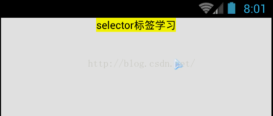
android:background="@drawable/resource_drawable_selector"/>效果:
默认黄色,单击不松开变绿,松开后变蓝


 1609
1609

 被折叠的 条评论
为什么被折叠?
被折叠的 条评论
为什么被折叠?
 到【灌水乐园】发言


