


最近一直游走在前后端的调试之中,一直很喜欢做前端的开发,因为可以体会得到用户的感受,而不是和“死板”的数据打交道,仅是喜欢,对于前途、薪资等没有多加考虑。好了,不再这里说一些自己肚子中的“陈芝麻烂谷子”了,还是分享一下自己使用Highcharts这个报表神器给自己带来的体会吧。
Highcharts是一个纯的JavaScript图标库,能够很简单便捷的在web网站或是web应用程序添加有交互性的图表。它具有很好的兼容性,对于各个浏览器的兼容,而且对于后台的编码没有限制,可以兼容多种语言的使用。百度了一番,让自己对Highcharts还刮目相看了。
下边就拿自己兴致勃勃做的例子和大家分享,Highcharts的使用非常简单,只需要在自己的布局中加入官网中相应图表的js,在js中传入自己的数据便可。
布局文件:
<html>
<head>
<meta http-equiv="Content-Type" content="text/html; charset=UTF-8">
<title>highChart Test</title>
<%@ include file="/common.jsp"%>

<script type="text/javascript"
	src="${pageContext.request.contextPath}/Script/highcharts.js">

</script>
<!-- 饼形图 -->
<%-- <script type="text/javascript"
	src="${pageContext.request.contextPath}/Script/hc_cicle.js">

</script> --%>
<!-- 曲线图 -->
<script type="text/javascript"
	src="${pageContext.request.contextPath}/Script/hc_line.js">

</script>
<!-- 柱状图 -->
<script type="text/javascript"
	src="${pageContext.request.contextPath}/Script/highChart.js">

</script>
</head>
<body>
	<div id="logreportArea" class="tablearea"
		style="margin-top: 20px; height: 89.5%;">

		<div class="chartdiv" style="margin-top: 100px" id="chart">
			<!-- 柱狀圖佈局位置 -->
			<div class="chartsty" style="margin-left: 100px; margin-right: 100px"
				id="Column"></div>
			<!-- 折線圖佈局位置 -->
			<div class="chartsty" style="margin-left: 100px; margin-right: 100px"
				id="Columns"></div>
		</div>
	</div>
</body>
</html>1.highChart.js
/**
 * 柱状图的js+數據
 */

$(function() {
	$('#Column')
			.highcharts(
					{
						chart : {
							type : 'column'
						},
						title : {
							text : 'Monthly Average Rainfall'
						},
						subtitle : {
							text : 'Source: WorldClimate.com'
						},
						xAxis : {
							categories : [ 'Jan', 'Feb', 'Mar', 'Apr', 'May',
									'Jun', 'Jul', 'Aug', 'Sep', 'Oct', 'Nov',
									'Dec' ]
						},
						yAxis : {
							min : 0,
							title : {
								text : 'Rainfall (mm)'
							}
						},
						tooltip : {
							headerFormat : '<span style="font-size:10px">{point.key}</span><table>',
							pointFormat : '<tr><td style="color:{series.color};padding:0">{series.name}: </td>'
									+ '<td style="padding:0"><b>{point.y:.1f} mm</b></td></tr>',
							footerFormat : '</table>',
							shared : true,
							useHTML : true
						},
						plotOptions : {
							column : {
								pointPadding : 0.2,
								borderWidth : 0
							}
						},
						series : [
								{
									name : 'Tokyo',
									data : [ 49.9, 71.5, 106.4, 129.2, 144.0,
											176.0, 135.6, 148.5, 216.4, 194.1,
											95.6, 54.4 ]

								},
								{
									name : 'New York',
									data : [ 83.6, 78.8, 98.5, 93.4, 106.0,
											84.5, 105.0, 104.3, 91.2, 83.5,
											106.6, 92.3 ]

								},
								{
									name : 'London',
									data : [ 48.9, 38.8, 39.3, 41.4, 47.0,
											48.3, 59.0, 59.6, 52.4, 65.2, 59.3,
											51.2 ]

								},
								{
									name : 'Berlin',
									data : [ 42.4, 33.2, 34.5, 39.7, 52.6,
											75.5, 57.4, 60.4, 47.6, 39.1, 46.8,
											51.1 ]

								} ]
					});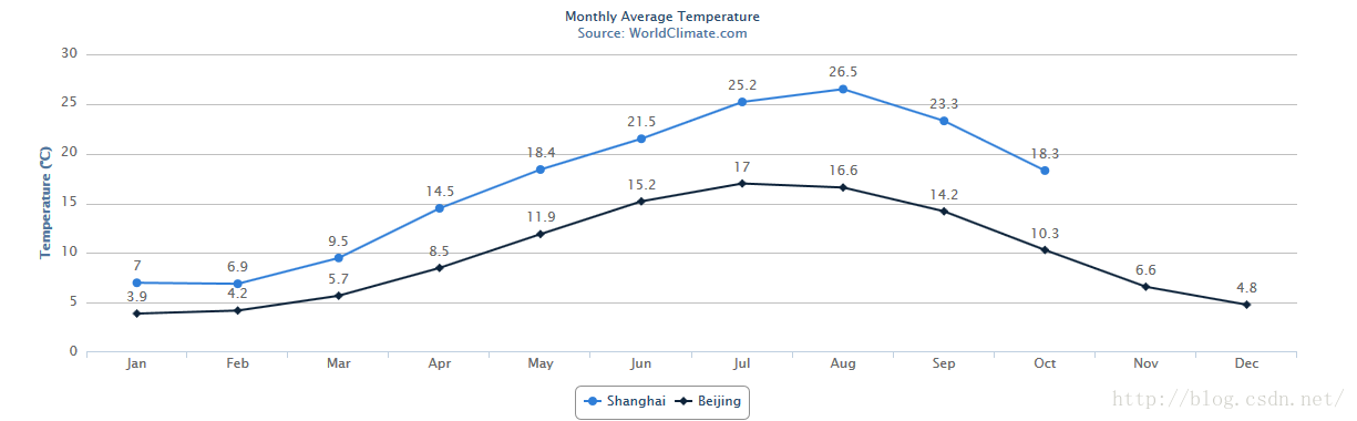
});/**
* 折线图的js+數據
*/
$(function load(data) {
$('#Columns').highcharts(
{
chart : {
type : 'line'
},
title : {
text : 'Monthly Average Temperature'
},
subtitle : {
text : 'Source: WorldClimate.com'
},
xAxis : {
categories : [ 'Jan', 'Feb', 'Mar', 'Apr', 'May', 'Jun',
'Jul', 'Aug', 'Sep', 'Oct', 'Nov', 'Dec' ]
},
yAxis : {
title : {
text : 'Temperature (°C)'
}
},
tooltip : {
enabled : false,
formatter : function() {
return '<b>' + this.series.name + '</b><br/>' + this.x
+ ': ' + this.y + '°C';
}
},
plotOptions : {
line : {
dataLabels : {
enabled : true
},
enableMouseTracking : false
}
},
series : [
{
name : 'Shanghai',
data : [ 7.0, 6.9, 9.5, 14.5, 18.4, 21.5, 25.2,
26.5, 23.3, 18.3 ]
},
{
name : 'Beijing',
data : [ 3.9, 4.2, 5.7, 8.5, 11.9, 15.2, 17.0,
16.6, 14.2, 10.3, 6.6, 4.8 ]
} ]
});
});
当然这是自己的实验之做,很是简单,但是Highcharts带给我们的整洁、美观却可以一目了然,期待后期的深入研究和分享!


 558
558


 被折叠的 条评论
为什么被折叠?
被折叠的 条评论
为什么被折叠?
 到【灌水乐园】发言


