


不同的情形下居中有很多不同的方法,以下探讨了不同情况下的居中解决办法。
1.水平居中
1>行内元素
要使一个拥有块级容器的行内元素居中,可以使用:
text-align: center;适用:inline、inline-block等重点内容重点内容
2>块级元素
通过设置其margin-left和margin-right分别为auto可以实现居中
margin: 0 auto;3>多个块级元素的居中
方法一:将块级元素设置为inline-block:
<div id="container">
<body>
<div id="left">
</div>
<div id="right">
</div>
<div id="middle">
</div>
</div>

#container{ width:100%; text-align:center; background:#37FF9B; }
#left{ height:300px; width:200px; background:#999; display:inline-block; }
#right{ height:200px; width:200px; background:#999; display:inline-block; }
#middle{ height:100px; width:200px; background:#999; display:inline-block; }
方法二:利用flex布局:
{
  display: flex;
  justify-content: center;
}
2.垂直居中
1>行内元素
单行:
方法一:设置上下相等的padding即可
方法二:设置行高line-height
2>块级元素
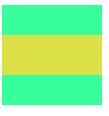
知道居中元素的高度:
<div>
     <p></p>
</div>

div{
     height:200px;
     width:200px;
     background:#37FF9B;
     position:relative;
     }
p{
    width:100%;
    height:80px;
    position:absolute;
    top:50%;
    margin-top:-40px;
    background:#DCE047;
    }
不知道居中元素的高度:
方法一:
<div>
     <p></p>
</div>

div{
     height:200px;
     width:200px;
     background:#37FF9B;
     position:relative;
     }
p{
    width:100%;
    height:80px;
    position:absolute;
    top:50%;
    transform: translateY(-50%);
    background:#DCE047;
    }
利用transform属性使其上移自身的一半高度
方法二:
使用flex布局:
<div>
     <p></p>
</div>

div{
     display:flex;
     flex-direction:column;
     justify-content:center;
     height:200px;
     width:200px;
     background:#37FF9B;
     }
p{
    width:100%;
    height:80px;

    background:#DCE047;
    }


 被折叠的 条评论
为什么被折叠?
被折叠的 条评论
为什么被折叠?
 到【灌水乐园】发言


