


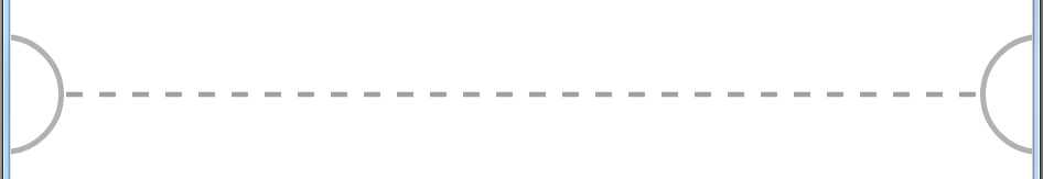
效果可查看https://codepen.io/GitKou/pen/OXPggx
HTML:
 <div class="m-edge" style="margin-top: 50px">
        <div class="semicircle leftSemiCircle"></div>
        <div class="dashedLine"></div>
        <div class="semicircle rightSemiCircle"></div>
 </div>
CSS:
.m-edge {
position: relative;
height: 100px;/* 高度任意更改,半圆不变形*/
margin: 0 -1px;
overflow: hidden;
}
.dashedLine {
border-bottom: 1px dashed #A0A0A0;
width: 100%;
box-sizing: border-box;
position: absolute;
top: 50%;
transform: translateY(-50%);
}
.semicircle {
position: absolute;
border: 1px solid #b1b1b1;
border-radius: 50%;
height: 100%;
writing-mode: vertical-lr;
z-index: 1000;
background: #fff;
box-sizing: border-box;
}
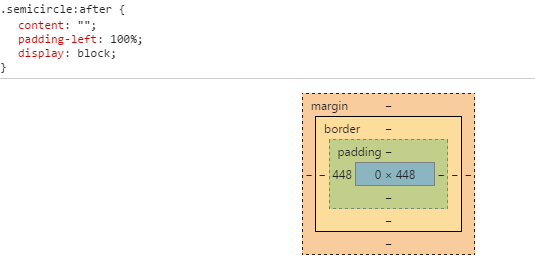
.semicircle:after {
content: "";
padding-left: 100%;
display: block;
}
.leftSemiCircle {
left: -0.5px;
transform: translateX(-50%);
}
.rightSemiCircle {
right: -0.5px;
transform: translateX(50%);
}
注意几点:
1.水平居中用到了:
   position: absolute;
    top: 50%;
    transform: translateY(-50%);
2.半径随外层高度而改变:用到了 writing-mode: vertical-lr;垂直方向书写;核心代码如下“
<div class="m-edge">
  <div class="semicircle">
  </div>
</div>


.semicircle {
    position: absolute;
    border: 1px solid #b1b1b1;
    border-radius: 50%;
    height: 100%;
    writing-mode: vertical-lr;
    z-index: 1000;
    background: #fff;
    box-sizing: border-box;
}

.semicircle:after {
    content: "";
    padding-left: 100%;
    display: block;
}
.m-edge{
  height:550px;/* 可修改*/
  position:relative;
}
.semicircle:after的 padding-left: 100%;会以父元素semicircle 的height做为基准,应为 writing-mode: vertical-lr;
writing-mode:
horizontal-tb
Content flows horizontally from left to right, vertically from top to bottom. The next horizontal line is positioned below the previous line.
vertical-rl
Content flows vertically from top to bottom, horizontally from right to left. The next vertical line is positioned to the left of the previous line.
vertical-lr
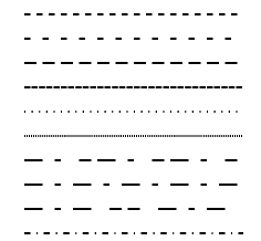
Content flows vertically from top to bottom, horizontally from left to right. The next vertical line is positioned to the right of the previous line.另外dashline可以用svg的dasharray来画
https://developer.mozilla.org/zh-CN/docs/Web/SVG/Attribute/stroke-dasharray
<?xml version="1.0"?>
<svg width="200" height="200" viewPort="0 0 200 300" version="1.1" xmlns="http://www.w3.org/2000/svg">

    <line stroke-dasharray="5, 5"              x1="10" y1="10" x2="190" y2="10" />
    <line stroke-dasharray="5, 10"             x1="10" y1="30" x2="190" y2="30" />
    <line stroke-dasharray="10, 5"             x1="10" y1="50" x2="190" y2="50" />
    <line stroke-dasharray="5, 1"              x1="10" y1="70" x2="190" y2="70" />
    <line stroke-dasharray="1, 5"              x1="10" y1="90" x2="190" y2="90" />
    <line stroke-dasharray="0.9"               x1="10" y1="110" x2="190" y2="110" />
    <line stroke-dasharray="15, 10, 5"         x1="10" y1="130" x2="190" y2="130" />
    <line stroke-dasharray="15, 10, 5, 10"     x1="10" y1="150" x2="190" y2="150" />
    <line stroke-dasharray="15, 10, 5, 10, 15" x1="10" y1="170" x2="190" y2="170" />
    <line stroke-dasharray="5, 5, 1, 5"        x1="10" y1="190" x2="190" y2="190" />

<style><![CDATA[line{    stroke: black;    stroke-width: 2;}]]></style>
</svg>
示例输出


 扫一扫
扫一扫
 2903
2903

 被折叠的 条评论
为什么被折叠?
被折叠的 条评论
为什么被折叠?
 到【灌水乐园】发言


