


flutter 自定义底部 BottomNavigationBar
前言
在日常开发中,很多时候flutter 自带的BottomNavigationBar 无法满足我们的需求,那么就需要自定义BottomNavigationBar 了,本篇文章将记录自定义 BottomNavigationBar 的封装,可以扩展成我们在日常开发中所有的需求。当然,本篇文章使用provider 来封装的,如果不使用provider,只需要看中间的widget 文件就可以了。
一、封装viewmodel
在 viewmodel 中,我们需要定义一个当前选中下标,所有tabItem 的数组,还需要一个选中下标的切换方法
int currentIndex = 0;

  List barItemList = [
    {
      "title": "首页",
      "normalIcon": 'assets/images/ic_error.png',
      "selectIcon": 'assets/images/ic_error.png'
    },
    {
      "title": "通讯录",
      "normalIcon": 'assets/images/ic_error.png',
      "selectIcon": 'assets/images/ic_error.png'
    },
    {
      "title": "发现",
      "normalIcon": 'assets/images/ic_error.png',
      "selectIcon": 'assets/images/ic_error.png'
    },
    {
      "title": "我",
      "normalIcon": 'assets/images/ic_error.png',
      "selectIcon": 'assets/images/ic_error.png'
    },
  ];

  // 选中下标的切换
  changeBottomTabIndex(int index) {
    currentIndex = index;
    notifyListeners();
  }
为了提升后期的可扩展性,我将使用PageController 来管理我的页面,因此我们还需要初始化一个 PageController
PageController tabPageController = PageController();
二、封装 bottomNavigationWidget
前面我们封装了tabItem 的属性,交互等功能,现在我们就要来实现UI部分的封装了。
- bottomWidget 的封装,我这里直接封装成一个组件,并且在组件中自定义了整个样式
  static Widget bottomNavigationWidget(TabNavigationViewModel model) {
    return Container(
      height: 56.h + Get.mediaQuery.padding.bottom,
      decoration: BoxDecoration(
          color: Colors.red,
          borderRadius: BorderRadius.only(
            topRight: Radius.circular(24.r),
            topLeft: Radius.circular(24.r),
          ),
          boxShadow: [BoxShadow(color: Colors.green, blurRadius: 0.12.r)]),
      child: Row(
        mainAxisAlignment: MainAxisAlignment.spaceAround,
        children: List<Widget>.generate(model.barItemList.length,
            (index) => _barItem(model.barItemList[index], model, index)),
      ),
    );
  }
从上面代码中,可以看到 height 的高度,我给了一个56的高度,再加上一个bottom 的高度,因为有些手机是有底部bottom 的,所以我们需要把这个高度给预留出来。
然后使用 List.generate 的方式,生成单独的itemBar ,接下来看一下 _barItem 组件的封装
  static Widget _barItem(item, TabNavigationViewModel model, int index) {
    return InkWell(
      onTap: () {
        if (model.currentIndex != index) {
          model.currentIndex = index;
          model.changeBottomTabIndex(index);
          model.tabPageController.jumpToPage(index);
        }
      },
      child: Column(
        mainAxisAlignment: MainAxisAlignment.center,
        children: [
          Image.asset(
            model.currentIndex == index
                ? item['selectIcon']
                : item['normalIcon'],
            width: 24,
            height: 24,
            fit: BoxFit.cover,
          ),
          const SizedBox(
            height: 10,
          ),
          Text(
            item['title'],
            style: TextStyle(
              color: model.currentIndex == index ? Colors.white : Colors.black,
            ),
          ),
        ],
      ),
    );
  }
代码写到这里,我们需要使用的整个BottomNavigationBar 就已经封装完成了。
三、自定义 BottomNavigationBar 的使用
前面封装完成了整个BottomNavigationBar 的自定义,那么我们该怎么使用呢?
Scaffold(
            body: PageView(
              controller: model.tabPageController,
              // physics: const NeverScrollableScrollPhysics(),
              children: [
                const HomePage(),
                Container(
                  color: Colors.grey,
                ),
                Container(
                  color: Colors.red,
                ),
                Container(
                  color: Colors.grey,
                ),
              ],
              onPageChanged: (index) {
                model.currentIndex = index;
                model.changeBottomTabIndex(index);
              },
            ),
            bottomNavigationBar:
              TabNavigationWidget.bottomNavigationWidget(model),
          )
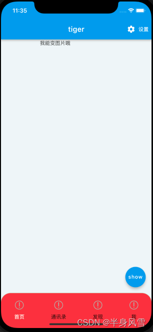
前面我提到过PageController 页面管理器,这里我们当然也要使用了,不熟悉的可以单独去了解一下,现在我们来看一下运行效果。
总结
本篇文章通过少量的代码,轻轻松松就实现了BottomNavigationBar 的自定义封装,是不是很奈斯?


 4328
4328


 被折叠的 条评论
为什么被折叠?
被折叠的 条评论
为什么被折叠?
 到【灌水乐园】发言


