


WPF布局常用控件(一)
Border
- Border控件是一个装饰控件,用于围绕其他元素绘制边框和背景。它提供了一种简单的方式来为其他控件添加边框和背景样式,而无需自定义控件的绘制逻辑。
| 常用属性 | 描述 |
|---|---|
| Background | 用于设置背景颜色或图像。 |
| BorderBrush | 用于设置边框的边框颜色 |
| CornerRadius | 用于设置边框的圆角程度。 |
| BorderThickness | 用于设置边框的宽度。它是一个Thickness对象,分别可以设置上、下、左、右边框的宽度。通过调整BorderThickness属性来控制Border控件边框的粗细程度。 |
| Padding | 用来设置内边距 。 |
- 下面写个例子
<Grid HorizontalAlignment="Center">
<Grid.ColumnDefinitions>
<ColumnDefinition Width="300"></ColumnDefinition>
</Grid.ColumnDefinitions>
<Grid.RowDefinitions>
<RowDefinition></RowDefinition>
<RowDefinition></RowDefinition>
<RowDefinition></RowDefinition>
</Grid.RowDefinitions>
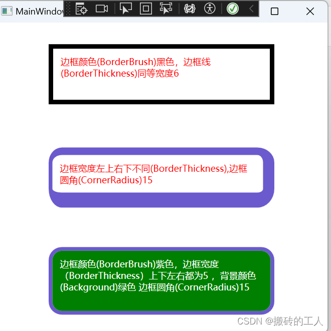
<Border Grid.Row="0" Grid.Column="0" Height="80" BorderBrush="Black" BorderThickness="6" Padding="10" >
<TextBlock Foreground="Red" TextWrapping="Wrap">
边框颜色(BorderBrush)黑色,边框线(BorderThickness)同等宽度6
</TextBlock>
</Border>
<Border Grid.Row="1" Grid.Column="0" Height="80" BorderBrush="SlateBlue" BorderThickness="5,10,15,20" Padding="10" CornerRadius="15">
<TextBlock Foreground="Red" TextWrapping="Wrap">
边框宽度左上右下不同(BorderThickness),边框圆角(CornerRadius)15
</TextBlock>
</Border>
<Border Grid.Row="2" Grid.Column="0" Height="90" BorderBrush="SlateBlue" BorderThickness="5" Background="Green" Padding="10" CornerRadius="15">
<TextBlock Foreground="White" TextWrapping="Wrap">
边框颜色(BorderBrush)紫色,边框宽度(BorderThickness)上下左右都为5 ,背景颜色(Background)绿色 边框圆角(CornerRadius)15
</TextBlock>
</Border>
</Grid>
BulletDecorator
- 用于在控件前添加符号(如项目符号)以实现列表项或标记样式的效果。
| 常用属性 | 描述 |
|---|---|
| Bullet | 用于定义显示在装饰器前面的“子弹”图形,这是一个内容属性,可以是任何 UIElement 类型的对象比如一个小圆点、图像或其他自定义形状。 |
| Child | BulletDecorator 控件的主要内容区域,它可以放置任意类型的 UIElement,例如文本、按钮、面板等。 |
- 下面写个例子
<Grid HorizontalAlignment="Center">
<Grid.ColumnDefinitions>
<ColumnDefinition Width="300"></ColumnDefinition>
</Grid.ColumnDefinitions>
<Grid.RowDefinitions>
<RowDefinition></RowDefinition>
<RowDefinition></RowDefinition>
<RowDefinition></RowDefinition>
</Grid.RowDefinitions>
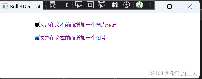
<BulletDecorator Grid.Row="0" Grid.Column="0" Margin="0 20 0 0">
<BulletDecorator.Bullet>
<Ellipse Width="10" Height="10" Fill="Black" />
</BulletDecorator.Bullet>
<BulletDecorator.Child>
<TextBlock Foreground ="Purple">
这是在文本前面增加一个圆点标记
</TextBlock>
</BulletDecorator.Child>
</BulletDecorator>
<BulletDecorator Grid.Row="1" Grid.Column="0">
<BulletDecorator.Bullet>
<Image Width="10" Height="10" Source="1.png" />
</BulletDecorator.Bullet>
<BulletDecorator.Child>
<TextBlock Foreground ="Purple">
这是在文本前面增加一个图片
</TextBlock>
</BulletDecorator.Child>
</BulletDecorator>
</Grid>
Button
- 用于触发一个操作或事件。Button 控件允许用户通过单击或触摸来与应用程序进行交互。
| 常用属性 | 描述 |
|---|---|
| Content | 用于设置按钮上显示的文本或内容。 |
| Background | 设置按钮的背景颜色或图像。 |
| Foreground | 设置按钮上文本的颜色。 |
| Width | 设置按钮的宽度。 |
| Height | 设置按钮的高度。 |
| BorderBrush | 设置按钮边框的颜色。 |
| BorderThickness | 设置按钮边框的宽度。 |
| Padding | 设置按钮内容与边框之间的空间。 |
| FontFamily, FontSize, FontStyle, FontWeight | 用于设置按钮上文本的字体属性。 |
| IsEnabled | 用于启用或禁用按钮的交互功能。 |
| Click | 绑定到按钮的 Click 事件处理程序。 |
| Template | 用于自定义按钮的外观和布局。 |
- 下面写个列子
<Window.Resources>
<ControlTemplate x:Key="MyButtonTemplate" TargetType="Button">
<BulletDecorator VerticalAlignment="Center">
<BulletDecorator.Bullet>
<Ellipse Fill="LightGray" Stroke="Red" StrokeThickness="1" Width="20" Height="20"/>
</BulletDecorator.Bullet>
<TextBlock Text="{TemplateBinding Content}" Background="Aquamarine" FontSize="20" HorizontalAlignment="Left" VerticalAlignment="Center"/>
</BulletDecorator>
</ControlTemplate>
</Window.Resources>
<Grid HorizontalAlignment="Center">
<Grid.ColumnDefinitions>
<ColumnDefinition></ColumnDefinition>
</Grid.ColumnDefinitions>
<Grid.RowDefinitions>
<RowDefinition></RowDefinition>
<RowDefinition></RowDefinition>
<RowDefinition></RowDefinition>
<RowDefinition></RowDefinition>
<RowDefinition></RowDefinition>
<RowDefinition></RowDefinition>
<RowDefinition></RowDefinition>
<RowDefinition></RowDefinition>
</Grid.RowDefinitions>
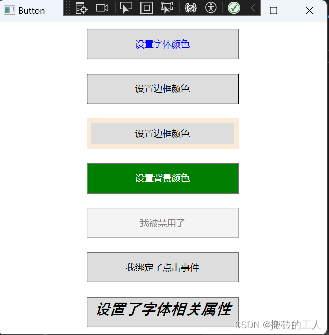
<Button Grid.Column="0" Grid.Row="0" Height="40" Width="200" Content="设置字体颜色" Foreground="Blue" ></Button>
<Button Grid.Column="0" Grid.Row="1" Height="40" Width="200" BorderBrush="Black" Content="设置边框颜色"></Button>
<Button Grid.Column="0" Grid.Row="2" Height="40" Width="200" BorderBrush="AntiqueWhite" BorderThickness="6" Content="设置边框颜色"></Button>
<Button Grid.Column="0" Grid.Row="3" Height="40" Width="200" Background="Green" Foreground="White" Content="设置背景颜色"></Button>
<Button Grid.Column="0" Grid.Row="4" Height="40" Width="200" Content="我被禁用了" IsEnabled="False" ></Button>
<Button Grid.Column="0" Grid.Row="5" Height="40" Width="200" Content="我绑定了点击事件" Click="Button_Click" ></Button>
<Button Grid.Column="0" Grid.Row="6" Height="40" Width="200" FontFamily="Gabriola" FontWeight="Bold" FontSize="20" FontStyle="Italic" Content="设置了字体相关属性"></Button>
<Button Grid.Column="0" Grid.Row="7" Template="{StaticResource MyButtonTemplate}" Content="我使用了模板"></Button>
</Grid>
公众号“点滴分享技术猿”


 920
920

 被折叠的 条评论
为什么被折叠?
被折叠的 条评论
为什么被折叠?
 到【灌水乐园】发言


