


掌握WPF控件:熟练常用属性(四)
DatePicker
- 用于用户通过将日期键入文本字段或使用下拉 Calendar 控件来选择日期。用户直接输入日期文本时,它会设置 Text 属性。 但会出现 DatePicker 无法转换为有效日期字符串的情况,这情况则将引发 DateValidationError 事件。 默认情况下,这会导致异常,但是可以在 DateValidationError 的事件里处理,把ThrowException 属性设置为 false,并阻止引发异常。
| 常用属性 | 描述 |
|---|---|
| BlackoutDates | 用于获取或设置标记为不可选择的日期的集合。 |
| CalendarStyle | 用于获取或设置呈现日历时使用的样式。 |
| DisplayDate | 用于获取或设置要显示的日期。 |
| DisplayDateEnd | 用于获取或设置要显示的最后一个日期。 |
| DisplayDateStart | 用于获取或设置要显示的第一个日期。 |
| FirstDayOfWeek | 用于获取或设置星期几为一周开始的日期。 |
| IsDropDownOpen | 用于获取或设置一个值,该值指示是打开还是关闭下拉 Calendar。 |
| IsTodayHighlighted | 用于获取或设置一个值,该值指示是否突出显示当前日期。这个属性就是Calendar控件里的属性。默认为true |
| SelectedDate | 用于获取或设置当前选定的日期。默认为null |
| SelectedDateFormat | 用于获取或设置用于显示所选日期的格式。默认值为 Long,可选值有:Short(于ToShortDateString() 返回的字符串一样)、Long(与 ToLongDateString() 返回的字符串一样) |
| Text | 用于获取由 DatePicker 显示的文本,或设置选定日期。 |
- 下面写一个例子
<Grid>
<Grid.RowDefinitions>
<RowDefinition Height="Auto"></RowDefinition>
<RowDefinition Height="Auto"></RowDefinition>
<RowDefinition Height="Auto"></RowDefinition>
</Grid.RowDefinitions>
<!--添加DateValidationError事件来阻止异常抛出-->
<!--设置SelectedDateFormat为Long,表示未缩写的星期几和月份名称显示日期-->
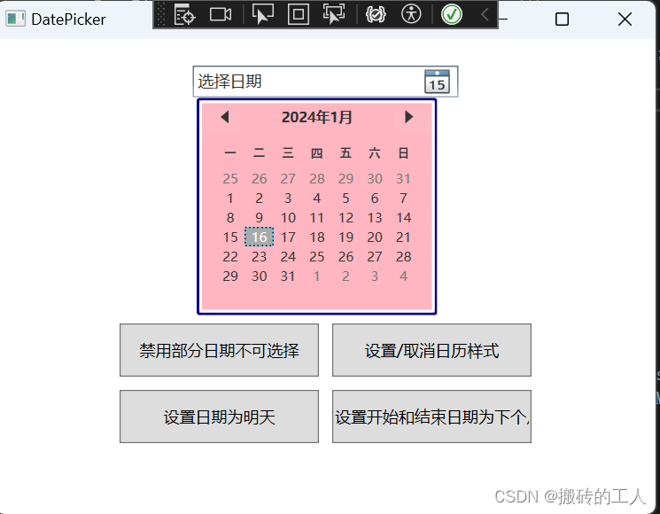
<DatePicker Grid.Row="0" Margin="0,20,0,0" Name="myDatePicker" Width="200" SelectedDateFormat="Long" DateValidationError="myDatePicker_DateValidationError"/>
<StackPanel Grid.Row="1" Orientation="Horizontal" HorizontalAlignment="Center" Margin="0,170,0,0" >
<Button Height="40" Width="150" Content="禁用部分日期不可选择" Click="Button_Click"></Button>
<Button Height="40" Width="150" Margin="10,0,0,0" Content="设置/取消日历样式" Click="Button_Click_1"></Button>
</StackPanel>
<StackPanel Grid.Row="2" Orientation="Horizontal" HorizontalAlignment="Center" Margin="0,10,0,0" >
<Button Height="40" Width="150" Content="设置日期为明天" Click="Button_Click_2"></Button>
<Button Height="40" Width="150" Margin="10,0,0,0" Content="设置开始和结束日期为下个月月初末" Click="Button_Click_3"></Button>
</StackPanel>
</Grid>
using System.Windows;
using System.Windows.Controls;
using System.Windows.Media;

namespace WpfCommonControls
{
    /// <summary>
    /// DatePicker.xaml 的交互逻辑
    /// </summary>
    public partial class DatePicker : Window
    {
        private static Random random = new Random();
        int monthNum = 0; //用来动态改变日期
        public DatePicker()
        {
            InitializeComponent();
        }

        private void Button_Click(object sender, RoutedEventArgs e)
        {
            // 设置部分不可选日期

            //演示这里,我当月随机禁用十天
            List<CalendarDateRange> blackoutDateList = new List<CalendarDateRange>();
            //本月时间
            DateTime startDate = new DateTime(DateTime.Now.Year, DateTime.Now.AddMonths(monthNum).Month, 1);
            DateTime endDate = startDate.AddMonths(1+ monthNum).AddDays(-1);
            for (int i = 0; i < 10; i++)
            {
                // 随机获取这个月的一天
                int day = random.Next(1, DateTime.DaysInMonth(startDate.Year, startDate.Month));
                DateTime randomDisabledDate = new DateTime(startDate.Year, startDate.Month, day);

                // 创建并添加禁用日期范围
                blackoutDateList.Add(new CalendarDateRange(randomDisabledDate, randomDisabledDate));

            }

            //清空历史禁用
            myDatePicker.BlackoutDates.Clear();
            foreach (var item in blackoutDateList)
            {
                // 将禁用日期列表应用到DatePicker
                myDatePicker.BlackoutDates.Add(item);
            }
            // 并且手动打开看效果
            myDatePicker.IsDropDownOpen=true;
        }

        private void myDatePicker_DateValidationError(object sender, DatePickerDateValidationErrorEventArgs e)
        {
            // 设置为false 阻止抛出异常
            e.ThrowException = false;
        }

        private void Button_Click_1(object sender, RoutedEventArgs e)
        {
            if (myDatePicker.CalendarStyle != null)
            {
                myDatePicker.CalendarStyle = null;  // 取消日历样式
            }
            else
            {
                //设置日历样式
                Style cellStyle = new Style();
                cellStyle.Setters.Add(new Setter(BackgroundProperty, Brushes.LightPink));  // 设置背景
                cellStyle.Setters.Add(new Setter(ForegroundProperty, Brushes.Black));   // 设置字体颜色
                cellStyle.Setters.Add(new Setter(BorderBrushProperty, Brushes.DarkBlue));  // 设置边框颜色
                cellStyle.Setters.Add(new Setter(BorderThicknessProperty, new Thickness(2))); //设置边框线
                myDatePicker.CalendarStyle = cellStyle;  // 设置日历样式

            }
            // 并且手动打开看效果
            myDatePicker.IsDropDownOpen = true;
        }

        private void Button_Click_2(object sender, RoutedEventArgs e)
        {
            // 在UI线程中设置新的DisplayDate
            Application.Current.Dispatcher.Invoke(() =>
            {
                //设置日期为明天,日历里选择的日期
                myDatePicker.DisplayDate = DateTime.Now.AddDays(1);
                //设置输入框的信息
                myDatePicker.Text = DateTime.Now.AddDays(1).ToLongDateString();
            });
            // 并且手动打开看效果
            myDatePicker.IsDropDownOpen = true;
        }

        private void Button_Click_3(object sender, RoutedEventArgs e)
        {
            // 设置
            monthNum = 1;//演示随机禁用时间跟随变化

            // 设置日历的起始日期和结束日期
            DateTime lastMonth = DateTime.Now.AddMonths(1);
            myDatePicker.DisplayDateStart = new DateTime(DateTime.Now.Year, lastMonth.Month, 1); ;
            myDatePicker.DisplayDateEnd = new DateTime(DateTime.Now.Year, lastMonth.AddMonths(1).Month, 1).AddDays(-1);

            // 修改一周的开始为星期几,这里会修改默认的周日在一周的第一位
            myDatePicker.FirstDayOfWeek = DayOfWeek.Tuesday;

            // 并且手动打开看效果
            myDatePicker.IsDropDownOpen = true;
        }
    }
}
GroupBox
- 用于创建一个具有用户界面(UI)内容边框和标题的容器。它只能包含一个子元素,但通过设置这个控件为面板,可以自由地向面板添加多个控件。
| 常用属性 | 描述 |
|---|---|
| Header | 用于获取或设置每个控件的标题所用的数据。 |
| RenderTransform | 用于元素的呈现位置的转换信息。例如GroupBox整个组件旋转45% |
| RenderTransformOrigin | 用于由RenderTransform声明的任何可能呈现转换的中心点,相对于元素的边界。 |
| Background | 用于控件的背景颜色。 |
- 下面写一个例子
<Grid>
<!--设置Header头文本,以及设置Background背景颜色-->
<!--设置RenderTransform 旋转45度不会影响元素的布局,它只会改变元素在屏幕上的呈现方式-->
<!--设置RenderTransformOrigin 旋转中心位置,设置为 (0.5, 0.5),表示变换的起始点位于GroupBox中心-->
<!--设置HorizontalContentAlignment为Right 表示组件内容内容右对齐-->
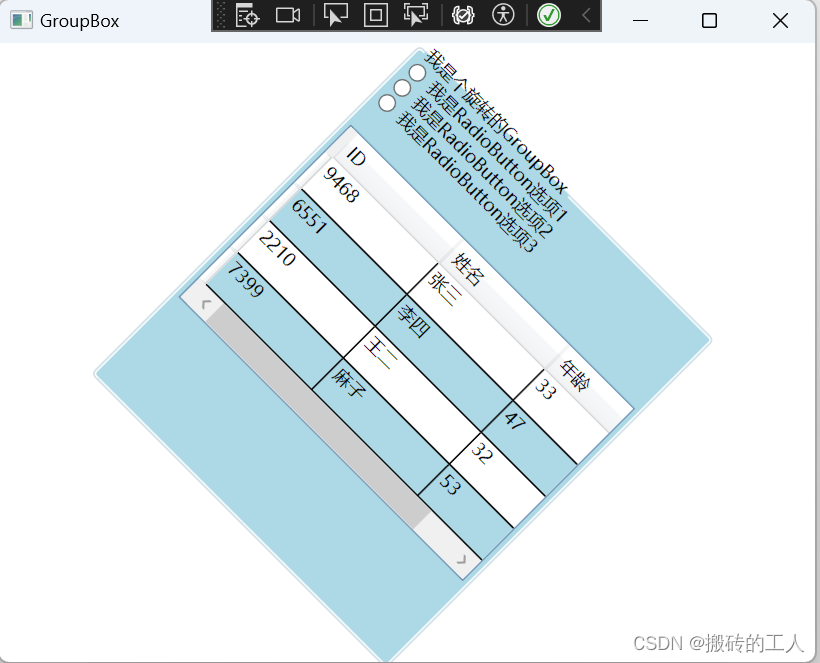
<GroupBox Header="我是个旋转的GroupBox" Width="280" Height="320" Background="LightBlue" >
<GroupBox.RenderTransform>
<RotateTransform Angle="45" />
</GroupBox.RenderTransform>
<GroupBox.RenderTransformOrigin>
<Point X="0.5" Y="0.5" />
</GroupBox.RenderTransformOrigin>
<GroupBox.Content>
<!--内容添加三个单选按钮和DataGrid表格-->
<StackPanel >
<RadioButton Content="我是RadioButton选项1" />
<RadioButton Content="我是RadioButton选项2" />
<RadioButton Content="我是RadioButton选项3" />
<DataGrid x:Name="myDataGrid1" Margin="0,20,0,0" AutoGenerateColumns="False" ColumnWidth="100" AlternatingRowBackground="LightBlue" AlternationCount ="2" CanUserAddRows ="False" CanUserDeleteRows="False" CanUserResizeRows="False" MinRowHeight="30.0">
<DataGrid.Columns>
<!-- 定义列 -->
<DataGridTextColumn Header="ID" Binding="{Binding Id}" />
<DataGridTextColumn Header="姓名" Binding="{Binding Name}" />
<DataGridTextColumn Header="年龄" Binding="{Binding Age}" />
</DataGrid.Columns>
</DataGrid>
</StackPanel>
</GroupBox.Content>
</GroupBox>
</Grid>
using System.Windows;

namespace WpfCommonControls
{
    /// <summary>
    /// GroupBox.xaml 的交互逻辑
    /// </summary>
    public partial class GroupBox : Window
    {
        static Random random = new Random();
        public GroupBox()
        {
            InitializeComponent();
            LoadData();
        }

        private void LoadData()
        {

            List<PersonModel> list = new List<PersonModel>
            {
                new PersonModel { Id=random.Next(1, 10001), Name = "张三", Age = random.Next(18, 61) },
                new PersonModel {Id=random.Next(1, 10001), Name = "李四", Age = random.Next(18, 61) },
                new PersonModel {Id=random.Next(1, 10001), Name = "王二", Age = random.Next(18, 61) },
                new PersonModel {Id=random.Next(1, 10001), Name = "麻子", Age = random.Next(18, 61) }
            };
            // 设置DataGrid的数据上下文
            myDataGrid1.ItemsSource = list;
        }

        public class PersonModel
        {
            /// <summary>
            /// ID
            /// </summary>
            public int Id { get; set; }

            /// <summary>
            /// 姓名
            /// </summary>
            public string? Name { get; set; }

            /// <summary>
            /// 年龄
            /// </summary>
            public int Age { get; set; }
        }
    }
}
Label
- 用于在用户界面(UI)中提供信息。Label 控件通常用于显示文本或其他内容,并允许用户通过快捷键快速访问相关控件。
| 常用属性 | 描述 |
|---|---|
| Content | 用于设置或获取Label控件中显示的文本内容。 |
| Foreground | 用于设置或获取Label控件前景色(即文本颜色)。 |
| Background | 用于设置或获取Label控件的背景色。 |
| FontFamily | 用于设置或获取Label控件中字体族。 |
| FontSize | 用于设置或获取Label控件中字体大小。 |
| FontWeight | 用于设置或获取Label控件中字体粗细。 |
- 下面写一个例子
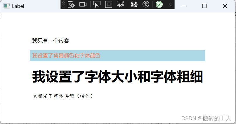
<Grid>
    <StackPanel HorizontalAlignment="Center" VerticalAlignment="Center">

        <Label Content="我只有一个内容" />
        <Label Margin="0,10,0,0" Content="我设置了背景颜色和字体颜色" Background="LightBlue"  Foreground="Coral"/>

        <Label Margin="0,10,0,0" Content="我设置了字体大小和字体粗细" FontSize="30"  FontWeight="Bold"/>

        <Label Margin="0,10,0,0" Content="我指定了字体类型(楷体)" FontFamily="KaiTi"/>

    </StackPanel>
</Grid>
Popup
- 是一个轻量级的容器,可以在其内容部分显示其他控件。Popup 控件可以用来创建各种用户界面元素,如上下文菜单、浮动工具栏、弹出窗口等。
| 常用属性 | 描述 |
|---|---|
| AllowsTransparency | 用于获取或设置一个值,该值指示 Popup 控件是否可以包含透明内容。 |
| Child | 用于获取或设置 Popup 控件的内容。 |
| HorizontalOffset | 用于获取或设置目标原点和弹出对齐点之间的水平距离。 |
| Placement | 用于获取或设置 Popup 控件打开时的控件方向(默认为Bottom下方),并指定 Popup 控件在与屏幕边界重叠时的控件行为。 |
| PlacementRectangle | 用于获取或设置当打开 Popup 控件时该控件相对于其放置的矩形。 |
| PlacementTarget | 用于获取或设置 Popup 打开时相对于其定位的元素。 |
| PopupAnimation | 用于获取或设置用于打开和关闭 Popup 控件的动画。默认值为 None。可选值有:Fade(淡入)、None(无)、Scroll(左上角滚动)、Slide(向下或向上滑动) |
| StaysOpen | 用于获取或设置一个值,该值指示当 Popup 控件焦点不再对准时,是否关闭该控件。为true 时候,显示后不会关闭 |
| VerticalOffset | 用于获取或设置目标原点和弹出对齐点之间的垂直距离。 |
- 下面写一个例子
<Grid>
<Grid.RowDefinitions>
<RowDefinition></RowDefinition>
<RowDefinition></RowDefinition>
<RowDefinition></RowDefinition>
<RowDefinition></RowDefinition>
</Grid.RowDefinitions>
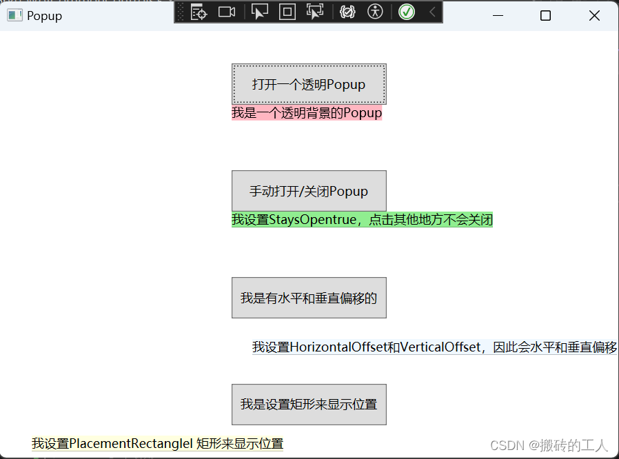
<Button x:Name="myButton" Grid.Row="0" Height="40" Width="150" Content="打开一个透明Popup" Click="Button_Click"></Button>
<!--设置AllowsTransparency为true,表示支持透明度-->
<!--设置PopupAnimation动画为Slide表示淡入出现-->
<!--设置PlacementTarget目标元素为按钮,打开默认在按钮下面-->
<Popup x:Name="myPopup" AllowsTransparency="True" PopupAnimation="Fade" PlacementTarget="{Binding ElementName=myButton}">
<Popup.Child>
<TextBlock Background="LightPink">我是一个透明背景的Popup</TextBlock>
</Popup.Child>
</Popup>
<Button x:Name="myButton1" Grid.Row="1" Height="40" Width="150" Content="手动打开/关闭Popup" Click="myButton1_Click"></Button>
<!--设置PopupAnimation动画为None表示无动画-->
<!--设置PlacementTarget目标元素为按钮,打开默认在按钮下面-->
<!--设置StaysOpen为true时候点击其他地方不会自动关闭,只能手动设置IsOpen=false关闭-->
<Popup x:Name="myPopup1" StaysOpen="True" PopupAnimation="None" PlacementTarget="{Binding ElementName=myButton1}">
<Popup.Child>
<TextBlock Background="LightGreen">我设置StaysOpentrue,点击其他地方不会关闭</TextBlock>
</Popup.Child>
</Popup>
<Button x:Name="myButton2" Grid.Row="2" Height="40" Width="150" Content="我是有水平和垂直偏移的" Click="myButton2_Click"></Button>
<!--设置PopupAnimation动画为Scroll表示左上角滚动出现-->
<!--设置PlacementTarget目标元素为按钮,打开默认在按钮下面-->
<!--设置了水平偏移HorizontalOffset为20,垂直偏移 为20,因此它会往下偏移20,往右偏移20-->
<Popup x:Name="myPopup2" HorizontalOffset="20" VerticalOffset="20" PopupAnimation="Scroll" PlacementTarget="{Binding ElementName=myButton2}">
<Popup.Child>
<TextBlock Background="AliceBlue">我设置HorizontalOffset和VerticalOffset,因此会水平和垂直偏移</TextBlock>
</Popup.Child>
</Popup>
<Button x:Name="myButton3" Grid.Row="3" Height="40" Width="150" Content="我是设置矩形来显示位置" Click="myButton3_Click"></Button>
<!--设置PopupAnimation动画为Slide表示上王下滑动-->
<!--设置PlacementTarget目标元素为按钮,打开默认Placement为Bottom在按钮下面,-->
<!--设置Placement为left 表示在左边-->
<!--设置PlacementRectangle的X为50、 Y为50、 Width为50和 Height为100-->
<Popup x:Name="myPopup3" PlacementRectangle="50,50,50,100" Placement="Left" PopupAnimation="Slide" PlacementTarget="{Binding ElementName=myButton3}">
<Popup.Child>
<TextBlock Background="LightYellow">我设置PlacementRectanglel 矩形来显示位置</TextBlock>
</Popup.Child>
</Popup>
</Grid>
using System.Windows;

namespace WpfCommonControls
{
    /// <summary>
    /// Popup.xaml 的交互逻辑
    /// </summary>
    public partial class Popup : Window
    {
        public Popup()
        {
            InitializeComponent();
        }

        private void Button_Click(object sender, RoutedEventArgs e)
        {
            //打开
            myPopup.IsOpen = true;
        }

        private void myButton1_Click(object sender, RoutedEventArgs e)
        {
            //手动切换打开和关闭,用来演示StaysOpen 为ture时,只能手动关闭
            myPopup1.IsOpen = !myPopup1.IsOpen;
        }

        private void myButton2_Click(object sender, RoutedEventArgs e)
        {
            //打开
            myPopup2.IsOpen = true;
        }

        private void myButton3_Click(object sender, RoutedEventArgs e)
        {
            //打开
            myPopup3.IsOpen = true;
        }
    }
}
公众号“点滴分享技术猿”


 4万+
4万+


 被折叠的 条评论
为什么被折叠?
被折叠的 条评论
为什么被折叠?
 到【灌水乐园】发言


