


为了更好的管理Android应用的用户界面里的组件,Android提供了布局管理器,通过使用布局管理器,Android应用的图形用户界面具有良好的平台无关性。通常来说,推荐使用布局管理器来管理组件的分布,大小,而不是直接设置组件位置和大小,布局管理器可以根据运行平台来调整组件的大小,程序员要做的,只是为容器选择合适的布局管理器。下面是布局管理器的结构图。

从上图可以看出,所有的布局管理器都直接或者间接继承ViewGroup
线性布局(LineraLayout)
顾名思义,就是一条直线,不过这条直线摆放满了,宁可超出屏幕也不换行。
常用属性:
android:divider 设置垂直布局时两个按钮之间的分隔条。
android:graviyt 设置布局管理器内组件的对其方式。可选值(top,botton,left,right,center,vertical,fill_vertical,center_horizontal,center,clip_horizontal)
android:orientation 设置布局的方向。可选值(horizontal,vertical)
LineraLayout包含的所有子元素都受LineraLayout.LayoutParams控制(可以理解为容器给子控件附加的属性),因此LineraLayout包含的子元素可以额外指定以下属性
android:layout_gravity 指定该子元素LineraLayout中的对齐方式
android:layout_width 指定该子元素在LineraLayout中所占的权重
因为线性布局确实没什么难度,这里就不贴代码了。
表格布局(TableLayout)
常用属性:
android:collapseColumns 设置需要被隐藏列的序列号,多个序列号之间用逗号隔开
android:shrinkColumns 设置允许被收缩的列的序列号,多个序列之间号用逗号隔开
android:stretchColums 设置允许被拉伸列的序列号,多个序列之间号用逗号隔开
<?xml version="1.0" encoding="utf-8"?>
<LinearLayout xmlns:android="http://schemas.android.com/apk/res/android"
android:layout_width="match_parent"
android:layout_height="match_parent"
android:orientation="vertical" >
<!-- 定义第一个表格 这里的位置类似数组,从0开始 第一列允许收缩,第二列允许拉伸 -->
<TableLayout
android:layout_width="match_parent"
android:layout_height="wrap_content"
android:background="#FF0000"
android:shrinkColumns="1"
android:stretchColumns="2" >
<!-- 直接添加按钮,它自己会占一行 -->
<Button
android:layout_width="wrap_content"
android:layout_height="wrap_content"
android:text="独自一行的按钮" />
<TableRow>
<Button
android:layout_width="wrap_content"
android:layout_height="wrap_content"
android:text="普通按钮" />
<Button
android:layout_width="wrap_content"
android:layout_height="wrap_content"
android:text="收缩的的的的的的按钮" />
<Button
android:layout_width="wrap_content"
android:layout_height="wrap_content"
android:text="拉伸按钮" />
</TableRow>
</TableLayout>
<!-- 定义第二个表格 指定第1列隐藏 -->
<TableLayout
android:layout_width="match_parent"
android:layout_height="wrap_content"
android:collapseColumns="1" >
<!-- 直接添加按钮,它自己会占一行 -->
<Button
android:layout_width="wrap_content"
android:layout_height="wrap_content"
android:text="独自一行的按钮" />
<TableRow>
<Button
android:layout_width="wrap_content"
android:layout_height="wrap_content"
android:text="普通按钮1" />
<Button
android:layout_width="wrap_content"
android:layout_height="wrap_content"
android:text="普通按钮2" />
<Button
android:layout_width="wrap_content"
android:layout_height="wrap_content"
android:text="普通按钮3" />
</TableRow>
</TableLayout>
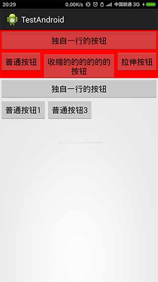
</LinearLayout>效果图:
帧布局(FrameLayout)
帧布局直接继承了VIewGroup组件通常在游戏开发中使用,并为每个加入其中的组件创建一个空白的区域(称为一帧),每个子组件占据一帧,这些帧会根据gravity属性执行自动对齐。类似于PS的图层。如果最后一个局部铺满屏幕,那么只有最后一个控件可见。另外FrameLayout包含的子元素也受FrameLayout.LayoutParams控制,因此它所包含子元素也可指定android:layout_gravity属性,该属性控制该子元素在FrameLayout中的对其方式。
常用属性:
android:foreground 设置该帧布局容器的前景图像
android:foregroundGravity 定义绘制前景图像的gravity属性
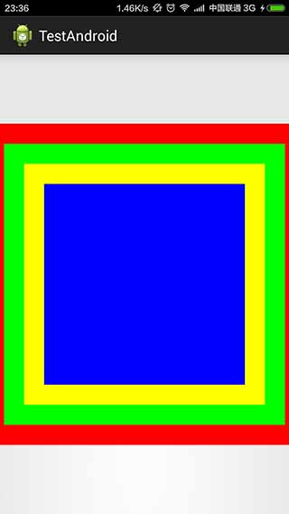
下面的Demo是4个TextView叠在一起,上面的TextView遮住下面的TextView
<?xml version="1.0" encoding="utf-8"?>
<FrameLayout xmlns:android="http://schemas.android.com/apk/res/android"
    android:layout_width="match_parent"
    android:layout_height="match_parent" >
    <!-- 定义4个TextView  先定义底部的 -->
    <TextView
        android:layout_width="wrap_content"
        android:layout_height="wrap_content"
        android:layout_gravity="center"
        android:background="#f00"
        android:height="400dp"
        android:width="400dp" />
    <TextView
        android:layout_width="wrap_content"
        android:layout_height="wrap_content"
        android:layout_gravity="center"
        android:background="#0f0"
        android:height="350dp"
        android:width="350dp" />
    <TextView
        android:layout_width="wrap_content"
        android:layout_height="wrap_content"
        android:layout_gravity="center"
        android:background="#ff0"
        android:height="300dp"
        android:width="300dp" />
    <TextView
        android:layout_width="wrap_content"
       	android:layout_height="wrap_content"
        android:layout_gravity="center"
        android:background="#00f"
        android:height="250dp"
        android:width="250dp" />
</FrameLayout>
效果图:
相对布局(RelativeLayout)
相对布局容器内子组件的位置总是相对兄弟组件或者父容器来决定的,因此这种布局方式被称为相对布局,如果A组件的位置是由B组件的位置来决定的,Android要求先定义B组件,在定义A组件。
常用属性:
boolean值的:
android:gravity 设置该布局容器内各组件的对其方式
android:ignoreGravity 设置哪个控件不受gravity影响
同样为了控制子控件的布局分布,Relative提供了内部类Relative.LayoutParams供子组件控制分布
android:layout_centerHorizontal 控件该子组件是否位于布局容器的水平居中
android:layout_centerVertical 控件该子组件是否位于布局容器的垂直居中
android:layout_centerInParent 控制该子组件是否位于布局容器的中央位置
android:layout_alignParentBottom 控制该子组件是否与布局容器底部对齐
android:layout_alignParentLeft 控制该子组件是否与布局容器左边对齐
android:layout_alignParentRight 控制该子组件是否与布局容器右边对齐
android:layout_alignParenTop 控制该子组件是否与布局容器顶端对齐
相对于其他ID的:
android:layout_toRightOf 控制该子组件位于给出ID组件的右侧
android:layout_toLeftOf 控制该子组件位于给出ID组件的左侧
android:layout_abover 控制该子组件位于给出ID的上方
android:layout_below 控制该子组件位于给出ID的下方
android:layout_alignTop 控件该子组件位于给出ID组件的上边界对齐
android:layout_alignBottom 控件该子组件位于给出ID组件的下边界对齐
android:layout_alignLeft 控件该子组件位于给出ID组件的左边界对齐
android:layout_alignRight 控件该子组件位于给出ID组件的右边界对齐
除此之外,RelativeLayout.LayoutParams继承了android.view.ViewGroup.MarginLayoutParams,因此RelativeLayout布局容器中每个组件也可指定android.view.ViewGroup.MarginLayoutParams的XML属性。
<?xml version="1.0" encoding="utf-8"?>
<RelativeLayout xmlns:android="http://schemas.android.com/apk/res/android"
    android:layout_width="match_parent"
    android:layout_height="match_parent" >

	<!-- 定义该组件在容器中间 -->
    <TextView
        android:id="@+id/center"
        android:layout_width="wrap_content"
        android:layout_height="wrap_content"
        <span style="color:#33ccff;">android:layout_centerInParent="true"</span>
        android:background="@drawable/ic_launcher" />
    <!-- 定义在该组件在center组件上方 -->
    <TextView
        android:layout_width="wrap_content"
        android:layout_height="wrap_content"
      <span style="color:#33ccff;">  android:layout_above="@id/center"
        android:layout_alignLeft="@id/center"</span>
        android:background="@drawable/ic_launcher" />
	<!-- 定义在该组件在center组件下方 -->
    <TextView
        android:layout_width="wrap_content"
        android:layout_height="wrap_content"
<span style="color:#33ccff;">        android:layout_below="@id/center"
        android:layout_alignLeft="@id/center"</span>
        android:background="@drawable/ic_launcher" />
	<!-- 定义在该组件在center组件左方 -->
    <TextView
        android:layout_width="wrap_content"
        android:layout_height="wrap_content"
<span style="color:#33ccff;">        android:layout_toLeftOf="@id/center"
        android:layout_alignTop="@id/center"</span>
        android:background="@drawable/ic_launcher" />
	<!-- 定义在该组件在center组件右方 -->
    <TextView
        android:layout_width="wrap_content"
        android:layout_height="wrap_content"
<span style="color:#33ccff;">        android:layout_toRightOf="@id/center"
        android:layout_alignTop="@id/center"</span>
        android:background="@drawable/ic_launcher" />

</RelativeLayout>注意:如果单纯指定在center控件的左侧,系统识别出的区域是左图效果,因为这个位置不明确,所以还需要它跟那个控件顶部对齐,这样才能确定具体位置。
效果图:

网格布局(GridLayout)
android中的网格局部是4.0才出现的,如果低版本使用需要导入相应的支持库,网格布局的作用类似于 HTML的table标签,它把整个容器划分为row*columsn个网格,每个网格可以放置一个组件,除此之外,也可以设置一个组件横跨多少列,一个组件横跨多少行
常用属性:
android:alignmentMode 设置该布局管理器采用的对齐模式
android:columnCount 设置该网格列的数量
android:columnOrderPreserved 设置该网格容器是否保留列序号
android:rowCount 设置该网格行的数量
android:rowOrderPreserved 设置该网格容器是否保留行序号
android:useDefaultMargins 设置该网格布局管理器是否使用默认的页边距
为了控制GridLayout布局容器中各子组件的布局分布,依然提供GridLayout.LayoutParams,该内部类提供了大量的XML控制子组件分布
android:layout_column 设置该子组件在GridLayout的第几列
android:layout_columnSpan 设置该子组件在GridLayout横向上跨几列
android:layout_gravity 设置该子组件采用何种方式占据该网格的空间
android:layout_row 设置该子组件在GridLayout的第几行
android:layout_rowSapn 设置该子组件在GridLayout纵向上跨几行
接下来看一下简单模拟计算器的布局:由于控件较多,这里就用代码创建空间
java文件
public class GridLayoutTest extends Activity
{
	GridLayout gridLayout;
	// 定义16个按钮的文本
	String[] chars = new String[]
		{
			"7" , "8" , "9" , "÷",
			"4" , "5" , "6" , "×",
			"1" , "2" , "3" , "-",
			"." , "0" , "=" , "+"
		};
	@Override
	public void onCreate(Bundle savedInstanceState)
	{
		super.onCreate(savedInstanceState);
		setContentView(R.layout.main);
		gridLayout = (GridLayout) findViewById(R.id.root);

		for(int i = 0 ; i < chars.length ; i++)
		{
			Button bn = new Button(this);
			bn.setText(chars[i]);
			// 设置该按钮的字体大小
			bn.setTextSize(40);
			// 指定该组件所在的行
			GridLayout.Spec rowSpec = GridLayout.spec(i / 4 + 2);
			// 指定该组件所在列
			GridLayout.Spec columnSpec = GridLayout.spec(i % 4);
			GridLayout.LayoutParams params = new GridLayout.LayoutParams(
					rowSpec , columnSpec);
			// 指定该组件占满父容器
			params.setGravity(Gravity.FILL);
			gridLayout.addView(bn , params);
		}
	}
}
XML
<?xml version="1.0" encoding="utf-8" ?>
<GridLayout xmlns:android="http://schemas.android.com/apk/res/android"
	android:layout_width="match_parent"
	android:layout_height="match_parent"
	android:rowCount="6"
	android:columnCount="4"
	android:id="@+id/root"
	>
<!-- 定义一个横跨4列的文本框,
并设置该文本框的前景色、背景色等属性  -->
<TextView
    android:layout_width="match_parent"
	android:layout_height="wrap_content"
	android:layout_columnSpan="4"
	android:textSize="50sp"
	android:layout_marginLeft="4px"
	android:layout_marginRight="4px"
	android:padding="5px"
	android:layout_gravity="right"
	android:background="#eee"
	android:textColor="#000"
	android:text="0"/>
<!-- 定义一个横跨4列的按钮 -->
<Button
    android:layout_width="match_parent"
	android:layout_height="wrap_content"
	android:layout_columnSpan="4"
	android:text="清除"/>
</GridLayout>
效果图:

绝对布局(AbsoluteLayout)
绝对布局不提供任何布局控制,而是由开发人员自己通过定义X,Y坐标来控制组件的位置,当使用绝对布局的作为容器的时候,布局管理器不再管理子组件的位置,大小,-----都 是由开发人员自己控制,其实大部分时候,使用绝对布局不是一个好的思路,Android应用千差万别,屏幕大小,分辨率存在较大差异,使用绝对布局会很难兼容不同屏幕大小,分辨率问题,因此绝对布局已经过时。
常用属性:
android:layout_x 指定该组件的X坐标
android:layout_y指定该组件的Y坐标
这里就不做详解了。
最后建议在实际开发中多使用线性布局和相对布局。


 1483
1483

 被折叠的 条评论
为什么被折叠?
被折叠的 条评论
为什么被折叠?
 到【灌水乐园】发言


