


代码简介:
一段为你网站加新年灯笼的代码
马上快过年了 我也不想被人捷足先登呀
放一段代码用来装饰你的Blog或者个人小站点
这样才有喜庆劲儿呢
喜欢的那去研究下吧,非常简单部署就可以实现了
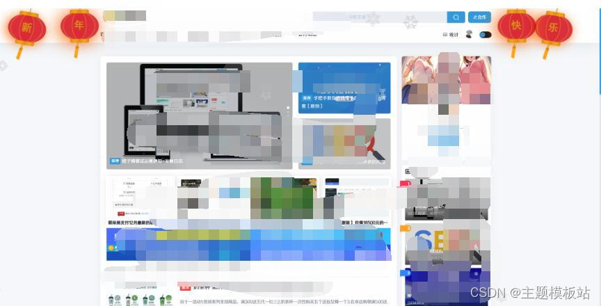
下面是预览图:
代码
<!-- 灯笼代码 --><metacharset="utf-8"><divclass="deng-box2"><divclass="deng"><divclass="xian"></div><divclass="deng-a"><divclass="deng-b"><divclass="deng-t">年</div></div></div><divclass="shui shui-a"><divclass="shui-c"></div><divclass="shui-b"></div></div></div></div><divclass="deng-box3"><divclass="deng"><divclass="xian"></div><divclass="deng-a"><divclass="deng-b"><divclass="deng-t">新</div></div></div><divclass="shui shui-a"><divclass="shui-c"></div><divclass="shui-b"></div></div></div></div><divclass="deng-box1"><divclass="deng"><divclass="xian"></div><divclass="deng-a"><divclass="deng-b"><divclass="deng-t">乐</div></div></div><divclass="shui shui-a"><divclass="shui-c"></div><divclass="shui-b"></div></div></div></div><divclass="deng-box"><divclass="deng"><divclass="xian"></div><divclass="deng-a"><divclass="deng-b"><divclass="deng-t">快</div></div></div><divclass="shui shui-a"><divclass="shui-c"></div><divclass="shui-b"></div></div></div></div><styletype="text/css">
.deng-box {
position: fixed;
top: -40px;
right: 150px;
z-index: 9999;
pointer-events: none;
    }
.deng-box1 {
position: fixed;
top: -30px;
right: 10px;
z-index: 9999;
pointer-events: none
    }
.deng-box2 {
position: fixed;
top: -40px;
left: 150px;
z-index: 9999;
pointer-events: none
    }
.deng-box3 {
position: fixed;
top: -30px;
left: 10px;
z-index: 9999;
pointer-events: none
    }
.deng-box1.deng,
.deng-box3.deng {
position: relative;
width: 120px;
height: 90px;
margin: 50px;
background: #d8000f;
background: rgba(216, 0, 15, .8);
border-radius: 50%50%;
-webkit-transform-origin: 50% -100px;
-webkit-animation: swing 5s infinite ease-in-out;
box-shadow: -5px5px30px4px#fc903d    }
.deng {
position: relative;
width: 120px;
height: 90px;
margin: 50px;
background: #d8000f;
background: rgba(216, 0, 15, .8);
border-radius: 50%50%;
-webkit-transform-origin: 50% -100px;
-webkit-animation: swing 3s infinite ease-in-out;
box-shadow: -5px5px50px4px#fa6c00    }
.deng-a {
width: 100px;
height: 90px;
background: #d8000f;
background: rgba(216, 0, 15, .1);
margin: 12px8px8px8px;
border-radius: 50%50%;
border: 2px solid #dc8f03    }
.deng-b {
width: 45px;
height: 90px;
background: #d8000f;
background: rgba(216, 0, 15, .1);
margin: -4px8px8px26px;
border-radius: 50%50%;
border: 2px solid #dc8f03    }
.xian {
position: absolute;
top: -20px;
left: 60px;
width: 2px;
height: 20px;
background: #dc8f03    }
.shui-a {
position: relative;
width: 5px;
height: 20px;
margin: -5px0059px;
-webkit-animation: swing 4s infinite ease-in-out;
-webkit-transform-origin: 50% -45px;
background: orange;
border-radius: 005px5px    }
.shui-b {
position: absolute;
top: 14px;
left: -2px;
width: 10px;
height: 10px;
background: #dc8f03;
border-radius: 50%    }
.shui-c {
position: absolute;
top: 18px;
left: -2px;
width: 10px;
height: 35px;
background: orange;
border-radius: 0005px    }
.deng:before {
position: absolute;
top: -7px;
left: 29px;
height: 12px;
width: 60px;
content: " ";
display: block;
z-index: 999;
border-radius: 5px5px00;
border: solid 1px#dc8f03;
background: orange;
background: linear-gradient(to right, #dc8f03, orange, #dc8f03, orange, #dc8f03)
    }
.deng:after {
position: absolute;
bottom: -7px;
left: 10px;
height: 12px;
width: 60px;
content: " ";
display: block;
margin-left: 20px;
border-radius: 005px5px;
border: solid 1px#dc8f03;
background: orange;
background: linear-gradient(to right, #dc8f03, orange, #dc8f03, orange, #dc8f03)
    }
.deng-t {
font-family: 黑体, Arial, Lucida Grande, Tahoma, sans-serif;
font-size: 3.2rem;
color: #dc8f03;
font-weight: 700;
line-height: 85px;
text-align: center
    }
.night.deng-box,
.night.deng-box1,
.night.deng-t {
background: 00!important    }
    @-moz-keyframes swing {
        0% {
-moz-transform: rotate(-10deg)
        }
        50% {
-moz-transform: rotate(10deg)
        }
        100% {
-moz-transform: rotate(-10deg)
        }
    }
    @-webkit-keyframes swing {
        0% {
-webkit-transform: rotate(-10deg)
        }
        50% {
-webkit-transform: rotate(10deg)
        }
        100% {
-webkit-transform: rotate(-10deg)
        }
    }
</style>


 1万+
1万+

 被折叠的 条评论
为什么被折叠?
被折叠的 条评论
为什么被折叠?
 到【灌水乐园】发言


