


作者:夏至 欢迎转载,也请保留这段申明,谢谢
这一章呢,我们来学习进度条ProgressBar,在我们的网页浏览或者其他下载的时候,总有一个缓冲的UI,那这里就是用到我们的Progress,它有两种形式,一种是圆形,一种是水平的。
先来看看样子:
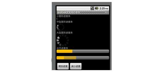
我们要实现就是上面的功能。这里我们先看看它的属性:
· android:max 设置范围大小0到max
· android:progress 设置当前进度
· android:secondaryProgress 设置第二进度,比如我们的看视频时的缓冲区域
其中有个style 属性,可以让我们来设置它的大小属性,我们一般可以这么设置:
style=”?android:attr/ progressBarStyleSmall
· progressBarStyleSmall 小型圆形
· progressBarStyleLarge 大型圆形
· progressBarStyleHorizontal 水平状态
这里我们获取的方法有:
· getMax():返回这个进度条的范围的上限
· getProgress():返回进度
· getSecondaryProgress():返回次要进度
<TextView
android:layout_width="match_parent"
android:layout_height="wrap_content"
android:textSize="24sp"
android:text="小型圆形进度条"
/>
<ProgressBar
android:id="@+id/small"
android:layout_width="match_parent"
android:layout_height="wrap_content"
style="?android:attr/progressBarStyleSmall"
/>
<TextView
android:layout_width="match_parent"
android:layout_height="wrap_content"
android:textSize="24sp"
android:text="中型圆形进度条"
/>
<ProgressBar
android:id="@+id/mid"
android:layout_width="match_parent"
android:layout_height="wrap_content"
/>
<TextView
android:layout_width="match_parent"
android:layout_height="wrap_content"
android:textSize="24sp"
android:text="大型圆形进度条"
/>
<ProgressBar
android:id="@+id/large"
android:layout_width="match_parent"
android:layout_height="wrap_content"
style="?android:attr/progressBarStyleLarge"
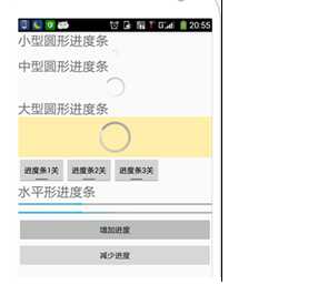
/>当然这里,我们可以根据上一节学习的开关按钮来实现,圆形进度条的开关功能:
<LinearLayout
    android:id="@+id/mylaytout1"
    xmlns:android="http://schemas.android.com/apk/res/android"
    android:orientation="horizontal"
    android:layout_width="wrap_content"
    android:layout_height="wrap_content">
    <ToggleButton
        android:id="@+id/tog1"
        android:layout_width="wrap_content"
        android:layout_height="wrap_content"
        android:textOn="进度条1开"
        android:textOff="进度条1关"
    />
    <ToggleButton
        android:id="@+id/tog2"
        android:layout_width="wrap_content"
        android:layout_height="wrap_content"
        android:textOn="进度条2开"
        android:textOff="进度条2关"
    />
    <ToggleButton
        android:id="@+id/tog3"
        android:layout_width="wrap_content"
        android:layout_height="wrap_content"
        android:textOn="进度条3开"
        android:textOff="进度条3关"
    />
</LinearLayout>
接下来就是添加两个按钮了,注意上面的线性布局都采用内容包裹,和水平排列的模式。
<TextView
    android:layout_width="match_parent"
    android:layout_height="wrap_content"
    android:textSize="24sp"
    android:text="水平形进度条"
/>
<ProgressBar
    android:id="@+id/pbar"
    android:layout_width="match_parent"
    android:layout_height="wrap_content"
    style="?android:attr/progressBarStyleHorizontal"
    android:max="100"
    android:progress="10"
/>
<ProgressBar
    android:id="@+id/pbar2"
    android:layout_width="match_parent"
    android:layout_height="wrap_content"
    style="?android:attr/progressBarStyleHorizontal"
    android:max="100"
    android:progress="10"
    android:secondaryProgress="20"
/>
<Button
    android:id="@+id/btn1"
    android:layout_width="match_parent"
    android:layout_height="wrap_content"
    android:text="增加进度"/>
<Button
    android:id="@+id/btn2"
    android:layout_width="match_parent"
    android:layout_height="wrap_content"
    android:text="减少进度"/>
这样我们就写好了布局了,接下来就是主活动的程序了。先把我们要用到的方法包裹起来,和定义好类变量.
public class MainActivity extends AppCompatActivity implements CompoundButton.OnCheckedChangeListener, View.OnClickListener {
    private ProgressBar small,mid,large,pbar,pbar2;
    private ToggleButton one,two,three;
    private Button btn1,btn2;
然后开始实例化了。
small = (ProgressBar)findViewById(R.id.small);
    mid   = (ProgressBar)findViewById(R.id.mid);
    large = (ProgressBar)findViewById(R.id.large);
    pbar  = (ProgressBar)findViewById(R.id.pbar);
    pbar2 = (ProgressBar)findViewById(R.id.pbar2);
    one = (ToggleButton)findViewById(R.id.tog1);
    two = (ToggleButton)findViewById(R.id.tog2);
    three = (ToggleButton)findViewById(R.id.tog3);
    btn1 = (Button)findViewById(R.id.btn1);
    btn2 = (Button)findViewById(R.id.btn2);
    one.setOnCheckedChangeListener(this);
    two.setOnCheckedChangeListener(this);
    three.setOnCheckedChangeListener(this);
    btn1.setOnClickListener(this);
    btn2.setOnClickListener(this);
这里我们用到两个方法,一个是开关方法
public void onCheckedChanged(CompoundButton buttonView, boolean isChecked) {
    if(one.isChecked())  small.setVisibility(View.VISIBLE);  //开进度条1
       else  small.setVisibility(View.GONE);
    if(two.isChecked())  mid.setVisibility(View.VISIBLE); //开进度条2
       else  mid.setVisibility(View.GONE);
    if(three.isChecked())  large.setVisibility(View.VISIBLE); //开进度条3
        else  large.setVisibility(View.GONE);
}
另一个是按键功能
public void onClick(View v) {
int progress = 0;
    switch (v.getId()){
        case R.id.btn1:
            pbar.setProgress((int)(pbar.getProgress()*1.5));
            pbar2.setProgress((int)(pbar2.getProgress()*1.5));
            pbar2.setSecondaryProgress((int) (pbar2.getProgress()*1.5));
        break;
        case R.id.btn2:
            progress = pbar.getProgress();
            if(progress <=2) progress = 2; //不能小于1,不然pbar.getProgress()*1.5)就没意义了
            else progress *= 0.9;
            pbar.setProgress(progress);
            pbar2.setProgress(progress);
            pbar2.setSecondaryProgress(progress);
        break;
    }
}
这样就完成了,效果如图:
如有错误,欢迎指出,如果喜欢,欢迎收藏!


 扫一扫
扫一扫

 被折叠的 条评论
为什么被折叠?
被折叠的 条评论
为什么被折叠?
 到【灌水乐园】发言


