


一个丰富的App界面总是由很多的控件组成的,包括原生控件及各种自定义控件,而这些控件全部是有序的放在各种布局(Layout)中,由布局按照一定的规律来自动调整内部控件的摆放位置从而实现各种复杂的界面。下面我们来详细了解一下5种基本Layout的使用。
1、布局属性简介
1.1 布局基本属性
//基本属性
android:id=""                    //控件的ID
android:layout_width=""          //宽度
android:layout_height=""         //高度

android:text        // 指定控件的文本,置尽量使用strings.xml
android:grivity     //指定控件内容的基本位置 ,比如举重,居右,
android:padding     //指定控件的内边距,控件当中的内容
android:singleLine  //如果设置为真的话,则将控件的内容在同一行当中显示

//属性值为true或false
android:layout_centerHrizontal           水平居中
android:layout_centerVertical            垂直居中
android:layout_centerInparent            相对于父元素完全居中
android:layout_alignParentBottom         贴紧父元素的下边缘
android:layout_alignParentLeft           贴紧父元素的左边缘
android:layout_alignParentRight          贴紧父元素的右边缘
android:layout_alignParentTop            贴紧父元素的上边缘

//属性值必须为id的引用名“@id/id-name”,用于相对布局中
android:layout_below        在某元素的下方
android:layout_above        在某元素的的上方
android:layout_toLeftOf     在某元素的左边
android:layout_toRightOf    在某元素的右边
android:layout_alignTop     本元素的上边缘和某元素的的上边缘对齐
android:layout_alignLeft    本元素的左边缘和某元素的的左边缘对齐
android:layout_alignBottom  本元素的下边缘和某元素的的下边缘对齐
android:layout_alignRight   本元素的右边缘和某元素的的右边缘对齐
正如我们所见,布局属性非常非常的多,我们不可能将其全部列举出来,在实际的应用中我们可以根据代码提示,选取我们需要的属性,前提是我们对各种属性了熟于心。
下面主要说说几个比较重要的属性,熟练掌握他们非常必要。
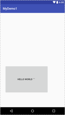
- android:gravity & android:layout_ gravity: android:gravity 是对view内部内容位置的限制;android:layout_ gravity是是设置控件在其父布局中的位置,示例Demo如下:
    <Button
        android:layout_width="wrap_content"
        android:layout_height="wrap_content"
        android:layout_gravity="bottom"
        android:gravity="bottom"
        android:text="hello world ``` "
        />
显示的效果如下:

从图中我们可以清楚的看到其区别。
- padding&margin :padding是定义控件自己的内容和控件边缘之间的距离;而margin是在说控件的四个边缘之外的距离,指的是和别的控件之间的距离。可见以下示例Demo:
     <Button
        android:layout_width="wrap_content"
        android:layout_height="wrap_content"
        android:layout_gravity="bottom"
        android:layout_margin="30dp"
        android:padding="80dp"
        android:text="hello world ``` "
        />
其显示效果如下:
从图中我们可以看到,layout_margin控制了控件和父布局的距离,padding控制了控件内容和控件的距离,更多的选项我们可以多尝试看看其效果。
通过这个示例我们也可以看出:属性前面加了layout_的基本都是控制控件与其父布局或者相对于其他控件之间的关系。
- layout_weight :顾名思义,它就是布局权重,只有在Linearlayout中,该属性才有效。我们通过以下代码对它有一个直观的认识.
<LinearLayout xmlns:android="http://schemas.android.com/apk/res/android"
              xmlns:tools="http://schemas.android.com/tools"
              android:layout_width="match_parent"
              android:layout_height="match_parent"
              android:orientation="horizontal"
             >
    <Button
        android:layout_width="0dp"
        android:layout_height="wrap_content"
        android:layout_weight="1"
        android:text="btn1 "
        />

    <Button
        android:layout_width="0dp"
        android:layout_height="wrap_content"
        android:layout_weight="2"
        android:text="btn2 "
        />

    <Button
        android:layout_width="100dp"
        android:layout_height="wrap_content"
        android:text="btn3  "
        />

</LinearLayout>
查看以上代码的显示如下图所示:
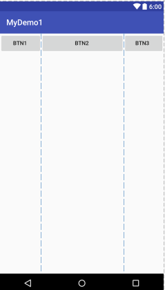
可以看出来,Button3只占据了100dp,其于两个Button按比例分了剩下屏幕,即分别占1/3和2/3。将android:layout_ width=”0dp”属性值换为wrap_content仍然如此。这是我们最常用的一种方式,墙裂推荐将其设为0dp即可!
然而,当我们将android:layout_ width=”0dp”属性值换为match_parent时情况似乎不是那么正常了,如下图所示:
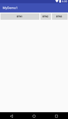
我们发现设置为1的weigh占据了2/3,而weight为2的却占据了1/3。那这又是为什么呢?
android:layout_weight的真实含义是:一旦View设置了该属性(有效的情况下),那么该 View的宽度等于原有宽度(android:layout_width)加上剩余空间的(自己)占比!
拿以上代码来说,Button1的原有宽度为1L,剩余空间的占比为1/3*(1L-2L),则Button1的宽度为1L+1/3*(1L-2L)=2/3L。同理,Button2的原有宽度为1L,剩余空间占比为2/3*(1L-2L),则Button2的宽度为1L+2/3*(1L-2L)=1/3L。(此时,原有宽度L=屏幕宽度-Button3的宽度,即总的可用宽度。)
根据以上结果我们可以应付大多数应用下的情况,但是理解还不够深入,请看以下代码:
    <Button
        android:id="@+id/btn1"
        android:layout_width="wrap_content"
        android:layout_height="wrap_content"
        android:layout_weight="1"
        android:text="btn1 "
        />

    <Button
        android:id="@+id/btn2"
        android:layout_width="wrap_content"
        android:layout_height="wrap_content"
        android:layout_weight="2000"
        android:text="btn2 "
        />
注意,我们将btn2的权重设置为了2000,根据之前的结论应该显示为btn1占了1/2001,btn2占了2000/2001,情况是这样吗?请看下图:
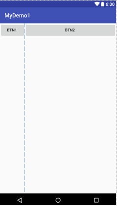
可以看到btn1并非只显示了1/2001,而是显示出了wrap_ content的效果,这就说明了:
在layout_width设置为fill_parent的时候,layout _ weight所代表的是你的控件要优先尽可能的小,但这个小是有限度的,即wrap_content.
同理,我们可以验证:
在layout_ width设置为match_ parent的时候,layout_ weight所代表的是你的控件要优先尽可能的大,但这个大是有限度的,即match_parent .
我们可以简单的认为 layout_ weight 的数字越小越优先。到这里,layout_ weight总算理解的比较全面了,各位童鞋可以自己试验、比较一下。
2、五大Layout的使用
Android中的基本布局方式有五种:LinearLayout、RelativeLayout、FrameLayout、TableLayout、AbsoluteLayout,其中线性布局和相对布局是实际开发中用得最多的;绝对布局由于布局太过僵硬、难以自适应,我们总是应该避免去使用它,在这里我们也不会对其进行讲解。
2.1 LinearLayout
线性布局,顾名思义控件在其中的排列顺序是线性的,即不是水平的就是垂直的,最典型的使用如下代码片段所示:
<LinearLayout xmlns:android="http://schemas.android.com/apk/res/android"
    android:layout_width="match_parent"
    android:layout_height="match_parent"
    android:orientation="vertical" >
    ...
</LinearLayout>
上面的2-4行是定义一个线性布局必须使用的属性,表示铺满父布局、控件竖直摆放。
2.2 RelativeLayout
相对布局,也是一种非常常用的布局,通过相对定位的方式可以让控件出现在布局中的任何位置,所以其属性也比较多,但仍然有很强的规律可循。
2.3 FrameLayout
帧布局,没有任何的定位方式,其内部控件都会摆放在布局的左上角(即从屏幕左上角坐标(0,0)开始布局)。它的应用场景也比较少,但是在一些情况下仍然很有用。
<FrameLayout xmlns:android="http://schemas.android.com/apk/res/android"
              xmlns:tools="http://schemas.android.com/tools"
              android:layout_width="match_parent"
              android:layout_height="match_parent">
    <Button
    android:id="@+id/btn1"
    android:layout_width="wrap_content"
    android:layout_height="120dp"
    android:text="btn1 "
    android:background="@color/colorAccent"
    />

    <Button
    android:id="@+id/btn2"
    android:layout_width="match_parent"
    android:layout_height="100dp"
    android:text="btn2"
    />
</FrameLayout>
显示如下:

2.4 TableLayout
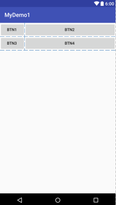
表格布局,与常见的表格相似,以行列的方式来管理放到其中的控件。 每一个TableLayout里面有表格行TableRow,TableRow里面可以具体定义每一个元素。这种布局同样不是很常用,因为我们可以用线性布局和相对布局可以非常方便的实现类似的UI,并且远比表格布局来的灵活。在此,仅对其做简单的介绍。
 <TableLayout
        android:layout_width="wrap_content"
        android:layout_height="wrap_content"
        android:stretchColumns="1"
        >

        <TableRow
            android:layout_width="wrap_content"
            android:layout_height="wrap_content"
            android:orientation="vertical">

            <Button
                android:id="@+id/btn1"
                android:layout_width="wrap_content"
                android:layout_height="wrap_content"
                android:layout_weight="1"
                android:text="btn1 "
                />

            <Button
                android:id="@+id/btn2"
                android:layout_width="match_parent"
                android:layout_height="wrap_content"
                android:layout_weight="150"
                android:text="btn2 "
                />
        </TableRow>

        <TableRow
            android:layout_width="match_parent"
            android:layout_height="wrap_content">

            <Button
                android:id="@+id/btn3"
                android:layout_width="wrap_content"
                android:layout_height="wrap_content"
                android:layout_weight="1"
                android:text="btn3 "
                />

            <Button
                android:id="@+id/btn4"
                android:layout_width="match_parent"
                android:layout_height="wrap_content"
                android:layout_weight="150"
                android:text="btn4 "
                />
        </TableRow>
 </LinearLayout>
只需要在每个TableRow标签之间添加我们需要的控件即可。上面布局显示如下图:
后记:
以上的几种布局我们仅仅了解了其一小部分,在实际的使用中能够完成大部分的布局。如果涉及到复杂的布局,可能就要深入的了解其原理甚至定制一部分特效。
MaterialDesign风格控件当中的CoordinatorLayout,其实就是一个加强型的FrameLayout,可以完成很多炫酷的效果,在之后的文章中我们也会分析这些较复杂的布局。我们只有打扎实根基才能实现更丰富、好看的UI特效。


 3132
3132


 被折叠的 条评论
为什么被折叠?
被折叠的 条评论
为什么被折叠?
 到【灌水乐园】发言


