


场景重现

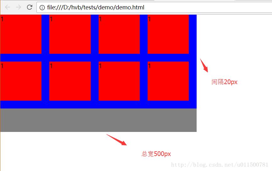
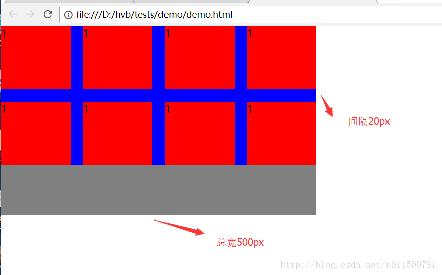
电商网站经常会出现如下布局来展示商品图片,每行4个,每个和每个之间有20px的距离,两端对齐,假设总宽度为500px
效果列举
失败效果
成功效果
代码示例
方法一:width: 25%; margin-right: -20px;
说明:每个大的item宽度25%,那么4个正好排成一行,item里面的div右边距20px,最后设置最大的包裹div右边距-20px,使右边界对齐
<!DOCTYPE html>
<html lang="en">
<head>
  <meta charset="UTF-8">
  <title>demo</title>
  <style>
    * {
        margin: 0;
        padding: 0;
    }
    body, html {
        width: 100%;
        height: 100%;
    }
    .ctn {
        width: 500px;
        height: 300px;
        background: grey;
    }
    .hidden {
        overflow: hidden;
    }
    .item-ctn {
        margin-right: -20px;
        margin-bottom: -20px;
        background: blue;
    }
    .item-ctn:after {
        content: '';
        display: block;
        clear: both;
    }
    .item {
        float: left;
        width: 25%;
        height: 100px;
        margin-bottom: 20px;
    }
    .item-ctx {
        margin-right: 20px;
        height: 100%;
        background: red;
    }
  </style>
</head>
<body>
    <div class="ctn">
        <div class="hidden">
            <div class="item-ctn">
                <div class="item">
                    <div class="item-ctx">
                        <p>1</p>
                    </div>
                </div>
                <div class="item">
                    <div class="item-ctx">
                        <p>1</p>
                    </div>
                </div>
                <div class="item">
                    <div class="item-ctx">
                        <p>1</p>
                    </div>
                </div>
                <div class="item">
                    <div class="item-ctx">
                        <p>1</p>
                    </div>
                </div>
                <div class="item">
                    <div class="item-ctx">
                        <p>1</p>
                    </div>
                </div>
                <div class="item">
                    <div class="item-ctx">
                        <p>1</p>
                    </div>
                </div>
                <div class="item">
                    <div class="item-ctx">
                        <p>1</p>
                    </div>
                </div>
                <div class="item">
                    <div class="item-ctx">
                        <p>1</p>
                    </div>
                </div>
            </div>
        </div>
    </div>
</body>
</html>方法二calc:width: calc((100% - 20px*3)/4); .item:nth-child(4n)
说明:使用css3新属性calc布局(注意不同浏览器的兼容前缀)
* 设置宽度
<style>
  * {
    margin: 0;
    padding: 0;
  }

  body,
  html {
    width: 100%;
    height: 100%;
  }

  .ctn {
    width: 500px;
    height: 300px;
    background: grey;
  }

  .hidden {
    overflow: hidden;
  }

  .item-ctn {
    margin-bottom: -20px;
    background: blue;
  }

  .item-ctn:after {
    content: '';
    display: block;
    clear: both;
  }

  .item {
    float: left;
    width: calc((100% - 20px*3)/4);
    margin-right: 20px;
    height: 100px;
    margin-bottom: 20px;
  }

  .item:nth-child(4n) {
    margin-right: 0;
  }

  .item-ctx {
    height: 100%;
    background: red;
  }
</style>方法三flex:display: flex; justify-content: space-between;
说明:使用flex布局,子元素间隔且两端对齐即可(注意不同浏览器的兼容前缀)
<style>
  * {
    margin: 0;
    padding: 0;
  }

  body,
  html {
    width: 100%;
    height: 100%;
  }

  .ctn {
    width: 500px;
    height: 300px;
    background: grey;
  }

  .hidden {
    overflow: hidden;
  }

  .item-ctn {
    margin-bottom: -20px;
    background: blue;
    /* 弹性盒子 */
    display: flex;
    /* 沿行轴线两端对齐,子元素之间有间隙 */
    justify-content: space-between;
    /* 子元素溢出父容器时换行 */
    flex-flow: row wrap;
  }

  .item {
    width: 110px;
    height: 100px;
    margin-bottom: 20px;
  }

  .item-ctx {
    height: 100%;
    background: red;
  }
</style>方法四grid:display: grid; justify-content: space-between;
说明:使用网格布局,子元素间隔且两端对齐即可(注意不同浏览器的兼容前缀)
<style>
  * {
    margin: 0;
    padding: 0;
  }

  body,
  html {
    width: 100%;
    height: 100%;
  }

  .ctn {
    width: 500px;
    height: 300px;
    background: grey;
  }

  .hidden {
    overflow: hidden;
  }

  .item-ctn {
    margin-bottom: -20px;
    background: blue;
    /* 网格布局 */
    display: grid;
    /* 定义网格的行和列 */
    grid-template: auto / 110px 110px 110px 110px;
    /* 沿行轴线两端对齐,子元素之间有间隙 */
    justify-content: space-between;
  }

  .item {
    width: 110px;
    height: 100px;
    margin-bottom: 20px;
  }

  .item-ctx {
    height: 100%;
    background: red;
  }
</style>


 1237
1237


 被折叠的 条评论
为什么被折叠?
被折叠的 条评论
为什么被折叠?
 到【灌水乐园】发言


