


这次的不纯,有几行js代码完成星空的随机分布。想直接拿走的老板,链接放在这里:https://download.csdn.net/download/u011561335/90490487
缘
创作随缘,不定时更新。
创作背景
刚看到csdn出活动了,赶时间,直接上代码。
html结构
<!DOCTYPE html>
<html lang="zh-CN">
<head>
    <meta charset="UTF-8">
    <meta name="viewport" content="width=device-width, initial-scale=1.0">
    <title>纯CSS星空闪烁动画</title>
    <link rel="stylesheet" href="styles.css">
</head>
<body>
    <div class="starry-sky"></div>
</body>
</html>
css样式
	body, html {
		margin: 0;
		padding: 0;
		width: 100%;
		height: 100%;
		overflow: hidden;
		background: linear-gradient(rgba(0, 0, 0, 0.85), rgba(0, 0, 0, 0.85)), url(b.gif) center / cover no-repeat;

	}

	.starry-sky {
		position: relative;
		width: 100%;
		height: 100%;
	}

	.star {
		position: absolute;
		width: 5px;
		height: 5px;
		border-radius: 50%;
		background: rgba(255, 255, 255, 0.8); /* 星星的颜色和透明度 */
		box-shadow:
			30vw 50vh #fff,
			70vw 20vh #fff,
			90vw 80vh #fff,
			50vw 90vh #fff,
			/* ... 可以继续添加更多box-shadow来生成更多星星 */
			;
		animation: twinkle 2s infinite, move 100s linear infinite;
	}

	/* 星星闪烁动画 */
	@keyframes twinkle {
		0%, 100% {
			opacity: 1;
		}
		50% {
			opacity: 0.5;
		}
	}

	/* 星星移动动画 */
	@keyframes move {
		0% {
			transform: translateY(0);
		}
		100% {
			transform: translateY(-100vh); /* 向上移动一个视窗高度 */
		}
	}

	/* 为了实现星星移动后无缝衔接,我们使用::after伪元素 */
	.star::after {
		content: "";
		position: absolute;
		top: 105vh; /* 初始位置在父元素下方 */
		left: 0;
		width: inherit;
		height: inherit;
		border-radius: inherit;
		background: inherit;
		box-shadow: inherit;
		animation: move 100s linear infinite;
	}
js代码
    document.addEventListener("DOMContentLoaded", function() {
        const starrySky = document.querySelector(".starry-sky");
        const starCount = 200; // 星星数量
        for (let i = 0; i < starCount; i++) {
            const star = document.createElement("div");
            star.classList.add("star");
            // 随机设置星星的位置
            star.style.left = `${Math.random() * 100}vw`;
            star.style.top = `${Math.random() * 100}vh`;
            star.style.animationDelay = `${Math.random() * 100}s`;
            starrySky.appendChild(star);
        }
    });
完整代码
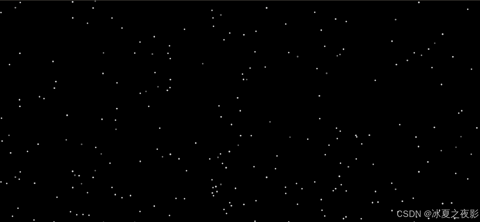
基础版
<!DOCTYPE html>
<html lang="zh-CN">
<head>
    <meta charset="UTF-8">
    <meta name="viewport" content="width=device-width, initial-scale=1.0">
    <title>纯CSS星空闪烁动画</title>
    <style>
	body, html {
		margin: 0;
		padding: 0;
		width: 100%;
		height: 100%;
		overflow: hidden;
		background: black; /* 设置背景为黑色,模拟夜空 */

	}

	.starry-sky {
		position: relative;
		width: 100%;
		height: 100%;
	}

	.star {
		position: absolute;
		width: 5px;
		height: 5px;
		border-radius: 50%;
		background: rgba(255, 255, 255, 0.8); /* 星星的颜色和透明度 */
		box-shadow:
			30vw 50vh #fff,
			70vw 20vh #fff,
			90vw 80vh #fff,
			50vw 90vh #fff,
			/* ... 可以继续添加更多box-shadow来生成更多星星 */
			;
		animation: twinkle 2s infinite, move 100s linear infinite;
	}

	/* 星星闪烁动画 */
	@keyframes twinkle {
		0%, 100% {
			opacity: 1;
		}
		50% {
			opacity: 0.5;
		}
	}

	/* 星星移动动画 */
	@keyframes move {
		0% {
			transform: translateY(0);
		}
		100% {
			transform: translateY(-100vh); /* 向上移动一个视窗高度 */
		}
	}

	/* 为了实现星星移动后无缝衔接,我们使用::after伪元素 */
	.star::after {
		content: "";
		position: absolute;
		top: 105vh; /* 初始位置在父元素下方 */
		left: 0;
		width: inherit;
		height: inherit;
		border-radius: inherit;
		background: inherit;
		box-shadow: inherit;
		animation: move 100s linear infinite;
	}

	</style>

</head>
<body>
    <div class="starry-sky"></div>
</body>

<script>
    document.addEventListener("DOMContentLoaded", function() {
        const starrySky = document.querySelector(".starry-sky");
        const starCount = 200; // 星星数量
        for (let i = 0; i < starCount; i++) {
            const star = document.createElement("div");
            star.classList.add("star");
            // 随机设置星星的位置
            star.style.left = `${Math.random() * 100}vw`;
            star.style.top = `${Math.random() * 100}vh`;
            star.style.animationDelay = `${Math.random() * 100}s`;
            starrySky.appendChild(star);
        }
    });
</script>

</html>
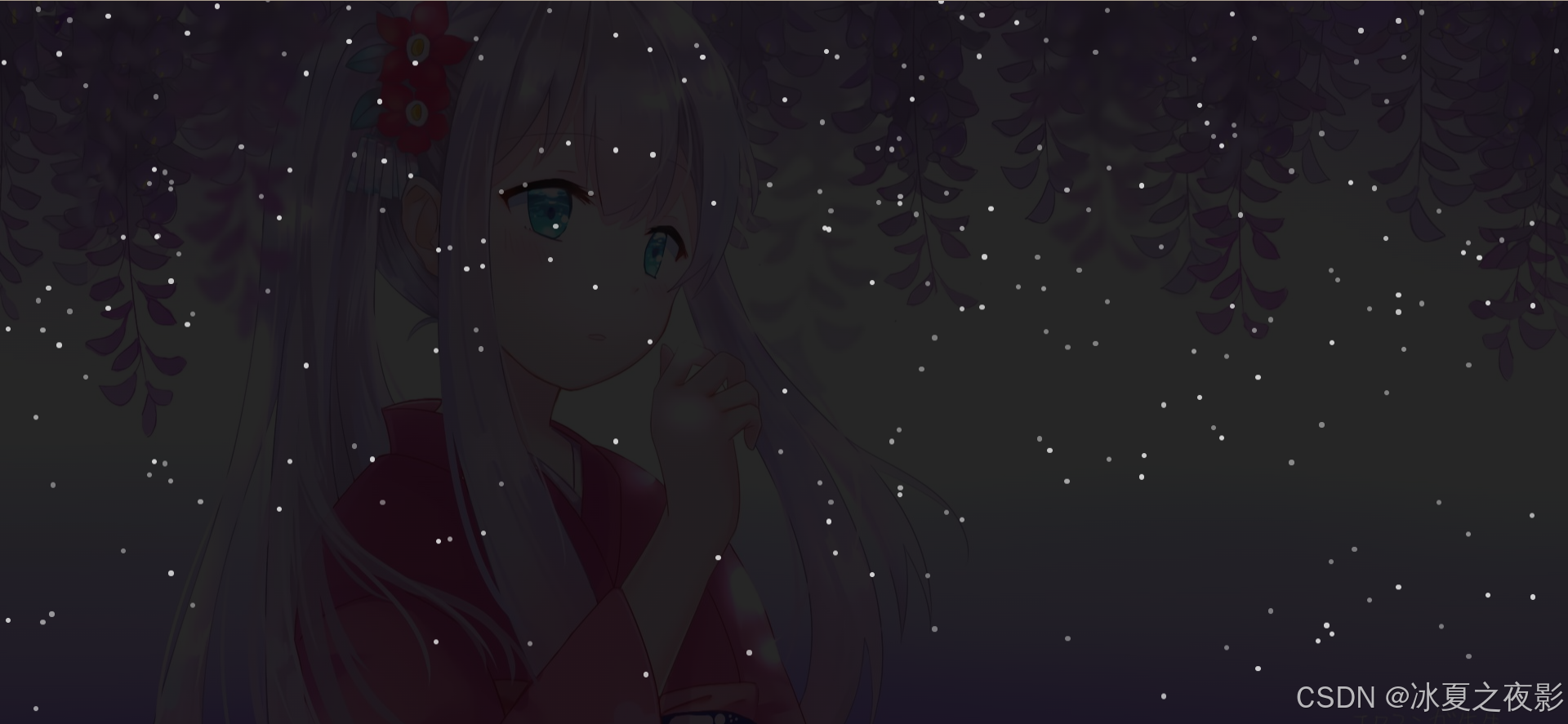
进阶版(女友星空版)
<!DOCTYPE html>
<html lang="zh-CN">
<head>
    <meta charset="UTF-8">
    <meta name="viewport" content="width=device-width, initial-scale=1.0">
    <title>纯CSS星空闪烁动画</title>
    <style>
	body, html {
		margin: 0;
		padding: 0;
		width: 100%;
		height: 100%;
		overflow: hidden;
		background: linear-gradient(rgba(0, 0, 0, 0.85), rgba(0, 0, 0, 0.85)), url(b.gif) center / cover no-repeat;

	}

	.starry-sky {
		position: relative;
		width: 100%;
		height: 100%;
	}

	.star {
		position: absolute;
		width: 5px;
		height: 5px;
		border-radius: 50%;
		background: rgba(255, 255, 255, 0.8); /* 星星的颜色和透明度 */
		box-shadow:
			30vw 50vh #fff,
			70vw 20vh #fff,
			90vw 80vh #fff,
			50vw 90vh #fff,
			/* ... 可以继续添加更多box-shadow来生成更多星星 */
			;
		animation: twinkle 2s infinite, move 100s linear infinite;
	}

	/* 星星闪烁动画 */
	@keyframes twinkle {
		0%, 100% {
			opacity: 1;
		}
		50% {
			opacity: 0.5;
		}
	}

	/* 星星移动动画 */
	@keyframes move {
		0% {
			transform: translateY(0);
		}
		100% {
			transform: translateY(-100vh); /* 向上移动一个视窗高度 */
		}
	}

	/* 为了实现星星移动后无缝衔接,我们使用::after伪元素 */
	.star::after {
		content: "";
		position: absolute;
		top: 105vh; /* 初始位置在父元素下方 */
		left: 0;
		width: inherit;
		height: inherit;
		border-radius: inherit;
		background: inherit;
		box-shadow: inherit;
		animation: move 100s linear infinite;
	}

	</style>

</head>
<body>
    <div class="starry-sky"></div>
</body>

<script>
    document.addEventListener("DOMContentLoaded", function() {
        const starrySky = document.querySelector(".starry-sky");
        const starCount = 200; // 星星数量
        for (let i = 0; i < starCount; i++) {
            const star = document.createElement("div");
            star.classList.add("star");
            // 随机设置星星的位置
            star.style.left = `${Math.random() * 100}vw`;
            star.style.top = `${Math.random() * 100}vh`;
            star.style.animationDelay = `${Math.random() * 100}s`;
            starrySky.appendChild(star);
        }
    });
</script>

</html>
效果图


 扫一扫
扫一扫


 1210
1210

 被折叠的 条评论
为什么被折叠?
被折叠的 条评论
为什么被折叠?
 到【灌水乐园】发言


