


想直接拿走的老板,链接放在这里:上传后更新
缘
创作随缘,不定时更新。
创作背景
刚看到csdn出活动了,赶时间,直接上代码。
html结构
<div class="ferris-wheel">
  <div class="axis"></div>
  <div class="pod"></div>
  <div class="pod"></div>
  <div class="pod"></div>
  <div class="pod"></div>
</div>
css样式
.ferris-wheel {
  width: 300px;
  height: 300px;
  position: relative;
  border: 2px dashed #999;
  border-radius: 50%;
}
.axis {
  width: 20px;
  height: 20px;
  background: #444;
  border-radius: 50%;
  position: absolute;
  top: 50%;
  left: 50%;
  transform: translate(-50%, -50%);
}
.pod {
  width: 40px;
  height: 40px;
  background: #f00;
  position: absolute;
  top: 0;
  left: 43%;
  transform-origin: 50% 150px; /* 关键属性 */
}
.pod:nth-child(2) { transform: rotate(0deg); }
.pod:nth-child(3) { transform: rotate(90deg); }
.pod:nth-child(4) { transform: rotate(180deg); }
.pod:nth-child(5) { transform: rotate(270deg); }
@keyframes rotate {
  from { transform: rotate(0deg); }
  to { transform: rotate(360deg); }
}

.ferris-wheel {
  animation: rotate 8s linear infinite;
}
.pod {
  transform: rotate(var(--angle)) translateY(0) rotate(calc(-1 * var(--angle)));
}
完整代码
基础版
<!DOCTYPE html>
<html lang="en">
<head>

<title>页面特效</title>
<style type="text/css">
.ferris-wheel {
  width: 300px;
  height: 300px;
  position: relative;
  border: 2px dashed #999;
  border-radius: 50%;
}
.axis {
  width: 20px;
  height: 20px;
  background: #444;
  border-radius: 50%;
  position: absolute;
  top: 50%;
  left: 50%;
  transform: translate(-50%, -50%);
}
.pod {
  width: 40px;
  height: 40px;
  background: #f00;
  position: absolute;
  top: 0;
  left: 43%;
  transform-origin: 50% 150px; /* 关键属性 */
}
.pod:nth-child(2) { transform: rotate(0deg); }
.pod:nth-child(3) { transform: rotate(90deg); }
.pod:nth-child(4) { transform: rotate(180deg); }
.pod:nth-child(5) { transform: rotate(270deg); }
@keyframes rotate {
  from { transform: rotate(0deg); }
  to { transform: rotate(360deg); }
}

.ferris-wheel {
  animation: rotate 8s linear infinite;
}
.pod {
  transform: rotate(var(--angle)) translateY(0) rotate(calc(-1 * var(--angle)));
}
</style>

</head>
<body>

<div class="ferris-wheel">
  <div class="axis"></div>
  <div class="pod"></div>
  <div class="pod"></div>
  <div class="pod"></div>
  <div class="pod"></div>
</div>

</body>
</html>
进阶版(鼠标控制移动)
<!DOCTYPE html>
<html lang="en">
<head>

<title>页面特效</title>
<style type="text/css">
.ferris-wheel {
  width: 300px;
  height: 300px;
  position: relative;
  border: 2px dashed #999;
  border-radius: 50%;
}
.axis {
  width: 20px;
  height: 20px;
  background: #444;
  border-radius: 50%;
  position: absolute;
  top: 50%;
  left: 50%;
  transform: translate(-50%, -50%);
}
.pod {
  width: 40px;
  height: 40px;
  background: #f00;
  position: absolute;
  top: 0;
  left: 43%;
  transform-origin: 50% 150px; /* 关键属性 */
}
.pod:nth-child(2) { transform: rotate(0deg); }
.pod:nth-child(3) { transform: rotate(90deg); }
.pod:nth-child(4) { transform: rotate(180deg); }
.pod:nth-child(5) { transform: rotate(270deg); }
@keyframes rotate {
  from { transform: rotate(0deg); }
  to { transform: rotate(360deg); }
}

.ferris-wheel {
  animation: rotate 8s linear infinite;
}
.pod {
  transform: rotate(var(--angle)) translateY(0) rotate(calc(-1 * var(--angle)));
}

.ferris-wheel:hover {
  animation-play-state: paused;
}

</style>

</head>
<body>

<div class="ferris-wheel">
  <div class="axis"></div>
  <div class="pod"></div>
  <div class="pod"></div>
  <div class="pod"></div>
  <div class="pod"></div>
</div>

</body>
</html>
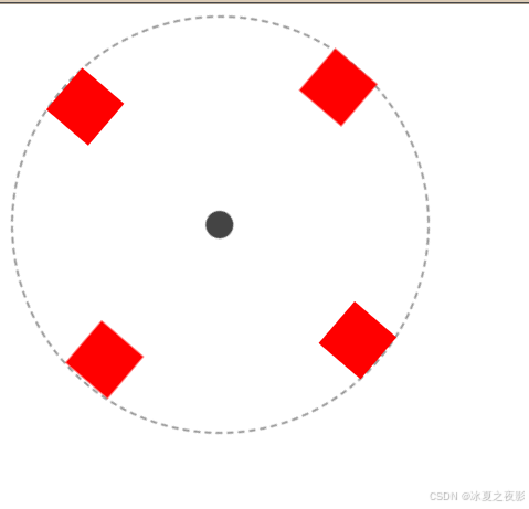
效果图


 扫一扫
扫一扫


 被折叠的 条评论
为什么被折叠?
被折叠的 条评论
为什么被折叠?
 到【灌水乐园】发言


