


最近无意中看到钉钉这个App,发现联系人详情这个界面的效果还是蛮好看的。正好最近在看Material Design,所以想看看可不可用Android系统原生的来实现这种效果。
先看效果图:
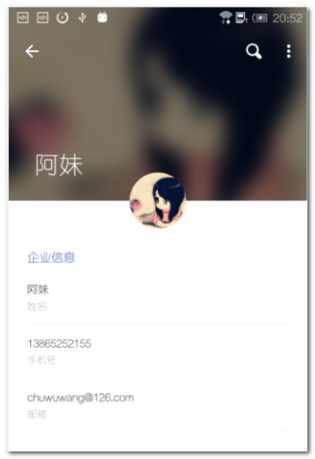
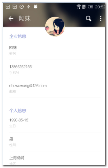
这是有一个推滑的特效的,在钉钉上有一个头像联动的效果,这个暂时没有实现,有点区别。
主要特点:
1.名字大小的缩放
2.圆形头像的固定
3.背景的模糊效果
4.下面详情的推滑效果
以上的效果都是用Material Design自带的元素来实现的,看起来还是蛮不错的。看下布局文件:
<?xml version="1.0" encoding="utf-8"?>
<android.support.design.widget.CoordinatorLayout xmlns:android="http://schemas.android.com/apk/res/android"
    xmlns:app="http://schemas.android.com/apk/res-auto"
    android:layout_width="match_parent"
    android:layout_height="match_parent"
    android:clipToPadding="true"
    android:fitsSystemWindows="true">

    <android.support.design.widget.AppBarLayout
        android:id="@+id/appBarLayout"
        android:layout_width="match_parent"
        android:layout_height="@dimen/dp700"
        android:fitsSystemWindows="true"
        android:orientation="vertical"
        android:theme="@style/ThemeOverlay.AppCompat.Dark.ActionBar">

        <android.support.design.widget.CollapsingToolbarLayout
            android:id="@+id/collapsingToolbarLayout"
            android:layout_width="match_parent"
            android:layout_height="match_parent"
            android:fitsSystemWindows="true"
            app:layout_scrollFlags="scroll|exitUntilCollapsed">

            <ImageView
                android:id="@+id/imageView_bg"
                android:layout_width="match_parent"
                android:layout_height="match_parent"
                android:contentDescription="@null"
                android:fitsSystemWindows="true"
                android:scaleType="centerCrop"
                app:layout_collapseMode="parallax"
                app:layout_collapseParallaxMultiplier="0.6" />

            <ImageView
                android:layout_width="match_parent"
                android:layout_height="match_parent"
                android:background="#80000000"
                android:contentDescription="@null"
                android:fitsSystemWindows="true"
                android:scaleType="centerCrop"
                app:layout_collapseMode="parallax"
                app:layout_collapseParallaxMultiplier="0.6" />

            <android.support.v7.widget.Toolbar
                android:id="@+id/toolbar"
                android:layout_width="match_parent"
                android:layout_height="?attr/actionBarSize"
                app:layout_collapseMode="pin" />

        </android.support.design.widget.CollapsingToolbarLayout>

    </android.support.design.widget.AppBarLayout>

    <android.support.design.widget.FloatingActionButton
        android:id="@+id/floatingActionButton"
        android:layout_width="@dimen/dp300"
        android:layout_height="@dimen/dp300"
        android:background="@android:color/transparent"
        app:borderWidth="0dp"
        app:layout_anchor="@id/collapsingToolbarLayout"
        app:layout_anchorGravity="bottom|center_horizontal" />

    <android.support.v4.widget.NestedScrollView
        android:layout_width="match_parent"
        android:layout_height="wrap_content"
        app:layout_behavior="@string/appbar_scrolling_view_behavior">

        <LinearLayout
            android:layout_width="match_parent"
            android:layout_height="match_parent"
            android:layout_marginEnd="@dimen/dp68"
            android:layout_marginStart="@dimen/dp68"
            android:paddingBottom="@dimen/dp300"
            android:orientation="vertical">

            <TextView
                android:layout_width="wrap_content"
                android:layout_height="wrap_content"
                android:paddingTop="@dimen/dp100"
                android:text="@string/company_info"
                android:textColor="#3E50B4"
                android:textSize="@dimen/sp50" />

            <TextView
                android:id="@+id/textView_name"
                android:layout_width="wrap_content"
                android:layout_height="wrap_content"
                android:layout_marginTop="@dimen/dp60"
                android:textColor="#333333"
                android:textSize="@dimen/sp45" />

            <TextView
                android:layout_width="wrap_content"
                android:layout_height="wrap_content"
                android:layout_marginTop="@dimen/dp10"
                android:text="@string/contacts_name"
                android:textColor="#b7b7b7"
                android:textSize="@dimen/sp40" />

            <View
                android:layout_width="match_parent"
                android:layout_height="1px"
                android:layout_marginTop="@dimen/dp40"
                android:background="#ececec" />

            <TextView
                android:id="@+id/textView_phone"
                android:layout_width="wrap_content"
                android:layout_height="wrap_content"
                android:layout_marginTop="@dimen/dp40"
                android:textColor="#222222"
                android:textSize="@dimen/sp45" />

            <TextView
                android:layout_width="wrap_content"
                android:layout_height="wrap_content"
                android:layout_marginTop="@dimen/dp10"
                android:text="@string/contacts_phone"
                android:textColor="#b7b7b7"
                android:textSize="@dimen/sp40" />

            <View
                android:layout_width="match_parent"
                android:layout_height="1px"
                android:layout_marginTop="@dimen/dp40"
                android:background="#ececec" />

            <TextView
                android:id="@+id/textView_email"
                android:layout_width="wrap_content"
                android:layout_height="wrap_content"
                android:layout_marginTop="@dimen/dp40"
                android:textColor="#222222"
                android:textSize="@dimen/sp45" />

            <TextView
                android:layout_width="wrap_content"
                android:layout_height="wrap_content"
                android:layout_marginTop="@dimen/dp10"
                android:text="@string/contacts_email"
                android:textColor="#b7b7b7"
                android:textSize="@dimen/sp40" />

            <View
                android:layout_width="match_parent"
                android:layout_height="1px"
                android:layout_marginTop="@dimen/dp40"
                android:background="#ececec" />

            <TextView
                android:layout_width="wrap_content"
                android:layout_height="wrap_content"
                android:layout_marginTop="@dimen/dp100"
                android:text="@string/person_info"
                android:textColor="#3E50B4"
                android:textSize="@dimen/sp50" />

            <TextView
                android:id="@+id/textView_birthday"
                android:layout_width="wrap_content"
                android:layout_height="wrap_content"
                android:layout_marginTop="@dimen/dp40"
                android:textColor="#222222"
                android:textSize="@dimen/sp45" />

            <TextView
                android:layout_width="wrap_content"
                android:layout_height="wrap_content"
                android:layout_marginTop="@dimen/dp10"
                android:text="@string/contacts_birthday"
                android:textColor="#b7b7b7"
                android:textSize="@dimen/sp40" />

            <View
                android:layout_width="match_parent"
                android:layout_height="1px"
                android:layout_marginTop="@dimen/dp40"
                android:background="#ececec" />

            <TextView
                android:id="@+id/textView_sex"
                android:layout_width="wrap_content"
                android:layout_height="wrap_content"
                android:layout_marginTop="@dimen/dp40"
                android:textColor="#222222"
                android:textSize="@dimen/sp45" />

            <TextView
                android:layout_width="wrap_content"
                android:layout_height="wrap_content"
                android:layout_marginTop="@dimen/dp10"
                android:text="@string/contacts_sex"
                android:textColor="#b7b7b7"
                android:textSize="@dimen/sp40" />

            <View
                android:layout_width="match_parent"
                android:layout_height="1px"
                android:layout_marginTop="@dimen/dp40"
                android:background="#ececec" />

            <TextView
                android:id="@+id/textView_address"
                android:layout_width="wrap_content"
                android:layout_height="wrap_content"
                android:layout_marginTop="@dimen/dp40"
                android:textColor="#222222"
                android:textSize="@dimen/sp45" />

            <TextView
                android:layout_width="wrap_content"
                android:layout_height="wrap_content"
                android:layout_marginTop="@dimen/dp10"
                android:text="@string/contacts_address"
                android:textColor="#b7b7b7"
                android:textSize="@dimen/sp40" />

            <View
                android:layout_width="match_parent"
                android:layout_height="1px"
                android:layout_marginTop="@dimen/dp40"
                android:background="#ececec" />

        </LinearLayout>

    </android.support.v4.widget.NestedScrollView>

</android.support.design.widget.CoordinatorLayout>
中间的圆形图像是用FloatingActionButton控件来实现的,需要把背景设置为透明,把边线设置为0。
        android:background="@android:color/transparent"
        app:borderWidth="0dp"
上面可以滑动的模块就是CollapsingToolbarLayout控件,但是必须要用AppBarLayout组件包住,模糊的背景就是一个ImageView,固定的导航栏就是Toolbar。下面的可滑动的具体内容就是NestedScrollView控件,就相当于一个ScrollView。
背景图片的模糊 我们的图片是从网络下载下来的,需要下载图片,在做模糊处理。这里用的加载图片是Picasso,它有一个转化器。具体代码:
    Picasso.with(getApplicationContext())
                    .load(contactsInfo.getImgSrc())
                    .transform(new BlurTransformation())
                    .placeholder(R.drawable.default_pic)
                    .error(R.drawable.default_pic)
                    .into(mImageViewBg);
    /**
     * 模糊转换
     */
    class BlurTransformation implements Transformation {

        public BlurTransformation() {
            super();
        }

        @Override
        public Bitmap transform(Bitmap bitmap) {
            return PictureUtil.blurBitmap(getApplicationContext(), bitmap, 15f);
        }

        @Override
        public String key() {
            return "blur";
        }

    }

    /**
     * 图片模糊
     */
    public static Bitmap blurBitmap(Context context, Bitmap bitmap, float blur) {

        //Let's create an empty bitmap with the same size of the bitmap we want to blur
        Bitmap outBitmap = Bitmap.createBitmap(bitmap.getWidth(), bitmap.getHeight(), Bitmap.Config.ARGB_8888);

        //Instantiate a new Renderscript
        RenderScript rs = RenderScript.create(context.getApplicationContext());

        //Create an Intrinsic Blur Script using the Renderscript
        ScriptIntrinsicBlur blurScript = ScriptIntrinsicBlur.create(rs, Element.U8_4(rs));

        //Create the Allocations (in/out) with the Renderscript and the in/out bitmaps
        Allocation allIn = Allocation.createFromBitmap(rs, bitmap);
        Allocation allOut = Allocation.createFromBitmap(rs, outBitmap);

        //Set the radius of the blur
        blurScript.setRadius(blur);

        //Perform the Renderscript
        blurScript.setInput(allIn);
        blurScript.forEach(allOut);

        //Copy the final bitmap created by the out Allocation to the outBitmap
        allOut.copyTo(outBitmap);

        //recycle the original bitmap
        bitmap.recycle();

        //After finishing everything, we destroy the Renderscript.
        rs.destroy();

        return outBitmap;
}CollapsingToolbarLayout作用是提供了一个可以折叠的Toolbar,它继承至FrameLayout,给它设置layout_scrollFlags,它可以控制包含在CollapsingToolbarLayout中的控件(如:ImageView、Toolbar)在响应layout_behavior事件时作出相应的scrollFlags滚动事件(移除屏幕或固定在屏幕顶端)。
在CollapsingToolbarLayout中,我们设置了layout_scrollFlags的值,关于它的值我这里再说一下:
scroll - 想滚动就必须设置这个。
enterAlways - 实现quick return效果, 当向下移动时,立即显示View(比如Toolbar)。
exitUntilCollapsed - 向上滚动时收缩View,但可以固定Toolbar一直在上面。
enterAlwaysCollapsed - 当你的View已经设置minHeight属性又使用此标志时,你的View只能以最小高度进入,只有当滚动视图到达顶部时才扩大到完整高度。
其中还设置了一些属性,简要说明一下:
app:contentScrim - 设置当完全CollapsingToolbarLayout折叠(收缩)后的背景颜色。
app:expandedTitleMarginStart - 设置扩张时候(还没有收缩时)title向左填充的距离。
app:layout_collapseMode(折叠模式),app:layout_collapseMode的属性在CollapsingToolbarLayout中定义,在CollapsingToolbarLayout的子视图中使用。
pin - 设置为这个模式时,当CollapsingToolbarLayout完全收缩后,Toolbar还可以保留在屏幕上。
parallax - 设置为这个模式时,在内容滚动时,CollapsingToolbarLayout中的View(比如ImageView)也可以同时滚动,实现视差滚动效果,通常和layout_collapseParallaxMultiplier(设置视差因子)搭配使用。这里的滚动视觉差,意思就是,你设置了0,那么就会图片一起滚动,你设置了1,那么图片是不会滚动的。
layout_collapseParallaxMultiplier(视差因子) - 设置视差滚动因子,值为:0~1。
使用CollapsingToolbarLayout时必须把title设置到CollapsingToolbarLayout上,设置到Toolbar上不会显示。即:
mCollapsingToolbarLayout.setTitle(” “);
该变title的字体颜色:
扩张时候的title颜色:mCollapsingToolbarLayout.setExpandedTitleColor();
收缩后在Toolbar上显示时的title的颜色:mCollapsingToolbarLayout.setCollapsedTitleTextColor();
        Toolbar mToolbar = (Toolbar) findViewById(R.id.toolbar);
        setSupportActionBar(mToolbar);
        getSupportActionBar().setDisplayHomeAsUpEnabled(true);
        mToolbar.setNavigationOnClickListener(new View.OnClickListener() {
            @Override
            public void onClick(View v) {
                onBackPressed();
            }
        });
        CollapsingToolbarLayout mCollapsingToolbarLayout = (CollapsingToolbarLayout) findViewById(R.id.collapsing_toolbar_layout);
        mCollapsingToolbarLayout.setTitle("leeshenzhou");
        mCollapsingToolbarLayout.setExpandedTitleColor(Color.WHITE);//设置还没收缩时状态下字体颜色
        mCollapsingToolbarLayout.setCollapsedTitleTextColor(Color.GREEN);//设置收缩后Toolbar上字体的颜色
我们可以看到有一个FloatingActionButton,可以随着CollapseToolbarLayout一起滚动。这个是通过CoordinatorLayout 的layout_anchor来实现的。悬浮视图使用它以后,CoordinatorLayout会把悬浮视图和设置的视图绑定在一起。可以通过layout_anchorGravity来来控制所在的位置。
使用CollapsingToolbarLayout实现折叠效果,需要注意几点:
1.AppBarLayout的高度固定。
2.CollapsingToolbarLayout的子视图设置layout_collapseMode属性,如果想要Toolbar固定,那么一定要设置Toolbar为pin模式。但是parallax其实不需要的,因为滚动这个效果,是CollaspingToolbarLayout实现的。子View设置,只是让子View跟着滚动而已。
3.关联悬浮视图设置app:layout_anchor,app:layout_anchorGravity属性。
4.另外标题内容是在CollapseToolbarLayout实现的,而不是Toolbar,滑动以后,标题内容固定在顶部是
CollapseToolbarLayout内部实现的,这个和是否设置了layout_collapseMode有关的。
5.移除Toolbar导航条的背景色,在xml中加上android:background=”?attr/colorPrimary”。
6.CollapsingToolbarLayout收起来变成普通的颜色,在xml中加上app:contentScrim=”?attr/colorPrimary”。去掉就是CollapsingToolbarLayout自己的背景色。
代码下载:https://github.com/chuwuwang/OnTheWay
代码正在修改中,效果请切换1.2.0 tag查看。


 1204
1204

 被折叠的 条评论
为什么被折叠?
被折叠的 条评论
为什么被折叠?
 到【灌水乐园】发言


