


这就是传说中的伸缩盒模型:Flexible Box:display:flex或者display:inline-flex,对于兼容IE:加-ms-前缀,对于兼容Safari:加-webkit-前缀。
等下要演示的相关属性有:flex,flex-basis,flex-direction,flex-wrap,flex-grow,flex-shrink,flex-flow,order,align-items,align-self,justify-content,好了,下面就是见证奇迹的时刻!
网上找来的浏览器对于伸缩盒模型的兼容图:
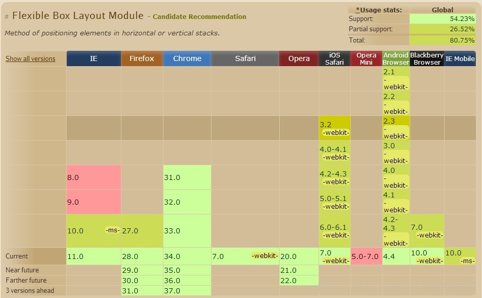
看上去兼容性好像很不错的样子是不是?^_^
下面是各种demo的展示环节:
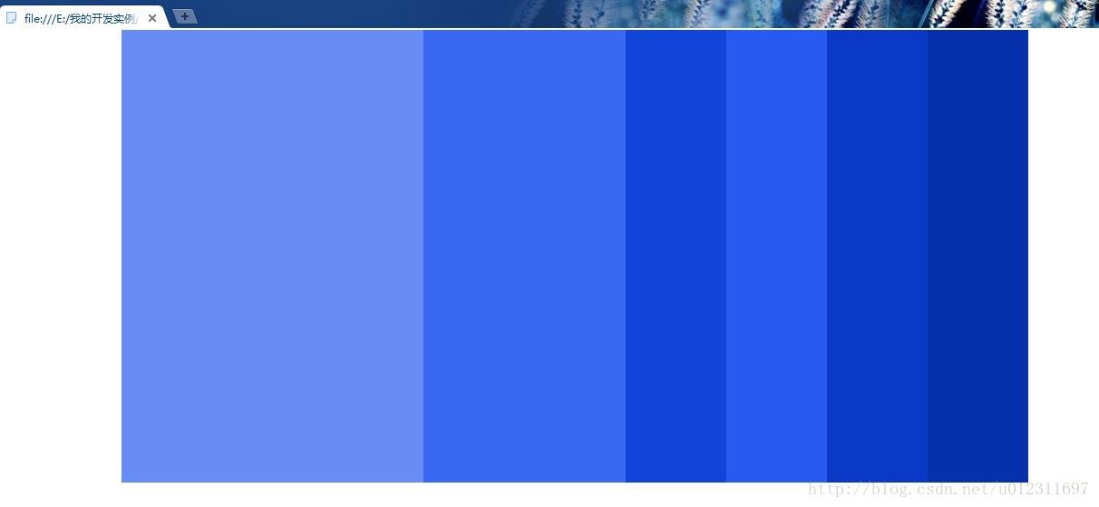
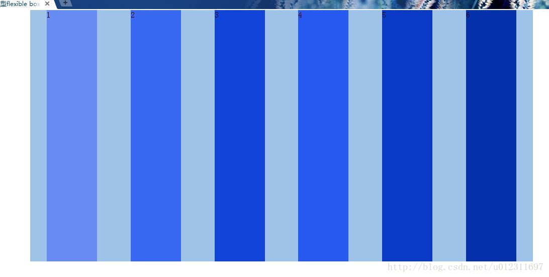
1.flex属性,其值一般设为数字。
下面是一个demo1:
<!doctype html>
<html>
<head>
<style type="text/css">
*{margin: 0;padding: 0;}
.container{
	display: flex;
	width: 1000px;
	height: 500px;
	background-color: #9fc2e9;
	margin:0 auto;
}
.item1{
	flex:1;
	background-color: #678cf4;
}
.item2{
	flex:1;
	background-color: #3969f3;
}
.item3{
	flex:1;
	background-color: #1145d9;
}
.item4{
	flex:1;
	background-color: #265af0;
}
.item5{
	flex:1;
	background-color: #0a3ac5;
}
.item6{
	flex:1;
	background-color: #0531ac;
}
</style>
</head>
<body>
<div class="container">
	<div class="item item1"></div>
	<div class="item item2"></div>
	<div class="item item3"></div>
	<div class="item item4"></div>
	<div class="item item5"></div>
	<div class="item item6"></div>
</div>
</body>
</html>

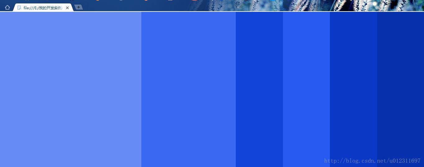
当然,大多时候我们不一定会希望它们均匀地分布,那么怎么将它们的各自所占有的空间自定义呢?这就是flex的一大好处:我们直接在数字上修改就好了:
我们将demo1中的.item1和.item2样式改为:
.item1{
	flex:3;
	background-color: #678cf4;
}
.item2{
	flex:2;
	background-color: #3969f3;
}
有时候我们需要整个container充满屏幕,那么只要把.container的样式改为:
.container{
	display: flex;
	width: 100%;
	height: 500px;
	background-color: #9fc2e9;
	margin:0 auto;
}
2.flex-basis属性,其值一般为一个长度单位或者一个百分比,规定灵活项目的初始长度。
我们将demo1中的.item1的样式改为:
.item1{
	flex-basis:100px;
	background-color: #678cf4;
}3.flex-direction属性,其值为row(默认值。灵活的项目将水平显示)|row-reverse(与 row 相同水平显示,但是以相反的顺序)|column(灵活的项目将垂直显示)|column-reverse(与 column 相同垂直显示,但是以相反的顺序)
3.1. flex-direction:row效果与demo1相同,这里就不累述了。
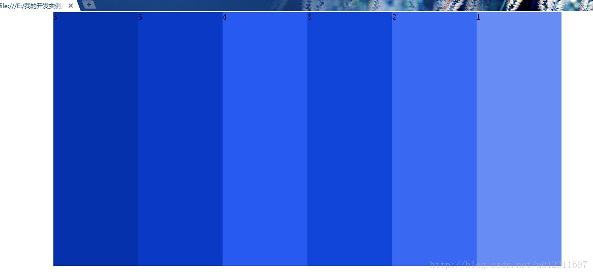
3.2. flex-direction:row-reverse(我们把这个叫做demo2好了,以区分上面的demo1代码段):
<!doctype html>
<html>
<head>
<style type="text/css">
*{margin: 0;padding: 0;}
.container{
	display: flex;
	flex-direction: row-reverse;
	width: 1000px;
	height: 500px;
	background-color: #9fc2e9;
	margin:0 auto;
}
.item1{
	flex:1;
	background-color: #678cf4;
}
.item2{
	flex:1;
	background-color: #3969f3;
}
.item3{
	flex:1;
	background-color: #1145d9;
}
.item4{
	flex:1;
	background-color: #265af0;
}
.item5{
	flex:1;
	background-color: #0a3ac5;
}
.item6{
	flex:1;
	background-color: #0531ac;
}
</style>
</head>
<body>
<div class="container">
	<div class="item item1">1</div>
	<div class="item item2">2</div>
	<div class="item item3">3</div>
	<div class="item item4">4</div>
	<div class="item item5">5</div>
	<div class="item item6">6</div>
</div>
</body>
</html>下面是演示的效果(注意数字是6,5,4,3,2,1):
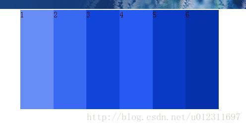
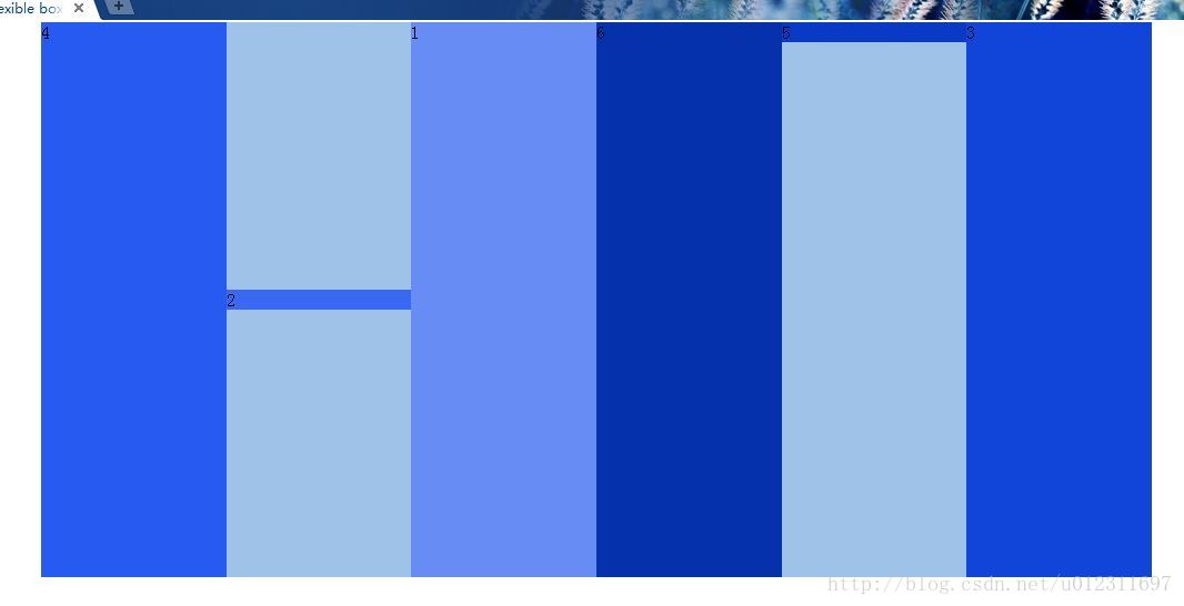
3.3. flex-direction:column
下面是演示的效果(注意数字):

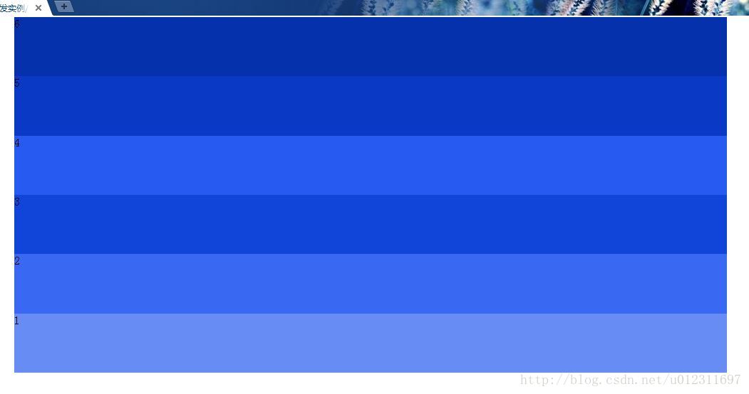
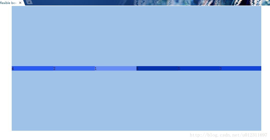
3.4. flex-direction:column-reverse
下面是演示的效果(注意数字6,5,4,3,2,1):
4.1. flex-wrap:nowrap(这里我们新建一个demo3,width设为400px,height设为200px,每个item设为100px):
<!doctype html>
<html>
<head>
<style type="text/css">
*{margin: 0;padding: 0;}
.container{
	display: flex;
	width: 400px;
	height: 200px;
	background-color: #9fc2e9;
	margin:0 auto;
}
.item1{
	width:100px;
	background-color: #678cf4;
}
.item2{
	width:100px;
	background-color: #3969f3;
}
.item3{
	width:100px;
	background-color: #1145d9;
}
.item4{
	width:100px;
	background-color: #265af0;
}
.item5{
	width:100px;
	background-color: #0a3ac5;
}
.item6{
	width:100px;
	background-color: #0531ac;
}
</style>
</head>
<body>
<div class="container">
	<div class="item item1">1</div>
	<div class="item item2">2</div>
	<div class="item item3">3</div>
	<div class="item item4">4</div>
	<div class="item item5">5</div>
	<div class="item item6">6</div>
</div>
</body>
</html>
下面是演示的效果:
Oh,my LadyGaga!我们发现虽然每个item是100px,但是在 flex-wrap:nowrap属性强大的作用下,item的大小自适应了
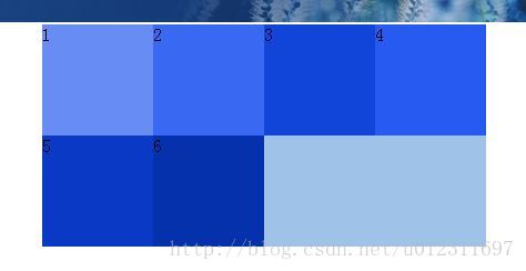
4.2. flex-wrap:wrap:我们只需要给dmeo3的.container加上flex-wrap:wrap属性即可
下面是显示的效果:
4.3. flex-wrap:wrap-reverse就是排序相反,这里不累述了。
5.flex-grow属性:规定项目将相对于其他灵活的项目进行扩展的量。如其他item的flex:1除了.item2的flex-grow:3,则.item2是其他的item的3倍大。
6.flex-shrink属性:规定项目将相对于其他灵活的项目进行收缩的量。如其他item的flex:1除了.item2的flex-shrink:3,则.item2是其他的item的1/3倍大。
7.flex-flow属性:是 flex-direction 和 flex-wrap 属性的速记属性。如:flex-flow:row-reserve wrap的效果与flex-direction:row-reserve;flex-wrap:wrap的效果相同。
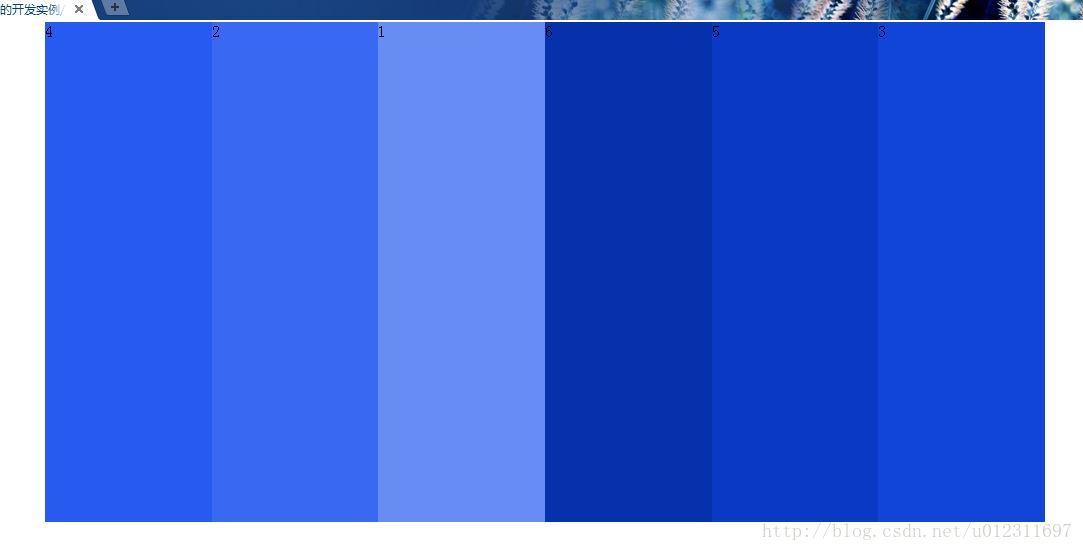
8.order属性:规定一个灵活的项目相对于同一容器内其他灵活项目的顺序,其值一般为数字
这是一个demo4,注意里面的每个item都规定了自己的排列顺序:
<!doctype html>
<html>
<head>
<style type="text/css">
*{margin: 0;padding: 0;}
.container{
	display: flex;
	width: 1000px;
	height: 500px;
	background-color: #9fc2e9;
	margin:0 auto;
}
.item1{
	flex:1;
	order: 3;
	background-color: #678cf4;
}
.item2{
	flex:1;
	order: 2;
	background-color: #3969f3;
}
.item3{
	flex:1;
	order: 6;
	background-color: #1145d9;
}
.item4{
	flex:1;
	order: 1;
	background-color: #265af0;
}
.item5{
	flex:1;
	order: 5;
	background-color: #0a3ac5;
}
.item6{
	flex:1;
	order: 4;
	background-color: #0531ac;
}
</style>
</head>
<body>
<div class="container">
	<div class="item item1">1</div>
	<div class="item item2">2</div>
	<div class="item item3">3</div>
	<div class="item item4">4</div>
	<div class="item item5">5</div>
	<div class="item item6">6</div>
</div>
</body>
</html>
9.aligin-items属性:规定灵活容器内的各项的默认对齐方式,其值可以为:stretch(默认值。项目被拉伸以适应容器)|center(项目位于容器的中心)|flex-start(项目位于容器的开头)|flex-end(项目位于容器的结尾)|baseline(项目位于容器的基线上)
我们在demo4的基础上给.container加上属性:align-items:center;那么效果会怎么样呢?
下面是演示的效果(我们发现项目居中了,而且项目的高度是随里面的内容自适应高度的):
9.aligin-self属性:规定灵活容器内被选中项目的对齐方式,其值可以为:auto(默认值。元素继承了它的父容器的 align-items 属性。如果没有父容器则为 "stretch")|stretch(元素被拉伸以适应容器)|center(元素位于容器的中心)|flex-start(元素位于容器的开头)|flex-end(元素位于容器的结尾)|baseline(元素位于容器的基线上)
我们在demo4的基础上给.item2加上属性align-self: center;给.item5加上属性align-self: flex-start;
下面是演示的效果:
10.justify-content属性:在当灵活容器内的各项没有占用主轴上所有可用的空间时对齐容器内的各项(水平),其值可以为:flex-start(默认值。项目位于容器的开头)|flex-end(目位于容器的结尾)|center(项目位于容器的中心)|space-between(项目位于各行之间留有空白的容器内)|space-around(项目位于各行之前、之间、之后都留有空白的容器内)
注意:justify-content属性有效果的前提是,所有的item的加起来的总宽度小于.container的宽度,这样才算是有可用的空间
下面是一个demo5(我们以justify-content:space-around为例):
<!doctype html>
<html>
<head>
<style type="text/css">
*{margin: 0;padding: 0;}
.container{
	display: flex;
	justify-content: space-around;
	width: 1000px;
	height: 500px;
	background-color: #9fc2e9;
	margin:0 auto;
}
.item1{
	width: 100px;
	background-color: #678cf4;
}
.item2{
	width: 100px;
	background-color: #3969f3;
}
.item3{
	width: 100px;
	background-color: #1145d9;
}
.item4{
	width: 100px;
	background-color: #265af0;
}
.item5{
	width: 100px;
	background-color: #0a3ac5;
}
.item6{
	width: 100px;
	background-color: #0531ac;
}
</style>
</head>
<body>
<div class="container">
	<div class="item item1">1</div>
	<div class="item item2">2</div>
	<div class="item item3">3</div>
	<div class="item item4">4</div>
	<div class="item item5">5</div>
	<div class="item item6">6</div>
</div>
</body>
</html>
好了,Flexible Box的一部分常用的属性就介绍到这里,还有一些属性我们不常用到,有兴趣的童鞋可以查阅资料更加深入地学习哦~


 2004
2004


 被折叠的 条评论
为什么被折叠?
被折叠的 条评论
为什么被折叠?
 到【灌水乐园】发言


