


响应式 Web 设计 - Viewport
什么是 Viewport?
viewport 是用户网页的可视区域。
viewport 翻译为中文可以叫做"视区"。
手机浏览器是把 页面 放在一个虚拟的"窗口"(viewport)中,
通常这个虚拟的"窗口"(viewport)要比 屏幕 宽,
这样就不用把每个网页挤到很小的窗口中(这样会破坏没有针对手机浏览器优化的网页的布局),
用户可以通过平移和缩放来看网页的不同部分。
设置 Viewport
一个常用的针对移动网页优化过的页面的 viewport meta 标签大致如下:
- width:控制 viewport 的大小,可以指定的一个值,如果 600,或者特殊的值,如 device-width 为设备的宽度(单位为缩放为 100% 时的 CSS 的像素)。
- height:和 width 相对应,指定高度。
- initial-scale:初始缩放比例,也即是当页面第一次 load 的时候缩放比例。
- maximum-scale:允许用户缩放到的最大比例。
- minimum-scale:允许用户缩放到的最小比例。
- user-scalable:用户是否可以手动进行缩放(0或1)。
以下实例演示了使用viewport和没使用viewport在移动端上的效果:
代码如下:
<!DOCTPYE html>
<html lang="zh">
<head>
	<link rel="icon" href="beyond.jpg" type="image/x-icon"/>
	<meta charset="UTF-8">
	<meta name="author" content="beyond">
	<meta http-equiv="refresh" content="520">
	<meta name="description" content="免费零基础教程">
	<meta name="viewport" content="width=device-width,
	initial-scale=1.0, maximum-scale=1.0,minimum-scale=1.0,user-scalable=0" />
	<meta name="keywords" content="HTML,CSS,JAVASCRIPT">
	<title>beyondの心中の动漫神作</title>
	<link rel="stylesheet" type="text/css" href="beyondbasestylewhite3.css">

	<!--[if lt IE 9]>
		<script src="//apps.bdimg.com/libs/html5shiv/3.7/html5shiv.min.js"></script>
	<![endif]-->

	<style type="text/css">
		body{
			font-size: 100%;
			/*background-image: url("sakura4.png");
			background-repeat: no-repeat;
			background-position: center center;*/
			/*声明margin和padding是个好习惯*/
			margin: 0;
			padding: 0;
		}
		/*让图片响应屏幕大小的改变*/
		img {
			max-width: 100%;
			height: auto;
		}
	</style>
</head>

<body>
		<h1 style="color:white;text-shadow:2px 2px 4px #000;letter-spacing:5px;" class="sgcontentcolor sgcenter">
			未 闻 花 名
		</h1>
		<img src="menma.png" alt="面码" width="600" height="600" />
		<p>
			在我们走过的季节里,路旁盛开的花朵也在不断变化,那个季节盛开的花是叫什么来着?轻轻摇曳着,一碰会微微刺痛,靠近一闻,隐约有股青涩的阳光的气息。那气息渐渐地淡去,我们也在慢慢长大。可是,那朵花一定还在某个地方盛开着……对,我们永远都会继续实现那朵花的愿望。
		</p>
		<p class="sgcontentcolor sgcenter" style="clear:left;">
			<b>注意:</b>图片会跟着窗口发生缩放

		</p>
		<!-- <a style="color:red;"></a> -->
		<footer id="copyright">
			<p style="font-size:14px;text-align:center;font-style:italic;">
			Copyright © <a id="author">2018</a> Powered by <a id="author">beyond</a>
			</p>
		</footer>
</body>
</html>
效果如下:
 添加 viewport代码如上面所示:

如果你在平板电脑或手机上访问,可以直接点击查看效果。
相关文章
CSS教程:响应式 Web 设计
响应式 Web 设计 - 介绍
什么是响应式 Web 设计?
响应式 Web 设计让你的网页能在所有设备上有好显示。
响应式 Web 设计只使用 HTML 和 CSS。
响应式 Web 设计不是一个程序或Javascript脚本。
设计最好的用户体验
友好的用户体验是网页可以在任何设备上展示和操作,设备包括桌面系统设备,平板电脑,iPhone等手机等。
网页应该根据设备的大小自动调整内容。
桌面设备
平板设备
手机设备
页面的设计与开发根据用户行为以及设备环境(系统平台、屏幕尺寸、横竖屏等)进行相应的响应和调整称之为响应式 Web 设计。
响应式 Web 设计 - 网格视图
什么是网格视图?
很多网页都是基于网格设计的,这说明网页是按列来布局的。

使用网格视图有助于我们设计网页。这让我们向网页添加元素变的更简单。
响应式网格视图通常是 12 列,宽度为100%,
在浏览器窗口大小调整时会自动伸缩。
响应式网格视图
代码如下:asdf(难,完全看不懂!!!)
<!DOCTYPE html>
<html>
<head>
<meta name="viewport" content="width=device-width, initial-scale=1.0"/>
<style>
* {
    box-sizing:border-box;
}
.class_div_wrapper {
	overflow:auto;
	position:relative;
	height:250px;
}
.class_div_content {
	width:8.33%;
	margin:0;
	xborder-left:1px solid grey;
    border-right:1px solid grey;
	height:100%;
	float:left;
	background-color:#84c754;
	background-color:#f1f1f1;
}
</style>
</head>
<body>

<div style="position:absolute;opacity:0.9;width:auto;left:8px;right:10px;">
	<div class="gridcontainer">
		<div class="class_div_wrapper" style="height:90px;">
			<div class="class_div_content" style="width:100%;background:#9933cc;border-right-color:transparent;">
			</div>
		</div>
		<div class="class_div_wrapper" style="height:230px;">
			<div class="class_div_content" style="background-color:#ffffff;border:none;width:25%;padding-top:15px;">
				<div style="background-color:#33b5e5;border:none;width:100%;height:15%;margin-bottom:10px;"></div>
				<div style="background-color:#33b5e5;border:none;width:100%;height:15%;margin-bottom:10px;"></div>
				<div style="background-color:#33b5e5;border:none;width:100%;height:15%;margin-bottom:10px;"></div>
				<div style="background-color:#33b5e5;border:none;width:100%;height:15%;"></div>
			</div>
			<div class="class_div_content" style="background-color:#ffffff;border:none;"></div>
			<div class="class_div_content" style="background-color:#ffffff;border:none;"></div>
			<div class="class_div_content" style="background-color:#ffffff;border:none;"></div>
			<div class="class_div_content" style="background-color:#ffffff;border:none;"></div>
			<div class="class_div_content" style="background-color:#ffffff;border:none;"></div>
			<div class="class_div_content" style="background-color:#ffffff;border:none;"></div>

			<div class="class_div_content" style="background-color:#ffffff;border:none;width:25%;padding-top:15px;">
				<div style="background-color:#33b5e5;border:none;width:100%;height:92%;"></div>
			</div>
		</div>
		<div class="class_div_wrapper" style="height:50px;">
			<div class="class_div_content" style="width:100%;background:#0099cc;border-right-color:transparent;">
			</div>
		</div>

	</div>
</div>

<div class="gridcontainer" style="opacity:0.1;">
	<div class="class_div_wrapper" style="height:370px;">
		<div class="class_div_content" style="background-color:#ffffff;border-right:1px solid #000000;border-left:1px solid #000000;"></div>
		<div class="class_div_content" style="background-color:#ffffff;border-right:1px solid #000000;"></div>
		<div class="class_div_content" style="background-color:#ffffff;border-right:1px solid #000000;"></div>
		<div class="class_div_content" style="background-color:#ffffff;border-right:1px solid #000000;"></div>
		<div class="class_div_content" style="background-color:#ffffff;border-right:1px solid #000000;"></div>
		<div class="class_div_content" style="background-color:#ffffff;border-right:1px solid #000000;"></div>
		<div class="class_div_content" style="background-color:#ffffff;border-right:1px solid #000000;"></div>
		<div class="class_div_content" style="background-color:#ffffff;border-right:1px solid #000000;"></div>
		<div class="class_div_content" style="background-color:#ffffff;border-right:1px solid #000000;"></div>
		<div class="class_div_content" style="background-color:#ffffff;border-right:1px solid #000000;"></div>
		<div class="class_div_content" style="background-color:#ffffff;border-right:1px solid #000000;"></div>
		<div class="class_div_content" style="background-color:#ffffff;border-right:1px solid #000000;"></div>
	</div>
</div>
<p>重置浏览器窗口大小网格会自动伸缩。</p>
</body>
</html>
效果如下:
创建响应式网格视图
接下来我们来创建一个响应式网格视图。
首先确保所有 HTML 元素都有 box-sizing 属性且设置为 border-box。
确保边距和边框包含在元素的宽度和高度间。
添加如下代码:
* {
    box-sizing: border-box;
}
查看更多 box-sizing 内容请点击:CSS3 box-sizing 属性 。
以下实例演示了最最简单的响应式网页,包含两列:
代码如下:
<!DOCTPYE html>
<html lang="zh">
<head>
	<link rel="icon" href="beyond.jpg" type="image/x-icon"/>
	<meta charset="UTF-8">
	<meta name="author" content="beyond">
	<meta http-equiv="refresh" content="520">
	<meta name="description" content="免费零基础教程">
	<meta name="viewport" content="width=device-width,
	initial-scale=1.0, maximum-scale=1.0,minimum-scale=1.0,user-scalable=0" />
	<meta name="keywords" content="HTML,CSS,JAVASCRIPT">
	<title>beyondの心中の动漫神作</title>
	<link rel="stylesheet" type="text/css" href="beyondbasestylewhite3.css">

	<!--[if lt IE 9]>
		<script src="//apps.bdimg.com/libs/html5shiv/3.7/html5shiv.min.js"></script>
	<![endif]-->

	<style type="text/css">
		body{
			font-size: 100%;
			/*background-image: url("sakura4.png");
			background-repeat: no-repeat;
			background-position: center center;*/
			/*声明margin和padding是个好习惯*/
			margin: 0;
			padding: 0;
		}
		/*响应式布局,必须加这一句CSS3*/
		* {
			box-sizing: border-box;
		}
		div.class_div_header {
			border: 1px solid red;
			padding: 15px;
		}
		div.class_div_menu {
			width: 25%;
			/*左浮动*/
			float: left;
			border:1px solid green;
		}
		div.class_div_main {
			width: 75%;
			/*左浮动*/
			float: left;
			padding: 15px;
			border:1px solid blue;
		}
	</style>
</head>

<body>
<div class="class_div_header">
	<h1 style="color:white;text-shadow:2px 2px 4px #000;letter-spacing:5px;" class="sgcontentcolor sgcenter">
			未 闻 花 名
	</h1>
</div>

<div class="class_div_menu">
	<ul>
		<li>首页</li>
		<li>APP</li>
		<li>民间偏方</li>
		<li>动漫</li>
	</ul>
</div>

<div class="class_div_main">
	<h1 style="color:white;text-shadow:2px 2px 4px #000;letter-spacing:5px;" class="sgcontentcolor sgcenter">
			未 闻 花 名
	</h1>
	<p>
			在我们走过的季节里,路旁盛开的花朵也在不断变化,那个季节盛开的花是叫什么来着?轻轻摇曳着,一碰会微微刺痛,靠近一闻,隐约有股青涩的阳光的气息。那气息渐渐地淡去,我们也在慢慢长大。可是,那朵花一定还在某个地方盛开着……对,我们永远都会继续实现那朵花的愿望。
	</p>
	<p class="sgcontentcolor sgcenter" style="clear:left;">
			<b>注意:</b>必须设置所有元素的box-sizing属性为border-box

	</p>
</div>
<footer id="copyright">
			<p style="font-size:14px;text-align:center;font-style:italic;">
			Copyright © <a id="author">2018</a> Powered by <a id="author">beyond</a>
			</p>
</footer>


</body>
</html>
效果如下:
核心代码:
width: 25%;
float: left;
}
.main {
width: 75%;
float: left;
}
以上实例包含两列,左边menu占25%,右边main占75%
12 列的网格系统可以更好的控制响应式网页。
首先我们可以计算每列的百分比: 100% / 12 列 = 8.33%。
在每列中指定 class, class="col-" 用于定义每列有几个 span ???Excuse Me???
代码如下:
<!DOCTPYE html>
<html lang="zh">
<head>
	<link rel="icon" href="beyond.jpg" type="image/x-icon"/>
	<meta charset="UTF-8">
	<meta name="author" content="beyond">
	<meta http-equiv="refresh" content="520">
	<meta name="description" content="免费零基础教程">
	<meta name="viewport" content="width=device-width,
	initial-scale=1.0, maximum-scale=1.0,minimum-scale=1.0,user-scalable=0" />
	<meta name="keywords" content="HTML,CSS,JAVASCRIPT">
	<title>beyondの心中の动漫神作</title>
	<link rel="stylesheet" type="text/css" href="beyondbasestylewhite3.css">

	<!--[if lt IE 9]>
		<script src="//apps.bdimg.com/libs/html5shiv/3.7/html5shiv.min.js"></script>
	<![endif]-->

	<style type="text/css">
		body{
			font-size: 100%;
			/*background-image: url("sakura4.png");
			background-repeat: no-repeat;
			background-position: center center;*/
			/*声明margin和padding是个好习惯*/
			margin: 0;
			padding: 0;
		}
		/*响应式布局,必须加这一句CSS3*/
		* {
			box-sizing: border-box;
		}
		div.class_div_header {
			border: 1px solid red;
			padding: 15px;
		}
		/*这个是在它后面添加啥???空白文本???*/
		div.class_div_12row:after {
			content: "";
			clear: both;
			/*将啥转成了block块???*/
			display: block;
		}
		/*这个又是啥选择器???*/
		[class*="col-"] {
			float: left;
			padding: 15px;
			border:1px solid Teal;
		}
		.col-1 {width: 8.33%;}
		.col-2 {width: 16.66%;}
		.col-3 {width: 25%;}
		.col-4 {width: 33.33%;}
		.col-5 {width: 41.66%;}
		.col-6 {width: 50%;}
		.col-7 {width: 58.33%;}
		.col-8 {width: 66.66%;}
		.col-9 {width: 75%;}
		.col-10 {width: 83.33%;}
		.col-11 {width: 91.66%;}
		.col-12 {width: 100%;}
	</style>
</head>

<body>
<div class="class_div_header">
	<h1 style="color:white;text-shadow:2px 2px 4px #000;letter-spacing:5px;" class="sgcontentcolor sgcenter">
			未 闻 花 名
	</h1>
</div>

<div class="class_div_12row">
	<div class="col-3">
		<ul>
			<li>首页</li>
			<li>APP</li>
			<li>民间偏方</li>
			<li>动漫</li>
		</ul>
	</div>

	<div class="col-9">
		<h1 style="color:white;text-shadow:2px 2px 4px #000;letter-spacing:5px;" class="sgcontentcolor sgcenter">
				未 闻 花 名
		</h1>
		<p>
				在我们走过的季节里,路旁盛开的花朵也在不断变化,那个季节盛开的花是叫什么来着?轻轻摇曳着,一碰会微微刺痛,靠近一闻,隐约有股青涩的阳光的气息。那气息渐渐地淡去,我们也在慢慢长大。可是,那朵花一定还在某个地方盛开着……对,我们永远都会继续实现那朵花的愿望。
		</p>
		<p class="sgcontentcolor sgcenter" style="clear:left;">
				<b>注意:</b>必须设置所有元素的box-sizing属性为border-box
		</p>
	</div>
	<footer id="copyright">
				<p style="font-size:14px;text-align:center;font-style:italic;">
				Copyright © <a id="author">2018</a> Powered by <a id="author">beyond</a>
				</p>
	</footer>
</div>

</body>
</html>
效果如下:
CSS 核心通用代码:
.col-2 { width: 16.66%;}
.col-3 { width: 25%;}
.col-4 { width: 33.33%;}
.col-5 { width: 41.66%;}
.col-6 { width: 50%;}
.col-7 { width: 58.33%;}
.col-8 { width: 66.66%;}
.col-9 { width: 75%;}
.col-10 { width: 83.33%;}
.col-11 { width: 91.66%;}
.col-12 { width: 100%;}
所有的class含有值col-的列 向左浮动,间距(padding) 为 15px:
CSS:
float: left;
padding: 15px;
border: 1px solid red;
}
每一行使用 <div> 包裹。所有列数加起来应该为 12才对:
< div class= "col-3" >... < /div >
< div class= "col-9" >... < /div >
< /div >
列中的行 为左浮动,并添加清除浮动:
CSS:
content: "";
clear: both;
display: block;
}
我们可以添加一些样式和颜色,让其更好看:
完整代码如下:
<!DOCTPYE html>
<html lang="zh">
<head>
	<link rel="icon" href="beyond.jpg" type="image/x-icon"/>
	<meta charset="UTF-8">
	<meta name="author" content="beyond">
	<meta http-equiv="refresh" content="520">
	<meta name="description" content="免费零基础教程">
	<meta name="viewport" content="width=device-width,
	initial-scale=1.0, maximum-scale=1.0,minimum-scale=1.0,user-scalable=0" />
	<meta name="keywords" content="HTML,CSS,JAVASCRIPT">
	<title>beyondの心中の动漫神作</title>
	<link rel="stylesheet" type="text/css" href="beyondbasestylewhite3.css">

	<!--[if lt IE 9]>
		<script src="//apps.bdimg.com/libs/html5shiv/3.7/html5shiv.min.js"></script>
	<![endif]-->

	<style type="text/css">

		body{
			font-size: 100%;
			/*background-image: url("sakura4.png");
			background-repeat: no-repeat;
			background-position: center center;*/
			/*声明margin和padding是个好习惯*/
			margin: 0;
			padding: 0;
		}
		/*响应式布局,必须加这一句CSS3*/
		* {
			box-sizing: border-box;
		}
		div.class_div_header {
			/*border: 1px solid red;*/
			padding: 15px;
		}
		/*这个是在它后面添加啥???空白文本???*/
		div.class_div_12row:after {
			content: "";
			clear: both;
			/*将啥转成了block块???*/
			display: block;
		}
		/*这个又是啥选择器???*/
		[class*="col-"] {
			float: left;
			padding: 15px;
			/*border:1px solid Teal;*/
		}
		.col-1 {width: 8.33%;}
		.col-2 {width: 16.66%;}
		.col-3 {width: 25%;}
		.col-4 {width: 33.33%;}
		.col-5 {width: 41.66%;}
		.col-6 {width: 50%;}
		.col-7 {width: 58.33%;}
		.col-8 {width: 66.66%;}
		.col-9 {width: 75%;}
		.col-10 {width: 83.33%;}
		.col-11 {width: 91.66%;}
		.col-12 {width: 100%;}

		/*美化一下页面样式*/
		html {
			font-family: "Lucida Sans",sans-serif;
		}
		div.class_div_header {
			background-color: #9933cc;
			color: #fff;
			padding: 15px;
		}
		div.class_div_menu ul {
			list-style-type: none;
			margin: 0;
			padding: 0;
		}
		div.class_div_menu li {
			padding: 8px;
			margin-bottom: 7px;
			background-color: #33b5e5;
			color: #fff;
			/*这个是什么鬼参数*/
			box-shadow: 0 1px 3px rgba(0,0,0,0.12), 0 1px 2px rgba(0,0,0,0.24);
		}
		div.class_div_menu li:hover {
			background-color: #0099cc;
		}
	</style>
</head>

<body>
<div class="class_div_header">
	<h1>光辉岁月</h1>
</div>

<div class="class_div_12row">
	<div class="col-3 class_div_menu">
		<ul>
			<li>首页</li>
			<li>APP</li>
			<li>民间偏方</li>
			<li>动漫</li>
		</ul>
	</div>

	<div class="col-9">
		<h1 style="color:white;text-shadow:2px 2px 4px #000;letter-spacing:5px;" class="sgcontentcolor sgcenter">
				未 闻 花 名
		</h1>
		<p>
				在我们走过的季节里,路旁盛开的花朵也在不断变化,那个季节盛开的花是叫什么来着?轻轻摇曳着,一碰会微微刺痛,靠近一闻,隐约有股青涩的阳光的气息。那气息渐渐地淡去,我们也在慢慢长大。可是,那朵花一定还在某个地方盛开着……对,我们永远都会继续实现那朵花的愿望。
		</p>
		<p class="sgcontentcolor sgcenter" style="clear:left;">
				<b>注意:</b>必须设置所有元素的box-sizing属性为border-box
		</p>
	</div>
	<footer id="copyright">
				<p style="font-size:14px;text-align:center;font-style:italic;">
				Copyright © <a id="author">2018</a> Powered by <a id="author">beyond</a>
				</p>
	</footer>
</div>

</body>
</html>
效果如下:
核心代码:
font-family: "Lucida Sans", sans-serif;
}
.header {
background-color: #9933cc;
color: #ffffff;
padding: 15px;
}
.menu ul {
list-style-type: none;
margin: 0;
padding: 0;
}
.menu li {
padding: 8px;
margin-bottom: 7px;
background-color : #33b5e5;
color: #ffffff;
box-shadow: 0 1px 3px rgba(0,0,0,0.12), 0 1px 2px rgba(0,0,0,0.24);
}
.menu li:hover {
background-color: #0099cc;
}
响应式 Web 设计 - 媒体查询
媒体(media)查询在 CSS3 上有介绍:CSS3 @media 查询。
使用 @media 查询,你可以针对不同的媒体类型定义不同的样式:
演示代码中,如果浏览器窗口小于500px时,背景将变成浅蓝色
代码如下:
<!DOCTPYE html>
<html lang="zh">
<head>
	<link rel="icon" href="beyond.jpg" type="image/x-icon"/>
	<meta charset="UTF-8">
	<meta name="author" content="beyond">
	<meta http-equiv="refresh" content="520">
	<meta name="description" content="免费零基础教程">
	<meta name="viewport" content="width=device-width,
	initial-scale=1.0, maximum-scale=1.0,minimum-scale=1.0,user-scalable=0" />
	<meta name="keywords" content="HTML,CSS,JAVASCRIPT">
	<title>beyondの心中の动漫神作</title>
	<link rel="stylesheet" type="text/css" href="beyondbasestylewhite3.css">

	<!--[if lt IE 9]>
		<script src="//apps.bdimg.com/libs/html5shiv/3.7/html5shiv.min.js"></script>
	<![endif]-->

	<style type="text/css">

		body{
			font-size: 100%;
			/*background-image: url("sakura4.png");
			background-repeat: no-repeat;
			background-position: center center;*/
			/*声明margin和padding是个好习惯*/
			margin: 0;
			padding: 0;
		}
		body {
			background-color: lightgreen;
		}
		/*媒体查询 当窗口小于500px时,自动变色*/
		@media only screen and (max-width: 500px) {
			body {
				background-color: lightblue;
			}
		}
	</style>
</head>

<body>

		<h1 style="color:white;text-shadow:2px 2px 4px #000;letter-spacing:5px;" class="sgcontentcolor sgcenter">
				未 闻 花 名
		</h1>
		<p>
				在我们走过的季节里,路旁盛开的花朵也在不断变化,那个季节盛开的花是叫什么来着?轻轻摇曳着,一碰会微微刺痛,靠近一闻,隐约有股青涩的阳光的气息。那气息渐渐地淡去,我们也在慢慢长大。可是,那朵花一定还在某个地方盛开着……对,我们永远都会继续实现那朵花的愿望。
		</p>
		<p class="sgcontentcolor sgcenter" style="clear:left;">
				<b>注意:</b>媒体查询可根据窗口大小,动态设置样式
		</p>

	<footer id="copyright">
				<p style="font-size:14px;text-align:center;font-style:italic;">
				Copyright © <a id="author">2018</a> Powered by <a id="author">beyond</a>
				</p>
	</footer>


</body>
</html>
效果如下:
核心代码:
如果浏览器窗口小于 500px, 背景将变为浅蓝色:
body {
background-color: lightblue;
}
}
添加断点
在先前的教程中我们使用 行和列 来制作网页,它是响应式的,但在小屏幕上并不能友好的展示。
媒体查询可以帮我们解决这个问题。
我们可以在设计稿的中间添加断点,不同的断点有不同的效果。
桌面设备
手机设备

使用媒体查询在 768px的宽度处 添加 断点:
即当屏幕小于768px的时候,每一列全宽为100%
当屏幕大于768px的时候,按桌面的效果显示
完整代码如下:
<!DOCTPYE html>
<html lang="zh">
<head>
	<link rel="icon" href="beyond.jpg" type="image/x-icon"/>
	<meta charset="UTF-8">
	<meta name="author" content="beyond">
	<meta http-equiv="refresh" content="520">
	<meta name="description" content="免费零基础教程">
	<meta name="viewport" content="width=device-width,
	initial-scale=1.0, maximum-scale=1.0,minimum-scale=1.0,user-scalable=0" />
	<meta name="keywords" content="HTML,CSS,JAVASCRIPT">
	<title>beyondの心中の动漫神作</title>
	<link rel="stylesheet" type="text/css" href="beyondbasestylewhite3.css">

	<!--[if lt IE 9]>
		<script src="//apps.bdimg.com/libs/html5shiv/3.7/html5shiv.min.js"></script>
	<![endif]-->

	<style type="text/css">

		body{
			font-size: 100%;
			/*background-image: url("sakura4.png");
			background-repeat: no-repeat;
			background-position: center center;*/
			/*声明margin和padding是个好习惯*/
			margin: 0;
			padding: 0;
		}
		/*响应式布局,必须加这一句CSS3*/
		* {
			box-sizing: border-box;
		}
		div.class_div_header {
			/*border: 1px solid red;*/
			padding: 15px;
		}
		/*这个是在它后面添加啥???空白文本???*/
		div.class_div_12row:after {
			content: "";
			clear: both;
			/*将啥转成了block块???*/
			display: block;
		}
		/*这个又是啥选择器???*/
		[class*="col-"] {
			float: left;
			padding: 15px;
			/*border:1px solid Teal;*/
		}
		.col-1 {width: 8.33%;}
		.col-2 {width: 16.66%;}
		.col-3 {width: 25%;}
		.col-4 {width: 33.33%;}
		.col-5 {width: 41.66%;}
		.col-6 {width: 50%;}
		.col-7 {width: 58.33%;}
		.col-8 {width: 66.66%;}
		.col-9 {width: 75%;}
		.col-10 {width: 83.33%;}
		.col-11 {width: 91.66%;}
		.col-12 {width: 100%;}

		/*美化一下页面样式*/
		html {
			font-family: "Lucida Sans",sans-serif;
		}
		div.class_div_header {
			background-color: #9933cc;
			color: #fff;
			padding: 15px;
		}
		div.class_div_menu ul {
			list-style-type: none;
			margin: 0;
			padding: 0;
		}
		div.class_div_menu li {
			padding: 8px;
			margin-bottom: 7px;
			background-color: #33b5e5;
			color: #fff;
			/*这个是什么鬼参数*/
			box-shadow: 0 1px 3px rgba(0,0,0,0.12), 0 1px 2px rgba(0,0,0,0.24);
		}
		div.class_div_menu li:hover {
			background-color: #0099cc;
		}
		@media only screen and (max-width: 640px) {
			/*手机上每一列全宽100%*/
			[class*="col-"] {
				width: 100%;
			}
		}
	</style>
</head>

<body>
<div class="class_div_header">
	<h1>光辉岁月</h1>
</div>

<div class="class_div_12row">
	<div class="col-3 class_div_menu">
		<ul>
			<li>首页</li>
			<li>APP</li>
			<li>民间偏方</li>
			<li>动漫</li>
		</ul>
	</div>

	<div class="col-9">
		<h1 style="color:white;text-shadow:2px 2px 4px #000;letter-spacing:5px;" class="sgcontentcolor sgcenter">
				未 闻 花 名
		</h1>
		<p>
				在我们走过的季节里,路旁盛开的花朵也在不断变化,那个季节盛开的花是叫什么来着?轻轻摇曳着,一碰会微微刺痛,靠近一闻,隐约有股青涩的阳光的气息。那气息渐渐地淡去,我们也在慢慢长大。可是,那朵花一定还在某个地方盛开着……对,我们永远都会继续实现那朵花的愿望。
		</p>
		<p class="sgcontentcolor sgcenter" style="clear:left;">
				<b>注意:</b>必须设置所有元素的box-sizing属性为border-box
				<br/>
				手机上屏幕宽小于等于640时,每列全宽100%
		</p>
	</div>
	<footer id="copyright">
				<p style="font-size:14px;text-align:center;font-style:italic;">
				Copyright © <a id="author">2018</a> Powered by <a id="author">beyond</a>
				</p>
	</footer>
</div>

</body>
</html>
效果如下:
核心代码如下: iPhone 5S 是640 X 1136
当屏幕 (浏览器窗口) 小于 640px, 每一列的宽度是 100%:
.col-1 { width: 8.33%;}
.col-2 { width: 16.66%;}
.col-3 { width: 25%;}
.col-4 { width: 33.33%;}
.col-5 { width: 41.66%;}
.col-6 { width: 50%;}
.col-7 { width: 58.33%;}
.col-8 { width: 66.66%;}
.col-9 { width: 75%;}
.col-10 { width: 83.33%;}
.col-11 { width: 91.66%;}
.col-12 { width: 100%;}
@media only screen and (max-width: 640px) {
/* For mobile phones: */
[class*="col-"] {
width: 100%;
}
}
为移动端优先设计
默认样式全是为了移动端设计的, 只有在屏幕大于640的时候,才用桌面样式
移动端优先意味着在设计桌面和其他设备时优先考虑移动端的设计。
这就意味着我们必须对默认的 CSS 做一些改变。
我们对屏幕小于 768px时的默认样式 进行样式修改,
同样在发现屏幕宽度大于 768px 时也需要修改一下特殊的样式。
以下是移动端优先实例:
[class*="col-"] {
width: 100%;
}
@media only screen and (min-width: 768px) {
/* For desktop: */
.col-1 {width: 8.33%;}
.col-2 {width: 16.66%;}
.col-3 {width: 25%;}
.col-4 {width: 33.33%;}
.col-5 {width: 41.66%;}
.col-6 {width: 50%;}
.col-7 {width: 58.33%;}
.col-8 {width: 66.66%;}
.col-9 {width: 75%;}
.col-10 {width: 83.33%;}
.col-11 {width: 91.66%;}
.col-12 {width: 100%;}
}
其他断点
你可以根据自己的需要添加断点。
我们同样可以为平板设备 和 移动手机设备设置断点。
桌面设备
平板设备
手机设备
在屏幕为 660px 时添加媒体查询,并设置ipad屏幕的新的样式(屏幕大于600px但小于768px)
完整代码如下: (牛X)
<!DOCTPYE html>
<html lang="zh">
<head>
<link rel="icon" href="beyond.jpg" type="image/x-icon"/>
<meta charset="UTF-8">
<meta name="author" content="beyond">
<meta http-equiv="refresh" content="520">
<meta name="description" content="免费零基础教程">
<meta name="viewport" content="width=device-width,
initial-scale=1.0, maximum-scale=1.0,minimum-scale=1.0,user-scalable=0" />
<meta name="keywords" content="HTML,CSS,JAVASCRIPT">
<title>beyondの心中の动漫神作</title>
<link rel="stylesheet" type="text/css" href="beyondbasestylewhite3.css">
<!--[if lt IE 9]>
<script src="//apps.bdimg.com/libs/html5shiv/3.7/html5shiv.min.js"></script>
<![endif]-->
<style type="text/css">
body{
font-size: 100%;
/*background-image: url("sakura4.png");
background-repeat: no-repeat;
background-position: center center;*/
/*声明margin和padding是个好习惯*/
margin: 0;
padding: 0;
}
/*响应式布局,必须加这一句CSS3*/
* {
box-sizing: border-box;
}
/*这个是在它后面添加啥???空白文本???*/
div.class_div_12row:after {
content: "";
clear: both;
/*将啥转成了block块???*/
display: block;
}
/*美化一下页面样式*/
html {
font-family: "Lucida Sans",sans-serif;
}
div.class_div_header {
background-color: #9933cc;
color: #fff;
padding: 2px;
}
div.class_div_menu ul {
list-style-type: none;
margin: 0;
padding: 0;
}
div.class_div_menu li {
padding: 8px;
margin-bottom: 7px;
background-color: #33b5e5;
color: #fff;
/*这个是什么鬼参数*/
box-shadow: 0 1px 3px rgba(0,0,0,0.12), 0 1px 2px rgba(0,0,0,0.24);
}
div.class_div_menu li:hover {
background-color: #0099cc;
}
/*新增的右侧边栏*/
div.class_div_rightaside {
background-color: #33b5e5;
padding: 5px;
color: #fff;
text-align: center;
font-size: 14px;
/*各个参数是什么鬼???*/
box-shadow: 0 1px 3px rgba(0,0,0,0.12), 0 1px 2px rgba(0,0,0,0.24);
}
/*新增的底部栏*/
div.class_div_footer {
background-color: rgba(17,134,193,0.2);
/*color: #fff;*/
text-align: center;
font-size: 12px;
padding: 3px;
}
/*这个又是啥选择器???
默认是移动优先设计
手机上每一列全宽100%*/
[class*="col-"] {
width: 100%;
}
/*全部左浮动*/
[class*="col-"] {
float: left;
padding: 2px;
}
@media only screen and (min-width: 640px) {
/*大于640时,也就是来到了平板屏幕的世界*/
.col-m-1 {width: 8.33%;}
.col-m-2 {width: 16.66%;}
.col-m-3 {width: 25%;}
.col-m-4 {width: 33.33%;}
.col-m-5 {width: 41.66%;}
.col-m-6 {width: 50%;}
.col-m-7 {width: 58.33%;}
.col-m-8 {width: 66.66%;}
.col-m-9 {width: 75%;}
.col-m-10 {width: 83.33%;}
.col-m-11 {width: 91.66%;}
.col-m-12 {width: 100%;}
}
@media only screen and (min-width: 768px) {
/*大于768时,也就是来到了电脑屏幕的世界*/
.col-1 {width: 8.33%;}
.col-2 {width: 16.66%;}
.col-3 {width: 25%;}
.col-4 {width: 33.33%;}
.col-5 {width: 41.66%;}
.col-6 {width: 50%;}
.col-7 {width: 58.33%;}
.col-8 {width: 66.66%;}
.col-9 {width: 75%;}
.col-10 {width: 83.33%;}
.col-11 {width: 91.66%;}
.col-12 {width: 100%;}
}
</style>
</head>
<body>
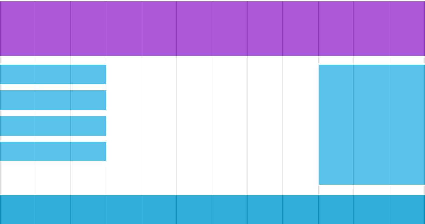
<div class="class_div_header">
<h1>光辉岁月</h1>
</div>
<div class="class_div_12row">
<div class="col-3 col-m-3 class_div_menu">
<ul>
<li>首页</li>
<li>APP</li>
<li>民间偏方</li>
<li>动漫</li>
</ul>
</div>
<div class="col-6 col-m-9">
<h1 style="color:white;text-shadow:2px 2px 4px #000;letter-spacing:5px;" class="sgcontentcolor sgcenter">
未 闻 花 名
</h1>
<p>
在我们走过的季节里,路旁盛开的花朵也在不断变化,那个季节盛开的花是叫什么来着?轻轻摇曳着,一碰会微微刺痛,靠近一闻,隐约有股青涩的阳光的气息。那气息渐渐地淡去,我们也在慢慢长大。可是,那朵花一定还在某个地方盛开着……对,我们永远都会继续实现那朵花的愿望。
</p>
</div>
<div class="col-3 col-m-12">
<div class="class_div_rightaside">
<h2>龙与虎</h2>
<p>讲述的是逢坂大河与高须龙儿之间的...</p>
<h2>轻音少女</h2>
<p>号称强国源泉,第一次发现没有男主的动漫也可以这么好看!</p>
</div>
</div>
</div>
<div class="class_div_footer">
<footer id="copyright">
<p style="font-size:14px;text-align:center;font-style:italic;">
Copyright © <a id="author">2018</a> Powered by <a id="author">beyond</a>
</p>
</footer>
</div>
</body>
</html>效果如下:
核心代码如下:
注意两组类样式是相同的,但名称不同 (col- 和 col-m-):
[class*="col-"] {
width: 100%;
}
@media only screen and (min-width: 600px) {
/* For tablets: */
.col-m-1 {width: 8.33%;}
.col-m-2 {width: 16.66%;}
.col-m-3 {width: 25%;}
.col-m-4 {width: 33.33%;}
.col-m-5 {width: 41.66%;}
.col-m-6 {width: 50%;}
.col-m-7 {width: 58.33%;}
.col-m-8 {width: 66.66%;}
.col-m-9 {width: 75%;}
.col-m-10 {width: 83.33%;}
.col-m-11 {width: 91.66%;}
.col-m-12 {width: 100%;}
}
@media only screen and (min-width: 768px) {
/* For desktop: */
.col-1 {width: 8.33%;}
.col-2 {width: 16.66%;}
.col-3 {width: 25%;}
.col-4 {width: 33.33%;}
.col-5 {width: 41.66%;}
.col-6 {width: 50%;}
.col-7 {width: 58.33%;}
.col-8 {width: 66.66%;}
.col-9 {width: 75%;}
.col-10 {width: 83.33%;}
.col-11 {width: 91.66%;}
.col-12 {width: 100%;}
}
以上代码看起来很多余,但是他可以根据屏幕大小自动设置不同的样式,所以还是非常必要的。
HTML 实例
默认是手机设备:全部跨100% 即12列
针对桌面设备特殊定制:
第一和第三部分跨越 3 列。中间部分跨域 6 列。
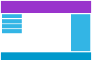
针对平板设备特殊定制:
第一跨域 3列,第二部分跨越 9 列,第三部分跨域 12 列:
< div class= "col-3 col-m-3" >... < /div >
< div class= "col-6 col-m-9" >... < /div >
< div class= "col-3 col-m-12" >... < /div >
< /div >
方向:横屏/竖屏
结合CSS媒体查询,可以创建适应不同设备的方向(横屏landscape、竖屏portrait等)的布局:
完整代码如下:
<!DOCTPYE html>
<html lang="zh">
<head>
	<link rel="icon" href="beyond.jpg" type="image/x-icon"/>
	<meta charset="UTF-8">
	<meta name="author" content="beyond">
	<meta http-equiv="refresh" content="520">
	<meta name="description" content="免费零基础教程">
	<meta name="viewport" content="width=device-width,
	initial-scale=1.0, maximum-scale=1.0,minimum-scale=1.0,user-scalable=0" />
	<meta name="keywords" content="HTML,CSS,JAVASCRIPT">
	<title>beyondの心中の动漫神作</title>
	<link rel="stylesheet" type="text/css" href="beyondbasestylewhite3.css">

	<!--[if lt IE 9]>
		<script src="//apps.bdimg.com/libs/html5shiv/3.7/html5shiv.min.js"></script>
	<![endif]-->

	<style type="text/css">

		body{
			font-size: 100%;
			/*background-image: url("sakura4.png");
			background-repeat: no-repeat;
			background-position: center center;*/
			/*声明margin和padding是个好习惯*/
			margin: 0;
			padding: 0;
		}
		body {
			background-color: lightgreen;
		}
		/*横屏时,背景色变浅蓝*/
		@media only screen and (position: landscape) {
			body {
				background-color: lightblue;
			}
		}

	</style>
</head>

<body>
		<h1 style="color:white;text-shadow:2px 2px 4px #000;letter-spacing:5px;" class="sgcontentcolor sgcenter">
				未 闻 花 名
		</h1>
		<p>
				在我们走过的季节里,路旁盛开的花朵也在不断变化,那个季节盛开的花是叫什么来着?轻轻摇曳着,一碰会微微刺痛,靠近一闻,隐约有股青涩的阳光的气息。那气息渐渐地淡去,我们也在慢慢长大。可是,那朵花一定还在某个地方盛开着……对,我们永远都会继续实现那朵花的愿望。
		</p>

		<p class="sgcontentcolor sgcenter" style="clear:left;">
				<b>注意:</b>横屏时,背景色会变浅蓝喔~
		</p>

	<footer id="copyright">
				<p style="font-size:14px;text-align:center;font-style:italic;">
				Copyright © <a id="author">2018</a> Powered by <a id="author">beyond</a>
				</p>
	</footer>


</body>
</html>
效果如下: (暂时无法演示,下次补上)
语法:
orientation:portrait | landscape
- portrait:指定输出设备中的页面可见区域高度大于或等于宽度
- landscape: 除portrait值情况外,都是landscape
核心代码:
如果是横屏背景将是浅蓝色:
body {
background-color: lightblue;
}
}
响应式 Web 设计 - 图片
使用 width 属性
如果 width 属性设置为 100%,图片会根据上下范围实现响应式功能
注意: 图片会放大,超过原来的大小,如果没有height:auto;约束的话,图片会变形
代码如下:
<!DOCTPYE html>
<html lang="zh">
<head>
	<link rel="icon" href="beyond.jpg" type="image/x-icon"/>
	<meta charset="UTF-8">
	<meta name="author" content="beyond">
	<meta http-equiv="refresh" content="520">
	<meta name="description" content="免费零基础教程">
	<meta name="viewport" content="width=device-width,
	initial-scale=1.0, maximum-scale=1.0,minimum-scale=1.0,user-scalable=0" />
	<meta name="keywords" content="HTML,CSS,JAVASCRIPT">
	<title>beyondの心中の动漫神作</title>
	<link rel="stylesheet" type="text/css" href="beyondbasestylewhite3.css">

	<!--[if lt IE 9]>
		<script src="//apps.bdimg.com/libs/html5shiv/3.7/html5shiv.min.js"></script>
	<![endif]-->

	<style type="text/css">

		body{
			font-size: 100%;
			/*background-image: url("sakura4.png");
			background-repeat: no-repeat;
			background-position: center center;*/
			/*声明margin和padding是个好习惯*/
			margin: 0;
			padding: 0;
		}

		/*调整窗口,width:100%,图片也会跟着放大
		并且可以超过自身的原始大小*/
		img {
			width: 100%;
			/*不加上这个高度约束的话,图片会变形*/
			height: auto;
		}
	</style>
</head>

<body>
		<h1 style="color:white;text-shadow:2px 2px 4px #000;letter-spacing:5px;" class="sgcontentcolor sgcenter">
				未 闻 花 名
		</h1>
		<img src="sakura.png" width="300" height="300" />

		<p class="sgcontentcolor sgcenter" style="clear:left;">
				<b>注意:</b>调整窗口,width:100%,图片也会跟着放大<br/>
				并且可以超过自身的原始大小
		</p>

	<footer id="copyright">
				<p style="font-size:14px;text-align:center;font-style:italic;">
				Copyright © <a id="author">2018</a> Powered by <a id="author">beyond</a>
				</p>
	</footer>


</body>
</html>
效果如下:
核心代码:
width: 100%;
height: auto;
}
注意在以上实例中,图片会变比它的原始图片还大。我们可以使用 max-width 属性很好的解决这个问题。
使用 max-width 属性
如果 max-width 属性设置为 100%, 图片永远不会大于其原始大小:
效果如下:
核心代码:
max-width: 100%;
height: auto;
}
提示:关于max-width属性的更多内容,请参考本站CSS参考手册中的CSS max-width属性部分。
给html_282.html这个响应式网页中添加个图片
完整代码如下:
<!DOCTPYE html>
<html lang="zh">
<head>
	<link rel="icon" href="beyond.jpg" type="image/x-icon"/>
	<meta charset="UTF-8">
	<meta name="author" content="beyond">
	<meta http-equiv="refresh" content="520">
	<meta name="description" content="免费零基础教程">
	<meta name="viewport" content="width=device-width,
	initial-scale=1.0, maximum-scale=1.0,minimum-scale=1.0,user-scalable=0" />
	<meta name="keywords" content="HTML,CSS,JAVASCRIPT">
	<title>beyondの心中の动漫神作</title>
	<link rel="stylesheet" type="text/css" href="beyondbasestylewhite3.css">

	<!--[if lt IE 9]>
		<script src="//apps.bdimg.com/libs/html5shiv/3.7/html5shiv.min.js"></script>
	<![endif]-->

	<style type="text/css">

		body{
			font-size: 100%;
			/*background-image: url("sakura4.png");
			background-repeat: no-repeat;
			background-position: center center;*/
			/*声明margin和padding是个好习惯*/
			margin: 0;
			padding: 0;
		}
		/*响应式布局,必须加这一句CSS3*/
		* {
			box-sizing: border-box;
		}

		/*这个是在它后面添加啥???空白文本???*/
		div.class_div_12row:after {
			content: "";
			clear: both;
			/*将啥转成了block块???*/
			display: block;
		}


		/*美化一下页面样式*/
		html {
			font-family: "Lucida Sans",sans-serif;
		}
		div.class_div_header {
			background-color: #9933cc;
			color: #fff;
			padding: 2px;
		}
		div.class_div_menu ul {
			list-style-type: none;
			margin: 0;
			padding: 0;
		}
		div.class_div_menu li {
			padding: 8px;
			margin-bottom: 7px;
			background-color: #33b5e5;
			color: #fff;
			/*这个是什么鬼参数*/
			box-shadow: 0 1px 3px rgba(0,0,0,0.12), 0 1px 2px rgba(0,0,0,0.24);
		}
		div.class_div_menu li:hover {
			background-color: #0099cc;
		}

		/*新增的右侧边栏*/
		div.class_div_rightaside {
			background-color: #33b5e5;
			padding: 5px;
			color: #fff;
			text-align: center;
			font-size: 14px;
			/*各个参数是什么鬼???*/
			box-shadow: 0 1px 3px rgba(0,0,0,0.12), 0 1px 2px rgba(0,0,0,0.24);
		}
		/*新增的底部栏*/
		div.class_div_footer {
			background-color: rgba(17,134,193,0.2);
			/*color: #fff;*/
			text-align: center;
			font-size: 12px;
			padding: 3px;
		}

		/*这个又是啥选择器???
		  默认是移动优先设计
		  手机上每一列全宽100%*/
		[class*="col-"] {
			width: 100%;
		}
		/*全部左浮动*/
		[class*="col-"] {
			float: left;
			padding: 2px;
		}
		@media only screen and (min-width: 640px) {
			/*大于640时,也就是来到了平板屏幕的世界*/
			.col-m-1 {width: 8.33%;}
			.col-m-2 {width: 16.66%;}
		    .col-m-3 {width: 25%;}
		    .col-m-4 {width: 33.33%;}
		    .col-m-5 {width: 41.66%;}
		    .col-m-6 {width: 50%;}
		    .col-m-7 {width: 58.33%;}
		    .col-m-8 {width: 66.66%;}
		    .col-m-9 {width: 75%;}
		    .col-m-10 {width: 83.33%;}
		    .col-m-11 {width: 91.66%;}
		    .col-m-12 {width: 100%;}
		}
		@media only screen and (min-width: 768px) {
			/*大于768时,也就是来到了电脑屏幕的世界*/
			.col-1 {width: 8.33%;}
			.col-2 {width: 16.66%;}
			.col-3 {width: 25%;}
			.col-4 {width: 33.33%;}
			.col-5 {width: 41.66%;}
			.col-6 {width: 50%;}
			.col-7 {width: 58.33%;}
			.col-8 {width: 66.66%;}
			.col-9 {width: 75%;}
			.col-10 {width: 83.33%;}
			.col-11 {width: 91.66%;}
			.col-12 {width: 100%;}
		}

		/*新增图片*/
		img {
			width: 100%;
			height: auto;
		}
	</style>
</head>

<body>
<div class="class_div_header">
	<h1>光辉岁月</h1>
</div>

<div class="class_div_12row">
	<div class="col-3 col-m-3 class_div_menu">
		<ul>
			<li>首页</li>
			<li>APP</li>
			<li>民间偏方</li>
			<li>动漫</li>
		</ul>
	</div>

	<div class="col-6 col-m-9">
		<h1 style="color:white;text-shadow:2px 2px 4px #000;letter-spacing:5px;" class="sgcontentcolor sgcenter">
				未 闻 花 名
		</h1>
		<p>
				在我们走过的季节里,路旁盛开的花朵也在不断变化,那个季节盛开的花是叫什么来着?轻轻摇曳着,一碰会微微刺痛,靠近一闻,隐约有股青涩的阳光的气息。那气息渐渐地淡去,我们也在慢慢长大。可是,那朵花一定还在某个地方盛开着……对,我们永远都会继续实现那朵花的愿望。
		</p>
		<img src="menma.png" width="300" height="300" />
	</div>

	<div class="col-3 col-m-12">
		<div class="class_div_rightaside">
			<h2>龙与虎</h2>
			<p>讲述的是逢坂大河与高须龙儿之间的...</p>
			<h2>轻音少女</h2>
			<p>号称强国源泉,第一次发现没有男主的动漫也可以这么好看!</p>
		</div>
	</div>

</div>

<div class="class_div_footer">
	<footer id="copyright">
				<p style="font-size:14px;text-align:center;font-style:italic;">
				Copyright © <a id="author">2018</a> Powered by <a id="author">beyond</a>
				</p>
	</footer>
</div>

</body>
</html>
效果如下:
核心代码:
width: 100%;
height: auto;
}
背景图片 background-size属性
背景图片也可以响应调整大小或缩放喔~
以下是三个不同的方法:
1. 如果 background-size 属性设置为 "contain", 背景图片将按比例自适应内容区域。
图片保持其比例不变,不会变形,会填充满一个方向,另一个方向会有留白
类似于iOS中的aspect-fit
代码如下:
<!DOCTPYE html>
<html lang="zh">
<head>
	<link rel="icon" href="beyond.jpg" type="image/x-icon"/>
	<meta charset="UTF-8">
	<meta name="author" content="beyond">
	<meta http-equiv="refresh" content="520">
	<meta name="description" content="免费零基础教程">
	<meta name="viewport" content="width=device-width,
	initial-scale=1.0, maximum-scale=1.0,minimum-scale=1.0,user-scalable=0" />
	<meta name="keywords" content="HTML,CSS,JAVASCRIPT">
	<title>beyondの心中の动漫神作</title>
	<link rel="stylesheet" type="text/css" href="beyondbasestylewhite3.css">

	<!--[if lt IE 9]>
		<script src="//apps.bdimg.com/libs/html5shiv/3.7/html5shiv.min.js"></script>
	<![endif]-->

	<style type="text/css">

		body{
			font-size: 100%;
			/*background-image: url("sakura4.png");
			background-repeat: no-repeat;
			background-position: center center;*/
			/*声明margin和padding是个好习惯*/
			margin: 0;
			padding: 0;
		}

		div {
			width: 100%;
			height: 400px;
			background-image: url("menma.png");
			background-repeat: no-repeat;
			/*核心代码,background-size的4种样式之一:contain
			  不会变形,会有一边填充满,另一边留白*/
			background-size: contain;
			border:1px solid red;
		}
	</style>
</head>

<body>
		<h1 style="color:white;text-shadow:2px 2px 4px #000;letter-spacing:5px;" class="sgcontentcolor sgcenter">
				未 闻 花 名
		</h1>
		<div>

		</div>

		<p class="sgcontentcolor sgcenter" style="clear:left;">
				<b>注意:</b>调整窗口,background-size的4种样式之一:contain<br/>
			  不会变形,会有一边填充满,另一边留白
		</p>

	<footer id="copyright">
				<p style="font-size:14px;text-align:center;font-style:italic;">
				Copyright © <a id="author">2018</a> Powered by <a id="author">beyond</a>
				</p>
	</footer>


</body>
</html>
效果如下:
这是 CSS 代码:
核心代码:
width: 100%;
height: 400px;
background-image: url('menma.png');
background-repeat: no-repeat;
background-size: contain;
border: 1px solid red;
}
2. 如果 background-size 属性设置为 "100% 100%" ,背景图片将延展覆盖整个区域:
如果background-size设置为宽100% 高100%,那么显然图片会完全拉伸并铺满div
类似于iOS中的scale-fill
效果如下:
核心代码:
这是 CSS 代码:
width: 100%;
height: 400px;
background-image: url('menma.jpg');
background-size: 100% 100%;
border: 1px solid red;
}
3. 如果 background-size 属性设置为 "cover",则会把背景图像等比例放大,
以使背景图像完全覆盖填充div区域,因此一部分的图片像素就不在div里了。
注意该属性保持了图片的比例因此 背景图像的某些部分无法显示在背景定位区域中:
效果如下:
这是 CSS 代码:
核心代码:
width: 100%;
height: 400px;
background-image: url('img_flowers.jpg');
background-size: cover;
border: 1px solid red;
}
不同设备显示不同图片
大尺寸图片可以显示在大屏幕上,但在小屏幕上却不能很好显示。
我们没有必要在小屏幕上去加载大图片,这样很影响加载速度。
所以我们又可以使用媒体查询了,根据不同的设备显示不同的图片。
以下大图片和小图片将显示在不同设备上:
代码如下:
<!DOCTPYE html>
<html lang="zh">
<head>
	<link rel="icon" href="beyond.jpg" type="image/x-icon"/>
	<meta charset="UTF-8">
	<meta name="author" content="beyond">
	<meta http-equiv="refresh" content="520">
	<meta name="description" content="免费零基础教程">
	<meta name="viewport" content="width=device-width,
	initial-scale=1.0, maximum-scale=1.0,minimum-scale=1.0,user-scalable=0" />
	<meta name="keywords" content="HTML,CSS,JAVASCRIPT">
	<title>beyondの心中の动漫神作</title>
	<link rel="stylesheet" type="text/css" href="beyondbasestylewhite3.css">

	<!--[if lt IE 9]>
		<script src="//apps.bdimg.com/libs/html5shiv/3.7/html5shiv.min.js"></script>
	<![endif]-->

	<style type="text/css">

		body{
			font-size: 100%;
			/*background-image: url("sakura4.png");
			background-repeat: no-repeat;
			background-position: center center;*/
			/*声明margin和padding是个好习惯*/
			margin: 0;
			padding: 0;

			/*小窗口默认显示小图片*/
			background-image: url("sakura4.png");
		}
		/*大窗口时,显示大图*/
		@media only screen and (min-width: 640px) {
			body {
				background-image: url('menma.png');
			}
		}


	</style>
</head>

<body>
		<h1 style="color:white;text-shadow:2px 2px 4px #000;letter-spacing:5px;" class="sgcontentcolor sgcenter">
				未 闻 花 名
		</h1>


		<p class="sgcontentcolor sgcenter" style="clear:left;">
				<b>注意:</b>调整窗口,小窗口显示小图片,大窗口显示大图片
		</p>

	<footer id="copyright">
				<p style="font-size:14px;text-align:center;font-style:italic;">
				Copyright © <a id="author">2018</a> Powered by <a id="author">beyond</a>
				</p>
	</footer>


</body>
</html>
效果如下:

核心代码:
body {
background-image: url('img_smallflower.jpg');
}
/* For width 400px and larger: */
@media only screen and (min-width: 400px) {
body {
background-image: url('img_bigflowers.jpg');
}
}
你可以使用媒体查询的 min-device-width 替代 min-width 属性,
它将检测的是设备宽度而不是浏览器宽度。
浏览器大小重置时,图片大小不会改变。
核心代码:
body {
background-image: url('img_smallflower.jpg');
}
/* 设备大于 400px (也等于): */
@media only screen and (min-device-width: 400px) {
body {
background-image: url('img_bigflowers.jpg');
}
}
HTML5 <picture> 元素
HTML5 的 <picture>元素可以设置多张图片。
< picture >元素类似于<video> 和 <audio> 元素。可以设备不同的资源,第一个设置的资源为首选使用的:
代码如下:
<!DOCTPYE html>
<html lang="zh">
<head>
	<link rel="icon" href="beyond.jpg" type="image/x-icon"/>
	<meta charset="UTF-8">
	<meta name="author" content="beyond">
	<meta http-equiv="refresh" content="520">
	<meta name="description" content="免费零基础教程">
	<meta name="viewport" content="width=device-width,
	initial-scale=1.0, maximum-scale=1.0,minimum-scale=1.0,user-scalable=0" />
	<meta name="keywords" content="HTML,CSS,JAVASCRIPT">
	<title>beyondの心中の动漫神作</title>
	<link rel="stylesheet" type="text/css" href="beyondbasestylewhite3.css">

	<!--[if lt IE 9]>
		<script src="//apps.bdimg.com/libs/html5shiv/3.7/html5shiv.min.js"></script>
	<![endif]-->

	<style type="text/css">

		body{
			font-size: 100%;
			/*background-image: url("sakura4.png");
			background-repeat: no-repeat;
			background-position: center center;*/
			/*声明margin和padding是个好习惯*/
			margin: 0;
			padding: 0;
		}


	</style>
</head>

<body>
		<h1 style="color:white;text-shadow:2px 2px 4px #000;letter-spacing:5px;" class="sgcontentcolor sgcenter">
				未 闻 花 名
		</h1>

		<picture>
			<source srcset="sakura4.png" media="(max-width:640px)"/>
			<source srcset="menma.png"/>
			<img src="menma.png" alt="面码" style="width:auto;">
		</picture>

		<p class="sgcontentcolor sgcenter" style="clear:left;">
				<b>注意:</b>调整窗口,小窗口显示小图片,大窗口显示大图片
		</p>

	<footer id="copyright">
				<p style="font-size:14px;text-align:center;font-style:italic;">
				Copyright © <a id="author">2018</a> Powered by <a id="author">beyond</a>
				</p>
	</footer>


</body>
</html>
效果如下:
核心代码:
< source srcset= "img_smallflower.jpg" media= "(max-width: 640px)" >
< source srcset= "img_bigflowers.jpg" >
< img src= "img_flowers.jpg" alt= "Flowers" >
< /picture >
srcset 属性的必须的,定义了图片资源。
media 属性是可选的,可以在媒体查询的 CSS @media 规则 查看详情。
对于不支持<picture> 元素的浏览器你也可以定义<img>元素来替代。
扩展阅读
《响应式图片101》:介绍为什么需要响应式图片以及如何选择正确的响应式图片解决方案。
响应式 Web 设计 - 视频(Video)
使用 width 属性
如果 width 属性设置为 100%,视频播放器会根据屏幕大小自动调整比例:
注意:这个样式,视频可以超过原始大小
代码如下:
<!DOCTPYE html>
<html lang="zh">
<head>
	<link rel="icon" href="beyond.jpg" type="image/x-icon"/>
	<meta charset="UTF-8">
	<meta name="author" content="beyond">
	<meta http-equiv="refresh" content="520">
	<meta name="description" content="免费零基础教程">
	<meta name="viewport" content="width=device-width,
	initial-scale=1.0, maximum-scale=1.0,minimum-scale=1.0,user-scalable=0" />
	<meta name="keywords" content="HTML,CSS,JAVASCRIPT">
	<title>beyondの心中の动漫神作</title>
	<link rel="stylesheet" type="text/css" href="beyondbasestylewhite3.css">

	<!--[if lt IE 9]>
		<script src="//apps.bdimg.com/libs/html5shiv/3.7/html5shiv.min.js"></script>
	<![endif]-->

	<style type="text/css">

		body{
			font-size: 100%;
			/*background-image: url("sakura4.png");
			background-repeat: no-repeat;
			background-position: center center;*/
			/*声明margin和padding是个好习惯*/
			margin: 0;
			padding: 0;
		}
		/*width:100%
		这样式,视频可以超过原始大小*/
		video {
			width: 100%;
			/*不加这个会比例失调*/
			height: auto;
		}


	</style>
</head>

<body>
		<h1 style="color:white;text-shadow:2px 2px 4px #000;letter-spacing:5px;" class="sgcontentcolor sgcenter">
				未 闻 花 名
		</h1>
		<video width="400" controls>
			<source src="anime.mp4" type="video/mp4" />
			<source src="anime.ogg" type="video/ogg" />
			Your browser does not support HTML5 video.
		</video>


		<p class="sgcontentcolor sgcenter" style="clear:left;">
				<b>注意:</b>调整窗口,width:100%<br/>
				视频可以超过原来的大小
		</p>

	<footer id="copyright">
				<p style="font-size:14px;text-align:center;font-style:italic;">
				Copyright © <a id="author">2018</a> Powered by <a id="author">beyond</a>
				</p>
	</footer>


</body>
</html>
效果如下:
核心代码:
width: 100%;
height: auto;
}
注意在以上实例中,视频播放器根据屏幕大小自动调整比例,且可以比原始尺寸还要大。
更多情况下我们可以使用 max-width 属性来替代。
使用 max-width 属性
如果 max-width 属性设置为 100%, 视频播放器会根据屏幕自动调整比例,但不会超过其原始大小:
效果如下:
实例
max-width: 100%;
height: auto;
}
在html_282.html网页中,添加视频
我们可以在网页中添加视频。
以下实例视频根据 div 区域大小自动调整并占满整个 div 区域:
完整代码如下:
<!DOCTPYE html>
<html lang="zh">
<head>
	<link rel="icon" href="beyond.jpg" type="image/x-icon"/>
	<meta charset="UTF-8">
	<meta name="author" content="beyond">
	<meta http-equiv="refresh" content="520">
	<meta name="description" content="免费零基础教程">
	<meta name="viewport" content="width=device-width,
	initial-scale=1.0, maximum-scale=1.0,minimum-scale=1.0,user-scalable=0" />
	<meta name="keywords" content="HTML,CSS,JAVASCRIPT">
	<title>beyondの心中の动漫神作</title>
	<link rel="stylesheet" type="text/css" href="beyondbasestylewhite3.css">

	<!--[if lt IE 9]>
		<script src="//apps.bdimg.com/libs/html5shiv/3.7/html5shiv.min.js"></script>
	<![endif]-->

	<style type="text/css">

		body{
			font-size: 100%;
			/*background-image: url("sakura4.png");
			background-repeat: no-repeat;
			background-position: center center;*/
			/*声明margin和padding是个好习惯*/
			margin: 0;
			padding: 0;
		}
		/*响应式布局,必须加这一句CSS3*/
		* {
			box-sizing: border-box;
		}

		/*这个是在它后面添加啥???空白文本???*/
		div.class_div_12row:after {
			content: "";
			clear: both;
			/*将啥转成了block块???*/
			display: block;
		}


		/*美化一下页面样式*/
		html {
			font-family: "Lucida Sans",sans-serif;
		}
		div.class_div_header {
			background-color: #9933cc;
			color: #fff;
			padding: 2px;
		}
		div.class_div_menu ul {
			list-style-type: none;
			margin: 0;
			padding: 0;
		}
		div.class_div_menu li {
			padding: 8px;
			margin-bottom: 7px;
			background-color: #33b5e5;
			color: #fff;
			/*这个是什么鬼参数*/
			box-shadow: 0 1px 3px rgba(0,0,0,0.12), 0 1px 2px rgba(0,0,0,0.24);
		}
		div.class_div_menu li:hover {
			background-color: #0099cc;
		}

		/*新增的右侧边栏*/
		div.class_div_rightaside {
			background-color: #33b5e5;
			padding: 5px;
			color: #fff;
			text-align: center;
			font-size: 14px;
			/*各个参数是什么鬼???*/
			box-shadow: 0 1px 3px rgba(0,0,0,0.12), 0 1px 2px rgba(0,0,0,0.24);
		}
		/*新增的底部栏*/
		div.class_div_footer {
			background-color: rgba(17,134,193,0.2);
			/*color: #fff;*/
			text-align: center;
			font-size: 12px;
			padding: 3px;
		}

		/*这个又是啥选择器???
		  默认是移动优先设计
		  手机上每一列全宽100%*/
		[class*="col-"] {
			width: 100%;
		}
		/*全部左浮动*/
		[class*="col-"] {
			float: left;
			padding: 2px;
		}
		@media only screen and (min-width: 640px) {
			/*大于640时,也就是来到了平板屏幕的世界*/
			.col-m-1 {width: 8.33%;}
			.col-m-2 {width: 16.66%;}
		    .col-m-3 {width: 25%;}
		    .col-m-4 {width: 33.33%;}
		    .col-m-5 {width: 41.66%;}
		    .col-m-6 {width: 50%;}
		    .col-m-7 {width: 58.33%;}
		    .col-m-8 {width: 66.66%;}
		    .col-m-9 {width: 75%;}
		    .col-m-10 {width: 83.33%;}
		    .col-m-11 {width: 91.66%;}
		    .col-m-12 {width: 100%;}
		}
		@media only screen and (min-width: 768px) {
			/*大于768时,也就是来到了电脑屏幕的世界*/
			.col-1 {width: 8.33%;}
			.col-2 {width: 16.66%;}
			.col-3 {width: 25%;}
			.col-4 {width: 33.33%;}
			.col-5 {width: 41.66%;}
			.col-6 {width: 50%;}
			.col-7 {width: 58.33%;}
			.col-8 {width: 66.66%;}
			.col-9 {width: 75%;}
			.col-10 {width: 83.33%;}
			.col-11 {width: 91.66%;}
			.col-12 {width: 100%;}
		}

		/*新增视频*/
		video {
			width: 100%;
			height: auto;
		}
	</style>
</head>

<body>
<div class="class_div_header">
	<h1>光辉岁月</h1>
</div>

<div class="class_div_12row">
	<div class="col-3 col-m-3 class_div_menu">
		<ul>
			<li>首页</li>
			<li>APP</li>
			<li>民间偏方</li>
			<li>动漫</li>
		</ul>
	</div>

	<div class="col-6 col-m-9">
		<h1 style="color:white;text-shadow:2px 2px 4px #000;letter-spacing:5px;" class="sgcontentcolor sgcenter">
				未 闻 花 名
		</h1>
		<p>
				在我们走过的季节里,路旁盛开的花朵也在不断变化,那个季节盛开的花是叫什么来着?轻轻摇曳着,一碰会微微刺痛,靠近一闻,隐约有股青涩的阳光的气息。那气息渐渐地淡去,我们也在慢慢长大。可是,那朵花一定还在某个地方盛开着……对,我们永远都会继续实现那朵花的愿望。
		</p>
		<video width="400" controls>
			<source src="anime.mp4" type="video/mp4" />
			<source src="anime.ogg" type="video/ogg" />
			Your browser does not support HTML5 video.
		</video>
	</div>

	<div class="col-3 col-m-12">
		<div class="class_div_rightaside">
			<h2>龙与虎</h2>
			<p>讲述的是逢坂大河与高须龙儿之间的...</p>
			<h2>轻音少女</h2>
			<p>号称强国源泉,第一次发现没有男主的动漫也可以这么好看!</p>
		</div>
	</div>

</div>

<div class="class_div_footer">
	<footer id="copyright">
				<p style="font-size:14px;text-align:center;font-style:italic;">
				Copyright © <a id="author">2018</a> Powered by <a id="author">beyond</a>
				</p>
	</footer>
</div>

</body>
</html>
效果如下:
实例
width: 100%;
height: auto;
}
响应式 Web 设计 - 框架 Bootstrap
本章节为大家介绍响应式 Web 设计框架 Bootstrap。
Bootstrap,来自 Twitter,是目前最受欢迎的前端框架。
Bootstrap 是基于 HTML、CSS、JAVASCRIPT 的,它简洁灵活,使得 Web 开发更加快捷。
Bootstrap支持HTML和CSS规范,是由CSS的动态Less语言写成。
实例
< html lang= "en" >
< head >
< title >Bootstrap Example < /title >
< meta charset= "utf-8" >
< meta name= "viewport" content= "width=device-width, initial-scale=1" >
< link rel= "stylesheet" href= "http://apps.bdimg.com/libs/bootstrap/3.3.4/css/bootstrap.min.css" >
< script src= "http://apps.bdimg.com/libs/jquery/2.1.4/jquery.min.js" > < /script >
< script src= "http://apps.bdimg.com/libs/bootstrap/3.3.4/js/bootstrap.min.js" > < /script >
< /head >
< body >
< div class= "container" >
< div class= "jumbotron" >
< h1 >我的第一个 Bootstrap 页面 < /h1 >
< /div >
< div class= "row" >
< div class= "col-sm-4" >
...
< /div >
< div class= "col-sm-4" >
...
< /div >
< div class= "col-sm-4" >
...
< /div >
< /div >
< /div >
< /body >
< /html >
不知所云 »
更多内容,敬请期待我们的 Bootstrap 教程。
未完待续,下一章节,つづく


 796
796


 被折叠的 条评论
为什么被折叠?
被折叠的 条评论
为什么被折叠?
 到【灌水乐园】发言


