


 本文介绍了如何在Compose中使用Dialog和AlertDialog,包括它们的构造函数参数、基本用法以及如何进行定制,如自定义按钮和内容。
跟View体系一样,Compose中也用Dialog做提示框的。既然有这个API,那我们还是得卷起来熟悉下使用流程及方法。
Dialog
其构造函数如下:
@Composable
fun Dialog(
    onDismissRequest: () -> Unit,
    properties: DialogProperties = DialogProperties(),
    content: @Composable () -> Unit
)
不难看出,声明对象时总共需要声明三个参数:
· onDismissRequest: () -> Unit :点击对话框外部或者按下返回按钮的时候会执行的内容。
· properties: DialogProperties? = null :进一步配置特定属性的对话框。
· contentColor: Color = contentColorFor(backgroundColor) :提供给其内容的背景颜色。
下面举个例子:
var showDialog by remember {
    mutableStateOf(false)
}
Button(onClick = { showDialog = !showDialog }) {
    Text("show dialog")
}
if (showDialog) {
    Dialog(onDismissRequest = { showDialog = !showDialog }) {
        Column(
            modifier = Modifier
                .size(200.dp, 50.dp)
                .background(Color.White)
        ) {
            Text(text = "这是一段描述Dialog内容的文本")
        }
    }
}
对应的效果为:
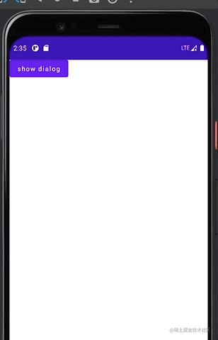
代码逻辑较简单,点击button即展示dialog,这里使用了关键字remember来刷新布尔值。其余没其他好说的,可能你会纳闷,为什么要在Dialog内部声明一个白色的Column呢。其实默认的Dialog是全屏样式,并且这里没有Modifier的自定义参数来修改样式。Dialog的关于使用方面的内容较简单,其内部复杂构造可以在后面等更新Compose的页面刷新机制。
AlertDialog
Dialog的参数是如此之少,可定制范围如此之小。Google会将这种设计放任不管?答案是明显的,还有一个替代Dialog的AlertDialog存在。根据其介绍:
AlertDialog是一个用紧急信息,详细信息或操作打断当前用户行为的对话框。
说白了就是一个可以浮在界面最上方的对话框。先看看其两个构造函数:
@Composable
fun AlertDialog(
    onDismissRequest: () -> Unit,
    buttons: @Composable () -> Unit,
    modifier: Modifier = Modifier,
    title: (@Composable () -> Unit)? = null,
    text: @Composable (() -> Unit)? = null,
    shape: Shape = MaterialTheme.shapes.medium,
    backgroundColor: Color = MaterialTheme.colors.surface,
    contentColor: Color = contentColorFor(backgroundColor),
    properties: DialogProperties = DialogProperties()
)
@Composable
fun AlertDialog(
    onDismissRequest: () -> Unit,
    confirmButton: @Composable () -> Unit,
    modifier: Modifier = Modifier,
    dismissButton: @Composable (() -> Unit)? = null,
    title: @Composable (() -> Unit)? = null,
    text: @Composable (() -> Unit)? = null,
    shape: Shape = MaterialTheme.shapes.medium,
    backgroundColor: Color = MaterialTheme.colors.surface,
    contentColor: Color = contentColorFor(backgroundColor),
    properties: DialogProperties = DialogProperties()
)
其各个参数含义如下:
· modifier: Modifier = Modifier:修饰符,这没得说。
· onDismissRequest: () -> Unit:点击对话框外部或者按下返回按钮的时候会执行的内容。注意:点击对话框的关闭按钮时并不会执行。
· confirmButton: () -> Unit:由用户确认操作的按钮,默认没有回调,需自行设置回调事件。
· dismissButton: () -> Unit = null :用于关闭对话框的按钮,默认没有回调,需自行设置回调事件。
· title: () -> Unit = null:标题,无默认内容。
· text: () -> Unit = null:内容,无默认内容。
· shape: Shape = MaterialTheme.shapes.medium:对话框的形状(Material主题)。
· backgroundColor: Color = MaterialTheme.colors.surface:对话框背景色。
· contentColor: Color = contentColorFor(backgroundColor):提供给其内容的背景颜色。
· properties: DialogProperties? = null:进一步配置特定属性的对话框。
由上可见两个AlertDialog的构造函数里的参数区别就在于Button是否可自定义。一个是默认按钮,一个是自定义按钮(可以使用Column等不同布局去展现摆放方式不同的按钮)。
观察其源码架构你会发现,AlertDialog的第一个构造函数继承自第二个函数,而第二个构造函数又继承自androidx.compose.ui.window.Dialog。这也就不难理解为什么AlertDialog跟Dialog的构造函数有三个参数一致了。
常规的使用方式也较简单:
var showDialog by remember {
mutableStateOf(false)
}
Column() {
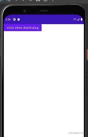
Button(onClick = { showDialog = !showDialog }) {
Text("click show AlerDialog")
}
if (showDialog) {
AlertDialog(
onDismissRequest = {
showDialog = false
},
title = {
Text(text = "Title")
},
text = {
Text(
"This area typically contains the supportive text " +
"which presents the details regarding the Dialog's purpose."
)
},
confirmButton = {
TextButton(
onClick = {
showDialog = false
}
) {
Text("Confirm")
}
},
dismissButton = {
TextButton(
onClick = {
showDialog = false
}
) {
Text("Dismiss")
}
}
)
}
}
其对应效果为:
当然,这只是较简单的例子,后续可以做更多自定义内容,如果想做最大程度的自定义,可以像AlertDialog继承Dialog一样,继承AlertDialog后再进行修改。


 903
903


 被折叠的 条评论
为什么被折叠?
被折叠的 条评论
为什么被折叠?
 到【灌水乐园】发言


