


Tangible Surfaces
Surfaces that we can touch and react to our input.
Affordances
一个对象,只是看着它,就能够用直觉去感知并且明白应该去如何操作,这样的特性被称为Affordances.
一如生活中的纸张和苹果,你可以折叠/撕碎,你可以远抛和嚼上一口.
在程序中实现这样的特性不是这么容易的事情,但我们仍然可以采取Affordances和tangibility的一些原则来让我们的应用变得更直观(intuitive).
Surface introduction
在MD(材料设计,Material Design)中,我们将UI想象成是由一张张的纸张重叠而成的平面,屏幕上的一切都在这个平面上.
这些平面具有小部分的物理特性,用以展示事物间的相关性和差异性.
这利用了我们快速识别物体的本能.
Just the smallest set of real world cues are enough to express a lot of meaning
各个平面之间层层叠加,并且在低层次的平面上投下阴影.
一般来说,距离我们越近的物体,越容易引起我们视觉上的注意.
我们利用阴影来表达一个平面相对于另一个平面的高度.
Using Surfaces
经验来说,如果是同一内容的条目,放置在同一个平面进行浏览和对比是相当重要的(即不要让ListView里面的每个Item都是一个CardView这样隔离开来);
相反,如果展示的是不同类型的条目,将它们放置在各自的平面上是更为合适的.
引导注意力Directing Attention是非常强有力的一项技术,但也需要恰当去使用.
就像上面说的,尽管对于不同类型的条目应该使其在各自的平面上,但是界面上出现太多分离平面的时候,会导致人注意力的涣散.
又是经验之谈,尽量不要在屏幕上一次展现超过5个以上的平面
Implements Surfaces
平面从本质上来讲是一个投射阴影的容器.
在XML文件中,设置高度的属性是
android:elevation="4dp"
系统会根据此自动绘制阴影.
高度值越大,阴影越深,也越加分散.
Question: What’s the standard elevation for an app bar?
Objects in material design possess similar qualities to objects in the physical world.
Find answer in Material Design
| Elevation(dp) | Component |
|---|---|
| 24 | Dialog |
| 24 | Picker |
| 16 | Nav drawer |
| 16 | Right drawer |
| 16 | Modal bottom sheet |
| 12 | Floating action button(FAB-pressed) |
| 9 | Sub menu(+1dp for each sub menu) |
| 8 | Botton navgation bar |
| 8 | Menu |
| 8 | Card(when picked up) |
| 8 | Raised button(pressed state) |
| 6 | Floating action button(FAB-resting elevation) |
| 6 | Snackbar |
| 4 | App bar |
| 3 | Refresh indicator |
| 3 | Quick entry/Search bar(scrolled state) |
| 2 | Card(resting elevation) |
| 2 | Raised button(resting elevation) |
| 2 | Quick entry/Search bar(resting elevation) |
| 1 | Swtich |
What’s the FB?
一个色彩鲜艳,同时浮于所有其他内容的上方.强烈提示用户可通过其进行一些操作.
一般的直径是40/56dp,静止高度为6dp,按下时的高度为12dp.
正因为FAB是一个对于吸引用户注意力具有强烈效果的控件,所以一定要注意避免过度使用它.一般而言在一个页面中只需要一个FAB即可.
并非每个屏幕都必须要一个FAB,如果你不能确定在当前的屏幕上的哪个操作是更应该设置给FAB的,那更好的选择可能是你并不需要一个FAB(手动滑稽).
Add a FAB to your project
首先为项目添加依赖:
dependencies {
    compile fileTree{dir: 'lib', include: ['*.jar'])
    compile 'com.android.support:appcompat-v7:22.2.0'
    compile 'com.android.support:design:22.2.0'
}
(版本号应该使用最新的)
在XML中,一个FAB可以是这样的(注意其中的几个关键属性)
<android.support.design.widget.FloatingActionButton
    android:layout_height="wrap_content"
    android:layout_width="wrap_content"

    app:fabSize="normal"
    app:elevation="6dp"
    app:pressedTranslationZ="12dp"
    app:layout_gravity="end"

    android:layout_margin="16dp"
 />
如果直接运行,可能会报错.
因为FAB需要AppCompat的支持来获取样式信息,所以需要把你的Theme改成类似Theme.AppCompat.Light这样的类型以获取支持.
Surface Feedback
在MD中,对于触摸的视觉反馈主要有两种形式:
波纹效果.
从指尖点击的位置开始,一直延伸到所在平面的边缘结束.而对于那些没有边界的元素,波纹将延伸地足够远以使用户感知到元素的大小.
又是我们也称其为ink ripple,因为它是平面上泛开的数字墨水,就像一滴墨水滴在纸上然后散开一样.
这种始于用户指尖的发散性动画效果,是MD设计风格里面很重要的一部分.
这种波纹效果,不仅使用户感受到自己控制着UI,同时也提供了更好的体验.抬升效果.
一如FAB的高度设定,在平时是6dp,而当你点击的时候,会抬升到12dp.就好像你的触摸吸引了该平面一样.这也给用户提供了不一般的体验.
Add the Ripple/Elevation to FAB
在support:design支持库中已经有一个实现好了的FAB,具有波纹效果和高度效果.
但是自己实现一个相同效果的FAB,对于加深理解来说是很重要的.
FAB的核心部件是一个ImageView,也可以通过使用ImageButton来简化操作.
src属性的图像,选择矢量图<vector>更有利于适配不同的屏幕
http://schemas.android.com/apk/res/android"
    android:height="24dp"
    android:width="24dp"
    android:viewportWidth="24"
    android:viewportHeight="24">
    <path android:fillColor="#fff" android:pathData="M19,13H13V13H11V13H5V11H11V5H13V11H19V13Z" />
</vector>
background属性设置<shape>可以让方形的图标变为圆形:
<?xml version="1.9" encoding="utf-8"?>
<shape xmlns:android="http://schemas.android.com/apk/res/android"
    android:shape="oval">
    <solid android:color="?attr/colorAccent" />
</shape>
然后我们来添加波纹效果,这需要将我们刚设置的形状标签,用波纹属性来包裹:
<ripple xmlns:android="http://schemas.android.com/apk/res/android"
    android:color="?android:colorControlHighlight">
    <item>
        <shape android:shape="oval">
            <solid android:color="?android:colorAccent" />
        </shape>
    </item>
</ripple>
下面则是要添加触摸时的抬升效果(a state list animator),
android:steateListAnimation="@anim/fab_raise":
<?xml version="1.0" encoding="utf-8"?>
<selector xmlns:android="http://schemas.android.com/apk/res/android">
    <item android:state_enabled="true" android:state_pressed="true">
        <objectAnimator
            android:duration="@android:integer/config_shortAnimTime"
            android:propertyName="translationZ"
            android:valueTo="8dp"
            android:valueType="floatType"
            />
    </item>
    <item>
        <objectAnimator
            android:duration="@android:integer/config_shortAnimTime"
            android:propertyName="translationZ"
            android:valueTo="0dp"
            android:valueType="floatType"
            />
    </item>
</selector>
Transform Paper
纸张和墨水的隐喻方式尽管有效,但切记不要被现实中的属性所束缚住.
你能在程序里实现的效果,比你想象的要更多.
尽可能带给用户,一种沉浸式的应用使用体验.
Create Transform Of Paper
最为简单常见的一个效果就是Circular Review
就是当点击RecycleView中的一个条目时,会动效并显示别的内容.
具体代码见此SimplePaperTransformations
Response For Scrolling
A seam to step transition
缝到阶的过渡:
两相邻平面先是形成一条缝,
当较低位置的平面从另一个下面滑过时,就形成了一个阶梯
CoordinatorLayout
    |---AppBarLayout(android:layout_height="168dp")
    |       |---CollapsingToolbarLayout(app:layout_scrollFlags="scroll|exitUntilCollapsed")
    |               |---Toolbar(android:layout_height="56dp")
    |---RecycleView(app:layout_behavior=...)
具体代码见此ScrollEventsDemo
Bold Graphic Design
An homage to great typography and print layout.
Gestalt Principle
周围世界的信息十分丰富,所以相对应的人脑已经形成了一种快速认知的本能.
其中依靠抽象/联想/对比等等,不一而足.
通过认知心理学(Cognitive Psychology)的研究,发现一种称为格式塔的原理.
过往经验法则(Law of Past Experience)
早起的应用就是这样,将现实事物用电子的形式展现,诸如秒表,记事本,等等.
像是记事本应用上面的横向,称其为”拟物化细节”,这让用户感到更加熟悉和亲切.
但是随着移动设备的增加,这类细节的重要性不断下降,人们更希望使用那些偏离现实世界的应用.接近法则(Law of Proximity)
相似法则(Law of Similarity)
元素之间的空间距离暗示了人们它们之间的相关性的高低.
Grid and Keylines
图标,间距,内外边框,都是8的倍数
而文字相关的,都是4的倍数
这些都是网格的作用
关键线则是用来让相似控件有基准线可以对齐.
Color
It can be used to direct attention or imply hierarchy and structure.
大胆并且有针对性地使用颜色,不仅仅是为了美观,
更是为了让你的应用更易于使用.
Using Color
挑选一款颜色作为主色(Primary Color)来代表你的应用是极具有价值的.
它可以表现你的品牌定位和个性.
然后是一款强调色(Accent Color),更加鲜亮和饱和的颜色能引导用户将注意力集中到特定的控件上,比如FAB.
材料设计为颜色指定了色度数值.深的数值大,浅的小.推荐500作为主色,同时加上A的颜色则是推荐作为强调色.
Using Palette
先创建一个colors.xml,里面采取MD所列的名称来命名颜色.
然后在styles.xml里面指定主色/底色/强调色
xml中,带有”?”的属性,像是android:background="?colorPrimary"这样的,是因为其引用的是一个本地属性,也可以改写成android:background="?attr/colorPrimary"这样的格式.
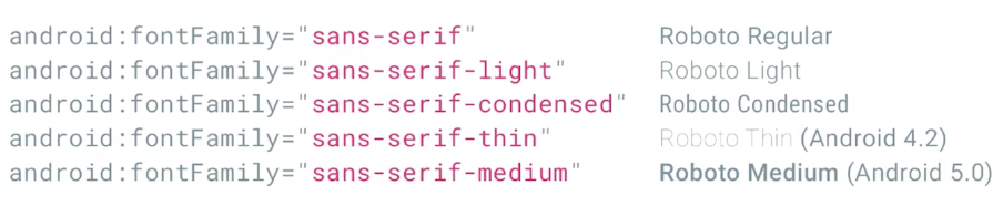
Roboto
SP
scale-independent pixels
缩放独立像素
16sp = 16dp @ 100% scale
16sp = 20dp @ 125% scale
使用sp可以方便那些视力上有困难的用户,放大字体也不会模糊.
Font
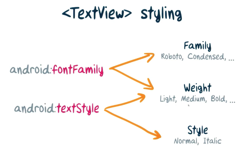
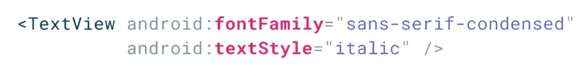
Choosing Fonts
在Roboto及其变体之外挑选字体,也绝非易事.
选择的字体仅仅是易于阅读同时和周围形成良好对比还远远不够,
字体的选择会影响用户对你的看法,以及他们做出的反应.
书写体/圆体使应用看起来更随意,而方方正正的字体则给人一种井然有序的感觉,等等
需要注意的是:
- 不要在一致的模块中使用类似的字体造成困扰;
- 在不同设备/分辨率上测试你选择字体的适应性;
- 确保字体的选择符合你应用的情感基调
Add Custom Font
在assets目录下添加你的字体文件.
如果是在片段中使用自定义字体,因为片段生命周期的缘故,需要在onAttach()里面实例化字体:
@Override
public void onAttach(Activity activity) {
    super.onAttach(activity);
    courgette = Typeface.createFromAsset(getActivity().getAssets(), "Courgette-Regular.ttf");
}
之所以这样做的原因是,在实例化后到附着于Activity上之间有一小段间隔,如果在这个间隔之内就调用了诸如tv.setTypeface(courgette);的方法,就会出现异常.
Using Image
图像,不仅带给人视觉的体验,更能触及人的情绪,甚至是回想起味道.
使用的图像将会强烈影响你的品牌效应.
使用的图像往往分为三类:
- 照片(Photography)
- 插图(Illustration)
- 图标(Iconography)
针对内容时,照片是很好的选择.
但尤其需要注意的是,提供充足分辨率的图像,同时在不同设备上测试它们,因为布局往往是不同的.
如果内容是抽象的,难以展示的,选择插图是一个好办法.
插图需要避免过度修饰,表述要清晰,同时尽量在一系列插图之间保持一致性,使其能够互相关联.
图标的使用,是为了便于寻找.
Make Image More Pleasant
Using ScaleType to fix your image.
Circular Avatars
RoundedBitmapDrawable drawable = RoundedBitmapDrawableFactory.create(context.getResources(), bitmap);
drawable.setCircular(true);
使用这个来创建圆形头像图片.
Aspect Ratio Image View
public class ThreeTwoImageView extends ImageView {
    ...
    ...
    ...(Three Construction)
    @Override
    protected void onMeasure(int widthSpec, int heightSpec) {
        int threeTwoHeight = MeasureSpec.getSize(widthSpec) * 2 / 3;
        int threeTwoHeightSpec = MeasureSpec.makeMeasureSpec(threeTwoHeight, MeasureSpec.EXACTLY);
        super.onMeasure(widthSpec, threeTwoHeightSpec);
    }
}
这样的iv视图将会固定为3:2的宽高比.
Background Protect
Scrim Gradient
为了解决当背景图片颜色和在其上的文字颜色相近导致看不见字的情况,
我们可以采取一层蒙版的方式.
<shape android:shape="rectangle">
    <gradient
        android:angle="-90"
        android:startColor="#000"
        android:centerColor="#000"
        android:endColor="#4d000000"
        android:type="linear" />
</shape>
然后我们使用一个FrameLayout,将这个盖在我们的ImageView上面:
<FramgLayout ...>
    <ImageView ... />
    <View
        android:background:="@drawable/scrim"
        ... />
    <TextView
        android:layout_gravity="bottom"
        ... />
</FrameLayout>
这样就可以改善视图效果.
Meaningful Motion
Motion that guides and encourages the user.
Animations in Android
The Early Days Of Animations
    AnimationSet animationSet = new AnimationSet(context, null);
    animationSet.addAnimation(new AlphaAnimation(1f, 0f));
    animationSet.addAnimation(new TranslateAnimation(0, 0, 0, -mButton.getHeight()));
    animationSet.setDuration(getResources().getInteger(android.R.integer.config_shortAnimTime));
    animationSet.setAnimationListener(new Animation.AnimationListener() {
        @Override public void onAnimationEnd(Animation animation) {
        mButton.setVisibility(View.GONE);
        startActivity(new Intent(MainActivity.this, SubActivity.class));
        overridePendingTransition(R.anim.activity_open_enter, R.anim.activity_open_exit);
        }
        ...
    });
    mButton.startAnimation;
或者可以在XML中定义动画,通过如下方式引入:
Animation animationSet = AnimationUtils.loadAnimation(context, R.anim.slideoutbutton);
下面是res/animslideoutbutton.xml`的文件内容:
<set ...>
    <translate
        android:fromYDelta="0%"
        android:toYDelta="-100%" />
    <alpha
        android:fromAlpha="1"
        android:toAlpha="0" />
</set>
Android 4: ViewPropertyAnimator
mButton.animate()
       .alpha(0f)
       .translationY(-mButton.getHeight())
       .setDuration(getResources().getInteger(android.R.integer.config_shortAnimTime))
       .withEndAction(new Runnable() {
           @Override
           public void run() {
               ...
           }
        });
Android 4: ObjectAnimator
ObjectAnimator.ofObject(
    mButton,
    "textColor",
    new ArgbEvaluator(),
    Color.BLACK,
    Color.RED)
    .setDuration(1000)
    .start();
这对文字的颜色做出了动画设计.
Introduce of TransitionManager
Slide slide = new Slide();
slide.setSlideEdge(Gravity.TOP);
ViewGroup root = (ViewGroup) findViewById(android.R.id.content);
TransitionManager.beginDelayedTransition(root, slide);
imageView.setVisibility(View.INVISIBLE);
这一段的API并不是很懂…
Some New Animation(API 4.4)
像是在一个页面下,两个场景的过渡,其实是使用了两套XML
然后使用TransitionManager来进行切换:
TransitionManager.go(
    Scene.getSceneForLayout(
        (ViewGroup) findViewById(R.id.root),
        R.layout.activity_main_scene_info,
        MainActivity.this)
    );
如果没有特别指定的话,系统会自动为你生成合适的效果.
如果想要自定义的话,在XML中描述动画效果,然后传递给TransitionManager:
TransitionManager.go(
    Scene.getSceneForLayout(
        (ViewGroup) findViewById(R.id.root),
        R.layout.activity_main_scene_info,
        MainActivity.this)
    ),
    TransitionInflater.from(this)
        .inflateTransition(R.transition.defaultToInfo));
Animation In Lollipop
Activity的退出和显示,可以做成两个动画来显示:
Exit Transition
res/transition/grid_exit.xml
<explode xmlns... />

res/values/styles.xml
<style name="AppTheme.Home">
    <item name="android:widnowExitTransition">
        @transition/grid_exit</item>
</style>
以上是Exit_Activity的动效,然后在代码中使用它:
GridActivity.java
Bundle bundle = ActivityOptions.
    makeSceneTransitionAnimation(this).toBundle();
context.startActivity(intent, bundle);
然后:
res/values/styles.xml
<style name="AppTheme" ...>
    <item
        name="android:windowContentTransitions">
        true</item>
</style>
(如果使用的是MD的Theme或者是AppCompat,这项是已经自动设置了的)
Enter Transition
DetailActivity.java
Slide slide = new Slide(Gravity.BOTTOM);
slide.addTarget(R.id.description);
slide.setInterpolator(
    AnimationUtils.loadInterpolator(this,
        android.R.interpolator.linear_out_slow_in));
slide.setDuration(slideDuration);
getWindow().setEnterTransition(slide);
API Check
code:
if (Build.VERSION.SDK_INT >=
    Build.VERSION_CODES.LOLLIPOP) {
    Slide slide = new Slide(Gravity.BOTTOM);
    ...
    getWindow().setEnterTransition(slide);
}

xml:
res/transition-v21/grid_exit.xml
...

res/values-v21/styles.xml
...
Re-enter
res/values/styles.xml
<style name="AppTheme" ...>
    <item
        name="android:windowContentTransitions">
        true</item>
    <item name="android:windowReenterTransition">
        @android:transition/slide_top</item>
</style>
Shared Element Transitions
当UI改变的时候,动效能帮助更好的说明这种改变,同时吸引用户的注意力.
共享元素即是指在两个界面中存在的相同的元素,
这样在两个页面之间切换的时候,应该为其提供一种平滑的过渡效果.
共享元素过渡使用相同的通道来进行推动,那就是过渡框架Transition Framework.
Now to build this, it helps to understand a little bit about how the system works under the hood.
When we say we’re doing a shared element transition between two activities, we aren’t actually sharing any views in their hierarchy. Each activity has an independent view tree. What we’re doing, is passing information about the shared view.
Such as, its position and its size between the two. When the second activity launches, it sets a transparent background and hides all of its own view so that you can, so to speak, see through to the previous activity behind it. It then locates the shared view within its own hierarchy and alters its attributes to match those passed in from the launching activity and makes that single view visible.
It then runs animations to transition the shared view from this state to its natural position in the layout. As the transition progresses, the window background and the rest of the non-shared amids slowly fade in until they’re totally opaque.
想要在两个视图中定义设置共享内容,我们需要在XML中定义transitionName属性:
layout/grid_item.xml
<ImageView
    ...
    android:transitionName=
        "@string/transition_photo" />

layout/activity_detail.xml
<ImageView
    ...
    android:transitionName=
        "@string/transition_photo" />
推荐是采用String资源文件的方式来保证其一致性.
然后,在Activity中,我们需要设置并指定共享元素:
GridActivity.java
Bundle bundle = ActivityOptions
    .makeSceneTransitionAnimation(
        this,
        sharedView,
        sharedView.getTransitionName()
        )
    .toBundle();
startActivity(intent, bundle);
为什么这里使用String而非id的方式来指明共享内容?
因为共享元素的过渡不仅仅是存在于单一应用之间,通过publish共享内容的名称,可以在不同的应用间进行共享元素的过渡效果.
共享元素的过渡的动效是如何这样生动地展现的?
Default Transition

Move.xml
<transitionSet>
    <changeBounds/>
    <changeTransform/>
    <changeClipBounds/>
    <changeImageTransform/>
</transitionSet>
如果想要实现自定义的动效:
Custom Shared Element Transition

<style name="AppTheme.Home">
    <item name="android:windowSharedElementEnterTransition>
        @transition/your_transition</item>
</style>
//-----------------
getWindow()
    .setSharedElementEnterTransition(yourTransition);
Instructive Motion
就像标签页之间切换的时候,给页面增加一点不明显的滑动动画,这就是一种指导动画,它以自己的动效暗示用户可以通过滑动来操作页面.
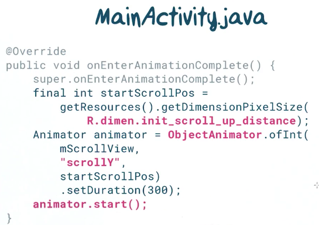
MainActivity.java
@Override
public void onEnterAnimationComplete() {
    super.onEnterAnimationComplete();
    final int startScrollPos =
        getResources().getDimensionPixelSize(
            R.dimen.init_scroll_up_distance);
    Animator animator = ObjectAnimator.ofInt(
        mScrollView,
        "scrollY",
        startScrollPos)
        .setDuration(300);
    animator.start();
}
可惜的是,这只在Android 5.0之后开始可用.
不过在早期版本,也可以进行伪造,设置启动延时即可.
Design to Enhance the Experience
With great power comes great responsibility.
经验来看,动画一般是300ms
当然,也可以通过移动的距离,来制定动画的时长
PS:经验来看,大部分设计人员制定的动效时长其实都超过了用户期望的时长…(好吐槽啊)
通过插值器来实现动效的加速度效果,同时在MD风格的设计当中,
加速和减速是不对称的
往往采用的是”快出,慢进”的效果(Fast-out/Slow-in)
user-initiated change
Really really important in MD
Coordinated Motion
现实世界中,很少有事物是完全线性运动的,所以曲线动效会比线性动效更加生动,但要小心这个效果会分散注意力.
尺寸变化有时会被误认为是高度变化,比较好的方式是以不同的速率将宽高的变化做成动画,这样展现出来就不容易产生误会了.
Gladden Detail
The detail are not the detail.
They make the design.
–Eames
无论何时,元素的状态发生了改变,都应该为其制作动画效果
不仅仅是大的区块需要,为小细节制作动画效果,能使过渡更加流畅和美观.
After all, animating literally means bringing to life.
为了制作出这些富有乐趣的效果,我们需要看看VectorDrawable和AnimatedVectorDrawable这两个类.
下面是一个VectorDrawable的例子:
<vector xmlns=...
    android:width="120dp"
    android:height="120dp"
    android:viewportWidth="24dp"
    android:viewportHeight="24dp">

    <path
        android:name="cross"
        android:pathData="M6.4,6.4 L17.6,17.6 M6.4,17.6 L17.6,6.4"
        android:strokeWidth="2dp"
        android:strokeLineCap="square"
        android:strokeColor="#999" />
</vector>
pathData的数据实际上绘制了一个X的图像
AnimatedVectorDrawable允许你将一些属性制成动画,下面是能制成动画的列表:
- Translate
- Scale
- Rotate
- Opacity
- Color
- Path
- Trim start/end
- Clip-path
前五项具有相当标准的动画绘制属性.
Path,可以变换(morph),从而达到动画的效果,比如将上面绘制的X变为✔.
同样可以将这个与别的效果合并,比如旋转,这样会更加美观一点.
形状的变化有一个限制条件,就是各个形状需要有相同数量的绘制指令,这样才能在两者之间进行插值.
当绘制一条路径的时候,Trim start/end可以让你通过裁减头或者尾来绘制它的一部分(裁减效果)
Clip-path,也即镂空效果,可以在你绘制的图形中留出镂空的部分,从而制成动效.
### Implement AnimatedVectorDrawable
The tick to cross animation
第一步先创建两个xml,用<vector>绘制的钩和叉
res/drawanle/ic_tick.xml
<vector xmlns...
    android:width="120dp"
    android:height="120dp"
    android:viewportWidth="24"
    android:viewportHeight="24">

    <group
        android:name="groupTickCross"
        android:pivotX="12"
        adnroid:pivotY="12" >

            <path
                android:name="tick"
                android:pathData="M4.8,13.4 ..."
                android:strokeWidth="2"
                android:strokeLineCap="square"
                android:strokeColor="#999" />

    </group>

</vector>

res/drawanle/ic_cross.xml
<vector xmlns...
    android:width="120dp"
    android:height="120dp"
    android:viewportWidth="24"
    android:viewportHeight="24">

    <group
        android:name="groupTickCross"
        android:pivotX="12"
        adnroid:pivotY="12" >

            <path
                android:name="cross"
                android:pathData="M6.4,6.4 ..."
                android:strokeWidth="2"
                android:strokeLineCap="square"
                android:strokeColor="#999" />

    </group>

</vector>
一个十分有用的技巧是,创建一个资源文件来保存你动画的所有属性:
这样就可以从很多不同的地方直接引用到我们所需要的数据.
第二步是为每一个变化的步骤创建动画效果.
res/animator/cross_to_tick.xml
<ObjectAnimator
    xmlns...
    android:propertyName="pathData"
    android:valueFrom="@string/path_cross"
    android:valueTo="@string/path_tick"
    android:duration="@integer/duration"
    android:interpolator="@android:interpolator/fast_out_slow_in"
    android:valueType="pathType" />
然后,创建一个可绘制的动画矢量来将图像与动画连接起来
res/drawable/avd_cross_to_tick.xml
<animated-vector
    xmlns...
    android:drawable="@drawable/ic_cross">

    <target
        android:name="@string/cross"
        android:animation="@animator/cross_to_tick" />

    <target
        android:name="@string/groupTickCross"
        android:animation="@animator/rotate_cross_to_tick" />

</animated-vector>
最后,在ImageView中显示绘制图,并在适当的时候启用动画
SomeActivity.java
AnimatedVectorDrawable crossToTick = getDrawable(
    R.drawable.avd_cross_to_tick);
imageView.setImageDrawable(crossToTick);
crossToTick.start();
Adaptive Design
UIs that look great no matter how large or small the screen is.
Five Principles
- Balanced use of space
- Reading comfort
- Image quality
- Maintaining context
- Aesthetic
Break Point and Content
临界点,就是在超过这个DPI值的时候,你的UI做出适应性改变.
MD设计规范里有提供一些临界点的范例,
但是,在适用于自己的应用时,要注意:
内容优先于范例的临界点
对于内容的适应的第一优先的
所以,基于内容来决定临界点,远比基于设备决定临界点要来的更具有前瞻性.
Fix in Break Point
- Reveal, 在大屏幕上显示那些你曾隐藏的内容(例如NavigationView)
- Divide, 将点击ListItem显示的详情页和List一起显示
- Reflow, 调整在不同屏幕上内容的显示方式(如单列变成三列)
- Expand, 将内容显示的平面拓展一些,并引入外边框来防止屏幕看起来太宽
Implement Adapter Design
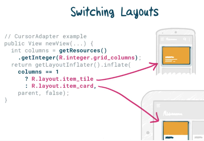
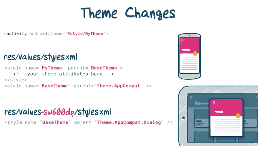
最简单的方法莫过于新建一个布局,并放置在比如res/layout-w6000dp这样的的资源目录下.
但是这样的方法,必然存在大量重复的代码,在布局文件多了以后,代码的维护问题就会很严重.
解决方式之一是采用<include>:
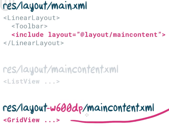
同时,对布局中的整数资源,可以同样采用w600dp限定符:
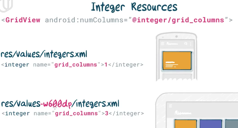
对于采用的不同布局,可以在Adapter中根据整数资源的不同来进行判断:
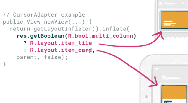
同时,不仅仅有整数资源,还有布尔类型的资源:
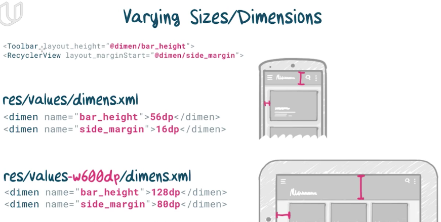
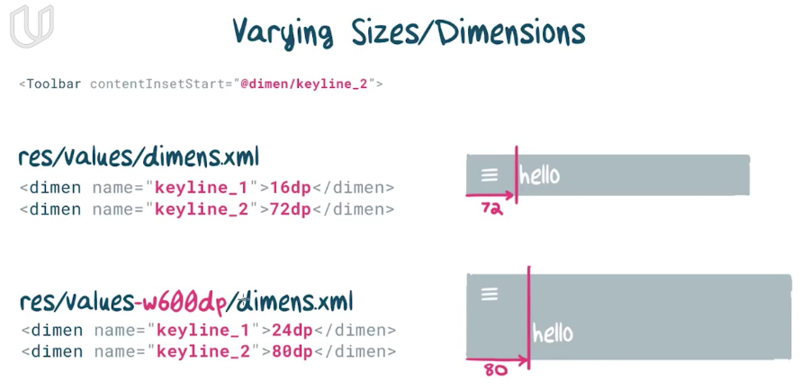
对于一些距离上的值的改变,同样运用这样的技术,可以最大程度上改善代码的重复率:
下面就是一个例子,防止在较大屏幕上导致的按钮拉伸过长:
注意的是仅仅match_parent不会在资源文件中起作用,因为特殊值-1是没有单位的,所以需要添加<item>到你的尺寸文件中,这样就可以引用了
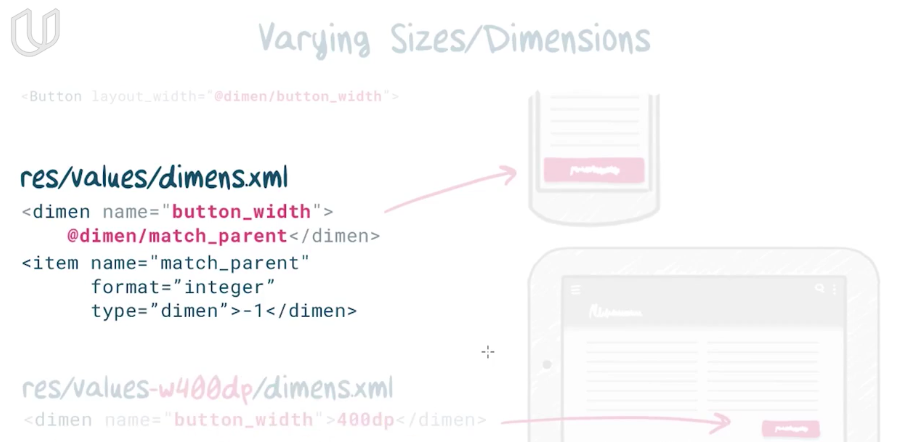
同样的,对于基准线,也是一样的道理:
Theme Change
Ending Wrods
课程内容基本到这里就结束了,
最后有一个课程结业作业.
不看不知道,一看才发现,竟然还推荐你学完另两门课,知识才够完成这个作业.
不禁感觉头大(:зゝ∠)…
那就先这样吧~


 被折叠的 条评论
为什么被折叠?
被折叠的 条评论
为什么被折叠?
 到【灌水乐园】发言


