Android平台中常用的可视化控件

16 篇文章 0 订阅

一. TextView

二. ImageView


1、结构

    java.lang.Object

      android.view.View

        android.widget.ImageView


    已知直接子类:

    ImageButton, QuickContactBadge 


    已知间接子类:

    ZoomButton


  2、类概述

    显示任意图像,例如图标。ImageView类可以加载各种来源的图片(如资源或图片库),需要计算图像的尺寸,比便它可以在其他布局中使用,并提供例如缩放和着色(渲染)各种显示选项。


  3、XML属性


属性名称

描述

android:adjustViewBounds

是否保持宽高比。需要与maxWidth、MaxHeight一起使用,否则单独使用没有效果。

android:cropToPadding

是否截取指定区域用空白代替。单独设置无效果,需要与scrollY一起使用,效果如下,实现代码见代码部分:


android:maxHeight

设置View的最大高度,单独使用无效,需要与setAdjustViewBounds一起使用。如果想设置图片固定大小,又想保持图片宽高比,需要如下设置:

1) 设置setAdjustViewBounds为true;

2) 设置maxWidth、MaxHeight;

3) 设置设置layout_width和layout_height为wrap_content。

android:maxWidth

设置View的最大宽度。同上。

android:scaleType

设置图片的填充方式。

matrix

0

用矩阵来绘图


fitXY

1

拉伸图片(不按比例)以填充View的宽高


layout_

height

:30px


layout_

width

:120px

fitStart

2

按比例拉伸图片,拉伸后图片的高度为View的高度,且显示在View的左边


fitCenter

3

按比例拉伸图片,拉伸后图片的高度为View的高度,且显示在View的中间


fitEnd

4

按比例拉伸图片,拉伸后图片的高度为View的高度,且显示在View的右边


center

5

按原图大小显示图片,但图片宽高大于View的宽高时,截图图片中间部分显示


layout_

height

:60px


layout_

width

:80px


padding

:10px


centerCrop

6

按比例放大原图直至等于某边View的宽高显示。


centerInside

7

当原图宽高或等于View的宽高时,按原图大小居中显示;反之将原图缩放至View的宽高居中显示。


android:src

设置View的drawable(如图片,也可以是颜色,但是需要指定View的大小)

android:tint

将图片渲染成指定的颜色。见下图:

左边为原图,右边为设置后的效果,见后面代码。


  4、代码  

    4.1  android:tint

Java代码   收藏代码
  1. <ImageView android:background="@android:color/white" android:src="@drawable/btn_mode_switch_bg"  
  2.         android:layout_width="wrap_content" android:layout_height="wrap_content"></ImageView>  
  3.     <ImageView android:layout_marginLeft="5dp" android:background="@android:color/white" android:tint="#ffff00" android:src="@drawable/btn_mode_switch_bg"  
  4.         android:layout_width="wrap_content" android:layout_height="wrap_content"></ImageView>   
     4.2  android:cropToPadding
Java代码   收藏代码
  1. <ImageView android:background="@android:color/white" android:scrollY="-10px" android:cropToPadding="true" android:src="@drawable/btn_mode_switch_bg"  
  2.         android:layout_width="wrap_content" android:layout_height="wrap_content"></ImageView>  
  3.     <ImageView android:background="@android:color/white" android:scrollY="10px" android:cropToPadding="true" android:src="@drawable/btn_mode_switch_bg"  
  4.         android:layout_width="wrap_content" android:layout_height="wrap_content"></ImageView>  
  5.     <ImageView android:paddingTop="10px"  android:background="@android:color/white" android:scrollY="10px" android:cropToPadding="true" android:src="@drawable/btn_mode_switch_bg"  
  6.         android:layout_width="wrap_content" android:layout_height="wrap_content"></ImageView>  
  7.     <ImageView android:paddingTop="10px" android:background="@android:color/white" android:scrollY="10px" android:cropToPadding="false" android:src="@drawable/btn_mode_switch_bg"  
  8.         android:layout_width="wrap_content" android:layout_height="wrap_content"></ImageView>  


三.CheckBox

CheckBox简介:

CheckBox和Button一样,也是一种古老的控件,它的优点在于,不用用户去填写具体的信息,只需轻轻点击,缺点在于只有“是”和“否”两种情况,但我们往往利用它的这个特性,来获取用户的一些信息。

如一个身份表单中,常常让用户填写“是否已经结婚”,显然让用户去填写“是”或“否”是不合理的,理想的情景是用如下控件:

选中后的状态:

建立CheckBox的布局:

复制代码
     
     
1 < CheckBox 2 android:id ="@+id/cb" 3 android:layout_width ="wrap_content" 4 android:layout_height ="wrap_content" 5 android:checked ="false" 6 android:text ="已婚" 7 ></ CheckBox >
复制代码

显然,Checked属性是CheckBox最重要的属性之一,改变它的方式有三种:

1、XML中申明 2、代码动态改变 3、用户触摸

它的改变将会触发OnCheckedChange事件,而您可以对应的使用OnCheckedChangeListener监听器来监听这个事件,

具体的匿名监听方法代码如下:

复制代码
     
     
// 获取CheckBox实例 CheckBox cb = (CheckBox) this .findViewById(R.id.cb); // 绑定监听器 cb.setOnCheckedChangeListener( new OnCheckedChangeListener() { @Override public void onCheckedChanged(CompoundButton arg0, boolean arg1) { // TODO Auto-generated method stub Toast.makeText(MyActivity. this , arg1 ? " 选中了 " : " 取消了选中 " , Toast.LENGTH_LONG).show(); } });


四. Button

代码中常用属性:

Button bt=new Buttion(Context context);

bt.setText();---为控件设置文本内容


xml中常用属性:

android:layout_width=""---控件宽

android:layout_height=""---控件高

android:layout_weight=""---控件权重

android:text=""---控件上的文本内容

android:onClick="doClick"---点击此控件时调用的方法---方法名称为:doClick

android:drawableTop=""---在Button组件上放置图片

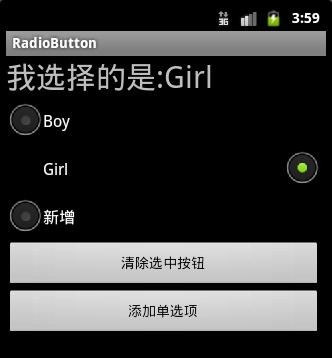
五. RadioButton和RadioGroup

实现RadioButton由两部分组成,也就是RadioButtonRadioGroup配合使用.RadioGroup是单选组合框,可以容纳多个RadioButton的容器.在没有RadioGroup的情况下,RadioButton可以全部都选中;当多个RadioButtonRadioGroup包含的情况下,RadioButton只可以选择一个。并用setOnCheckedChangeListener来对单选按钮进行监听

01 RadioGroup相关属性:
02  
03 RadioGroup.getCheckedRadioButtonId ();--获取选中按钮的id
04  
05 RadioGroup.clearCheck ();//---清除选中状态
06  
07 RadioGroup.check (int id);//---通过参入选项id来设置该选项为选中状态如果传递-1作为指定的选择标识符来清除单选按钮组的勾选状态,相当于调用clearCheck()操作
08  
09 setOnCheckedChangeListener (RadioGroup.OnCheckedChangeListener listener); //--一个当该单选按钮组中的单选按钮勾选状态发生改变时所要调用的回调函数
10  
11 addView (View child, int index, ViewGroup.LayoutParams params);//---使用指定的布局参数添加一个子视图
12  
13 //参数 child 所要添加的子视图    index 将要添加子视图的位置  params 所要添加的子视图的布局参数
14  
15 RadioButton.getText();//获取单选框的值
16  
17 //此外,RadioButton的checked属性设置为true,代码里调用RadioButton的check(id)方法,不会触发onCheckedChanged事件

RadioButton和RadioGroup的关系:

1、RadioButton表示单个圆形单选框,而RadioGroup是可以容纳多个RadioButton的容器

2、每个RadioGroup中的RadioButton同时只能有一个被选中

3、不同的RadioGroup中的RadioButton互不相干,即如果组A中有一个选中了,组B中依然可以有一个被选中

4、大部分场合下,一个RadioGroup中至少有2个RadioButton

5、大部分场合下,一个RadioGroup中的RadioButton默认会有一个被选中,并建议您将它放在RadioGroup中的起始位置

看案例:

1.定义布局文件:


01 <?xml version="1.0" encoding="utf-8"?>
02 <ScrollView xmlns:android="http://schemas.android.com/apk/res/android"
03     android:layout_width="match_parent"
04     android:layout_height="match_parent" >
05  <LinearLayout
06         android:orientation="vertical"
07         android:layout_width="match_parent"
08         android:layout_height="wrap_content"
09         android:layout_marginRight="5dp" >
10            
11            <TextView
12         android:id="@+id/radiogroup_info_id"
13         android:layout_width="228px"
14         android:layout_height="wrap_content"
15         android:text="我选择的是...?"
16         android:textSize="30sp"   
17          />  
18             
19           <RadioGroup
20             android:id="@+id/radioGroup_sex_id"
21             android:layout_width="match_parent"
22             android:layout_height="match_parent"
23               >
24               <RadioButton
25                 android:id="@+id/boy_id"
26                 android:layout_width="match_parent"
27                 android:layout_height="match_parent"  
28                 android:text="Boy"
29                   />
30               <RadioButton
31                 android:id="@+id/girl_id"
32                 android:layout_width="match_parent"
33                 android:layout_height="match_parent"  
34                 android:text="Girl"
35                   />
36                
37           </RadioGroup>
38           <Button
39                android:id="@+id/radio_clear"
40                android:layout_width="match_parent"
41                android:layout_height="match_parent"  
42                android:text="清除选中按钮"
43               />
44            
45           <Button
46                android:id="@+id/radio_add_child"
47                android:layout_width="match_parent"
48                android:layout_height="match_parent"  
49                android:text="添加单选项"
50               />
51            
52        </LinearLayout>
53  </ScrollView>

 2.java代码文件


01 package com.dream.app.start.first.radiobutton;
02  
03 import com.dream.app.start.R;
04 import com.dream.app.start.R.id;
05 import com.dream.app.start.R.layout;
06 import com.dream.app.start.three.utils.PublicClass;
07  
08 import android.app.Activity;
09 import android.os.Bundle;
10 import android.view.View;
11 import android.view.View.OnClickListener;
12 import android.view.ViewGroup.LayoutParams;
13 import android.widget.Button;
14 import android.widget.RadioButton;
15 import android.widget.RadioGroup;
16 import android.widget.RadioGroup.OnCheckedChangeListener;
17 import android.widget.TextView;
18 import android.widget.ToggleButton;
19  
20 public class RadioButtonDemo extends PublicClass {
21     private  TextView   textView=null;
22     private  RadioGroup  radioGroup=null;
23     private  RadioButton  radioButton_boy,radioButton_girl;
24     private Button   radio_clear,child;
25     /* (non-Javadoc)
26      * <a href="http://my.oschina.net/u/244147" target="_blank" rel="nofollow">@see</a>  android.app.Activity#onCreate(android.os.Bundle)
27      */
28     @Override
29     protected void onCreate(Bundle savedInstanceState) {
30         // TODO Auto-generated method stub
31         super.onCreate(savedInstanceState);
32          
33         setContentView(R.layout.layout_frist_radiobuton);
34          
35         textView = (TextView)findViewById(R.id.radiogroup_info_id); 
36          
37         //radioGroup
38         radioGroup=(RadioGroup)findViewById(R.id.radioGroup_sex_id);
39         radioButton_boy=(RadioButton)findViewById(R.id.boy_id);
40         radioButton_girl=(RadioButton)findViewById(R.id.girl_id);
41         child=(Button)findViewById(R.id.radio_add_child);
42         //---
43         radioGroup.setOnCheckedChangeListener(listen);
44         radio_clear=(Button)findViewById(R.id.radio_clear);
45         radio_clear.setOnClickListener(onClick);
46         child.setOnClickListener(onClick);
47     }
48      
49     private OnCheckedChangeListener  listen=new OnCheckedChangeListener() {
50          
51         @Override
52         public void onCheckedChanged(RadioGroup group, int checkedId) {
53         int id= group.getCheckedRadioButtonId();
54             switch (group.getCheckedRadioButtonId()) {
55             case R.id.girl_id:
56                 textView.setText("我选择的是:"+radioButton_girl.getText());
57                 break;
58             case R.id.boy_id:
59                 textView.setText("我选择的是:"+radioButton_boy.getText());
60                 break;
61             default:
62                 textView.setText("我选择的是:新增");
63                 break;
64             }
65              
66         }
67     };
68     private OnClickListener  onClick=new OnClickListener() {
69          
70         @Override
71         public void onClick(View v) {
72             radio_clear=(Button)v;
73             switch (radio_clear.getId()) {
74             case R.id.radio_clear:
75                 radioGroup.check(-1);//清除选项
76 //              radioGroup.clearCheck(); //清除选项
77                 textView.setText("我选择的是...?");
78                 break;
79             case R.id.radio_add_child:
80                                //新增子
81                 RadioButton  newRadio =new RadioButton(getApplicationContext());
82                 newRadio.setText("新增");
83                 radioGroup.addView(newRadio, radioGroup.getChildCount());              
84                 break;
85                 //
86              
87            default:
88                 break;
89             }
90         }
91     };
92  
93 }

运行效果:

运行效果

选中一个按钮时的截图


3.

点击添加单选项的截图


 4:可以通过设置如下属性可以使单选按钮在显示文本的右边

                android:button="@null"                    

                android:drawableRight="@android:drawable/btn_radio"

效果:


RadioButton和CheckBox的区别:

1、单个RadioButton在选中后,通过点击无法变为未选中

    单个CheckBox在选中后,通过点击可以变为未选中

2、一组RadioButton,只能同时选中一个

     一组CheckBox,能同时选中多个

3、RadioButton在大部分UI框架中默认都以圆形表示

     CheckBox在大部分UI框架中默认都以矩形表示

==================================================

☆定制RadioButton样式

RadioButton长成什么样子是由其Background、Button等属性决定的,Android系统 
使用style定义了默认的属性,在android源码 

android/frameworks/base/core/res/res/values/styles.xml中可以看到默认的定义:

1 <style name="Widget.CompoundButton.RadioButton"
2         <item name="android:background">@android:drawable/btn_radio_label_background</item
3         <item name="android:button">@android:drawable/btn_radio</item
4 </style>

即其背景图是btn_radio_label_background,其button的样子是btn_radio 

btn_radio_label_background是什么? 
其路径是android/frameworks/base/core/res/res/drawable-mdpi/btn_radio_label_background.9.png 
可以看到是一个NinePatch图片,用来做背景,可以拉伸填充。 

btn_radio是什么? 

其路径是android/frameworks/base/core/res/res/drawable/btn_radio.xml 

是个xml定义的drawable,打开看其内容:

01 <selector xmlns:android="http://schemas.android.com/apk/res/android">     
02     <item android:state_checked="true" android:state_window_focused="false" 
03           android:drawable="@drawable/btn_radio_on" /> 
04     <item android:state_checked="false" android:state_window_focused="false" 
05           android:drawable="@drawable/btn_radio_off" /> 
06    
07     <item android:state_checked="true" android:state_pressed="true" 
08           android:drawable="@drawable/btn_radio_on_pressed" /> 
09     <item android:state_checked="false" android:state_pressed="true" 
10           android:drawable="@drawable/btn_radio_off_pressed" /> 
11    
12     <item android:state_checked="true" android:state_focused="true" 
13           android:drawable="@drawable/btn_radio_on_selected" /> 
14     <item android:state_checked="false" android:state_focused="true" 
15           android:drawable="@drawable/btn_radio_off_selected" /> 
16    
17     <item android:state_checked="false" android:drawable="@drawable/btn_radio_off" /> 
18     <item android:state_checked="true" android:drawable="@drawable/btn_radio_on" /> 
19 </selector>

<item android:state_checked="true" android:state_pressed="true"  
          android:drawable="@drawable/btn_radio_on_pressed" />  

意思即为当radiobutton被选中时,并且被按下时,其Button应该长成btn_radio_on_pressed这个样子。


文件是android/frameworks/base/core/res/res/drawable-mdpi/btn_radio_on_pressed.png 

drawable的item中可以有以下属性: 

1 android:drawable="@[package:]drawable/drawable_resource"
2 android:state_pressed=["true" | "false"]
3 android:state_focused=["true" | "false"]
4 android:state_selected=["true" | "false"]
5 android:state_active=["true" | "false"]
6 android:state_checkable=["true" | "false"]
7 android:state_checked=["true" | "false"]
8 android:state_enabled=["true" | "false"]
9 android:state_window_focused=["true" | "false"]

当按钮的状态和某个item匹配后,就会使用此item定义的drawable作为按钮图片。  

从上面分析我们如果要修改RadioButton的外观,

自定义有三种方式:

1.方式一:

01 <?xml version="1.0" encoding="utf-8"?>    
02 <selector xmlns:android="http://schemas.android.com/apk/res/android">  
03 <!-- 未选中->  
04     <item    
05          android:state_checked="false"    
06          android:drawable="@drawable/tabswitcher_long" /> 
07 <!--选中->    
08     <item    
09         android:state_checked="true"    
10         android:drawable="@drawable/tabswitcher_short" />    
11 </selector>

在布局文件中使用

1 <RadioGroup 
2   ... 
3
4 <RadioButton 
5   ... 
6 android:button="@null" 
7 android:background="@drawable/radio" 
8 /> 
9 </RadioGroup>

android:button="@null"   去除RadioButton前面的圆点

2.方式二:在JAVA代码中定义

1 @Override  
2 public boolean onTouchEvent(MotionEvent event) { 
3   if(event.getActionMasked() == MotionEvent.ACTION_DOWN){ 
4     this.setBackgroundResource(com.wxg.tab.R.drawable.main_bg); 
5   }else if(event.getActionMasked()== MotionEvent.ACTION_DOWN) { 
6     this.setBackgroundResource(com.wxg.tab.R.drawable.hui); 
7   
8   return super.onTouchEvent(event); 
9 }

去除RadioButton前面的圆点adioButton.setButtonDrawable(android.R.color.transparent);

3. 方式三

使用XML文件定义,在JAVA代码中使用 radioButton.setBackgroundResource(R.drawable.radio);调用

==============================================================

                                                设置RadioButton在文字的右边

1 <b><RadioButton  
2             android:id="@+id/button2"  
3             android:layout_width="fill_parent"  
4             android:layout_height="50dip"  
5             android:button="@null"  
6             android:drawableRight="@android:drawable/btn_radio"  //在右边
7             android:paddingLeft="30dip"  
8             android:text="Android高手"  
9             android:textSize="20dip" />   </b>

================================================================

自定义 radiobutton 文字颜色随选中状态而改变

主要是写一个 color selector

在res/建一个文件夹取名color

res/color/color_radiobutton.xml
1 <?xml version="1.0" encoding="utf-8"?>
2 <selector xmlns:android="http://schemas.android.com/apk/res/android">
3  
4      <item android:state_checked="true" 
5      android:color="@color/color_text_selected"/>
6      <!-- not selected -->
7      <item android:color="@color/color_text_normal"/>
8 </selector>

布局文件定义控件:
01 <RadioButton
02             android:id="@+id/radiobutton_1"
03             android:layout_width="wrap_content"
04             android:layout_height="wrap_content"
05             android:background="@drawable/selector_radio"
06             android:button="@null"
07             android:checked="true"
08              android:gravity="center"
09              android:text="目录"
10             <!--自定义文本颜色  -->
11             android:textColor="@color/color_radiobutton"
12             android:textSize="@dimen/font_size"
13             android:textStyle="bold" />

============================================================
RadioButton上显示图片和文字

使用XML文件很简单就可以实现,但是有时必须要使用java code 的方式动态实现,这就有些复杂了,这需要继承RadioButton并覆盖其中的onDraw方法。

在代码中的image是Bitmap对象。

01 @Override 
02  
03 protected void onDraw(Canvas canvas) { 
04  
05   super.onDraw(canvas); 
06  
07    if(image!=null){ 
08  
09     Paint pt = new Paint(); 
10  
11     pt.setARGB(255,66,66,66); 
12  
13     //消除锯齿 
14  
15     pt.setAntiAlias(true); 
16  
17     //居中显示图片 
18  
19     int imageX=(int)(this.getWidth()-image.getWidth())/2
20  
21     canvas.drawBitmap(image,imageX,5,pt); 
22  
23     pt.setARGB(255,255,255,255); 
24  
25     //居中显示字符串 
26  
27     int strX=(int)(this.getWidth()-name.getBytes().length*5.5)/2
28  
29     canvas.drawText(name,strX,(image.getHeight()+15),pt); 
30     }
31  }

六. ImageButton

将按钮背景图预先ImportDrawable里(*.png图形文件),利用这些图片,作为ImageButton的背景图。为了做对照,我们另外在Layout配置一个“一般按钮”,运行结果画面中,可以明显看出图片按钮与一般按钮在外观上的差异。

一般来说,要设置ImageButton背景图有许多方法,此程序使用的方法是ImageButton.setImage- Resource()需要传递的参数即是res/drawable/下面的Resource ID,除了设置背景图片的方法外,程序需要用到onFocusChangeonClick等按钮事件作为按钮事件单击之后的处理,最后通过TextView来显示目前图片按钮的状态为onClickonFocus,或offFocus,并且同步更新按钮的背景图,让User有动态交互的感觉。

src/irdc.ex04_02/EX04_02.java

主程序构造三个对象ImageButtonButtonTextView,并在ImageButton上设置onFocus ChangeListeneronClickListener,并实现Image Button图片的置换。

ImageButton.setOnFocusChangeListener()是处理User单击图片按钮之后需要处理的关键,当单击图片按钮的瞬间,以ImageButton.setImageResource()来更换背景图片。


/* import程序略 */

import android.view.View.OnClickListener;

import android.view.View.OnFocusChangeListener;


public class EX04_02 extends Activity

{

  /*声明三个对象变量(图片按钮,一般按钮,TextView)*/

  private ImageButton mImageButton1;

  private Button mButton1;

  private TextView mTextView1;


  /** Called when the activity is first created. */

  @Override

  public void onCreate(Bundle savedInstanceState)

  {

    super.onCreate(savedInstanceState);

    setContentView(R.layout.main);


    /*通过findViewById构造三个对象*/

    mImageButton1 =(ImageButton) findViewById(R.id.myImageButton1);

    mButton1=(Button)findViewById(R.id.myButton1);

    mTextView1 = (TextView) findViewById(R.id.myTextView1);


    /*通过OnFocusChangeListener来响应ImageButtononFous事件*/

    mImageButton1.setOnFocusChangeListener(new OnFocusChangeListener()

    {

      public void onFocusChange(View arg0, boolean isFocused)

      {

        // TODO Auto-generated method stub


        /*ImageButton状态为onFocus改变ImageButton的图片

         * 并改变textView的文字*/

        if (isFocused==true)

        {

          mTextView1.setText("图片按钮状态为:Got Focus");

          mImageButton1.setImageResource(R.drawable.iconfull);

        }

        /*ImageButton状态为offFocus改变ImageButton的图片

         *并改变textView的文字*/

        else

        {

          mTextView1.setText("图片按钮状态为:Lost Focus");

          mImageButton1.setImageResource(R.drawable.iconempty);

        }

      }

    });


    /*通过onClickListener来响应ImageButtononClick事件*/

    mImageButton1.setOnClickListener(new OnClickListener()

    {

      public void onClick(View v)

      {

        // TODO Auto-generated method stub

        /*ImageButton状态为onClick改变ImageButton的图片

         * 并改变textView的文字*/

        mTextView1.setText("图片按钮状态为:Got Click");

        mImageButton1.setImageResource(R.drawable.iconfull);

      }  

    });


    /*通过onClickListener来响应ButtononClick事件*/

    mButton1.setOnClickListener(new OnClickListener()

    {

      public void onClick(View v)

      {

        // TODO Auto-generated method stub

        /*Button状态为onClick改变ImageButton的图片

         * 并改变textView的文字*/

        mTextView1.setText("图片按钮状态为:Lost Focus");

        mImageButton1.setImageResource(R.drawable.iconempty);

      }

    });

  }

}


扩展学习

除了在运行时用onFocus()onClick()事件来设置按钮背景图片外,AndroidMVC设计理念可以让程序运行之际初就以xml定义的方式来初始化ImageButton的背景图,这仅需先将图片导入res/drawable

设置方法为在res/drawable下自行定义一个xml,主要针对按钮的state_focusedstate_presseddrawable属性作设置,如下所示:

drawable/advancedbutton.xml

<?xml version="1.0" encoding="utf-8"?> 

<selector

  xmlns:android="http://schemas.android.com/apk/res/android">

  <item

    android:state_focused="true"

    android:state_pressed="false"

    android:drawable="@drawable/btnfocused" />

  <item

    android:state_focused="true"

    android:state_pressed="true"

    android:drawable="@drawable/btnfocusedpressed" />

  <item

    android:state_focused="false"

    android:state_pressed="true"

    android:drawable="@drawable/btnpressed" />

  <item android:drawable="@drawable/btndefault" />

</selector>


然后,在main.xml中将advancedbutton赋值给Button组件中background的属性。

layout/main.xml

<Button

  android:id="@+id/myButton1"

  android:background="@drawable/advancedbutton"

  android:layout_width="wrap_content"

  android:layout_height="wrap_content"


七.ToggleButton

关键字: Android API 中文,Android 中文 API,android sdk 中文

  本章翻译的是android.widget.ToggleButton,译为开关按钮 。欢迎更多朋友一起参与Android API 的中文翻译行动!再次感谢移动社区提供的积分支持!我的邮箱over140@gmail.com。


声明

  欢迎转载,但请保留文章原始出处:) 

    博客园:http://www.cnblogs.com

    农民伯伯: http://www.cnblogs.com/over140/


版本

  Android 2.2 r1 


正文

  一、结构

    public class ToggleButton extends CompoundButton


    java.lang.Object

        android.view.View

              android.widget.TextView

                      android.widget.Button

                            android.widget.CompoundButton

                                   android.widget.ToggleButton


  二、 类概述


    通过一个带有亮度指示同时默认文本为“ON”或“OFF”的按钮显示选中/未选中状态。


  三、XML属性

属性名称

描述

android:disabledAlpha

设置按钮在禁用时透明度。


android:textOff

未选中时按钮的文本

android:textOn

选中时按钮的文本


  四、公共方法

         public CharSequence getTextOff ()

         返回按钮未选中时的文本。

                   返回值

                            文本


         public CharSequence getTextOn ()

         返回按钮选中时的文本。

                   返回值

                            文本


         public void setBackgroundDrawable (Drawable d)

         设置指定的可绘制(译者注:如图片)为背景,或删除背景。如果让背景有边距,这个视图的边距就是背景的边距。然而,当背景被删除时,这个视图的边距不能被触摸。如果需要设置边距,请使用方法setPadding(int, int, int, int)

(译者注:如果设置删除背景整个就不显示了,此外设置背景后选中和被选中的图片也不显示了,如下图: ,实现代码:


                   参数

                            d      设置可绘制(译者注:如图片)为背景,或设置为空删除背景。


         public void setChecked (boolean checked)

         改变按钮的选中状态。

                   参数

                            checked true让按钮选中,false让按钮不选中


         public void setTextOff (CharSequence textOff)

         设置按钮未选中时显示的文本。

                   参数

                            textOff    文本


         public void setTextOn (CharSequence textOn)

         设置按钮选中时显示的文本。

                   参数

                            textOn     文本


  五、受保护方法

         protected void drawableStateChanged ()

         在视图状态的变化影响到所显示可绘制的状态时调用这个方法。

         确保在覆盖时中调用父类方法(译者注:super. drawableStateChanged ())。


         protected void onFinishInflate ()

         XML文件加载视图完成时调用。这个函数在加载的最后阶段被调用,所有的子视图已经被添加。

         即使子类重写了onFinishInflate方法,也应该始终确保调用父类方法(译者注:super. onFinishInflate()),使系统能够调用。 


  六、下载

    http://download.csdn.net/source/2746654


  八、系列

    Android 2.2 API 中文文档系列(1) —— TextView

    Android 2.2 API 中文文档系列(2) —— EditText

    Android 2.2 API 中文文档系列(3) —— AccessibilityService

    Android 2.2 API 中文文档系列(4) —— Manifest

    Android 2.2 API 中文文档系列(5) —— View

    Android 2.2 API 中文文档系列(6) —— ImageView

    Android 2.2 API 中文文档系列(7) —— ImageButton

     Android 2.2 API 中文文档系列(8) —— QuickContactBadge

    Android 2.2 API 中文文档系列(9) —— ZoomButton

     Android 2.2 r1 API 中文文档系列(10) —— CheckBox

    Android 2.2 r1 API 中文文档系列(11) —— RadioButton

    Android 2.2 r1 API 中文文档系列(12) —— Button


  • 0
    点赞
  • 1
    收藏
    觉得还不错? 一键收藏
  • 打赏
    打赏
  • 0
    评论

“相关推荐”对你有帮助么?

  • 非常没帮助
  • 没帮助
  • 一般
  • 有帮助
  • 非常有帮助
提交
评论
添加红包

请填写红包祝福语或标题

红包个数最小为10个

红包金额最低5元

当前余额3.43前往充值 >
需支付:10.00
成就一亿技术人!
领取后你会自动成为博主和红包主的粉丝 规则
hope_wisdom
发出的红包

打赏作者

一枚码农404

你的鼓励将是我创作的最大动力

¥1 ¥2 ¥4 ¥6 ¥10 ¥20
扫码支付:¥1
获取中
扫码支付

您的余额不足,请更换扫码支付或充值

打赏作者

实付
使用余额支付
点击重新获取
扫码支付
钱包余额 0

抵扣说明:

1.余额是钱包充值的虚拟货币,按照1:1的比例进行支付金额的抵扣。
2.余额无法直接购买下载,可以购买VIP、付费专栏及课程。

余额充值