


背景
最近想用uni-app写个简单的APP,为增加特效,想使用类似游戏里边的图片按钮,按下缩小,松手还原,然后可以触发对应事件。但是找了一圈发现好像并没有原生支持,所以就自己写了一个,这里记录一下。
代码实现
1. 图片按钮代码组件定义:imgButton.vue
<template>
	<view>
		<image :src="props.src" @touchstart="handleMouseDown" @mousedown="handleMouseDown" @touchend="handleMouseUp" @mouseup="handleMouseUp"
			:style="{width:'100%', height:'100%',margin: 'auto',  transform: scale}"
			@contextmenu.prevent="preventDefault" :draggable="false" />
	</view>
</template>

<script setup>
	import {
		ref,
		defineEmits
	} from 'vue';
	const props = defineProps(['src'])
	const emit = defineEmits(['up', 'down'])
	const scale = ref('scale(1)')
	// 按住鼠标或者屏幕
	const handleMouseDown = () => {
		scale.value = 'scale(0.9)'
		emit('down')
	}
	// 松开鼠标或者屏幕
	const handleMouseUp = () => {
		scale.value = 'scale(1)'
		emit('up')
	}

	const preventDefault = (event) => {
		event.preventDefault()
	}
</script>

<style>

</style>
2. 测试代码
<template>
<view class="container">
<!-- 运动控制 -->
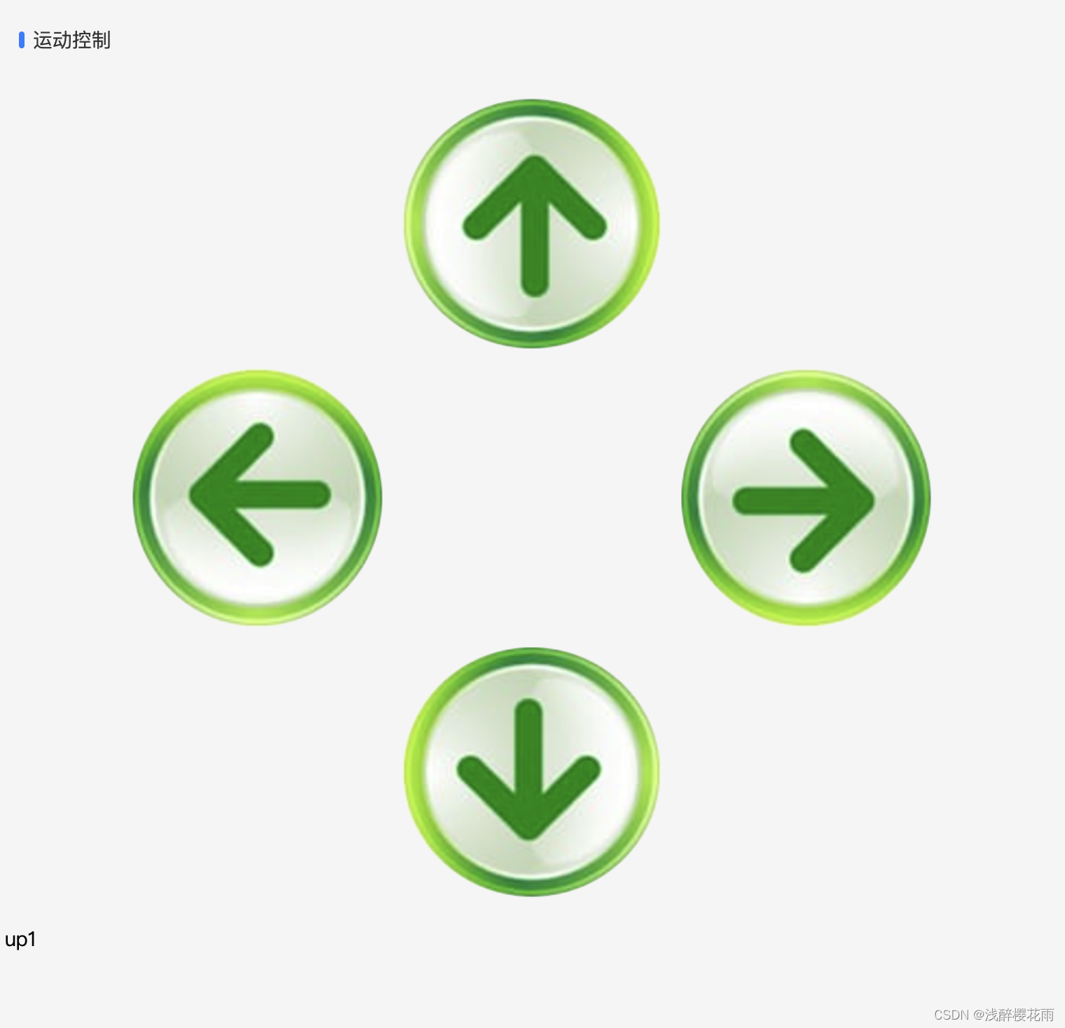
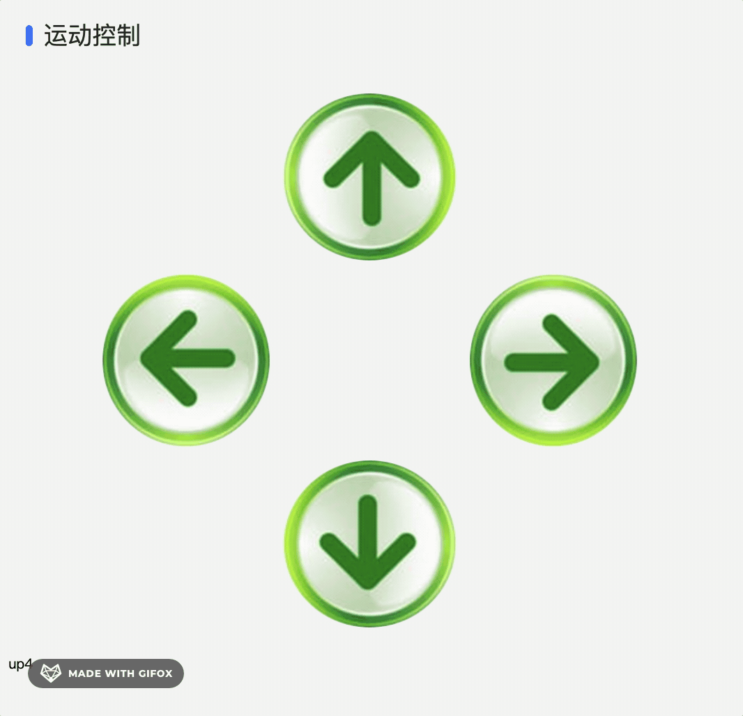
<uni-section title="运动控制" type="line" padding style="background-color: transparent;">
<uni-grid :column="3" :highlight="false" border-color="green" :show-border="false"
style="width: 80%;margin: 0 auto;">
<uni-grid-item></uni-grid-item>
<uni-grid-item><img-button src="../../static/WX20240507-105057@2x.png"
style="width: 100%;height: 100%;transform: rotate(-90deg);margin: auto;" @down="log('down1')"
@up="log('up1')"></img-button></uni-grid-item>
<uni-grid-item></uni-grid-item>
<uni-grid-item><img-button src="../../static/WX20240507-105057@2x.png"
style="width: 100%;height: 100%;transform: rotate(180deg);margin: auto;" @down="log('down2')"
@up="log('up2')"></img-button></uni-grid-item>
<uni-grid-item></uni-grid-item>
<uni-grid-item><img-button src="../../static/WX20240507-105057@2x.png"
style="width: 100%;height: 100%;transform: rotate(0deg);margin: auto;" @down="log('down3')"
@up="log('up3')"></img-button></uni-grid-item>
<uni-grid-item></uni-grid-item>
<uni-grid-item><img-button src="../../static/WX20240507-105057@2x.png"
style="width: 100%;height: 100%;transform: rotate(90deg);margin: auto;" @down="log('down4')"
@up="log('up4')"></img-button></uni-grid-item>
<uni-grid-item></uni-grid-item>
</uni-grid>
</uni-section>
<view>{{ logText }}</view>
</view>
</template>
<script setup>
import {
ref
} from 'vue'
import imgButton from './imgButton'
const logText = ref('111')
const log = (msg) => {
logText.value = msg
}
</script>
<style>
.container {
padding: 10rpx;
font-size: 14rpx;
line-height: 24rpx;
overflow: hidden;
}
</style>
运行效果


 3630
3630

 被折叠的 条评论
为什么被折叠?
被折叠的 条评论
为什么被折叠?
 到【灌水乐园】发言


