


 这篇学习笔记详细介绍了微信小程序的各种组件,包括视图容器如view、scroll-view、swiper,表单组件如button、input、picker,操作反馈组件如switch,导航组件navigator,多媒体组件audio,地图组件map,以及画布canvas及其绘图上下文。
组件
1 .组件分类
视图容器(View Container):
view
<view class="section">
  <view class="section__title">flex-direction: row</view>
  <view class="flex-wrp" style="flex-direction:row;">
    <view class="flex-item bc_green">1</view>
    <view class="flex-item bc_red">2</view>
    <view class="flex-item bc_blue">3</view>
  </view>
</view>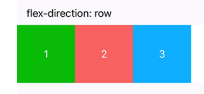
scroll-view
可滚动视图区域。
<view class="section">
  <view class="section__title">vertical scroll</view>
  <scroll-view scroll-y="true" style="height: 200px;" bindscrolltoupper="upper" bindscrolltolower="lower" bindscroll="scroll" scroll-into-view="{{toView}}" scroll-top="{{scrollTop}}">
    <view id="green" class="scroll-view-item bc_green"></view>
    <view id="red"  class="scroll-view-item bc_red"></view>
    <view id="yellow" class="scroll-view-item bc_yellow"></view>
    <view id="blue" class="scroll-view-item bc_blue"></view>
  </scroll-view>

  <view class="btn-area">
    <button size="mini" bindtap="tap">click me to scroll into view </button>
    <button size="mini" bindtap="tapMove">click me to scroll</button>
  </view>
</view>
<view class="section section_gap">
  <view class="section__title">horizontal scroll</view>
  <scroll-view class="scroll-view_H" scroll-x="true" style="width: 100%">
    <view id="green" class="scroll-view-item_H bc_green"></view>
    <view id="red"  class="scroll-view-item_H bc_red"></view>
    <view id="yellow" class="scroll-view-item_H bc_yellow"></view>
    <view id="blue" class="scroll-view-item_H bc_blue"></view>
  </scroll-view>
</view>
var order = ['red', 'yellow', 'blue', 'green', 'red']
Page({
data: {
toView: 'red',
scrollTop: 100
},
upper: function(e) {
console.log(e)
},
lower: function(e) {
console.log(e)
},
scroll: function(e) {
console.log(e)
},
tap: function(e) {
for (var i = 0; i < order.length; ++i) {
if (order[i] === this.data.toView) {
this.setData({
toView: order[i + 1]
})
break
}
}
},
tapMove: function(e) {
this.setData({
scrollTop: this.data.scrollTop + 10
})
}
})swiper
滑块视图容器。
(轮播)
视图容器(View Container):
icon 图标
<view class="group">
  <block wx:for="{{iconSize}}">
    <icon type="success" size="{{item}}"/>
  </block>
</view>
text 文本
支持转义符”\”。
除了文本节点以外的其他节点都无法长按选中。
<view class="btn-area">
  <view class="body-view">
    <text>{{text}}</text>
    <button bindtap="add">add line</button>
    <button bindtap="remove">remove line</button>
  </view>
</view>
progress 进度条
<progress percent="20" show-info />表单(Form):
* button 按钮*
checkbox-group 多项选择器
内部由多个checkbox组成。
checkbox 多选项目
<checkbox-group bindchange="checkboxChange">
  <label class="checkbox" wx:for="{{items}}">
    <checkbox value="{{item.name}}" checked="{{item.checked}}"/>{{item.value}}
  </label>
</checkbox-group>
Page({
data: {
items: [
{name: 'USA', value: '美国'},
{name: 'CHN', value: '中国', checked: 'true'},
{name: 'BRA', value: '巴西'},
{name: 'JPN', value: '日本'},
{name: 'ENG', value: '英国'},
{name: 'TUR', value: '法国'},
]
},
checkboxChange: function(e) {
console.log('checkbox发生change事件,携带value值为:', e.detail.value)
}
})form 表单
input 输入框
label
picker
滚动选择器,现支持三种选择器,通过mode来区分,分别是普通选择器,时间选择器,日期选择器,默认是普通选择器。
radio-group
单项选择器,内部由多个组成。
radio
单选项目
slider
滑动选择器。
switch
开关选择器
操作反馈(Interaction):
操作反馈
switch:开关选择器
action-sheet-item:底部菜单表的子选项
action-sheet-cancel:底部菜单表的取消按钮,和的区别是,点击它会触发的change事件,并且外观上会同它上面的内容间隔开来。
导航(Navigation):
navigator 页面链接
navigator-hover默认为{background-color: rgba(0, 0, 0, 0.1); opacity: 0.7;}, 的子节点背景色应为透明色。
<view class="btn-area">
  <navigator url="navigate?title=navigate" hover-class="navigator-hover">跳转到新页面</navigator>
  <navigator url="redirect?title=redirect" redirect hover-class="other-navigator-hover">在当前页打开</navigator>
</view>
多媒体(Media):
audio 音频
地图(Map):
map 地图
画布(Canvas):
canvas标签默认宽度300px、高度225px
同一页面中的 canvas-id 不可重复,如果使用一个已经出现过的 canvas-id,该 canvas 标签对应的画布将被隐藏并不再正常工作
wx.createContext()
创建并返回绘图上下文context对象
wx.createContext()
创建并返回绘图上下文context对象


 扫一扫
扫一扫
 976
976

 被折叠的 条评论
为什么被折叠?
被折叠的 条评论
为什么被折叠?
 到【灌水乐园】发言


