


<!DOCTYPE html>
<html>
<head>
<meta http-equiv="Content-type" content="text/html" charset="utf-8">
<link rel="stylesheet" type="text/css" href="../style.css">
<style type="text/css">
body{
background: #3F3F3F;
font-size: 18px;
color: white;
}
.image{
width: 250px;height: 240px;margin: 4px;border:1px solid #C4C4C4;background: #C6C6C6;
}
.price-new{
line-height: 60px;color: #FF4B4C;
}
.cart{
float: left;width: 90px;height: 32px;background: #7E7E7E;margin-left:14px;border-radius: 4px;font-size:15px;color: #fff;padding-top: 5px;padding-left: 4px;
}
.share{
float: left;width: 60px;height: 32px;background: #7E7E7E;margin-left: 4px;border-radius: 4px;font-size:15px;color: #fff;padding-top: 5px;padding-left: 4px;
}
.cart:hover,.share:hover{
background: #FD8017;
}
.fortitle{
height: 50px;
border-top: 1px solid #5D5D5D;
color: #A5A5A5;
line-height: 50px;
}
.outer{
margin: 0 auto;
width: 1200px;
padding-top: 8px;
border:1px solid #5D5D5D;
background: #4B4B4B;
border-radius: 5px;
}
frame{
border: 1px solid black;
}
/*正反面翻转效果:*/
/* flip the pane when hovered */
.flip-container{
}
.flip-container:hover .flipper{
transform: rotateY(180deg);
}
.flip-container, .front, .back {
width: 241px;
height: 371px;
}
/* flip speed goes here */
.flipper {
transition: 0.6s;
transform-style: preserve-3d; /*规定如何在 3D 空间中呈现被嵌套的元素。flat:子元素将不保留其 3D 位置,此时文字、图像都会反写;preserve-3d:子元素将保留其 3D 位置,此时文字、图像不会反写*/
position: relative;
}
/* hide back of pane during swap */
.front, .back {
backface-visibility: hidden; /*定义当元素不面向屏幕时是否可见。visible:背面是可见的;hidden:背面是不可见的。*/
position: absolute;
top: 0;
left: 0;
}
.front{background: url(image/pro1.png) no-repeat;border:1px solid black;}
.back{background: url(image/pro2.png) no-repeat;border:1px solid black;}
/* front pane, placed above back */
.front {
z-index: 2;
}
/* back, initially hidden pane */
.back {
transform: rotateY(180deg);
}
/*上下图交替移动出现:*/
.item-inner{width: 265px;height: 246px;border:1px solid ##909090;;}
.item-inner:hover .product-image .image {
transform: translate3d(0px,-100%,0px);
-webkit-transform: translate3d(0px,-100%,0px);
}
.item-inner .product-image .image {
transform: translate3d(0px,0px,0px);
-webkit-transform: translate3d(0px,0px,0px);
transition: all 0.7s ease 0s;
-webkit-transition: all 0.7s ease 0s;
}
.item-inner:hover .image1 {
position: absolute;
-webkit-transform: translate3d(0px,0px,0px);
transform: translate3d(0px,0px,0px);
z-index: 0;
}
.item-inner .image1 {
transform: translate3d(0px,100%,0px);
-webkit-transform: translate3d(0px,100%,0px);
transition: all 0.7s ease 0s;
-webkit-transition: all 0.7s ease 0s;
left: 0;
position: absolute;
top: 0;
width: 100%;
}
.item-inner .product-image {
display: block;
overflow: hidden;
position: relative;
text-align: center;
padding: 0;
margin: 0 -5px;
}
/*图片旋转*/
.image{
transition: transform 1s;
-moz-transition: -moz-transform 1s;/* Firefox 4 */
-webkit-transition: -webkit-transform 1s;/* Safari 和 Chrome */
-o-transition: -o-transform 1s;/* Opera */
}
.translateX6:hover .image{
-webkit-transform: rotate(360deg);
-moz-transform: rotate(360deg);
-ms-transform: rotate(360deg);
-o-transform: rotate(360deg);
transform: rotate(360deg);
}
/*图片放大*/
.product-thumb .image{overflow: hidden;}/*这句的作用是:图片放大后,超出的部分不显示*/
.product-thumb .image img {
margin-right: auto;
margin-left: auto;
-webkit-transition: all 1s ease;
-o-transition: all 1s ease;
transition: all 1s ease;
}
.product-thumb .image:hover img {
-webkit-transform: scale(1.25);
-ms-transform: scale(1.25);
-o-transform: scale(1.25);
transform: scale(1.25);
}
/*弹起效果*/
.product-thumb2 {
box-shadow: 0 1px 3px 0 rgba(42, 48, 60, 0.19);
-webkit-transition: all .15s ease;
-moz-transition: all .15s ease;
-ms-transition: all .15s ease;
-o-transition: all .15s ease;
transition: all .15s ease;
}
.product-thumb2:hover {
box-shadow: 0 9px 19px 0 rgba(110,127,134,.44);
-moz-transform: translateY(-1px);
-webkit-transform: translateY(-1px);
-o-transform: translateY(-1px);
-ms-transform: translateY(-1px);
transform: translateY(-1px);
}
.product-thumb17{position: relative;}
.fugai{position: absolute;width: 250px;height: 240px;background: rgba(0,0,0,0);top: 3px;left: 3px;
-webkit-transition: all 0.5s ease;
-moz-transition: all 0.5s ease;
-ms-transition: all 0.5s ease;
-o-transition: all 0.5s ease;
transition: all 0.5s ease;
}
.product-thumb17:hover .fugai{background: rgba(0,0,0,0.7);}
.anniuzu{position: absolute;top: 20px;left: 20px;}
.anniu{display: inline-block;width: 50px;height: 50px;border-radius: 50%;color: #fff;opacity: 0;
-webkit-transition: all 0.5s ease;
-moz-transition: all 0.5s ease;
-ms-transition: all 0.5s ease;
-o-transition: all 0.5s ease;
transition: all 0.5s ease;
}
.anniu.one{background: #FF6B6B;}
.anniu.two{background: #49C7BE;}
.anniu.three{background: #81C25D;}
.product-thumb17:hover .fugai .anniuzu{top: 80px;left: 40px;}
.product-thumb17:hover .fugai .anniu{opacity: 1;}
.anniu:hover{background: #888888;}
/*搜索框从右至左伸展效果*/
.searchDiv{width: 300px;height: 100px;}
.searchDiv:hover .searchInput{
width: 80%;
transition:width 1s;
-moz-transition:width 1s;
-webkit-transition:width 1s;
-o-transition:width 1s;
}
.searchInput{
display: inline-block;float: right;height: 34px;width: 0px;margin-right: -2px;
}
.searchButton{
display: inline-block;float: right;width: 40px;height: 40px;background: #333;border:none;color: #fff;
}
</style>
</head>
<body>
<div class="outer">
<center>
<div class="fortitle" style="border:none;">一、正反面翻转效果(鼠标移入、移出图片可查看效果)</div><br/>
<div class="flip-container">
<div class="flipper">
<div class="front">
<!-- 前面内容 -->
</div>
<div class="back">
<!-- 背面内容 -->
</div>
</div>
</div>
</center>
<br/><br/>
<center>
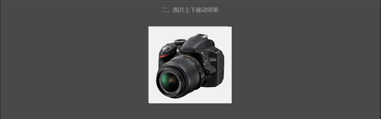
<div class="fortitle">二、图片上下移动效果</div><br/>
<div class="item-inner">
<div class="product-image">
<div class="image"><img src="../image/d3.png"/></div>
<div class="image1"><img src="../image/d3.png"/></div>
</div>
</div>
</center>
<br/><br/>
<center>
<div class="fortitle">三、图片旋转效果</div><br/>
<div class="translateX6" style="width: 260px;height: 360px;border:1px solid #909090;">
<div class="image"><img src="../image/hh.jpg" style="width: 240px;"></div>
<div class="caption"><div class="price-new">$89.96</div></div>
<div class="cart">add to cart</div>
<div class="share">collect</div>
<div class="share">share</div>
</div><br/>
</center><br/>
<center>
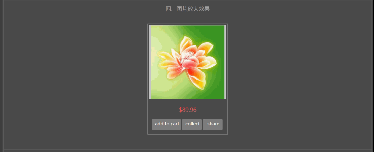
<div class="fortitle">四、图片放大效果</div><br/>
<div class="product-thumb" style="width: 260px;height: 360px;border:1px solid #909090;">
<div class="image"><img src="../image/hh.jpg" style="width: 240px;"></div>
<div class="caption"><div class="price-new" >$89.96</div></div>
<div class="cart">add to cart</div>
<div class="share">collect</div>
<div class="share">share</div>
</div><br/>
</center><br/>
<center>
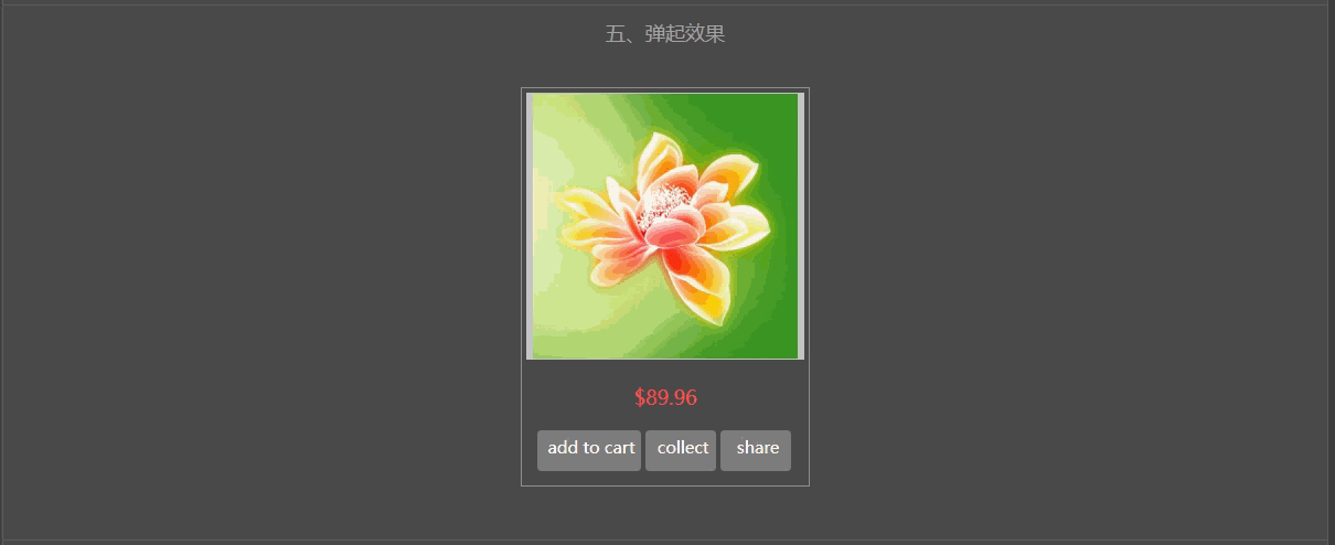
<div class="fortitle">五、弹起效果</div><br/>
<div class="product-thumb2" style="width: 260px;height: 360px;border:1px solid #909090;">
<div class="image"><img src="../image/hh.jpg" style="width: 240px;"></div>
<div class="caption"><div class="price-new" >$89.96</div></div>
<div class="cart">add to cart</div>
<div class="share">collect</div>
<div class="share">share</div>
</div><br/>
</center><br/>
<center>
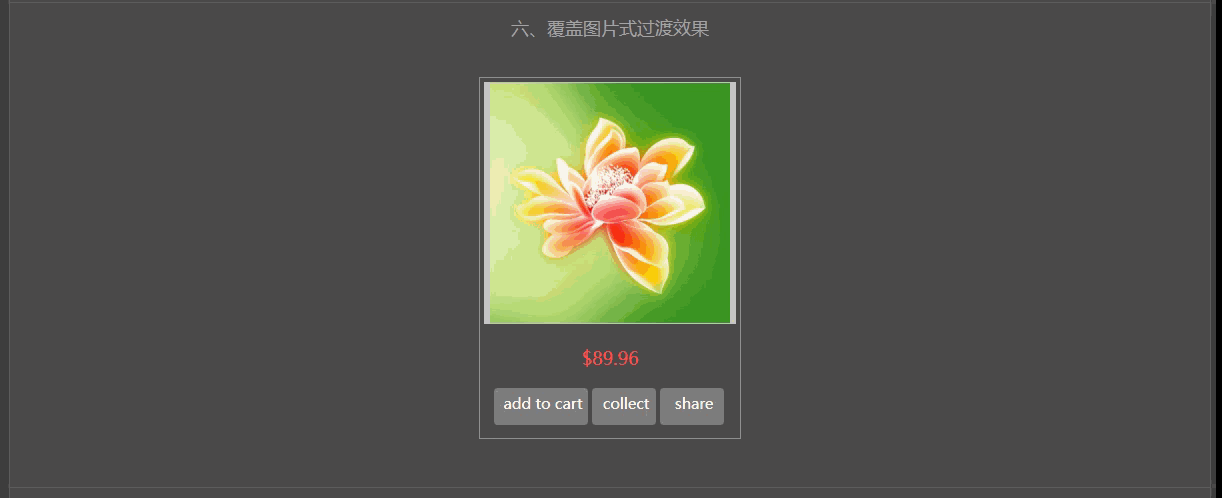
<div class="fortitle">六、覆盖图片式过渡效果</div><br/>
<div class="product-thumb17" style="width: 260px;height: 360px;border:1px solid #909090;">
<div class="image"><img src="../image/hh.jpg" style="width: 240px;">
</div>
<div class="fugai">
<div class="anniuzu">
<div class="anniu one" style="line-height: 50px;">A</div>
<div class="anniu two" style="line-height: 50px;">C</div>
<div class="anniu three" style="line-height: 50px;">S</div>
</div>
</div>
<div class="caption"><div class="price-new">$89.96</div></div>
<div class="cart">add to cart</div>
<div class="share">collect</div>
<div class="share">share</div>
</div><br/>
</center><br/>
<center>
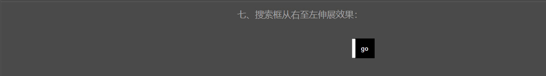
<div class="fortitle">七、搜索框从右至左伸展效果:</div><br/>
<div class="searchDiv">
<button type="button" class="searchButton" placeholder="search" style="background:black;">go</button>
<input type="text" class="searchInput" />
</div>
</center>
</div>
</body>
</html>
<!DOCTYPE html>
<html>
<head>
<meta http-equiv="Content-type" content="text/html" charset="utf-8">
<link rel="stylesheet" type="text/css" href="../style.css">
<style type="text/css">
body{
background: #3F3F3F;
font-size: 18px;
color: white;
}
.image{
width: 250px;height: 240px;margin: 4px;border:1px solid #C4C4C4;background: #C6C6C6;
}
.price-new{
line-height: 60px;color: #FF4B4C;
}
.cart{
float: left;width: 90px;height: 32px;background: #7E7E7E;margin-left:14px;border-radius: 4px;font-size:15px;color: #fff;padding-top: 5px;padding-left: 4px;
}
.share{
float: left;width: 60px;height: 32px;background: #7E7E7E;margin-left: 4px;border-radius: 4px;font-size:15px;color: #fff;padding-top: 5px;padding-left: 4px;
}
.cart:hover,.share:hover{
background: #FD8017;
}
.fortitle{
height: 50px;
border-top: 1px solid #5D5D5D;
color: #A5A5A5;
line-height: 50px;
}
.outer{
margin: 0 auto;
width: 1200px;
padding-top: 8px;
border:1px solid #5D5D5D;
background: #4B4B4B;
border-radius: 5px;
}
frame{
border: 1px solid black;
}
/*正反面翻转效果:*/
/* flip the pane when hovered */
.flip-container{
}
.flip-container:hover .flipper{
transform: rotateY(180deg);
}
.flip-container, .front, .back {
width: 241px;
height: 371px;
}
/* flip speed goes here */
.flipper {
transition: 0.6s;
transform-style: preserve-3d; /*规定如何在 3D 空间中呈现被嵌套的元素。flat:子元素将不保留其 3D 位置,此时文字、图像都会反写;preserve-3d:子元素将保留其 3D 位置,此时文字、图像不会反写*/
position: relative;
}
/* hide back of pane during swap */
.front, .back {
backface-visibility: hidden; /*定义当元素不面向屏幕时是否可见。visible:背面是可见的;hidden:背面是不可见的。*/
position: absolute;
top: 0;
left: 0;
}
.front{background: url(image/pro1.png) no-repeat;border:1px solid black;}
.back{background: url(image/pro2.png) no-repeat;border:1px solid black;}
/* front pane, placed above back */
.front {
z-index: 2;
}
/* back, initially hidden pane */
.back {
transform: rotateY(180deg);
}
/*上下图交替移动出现:*/
.item-inner{width: 265px;height: 246px;border:1px solid ##909090;;}
.item-inner:hover .product-image .image {
transform: translate3d(0px,-100%,0px);
-webkit-transform: translate3d(0px,-100%,0px);
}
.item-inner .product-image .image {
transform: translate3d(0px,0px,0px);
-webkit-transform: translate3d(0px,0px,0px);
transition: all 0.7s ease 0s;
-webkit-transition: all 0.7s ease 0s;
}
.item-inner:hover .image1 {
position: absolute;
-webkit-transform: translate3d(0px,0px,0px);
transform: translate3d(0px,0px,0px);
z-index: 0;
}
.item-inner .image1 {
transform: translate3d(0px,100%,0px);
-webkit-transform: translate3d(0px,100%,0px);
transition: all 0.7s ease 0s;
-webkit-transition: all 0.7s ease 0s;
left: 0;
position: absolute;
top: 0;
width: 100%;
}
.item-inner .product-image {
display: block;
overflow: hidden;
position: relative;
text-align: center;
padding: 0;
margin: 0 -5px;
}
/*图片旋转*/
.image{
transition: transform 1s;
-moz-transition: -moz-transform 1s;/* Firefox 4 */
-webkit-transition: -webkit-transform 1s;/* Safari 和 Chrome */
-o-transition: -o-transform 1s;/* Opera */
}
.translateX6:hover .image{
-webkit-transform: rotate(360deg);
-moz-transform: rotate(360deg);
-ms-transform: rotate(360deg);
-o-transform: rotate(360deg);
transform: rotate(360deg);
}
/*图片放大*/
.product-thumb .image{overflow: hidden;}/*这句的作用是:图片放大后,超出的部分不显示*/
.product-thumb .image img {
margin-right: auto;
margin-left: auto;
-webkit-transition: all 1s ease;
-o-transition: all 1s ease;
transition: all 1s ease;
}
.product-thumb .image:hover img {
-webkit-transform: scale(1.25);
-ms-transform: scale(1.25);
-o-transform: scale(1.25);
transform: scale(1.25);
}
/*弹起效果*/
.product-thumb2 {
box-shadow: 0 1px 3px 0 rgba(42, 48, 60, 0.19);
-webkit-transition: all .15s ease;
-moz-transition: all .15s ease;
-ms-transition: all .15s ease;
-o-transition: all .15s ease;
transition: all .15s ease;
}
.product-thumb2:hover {
box-shadow: 0 9px 19px 0 rgba(110,127,134,.44);
-moz-transform: translateY(-1px);
-webkit-transform: translateY(-1px);
-o-transform: translateY(-1px);
-ms-transform: translateY(-1px);
transform: translateY(-1px);
}
.product-thumb17{position: relative;}
.fugai{position: absolute;width: 250px;height: 240px;background: rgba(0,0,0,0);top: 3px;left: 3px;
-webkit-transition: all 0.5s ease;
-moz-transition: all 0.5s ease;
-ms-transition: all 0.5s ease;
-o-transition: all 0.5s ease;
transition: all 0.5s ease;
}
.product-thumb17:hover .fugai{background: rgba(0,0,0,0.7);}
.anniuzu{position: absolute;top: 20px;left: 20px;}
.anniu{display: inline-block;width: 50px;height: 50px;border-radius: 50%;color: #fff;opacity: 0;
-webkit-transition: all 0.5s ease;
-moz-transition: all 0.5s ease;
-ms-transition: all 0.5s ease;
-o-transition: all 0.5s ease;
transition: all 0.5s ease;
}
.anniu.one{background: #FF6B6B;}
.anniu.two{background: #49C7BE;}
.anniu.three{background: #81C25D;}
.product-thumb17:hover .fugai .anniuzu{top: 80px;left: 40px;}
.product-thumb17:hover .fugai .anniu{opacity: 1;}
.anniu:hover{background: #888888;}
/*搜索框从右至左伸展效果*/
.searchDiv{width: 300px;height: 100px;}
.searchDiv:hover .searchInput{
width: 80%;
transition:width 1s;
-moz-transition:width 1s;
-webkit-transition:width 1s;
-o-transition:width 1s;
}
.searchInput{
display: inline-block;float: right;height: 34px;width: 0px;margin-right: -2px;
}
.searchButton{
display: inline-block;float: right;width: 40px;height: 40px;background: #333;border:none;color: #fff;
}
</style>
</head>
<body>
<div class="outer">
<center>
<div class="fortitle" style="border:none;">一、正反面翻转效果(鼠标移入、移出图片可查看效果)</div><br/>
<div class="flip-container">
<div class="flipper">
<div class="front">
<!-- 前面内容 -->
</div>
<div class="back">
<!-- 背面内容 -->
</div>
</div>
</div>
</center>
<br/><br/>
<center>
<div class="fortitle">二、图片上下移动效果</div><br/>
<div class="item-inner">
<div class="product-image">
<div class="image"><img src="../image/d3.png"/></div>
<div class="image1"><img src="../image/d3.png"/></div>
</div>
</div>
</center>
<br/><br/>
<center>
<div class="fortitle">三、图片旋转效果</div><br/>
<div class="translateX6" style="width: 260px;height: 360px;border:1px solid #909090;">
<div class="image"><img src="../image/hh.jpg" style="width: 240px;"></div>
<div class="caption"><div class="price-new">$89.96</div></div>
<div class="cart">add to cart</div>
<div class="share">collect</div>
<div class="share">share</div>
</div><br/>
</center><br/>
<center>
<div class="fortitle">四、图片放大效果</div><br/>
<div class="product-thumb" style="width: 260px;height: 360px;border:1px solid #909090;">
<div class="image"><img src="../image/hh.jpg" style="width: 240px;"></div>
<div class="caption"><div class="price-new" >$89.96</div></div>
<div class="cart">add to cart</div>
<div class="share">collect</div>
<div class="share">share</div>
</div><br/>
</center><br/>
<center>
<div class="fortitle">五、弹起效果</div><br/>
<div class="product-thumb2" style="width: 260px;height: 360px;border:1px solid #909090;">
<div class="image"><img src="../image/hh.jpg" style="width: 240px;"></div>
<div class="caption"><div class="price-new" >$89.96</div></div>
<div class="cart">add to cart</div>
<div class="share">collect</div>
<div class="share">share</div>
</div><br/>
</center><br/>
<center>
<div class="fortitle">六、覆盖图片式过渡效果</div><br/>
<div class="product-thumb17" style="width: 260px;height: 360px;border:1px solid #909090;">
<div class="image"><img src="../image/hh.jpg" style="width: 240px;">
</div>
<div class="fugai">
<div class="anniuzu">
<div class="anniu one" style="line-height: 50px;">A</div>
<div class="anniu two" style="line-height: 50px;">C</div>
<div class="anniu three" style="line-height: 50px;">S</div>
</div>
</div>
<div class="caption"><div class="price-new">$89.96</div></div>
<div class="cart">add to cart</div>
<div class="share">collect</div>
<div class="share">share</div>
</div><br/>
</center><br/>
<center>
<div class="fortitle">七、搜索框从右至左伸展效果:</div><br/>
<div class="searchDiv">
<button type="button" class="searchButton" placeholder="search" style="background:black;">go</button>
<input type="text" class="searchInput" />
</div>
</center>
</div>
</body>
</html>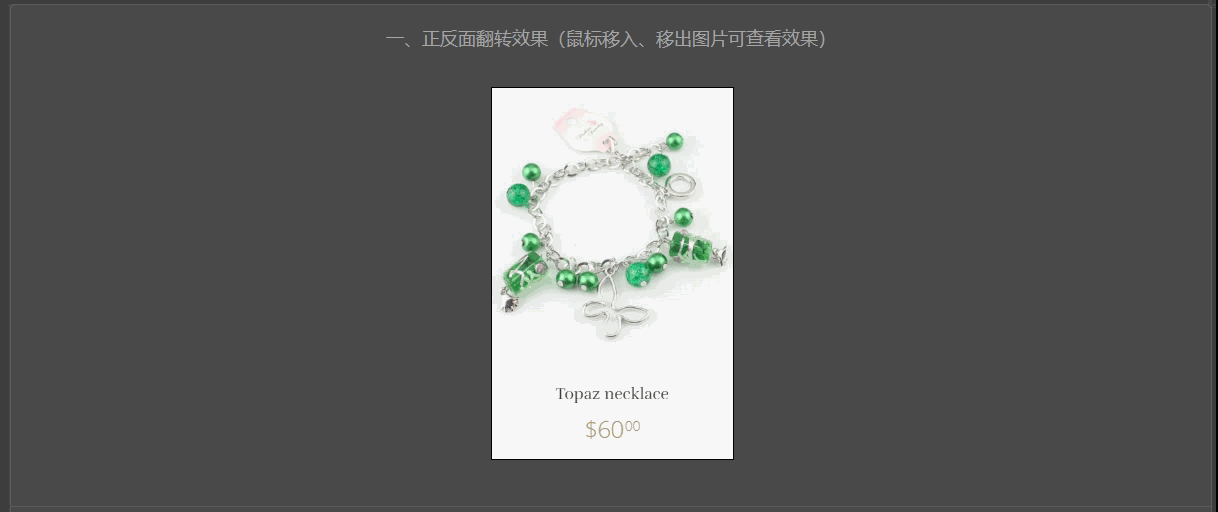


 扫一扫
扫一扫


 被折叠的 条评论
为什么被折叠?
被折叠的 条评论
为什么被折叠?
 到【灌水乐园】发言


