


最近热火朝天地做了一个web app项目,虽然之前做过这种类似移动端的项目,
但是当时只是出于形势所迫才做的,所以移动端的水平基本还是处于入门阶段。
最近开始做移动端web相关的,在这个项目中自己还是学到不少东西,总结一些肤浅的实践经验,供初学都参考。
1. 带有文字段落和图标的div随文字段落内容的变化自动垂直居中对齐
我们在项目中经常会遇到这种情况:文字段落和图标混合在一起,文字的段落的内容是随后端吐给前端的数据自动变化的,
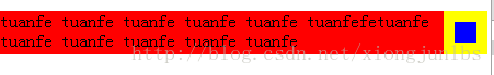
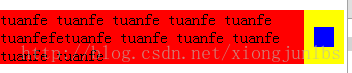
但是这时候却要保证图标和内容都垂直居中 对齐的,如下两张图所示,内容由两排变成三排时,蓝色表示一个按钮或者一张图片,
在红色区域文字的变化过程中,蓝色图标始终是垂直民在显示,源代码如下所示:
<!DOCTYPE html>
<html>
<head>
    <meta charset="UTF-8">
    <title></title>
    <style type="text/css">
        body{

            padding: 0;
            margin: 0;
            width: 100%;
            height: 100%;
        }

        .test{
            position: relative;
            padding-right: 40px;
            background-color: yellow;

        }
        .content{
            min-height: 40px;
            background-color: red ;
        }

        .icon-arrow{
            position: absolute;
            top: 0;
            right: 10px;
            bottom: 0;
            margin: auto;
            height: 20px;
            width: 20px;
            background-color: blue;
        }

    </style>
</head>
<body>
    <div class="test">
        <p class="content">
            tuanfe tuanfe  tuanfe tuanfe tuanfe tuanfefetuanfe tuanfe  tuanfe tuanfe tuanfe tuanfe
        </p>
            <div class="icon-arrow"></div>
        </div>
</body>
</html>
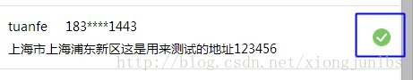
2. 在web app开发中,在放置一些背景图片或者其他装饰小图片时,可以更多的用before或after伪类
个人觉得多使用before和after伪类,这样布局起来很轻松,首先代码质量比较高,后期也容易维护修改,自从用了这两个属性后,就舍不得离手了。
如图所示的这种情形,这里的打勾的图标我就是用的after伪类来实现的,源代码如下:
p-submission .delivery-address:after {
content: '';
position: absolute;
width: 20px;
height: 20px;
background-color: #ccc;
top: 0;
bottom: 0;
right: 10px;
margin: auto;
background: url(/static/order/submission/img/pay_41ab3f5.png) no-repeat right center;
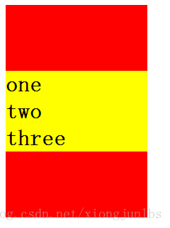
background-size: 20px 20px;3. 用弹性布局实现垂直居中对齐
我想这种情况,在项目中常见了,在web app中可以试试弹性布局这个新技术玩玩,如图所示,源代码也如下。
<!DOCTYPE html>
<html lang="en">
<head>
    <meta charset="UTF-8">
    <title></title>
    <style>
        .container{

            display: flex;
            height: 300px;
            width: 200px;
            flex-direction: column;
            justify-content: center;
            background-color: red;
        }

        h1{
            margin: 0;
            background-color: yellow;
        }

    </style>
</head>
<body>
<div class="container">
    <h1>one</h1>
    <h1>two</h1>
    <h1>three</h1>
</div>
</body>
</html>


 扫一扫
扫一扫
 200
200

 被折叠的 条评论
为什么被折叠?
被折叠的 条评论
为什么被折叠?
 到【灌水乐园】发言


