


(This article was first published on
Plotly Blog, and kindly contributed to
R-bloggers)
Many graphs use a
time series, meaning they measure events over time.
William Playfair (1759 - 1823) was a Scottish economist and pioneer of this approach. Playfair invented the line graph. The graph below–one of his most famous–depicts how in the 1750s the Brits started exporting more than they were importing.

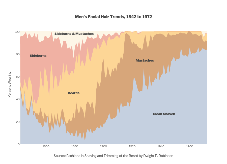
First we’ll show an example of a standard time series graph. The data is drawn from a paper on shaving trends. The author concludes that the “dynamics of taste”, in this case facial hair, are “common expressions of underlying conditions and sequences in social behavior.” Time is on the x-axis. The y-axis shows the respective percentages of men’s facial hair styles.
 width="900" id="plotly-Dreamshot:1452" src="https://plot.ly/~Dreamshot/1452.embed" frameborder="0" scrolling="no" style="visibility: hidden; position: absolute; max-width: 100%;">
You can click and drag to move the axis, click and drag to zoom, or toggle traces on and off in the legend. The temperatue graph below shows how Plotly adjusts data from years to nanoseconds as you zoom. The first timestamp is 2014-12-15 08:55:13.961347, which is how Plotly reads dates. That is, `yyyy-mm-dd HH:MM:SS.ssssss`. Now that’s drilling down.

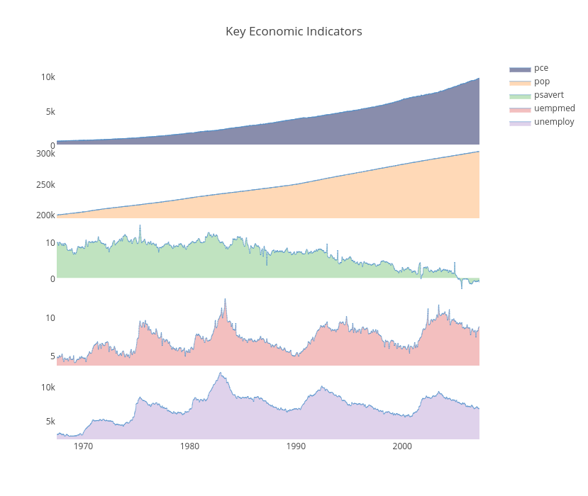
One of the special things about Plotly is that you can translate plots and data between programming lanuguages, file formats, and data types. For example, the multiple axis plot below uses stacked plots on the same time scale for different eonomic indicators. This plot was made using ggplot2’s time scale. We can convert the plot into Plotly, allowing anyone to edit the figure from different programming languages or the Plotly web app.
 width="1189" id="plotly-MattSundquist:10864" src="https://plot.ly/~MattSundquist/10864.embed" frameborder="0" scrolling="no" style="visibility: hidden; position: absolute; max-width: 100%;">
We have a time series tutorial that explains time series graphs, custom date formats, custom hover text labels, and time series plots in MATLAB, Python , and R.
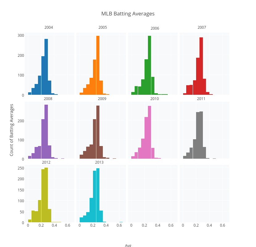
Another way to slice your data is by subplots. These histograms were made with R and compare yearly data. Each plot shows the annual number of players who had a given batting average in Major League Baseball.
 width="1189" id="plotly-MattSundquist:11035" src="https://plot.ly/~MattSundquist/11035.embed" frameborder="0" scrolling="no" style="visibility: hidden; position: absolute; max-width: 100%;">
You can also display your data using small multiples, a concept developed by Edward Tufte. Small multiples are “illustrations of postage-stamp” size. They use the same graph type to index data by a cateogry or label. Using facets, we’ve plotted a dataset of airline passengers. Each subplot shows the overall travel numbers and a reference line for the thousands of passengers travelling that month.
 width="1189" id="plotly-MattSundquist:10875" src="https://plot.ly/~MattSundquist/10875.embed" frameborder="0" scrolling="no" style="visibility: hidden; position: absolute; max-width: 100%;">
The heatmap below shows the percentages of people’s birthdays on a given date, gleaned from 480,040 life isurance applications. The x-axis shows months, the y-axis shows the day of the month, and the z shows the % of birthdays on each date.
 width="750" id="plotly-Dreamshot:354" src="https://plot.ly/~Dreamshot/354.embed" frameborder="0" scrolling="no" style="visibility: hidden; position: absolute; max-width: 100%;">
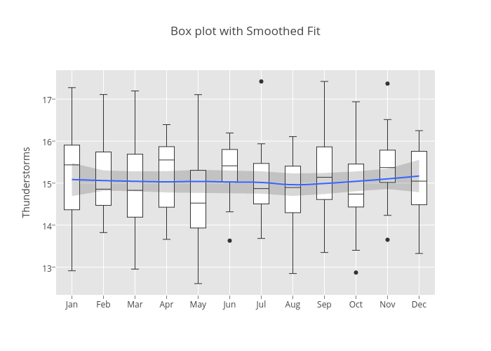
To show how values in your data are spaced over different months, we can use seasonal boxplots. The boxes represent how the data is spaced for each month; the dots represent outliers. We’ve used ggplot2 to make our plot and added a smoothed fit with a confidence interval. See our box plot tutorial to learn more.
 width="829" id="plotly-MattSundquist:10984" src="https://plot.ly/~MattSundquist/10984.embed" frameborder="0" scrolling="no" style="visibility: hidden; position: absolute; max-width: 100%;">
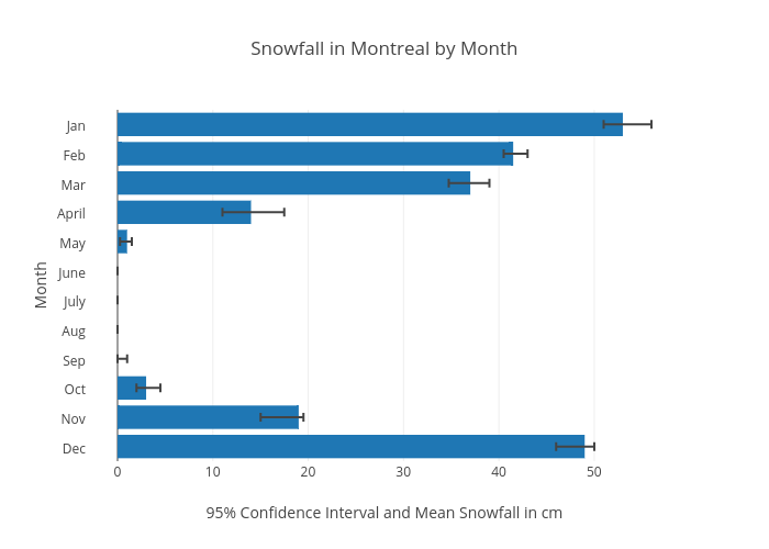
We can use a bar chart with error bars to look at data over a monthly interval. In this case, we’re using R to make a graph with error bars showing snowfall in Montreal.
 id="plotly-chelsea_lyn:158" src="https://plot.ly/~chelsea_lyn/158.embed" frameborder="0" scrolling="no" style="visibility: hidden; position: absolute; max-width: 100%;">
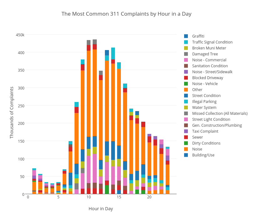
We may want to look at data that is not stricly a time series plot, but still represents changes over time. For example, we may want hourly event data. Below we’re showing the most popular hourly reasons to call 311 in NYC, a number you can call for non-emergency help. The plot is from our pandas and SQLite guide.
 width="808" id="plotly-MattSundquist:10789" src="https://plot.ly/~MattSundquist/10789.embed" frameborder="0" scrolling="no" style="visibility: hidden; position: absolute; max-width: 100%;">
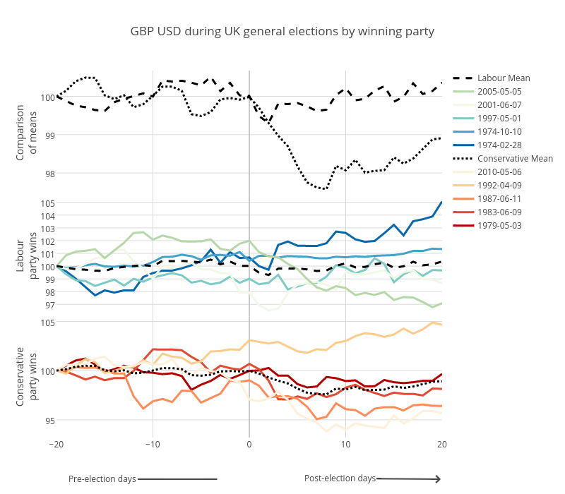
We can also show a before and after effect to examine changes from an event. The plot below, made in an IPython Notebook, tracks Conservative and Labour election impacts on Pounds and Dollars.
 width="800" id="plotly-MattSundquist:11482" src="https://plot.ly/~MattSundquist/11482.embed" frameborder="0" scrolling="no" style="visibility: hidden; position: absolute; max-width: 100%;">
We can also use a 3D chart to show events over time. For example, our surface chart below shows the UK Swaps Term Structure with historical dates along the X axis, the Term Structure on the Y axis, and the swap rates over the Z Axis. The message: rates are lower than ever. At the long end of the curve we don’t see a massive increase. This example was made using cufflinks, a Python library by Jorge Santos. For more on 3D graphing see our Python, MATLAB, R, and web tutorials.
 width="685" id="plotly-MattSundquist:11399" src="https://plot.ly/~MattSundquist/11399.embed" frameborder="0" scrolling="no" style="visibility: hidden; position: absolute; max-width: 100%;">
If you liked this post, please consider sharing. We’re @plotlygraphs, or email us at feedback at plot dot ly. We have tutorials that show how to make and embed graphs in your website, blog, or apps. To learn more about how companies are using Plotly Enterprise across different industries, see our customer stories.
This post shows how you can use Playfair’s approach and many more for making a time series graph. To embed Plotly graphs in your applications, dashboards, and reports, check out Plotly Enterprise.
1. By Year
First we’ll show an example of a standard time series graph. The data is drawn from a paper on shaving trends. The author concludes that the “dynamics of taste”, in this case facial hair, are “common expressions of underlying conditions and sequences in social behavior.” Time is on the x-axis. The y-axis shows the respective percentages of men’s facial hair styles.
width="900" id="plotly-Dreamshot:1452" src="https://plot.ly/~Dreamshot/1452.embed" frameborder="0" scrolling="no" style="visibility: hidden; position: absolute; max-width: 100%;">
You can click and drag to move the axis, click and drag to zoom, or toggle traces on and off in the legend. The temperatue graph below shows how Plotly adjusts data from years to nanoseconds as you zoom. The first timestamp is 2014-12-15 08:55:13.961347, which is how Plotly reads dates. That is, `yyyy-mm-dd HH:MM:SS.ssssss`. Now that’s drilling down.
One of the special things about Plotly is that you can translate plots and data between programming lanuguages, file formats, and data types. For example, the multiple axis plot below uses stacked plots on the same time scale for different eonomic indicators. This plot was made using ggplot2’s time scale. We can convert the plot into Plotly, allowing anyone to edit the figure from different programming languages or the Plotly web app.
width="1189" id="plotly-MattSundquist:10864" src="https://plot.ly/~MattSundquist/10864.embed" frameborder="0" scrolling="no" style="visibility: hidden; position: absolute; max-width: 100%;">
We have a time series tutorial that explains time series graphs, custom date formats, custom hover text labels, and time series plots in MATLAB, Python , and R.
2. Subplots & Small Multiples
Another way to slice your data is by subplots. These histograms were made with R and compare yearly data. Each plot shows the annual number of players who had a given batting average in Major League Baseball.
width="1189" id="plotly-MattSundquist:11035" src="https://plot.ly/~MattSundquist/11035.embed" frameborder="0" scrolling="no" style="visibility: hidden; position: absolute; max-width: 100%;">
You can also display your data using small multiples, a concept developed by Edward Tufte. Small multiples are “illustrations of postage-stamp” size. They use the same graph type to index data by a cateogry or label. Using facets, we’ve plotted a dataset of airline passengers. Each subplot shows the overall travel numbers and a reference line for the thousands of passengers travelling that month.
width="1189" id="plotly-MattSundquist:10875" src="https://plot.ly/~MattSundquist/10875.embed" frameborder="0" scrolling="no" style="visibility: hidden; position: absolute; max-width: 100%;">
3. By Month
The heatmap below shows the percentages of people’s birthdays on a given date, gleaned from 480,040 life isurance applications. The x-axis shows months, the y-axis shows the day of the month, and the z shows the % of birthdays on each date.
width="750" id="plotly-Dreamshot:354" src="https://plot.ly/~Dreamshot/354.embed" frameborder="0" scrolling="no" style="visibility: hidden; position: absolute; max-width: 100%;">
To show how values in your data are spaced over different months, we can use seasonal boxplots. The boxes represent how the data is spaced for each month; the dots represent outliers. We’ve used ggplot2 to make our plot and added a smoothed fit with a confidence interval. See our box plot tutorial to learn more.
width="829" id="plotly-MattSundquist:10984" src="https://plot.ly/~MattSundquist/10984.embed" frameborder="0" scrolling="no" style="visibility: hidden; position: absolute; max-width: 100%;">
We can use a bar chart with error bars to look at data over a monthly interval. In this case, we’re using R to make a graph with error bars showing snowfall in Montreal.
id="plotly-chelsea_lyn:158" src="https://plot.ly/~chelsea_lyn/158.embed" frameborder="0" scrolling="no" style="visibility: hidden; position: absolute; max-width: 100%;">
4. A Repeated Event With A Category
We may want to look at data that is not stricly a time series plot, but still represents changes over time. For example, we may want hourly event data. Below we’re showing the most popular hourly reasons to call 311 in NYC, a number you can call for non-emergency help. The plot is from our pandas and SQLite guide.
width="808" id="plotly-MattSundquist:10789" src="https://plot.ly/~MattSundquist/10789.embed" frameborder="0" scrolling="no" style="visibility: hidden; position: absolute; max-width: 100%;">
We can also show a before and after effect to examine changes from an event. The plot below, made in an IPython Notebook, tracks Conservative and Labour election impacts on Pounds and Dollars.
width="800" id="plotly-MattSundquist:11482" src="https://plot.ly/~MattSundquist/11482.embed" frameborder="0" scrolling="no" style="visibility: hidden; position: absolute; max-width: 100%;">
5. A 3D Graph
We can also use a 3D chart to show events over time. For example, our surface chart below shows the UK Swaps Term Structure with historical dates along the X axis, the Term Structure on the Y axis, and the swap rates over the Z Axis. The message: rates are lower than ever. At the long end of the curve we don’t see a massive increase. This example was made using cufflinks, a Python library by Jorge Santos. For more on 3D graphing see our Python, MATLAB, R, and web tutorials.
width="685" id="plotly-MattSundquist:11399" src="https://plot.ly/~MattSundquist/11399.embed" frameborder="0" scrolling="no" style="visibility: hidden; position: absolute; max-width: 100%;">
Sharing & Deploying Plotly
If you liked this post, please consider sharing. We’re @plotlygraphs, or email us at feedback at plot dot ly. We have tutorials that show how to make and embed graphs in your website, blog, or apps. To learn more about how companies are using Plotly Enterprise across different industries, see our customer stories.


 441
441

 被折叠的 条评论
为什么被折叠?
被折叠的 条评论
为什么被折叠?
 到【灌水乐园】发言


