


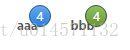
效果如图
这个很多人可能没思路,其实就是a标签里面加个显示数量的div
<a href="index.html" class="nav-link">aaa<div class="nav-counter nav-counter-blue">4</div></a>但是复杂的是css代码,如下
.nav-link {
  position: relative;
  padding: 0 14px;
  line-height: 34px;
  font-size: 10px;
  font-weight: bold;
  color: #555;
  text-decoration: none;
}
.nav-link:hover {
  color: #333;
  text-decoration: underline;
}

.nav-counter {
  position: absolute;
  top: -1px;
  right: 1px;
  min-width: 8px;
  height: 20px;
  line-height: 20px;
  margin-top: -11px;
  padding: 0 6px;
  font-weight: normal;
  color: white;
  text-align: center;
  text-shadow: 0 1px rgba(0, 0, 0, 0.2);
  background: #e23442;
  border: 1px solid #911f28;
  border-radius: 11px;
  background-image: -webkit-linear-gradient(top, #e8616c, #dd202f);
  background-image: -moz-linear-gradient(top, #e8616c, #dd202f);
  background-image: -o-linear-gradient(top, #e8616c, #dd202f);
  background-image: linear-gradient(to bottom, #e8616c, #dd202f);
  -webkit-box-shadow: inset 0 0 1px 1px rgba(255, 255, 255, 0.1), 0 1px rgba(0, 0, 0, 0.12);
  box-shadow: inset 0 0 1px 1px rgba(255, 255, 255, 0.1), 0 1px rgba(0, 0, 0, 0.12);
}

.nav-counter-green {
  background: #75a940;
  border: 1px solid #42582b;
  background-image: -webkit-linear-gradient(top, #8ec15b, #689739);
  background-image: -moz-linear-gradient(top, #8ec15b, #689739);
  background-image: -o-linear-gradient(top, #8ec15b, #689739);
  background-image: linear-gradient(to bottom, #8ec15b, #689739);
}

.nav-counter-blue {
  background: #3b8de2;
  border: 1px solid #215a96;
  background-image: -webkit-linear-gradient(top, #67a7e9, #2580df);
  background-image: -moz-linear-gradient(top, #67a7e9, #2580df);
  background-image: -o-linear-gradient(top, #67a7e9, #2580df);
  background-image: linear-gradient(to bottom, #67a7e9, #2580df);
}
html十分精简,只有一句话,但是css比较复杂,主要是a标签的position: relative,里面显示消息数量的div设成position:absolute,然后就有了重叠效果。


 扫一扫
扫一扫
 757
757

 被折叠的 条评论
为什么被折叠?
被折叠的 条评论
为什么被折叠?
 到【灌水乐园】发言


