


A material design circle the progress bar,You can download it in image loading and file upload when used.
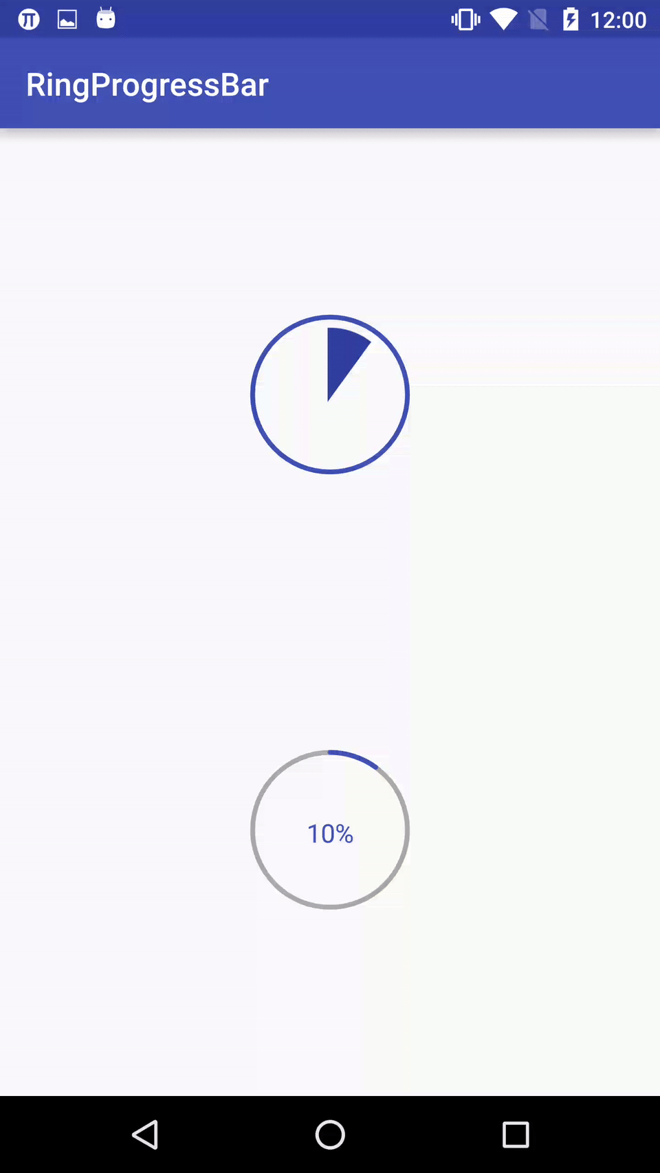
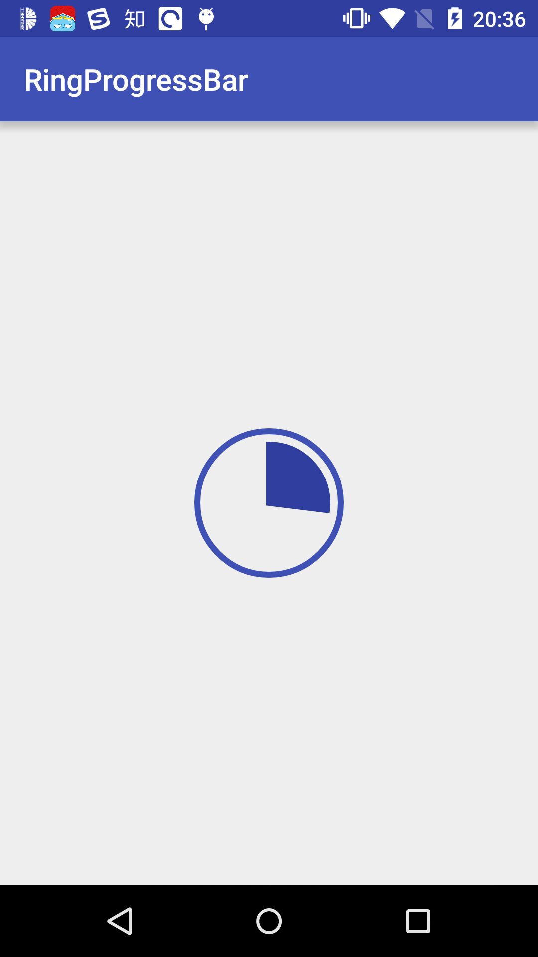
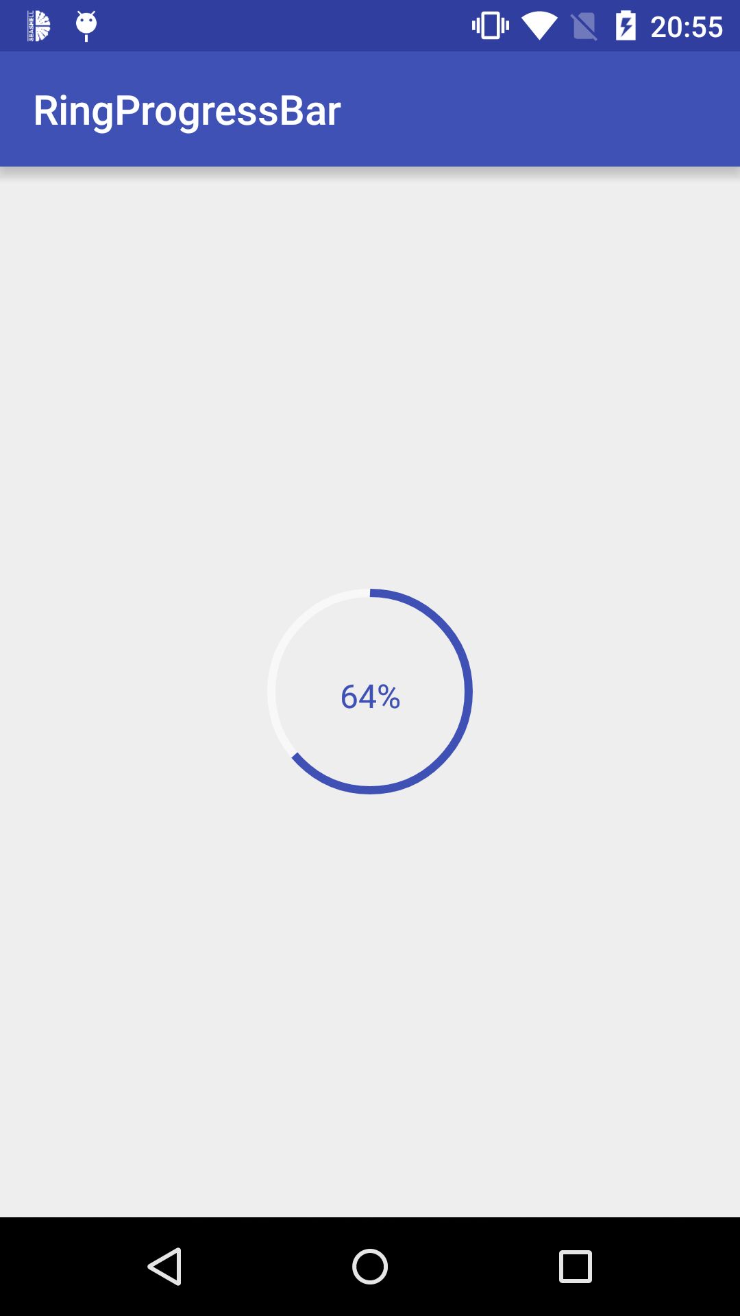
Screenshots
Import
 Step 1. Add the JitPack repository to your build file
 Add it in your root build.gradle at the end of repositories:

    allprojects {
        repositories {
            ...
            maven { url "https://jitpack.io" }
        }
    }


Step 2. Add the dependency

    dependencies {
             compile 'com.github.HotBitmapGG:RingProgressBar:V1.2.1'
    }
Directions
- custom properties
| name | format | instructions |
|---|---|---|
| ringColor | color | Color ring |
| ringProgressColor | color | Progress of color |
| ringWidth | dimension | Ring width of progress |
| textColor | color | Text color |
| textSize | dimension | Text size |
| max | integer | Max progress |
| textIsShow | boolean | Is display text |
| style | STROKE& FILL | Circle progress style |
Usage
- 1.In the XML
    <io.netopen.hotbitmapgg.library.view.RingProgressBar
        android:id="@+id/progress_bar_1"
        android:layout_width="wrap_content"
        android:layout_height="wrap_content"
        android:layout_centerInParent="true"
        android:layout_alignParentTop="true"
        app:max="100"
        android:layout_marginTop="100dp"
        app:ringColor="@color/colorPrimary"
        app:ringProgressColor="@color/colorPrimaryDark"
        app:ringWidth="3dp"
        app:style="FILL"
        app:textColor="@color/colorPrimary"
        app:textIsShow="true"
        app:textSize="16sp" />


    <io.netopen.hotbitmapgg.library.view.RingProgressBar
        android:id="@+id/progress_bar_2"
        android:layout_width="wrap_content"
        android:layout_height="wrap_content"
        android:layout_centerInParent="true"
        android:layout_alignParentBottom="true"
        android:layout_marginBottom="100dp"
        app:max="100"
        app:ringColor="@android:color/darker_gray"
        app:ringProgressColor="@color/colorPrimary"
        app:ringWidth="3dp"
        app:style="STROKE"
        app:textColor="@color/colorPrimary"
        app:textIsShow="true"
        app:textSize="16sp" />
- 2.In the code
  mRingProgressBar = (RingProgressBar) findViewById(R.id.progress_bar);

  // Set the progress bar's progress
  mRingProgressBar.setProgress(progress);
  mRingProgressBar.setOnProgressListener(new RingProgressBar.OnProgressListener()
  {

    @Override
     public void progressToComplete()
     {
         // Progress reaches the maximum callback default Max value is 100
         Toast.makeText(MainActivity.this, "complete", Toast.LENGTH_SHORT).show();
     }
  });
Tips
- Increased after the completion of a tick to show animation effects, but don't know this have any practical application, so the code commented out, students in need can use open comments.
Other
-
高仿 BiliBili 客户端: https://github.com/HotBitmapGG/OhMyBiliBili
-
Gank.io 客户端: https://github.com/HotBitmapGG/StudyProject
-
妹子福利 App: https://github.com/HotBitmapGG/MoeQuest
-
仿芝麻信用分仪表盘: https://github.com/HotBitmapGG/CreditSesameRingView
License
Copyright 2016 HotBitmapGG
Licensed under the Apache License, Version 2.0 (the "License"); you may not use this file except in compliance with the License. You may obtain a copy of the License at
http://www.apache.org/licenses/LICENSE-2.0
Unless required by applicable law or agreed to in writing, software distributed under the License is distributed on an "AS IS" BASIS, WITHOUT WARRANTIES OR CONDITIONS OF ANY KIND, either express or implied. See the License for the specific language governing permissions and limitations under the License.


 扫一扫
扫一扫
 2461
2461

 被折叠的 条评论
为什么被折叠?
被折叠的 条评论
为什么被折叠?
 到【灌水乐园】发言


