


ProgressView
项目地址:WhiteDG/ProgressView 
简介:ProgressView is a Custom View extend Progressbar to realize circular and horizontal ProgressBar with number.
ProgressBar-自定义控件-进度条-
ProgressView is a Custom View extend Progressbar to realize circular and horizontal ProgressBar with number.
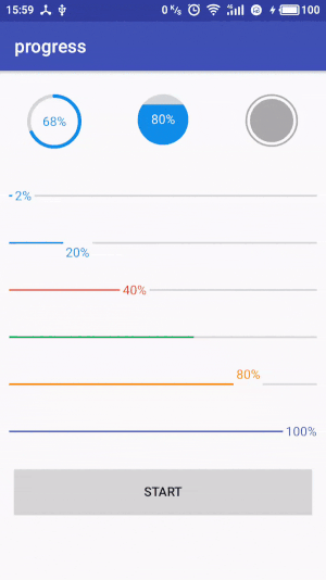
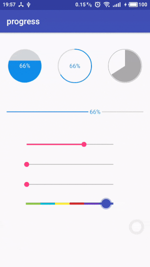
Screenshots
Installation
Add the depedency in your build.gradle. The library is distributed via jCenter.
dependencies {
    compile 'com.white:progressview:1.0.1'
}
Usage
- In the XML
add the progressview in your layout.xml and set the attributes
// style Horizontal
<com.white.progressview.HorizontalProgressView
    android:id="@+id/progress100"
    android:layout_width="match_parent"
    android:layout_height="wrap_content"
    android:padding="10dp"
    android:progress="100"
    app:progressReachColor="@color/colorPrimary"
    app:progressTextColor="@color/colorPrimary"
    app:progressTextVisible="true"
    />

// style Circle
<com.white.progressview.CircleProgressView
      android:id="@+id/circle_progress_normal"
      android:layout_width="wrap_content"
      android:layout_height="wrap_content"
      android:layout_weight="1"
      android:padding="10dp"
      android:progress="68"
      app:progressNormalSize="4dp"
      app:progressReachSize="4dp"
      app:progressStyle="Normal"
      app:radius="28dp"
      />
- In the Activity
you can also set all of the attributes in activity
horizontalProgressView.setXXXX();
// for example:
horizontalProgressView.setTextVisible(false);
horizontalProgressView.setReachBarSize(4);
horizontalProgressView.setProgressPosition(HorizontalProgressView.TOP);
...
and set progress with anim in time
HorizontalProgressView horizontalProgressView = (HorizontalProgressView) findViewById(R.id.progress100);
// set progress 100 with anim in 2500ms
horizontalProgressView.setProgressInTime(100,2500);
// set progress from 20 to 100 with anim in 2500ms
horizontalProgressView.setProgressInTime(0,100,2500);
// reset current progress with anim in 2500ms
horizontalProgressView.runProgressAnim(2500);

CircleProgressView circleProgressView = (CircleProgressView) findViewById(R.id.circle_progress_normal);
...
// same as HorizontalProgressView
circleProgressView.setProgressInTime(100,2500);
Attributes
HorizontalProgressView
| Name | Description |
|---|---|
| progressNormalColor | set the normal bar color |
| progressReachColor | set the reach bar color |
| progressTextColor | set the progress text color |
| progressTextSize | set the progress text size |
| progressTextOffset | set the progress text offset |
| progressNormalSize | set the normal bar size |
| progressReachSize | set the reach bar size |
| progressTextPosition | set the progress text position(CENTER/BOTTOM/TOP) |
| progressTextVisible | is show the progress text |
| progressTextSkewX | set the progress text skewx |
| progressTextPrefix | set the progress text prefix |
| progressTextSuffix | set the progress text suffix(default '%') |
CircleProgressView
| Name | Description |
|---|---|
| progressNormalColor | set the normal bar color |
| progressReachColor | set the reach bar color |
| progressTextColor | set the progress text color |
| progressTextSize | set the progress text size |
| progressTextOffset | set the progress text offset |
| progressNormalSize | set the normal bar size |
| progressReachSize | set the reach bar size |
| radius | set the circle radius |
| progressTextVisible | is show the progress text |
| progressTextSkewX | set the progress text skewx |
| progressTextPrefix | set the progress text prefix |
| progressTextSuffix | set the progress text suffix(default '%') |
| progressStartArc | set the startArc of reach area |
| progressStyle | set the style of CircleProgressView(Normal/FillInner/FillInnerArc) |
| reachCapRound | set the reach bar cap round or not(only for style Normal) |
| innerBackgroundColor | set the inner background color(only for style Normal) |
| innerProgressColor | set the inner progress color(only for style FillInner) |
| innerPadding | set the padding between the inner and outer circles(only for style FillInnerArc) |
| outerColor | set the outer circle color(only for style FillInnerArc) |
| outerSize | set outer circle width(only for style FillInnerArc) |


 290
290

 被折叠的 条评论
为什么被折叠?
被折叠的 条评论
为什么被折叠?
 到【灌水乐园】发言


