


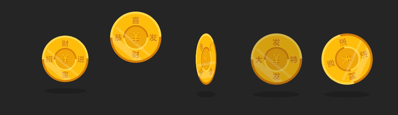
小时候喜欢看阿凡提动画片,羡慕阿凡提总能用他聪明的头脑整蛊贪婪无情的巴依老爷,却让巴依老爷拿他毫无办法。印象最深的,是一集《卖影子》的动画片。现在想来,阿凡提还真不是个穷人,他居然经常随身携带着不少的金币呢。本篇案例,我们就借用一枚阿凡提的金币,给大家介绍几种基本的css动画效果。现在,我们先看看效果图:
 还是老规矩,不感兴趣的朋友可以闪了。感兴趣的朋友,请跟着我一步一步往下看。
搬一枚金币
首先,先把金币从阿凡提的钱袋里隔空搬运一枚:
<div class="coin ">
  <div class="front">
    <span class="currency">¥</span>
    <div class="shapes">
      <div class="shape_l">招</div>
      <div class="shape_r">进</div>
      <span class="top">财</span>
      <span class="bottom">宝</span>
    </div>
  </div>
  <div class="shadow "></div> /* 给金币增加一个阴影 */
</div>
给它加样式,把布局变成金灿灿的金币:
.coin {
  margin: auto;
  position: absolute;
  bottom: 0;
  left: 0;
  right: 0;
  top: 0;
  height: 150px;
  width: 150px;
}

.coin .front, .coin .back {
  position: absolute;
  height: 150px;
  width: 150px;
  background: #ffbd0b;
  border-radius: 50%;
  border-top: 7px solid #ffd84c;
  border-left: 7px solid #ffd84c;
  border-right: 7px solid #d57e08;
  border-bottom: 7px solid #d57e08;
  transform: rotate(44deg);
}
.coin .front:before, .coin .back:before {
  content: "";
  margin: 35.5px 35.5px;
  position: absolute;
  width: 70px;
  height: 70px;
  background: #f0a608;
  border-radius: 50%;
  border-bottom: 5px solid #ffd84c;
  border-right: 5px solid #ffd84c;
  border-left: 5px solid #d57e08;
  border-top: 5px solid #d57e08;
  z-index: 2;
}
.coin .front .currency, .coin .back .currency {
  overflow: hidden;
  position: absolute;
  color: #ffbd0b;
  font-size: 40px;
  transform: rotate(-44deg);
  line-height: 3.7;
  width: 100%;
  height: 100%;
  text-align: center;
  text-shadow: 0 3px 0 #cb7407
最低0.47元/天 解锁文章


 668
668


 被折叠的 条评论
为什么被折叠?
被折叠的 条评论
为什么被折叠?
 到【灌水乐园】发言


