


<div> 元素为矩形,而它的每个border为一个等腰梯形, 上底为<div>的width / height, 高为border的粗细。

把四边的上底设为0, 即width = 0, height=0 时,梯形就变成三角形了。

.divideRect{
    		height: 0px;
            width: 0px;
            border-left: 20px solid red;
            border-right: 20px solid red;
            border-top: 20px solid orange;
            border-bottom: 20px solid orange;
    	}
接着把四面的border中的两条border变成transparent 透明,一条不定义,一条border填上颜色,三角形就出现了。

.triangle{
          height: 0px;
          width: 0px;
          border-left: 20px solid transparent;
          border-right: 20px solid transparent;
          border-bottom: 20px solid orange;
      }
画扇形则是在三角形的基础上把border内折50%的弧度

 .triangle{
           height: 0px;
           width: 0px;
           border-left: 40px solid transparent;
           border-right: 40px solid transparent;
           border-bottom: 40px solid orange;
           border-radius: 50%; /*扇形:要求 border-left = right*/
       }
同理,画圆形就是在四边都在的基础上内折50%弧度
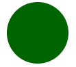
.circle{
            height: 100px;
            width: 100px;
            border-radius: 50px;
            background-color: darkgreen;
        }


 9062
9062


 被折叠的 条评论
为什么被折叠?
被折叠的 条评论
为什么被折叠?
 到【灌水乐园】发言


