


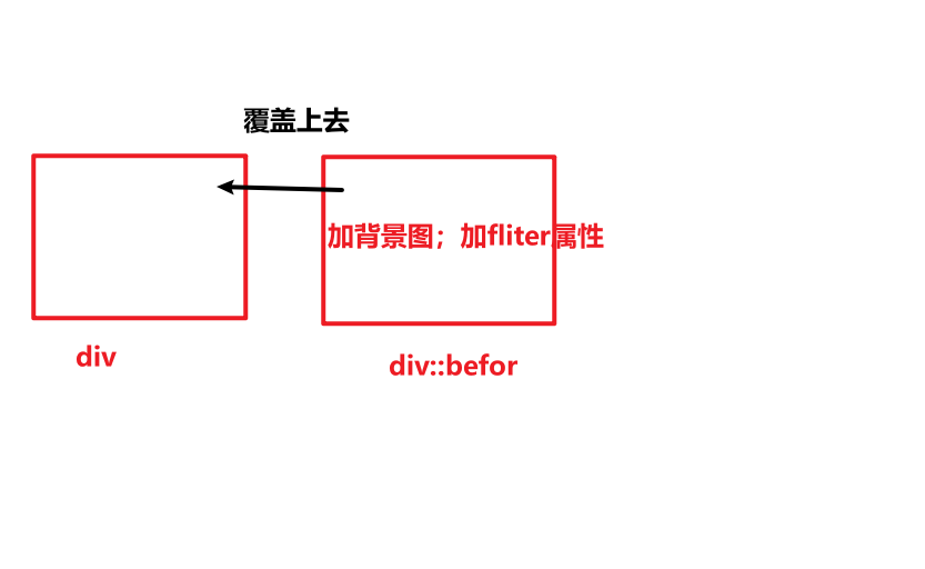
实现毛玻璃重点是利用filter属性的blur。原理是,可以给一个基础盒子的伪元素设置毛玻璃滤镜,再给伪元素设置背景图,让伪元素完全覆盖在这个基础盒子之上。
代码:
<template>
  <div class="high-quality">
  </div>
</template>


<style scoped lang="less">
.high-quality{
 position: relative;
  width:100%;
  height: 175px;
  padding:14px;
  display: flex;
  border-radius: 10px;
  overflow: hidden; //多余的毛玻璃部分隐藏
}
.high-quality:before{
  position: absolute;
  width: 100%;
  height: 100%;
  z-index:1;
  top: 0;
  left: 0;
  bottom: 0;
  right: 0;
  content: '';
  display: inline-block;
  background: url('https://img2.baidu.com/it/u=2241564326,399361128&fm=253&fmt=auto&app=120&f=JPEG?w=300&h=300') no-repeat;
  background-size:102% ;
  background-position: center center;
  border-radius: 10px;
  filter: blur(20px); //增加毛玻璃
}
</style>
效果:


 2136
2136


 被折叠的 条评论
为什么被折叠?
被折叠的 条评论
为什么被折叠?
 到【灌水乐园】发言


