


为什么要使用自定义的alert提示框与confirm确认框?
自定义这些提示,可以让我们更好地控制提示框的交互行为,从而提升用户体验.同时自定义的alert与confirm还可以根据网站的整体风格以及色调等进行定制,修改颜色以及样式使其与网站的风格相匹配.总而言之,都是为了让用户能有个更好的网站使用体验.
自定义的alert提示框
一般来说alert会有两种样式,一种时操作正确时的,一种在发生错误时进行提醒.所以我们在自定义一个alert提示框时会有两个重要的元素,一个是要提示的信息,一个是提示框的样式.
JS部分:
function showCustomAlert(msg, sty) {
  // 创建提示框元素
  var customAlert = document.createElement("div");
  customAlert.className = "custom-alert"
  var icon = document.createElement("i")
  var message = document.createElement("i")
  if (sty) {
    icon.className = 'iconfont icon-right-1-copy'
    customAlert.style.backgroundColor = "#def5de"
    customAlert.style.color = "#09713a"

  } else if (!sty) {
    icon.className = 'iconfont icon-cuowuguanbiquxiao-yuankuang'
    customAlert.style.backgroundColor = "#ffeded"
    customAlert.style.color = "#ff717c"
  }
  // 创建提示文本
  message.innerHTML = msg
  // 将提示文本添加到提示框中
  customAlert.appendChild(icon)
  customAlert.appendChild(message)

  // 将提示框添加到页面中
  document.body.appendChild(customAlert)
  //一定时间后自动关闭提示框
  setTimeout(function () {
    document.body.removeChild(customAlert)
  }, 1500); // 1500毫秒(1.5秒)后关闭提示框
}
这段代码中我们利用js在页面中创建了一个提示框,并可以调用函数时将关键的信息作为参数传递并显示在这个html元素中.同时也可以在调用时直接传递布尔值,来设定他的颜色和信息前方显示的字体图标.同时因为我们设计了一个定时器,让这个元素会在显示1.5秒后被移除,这样就实现了显示一定时长的效果.
Css部分:
.custom-alert {
  z-index: 60;
  line-height: 40px;
  position: fixed;
  width: 360px;
  height: 40px;
  top: 10%;
  left: 50%;
  -webkit-transform: translate(-50%);
  transform: translate(-50%);
  padding: 5px 20px;
  border-radius: 5px;
}
接下来就是利用css控制他的具体样式,以及让他悬浮在页面中上方.
使用方法:
直接调用函数,同时传两个参数,一个为信息内容,一个为对应的样式.
showCustomAlert("正确!",true)或
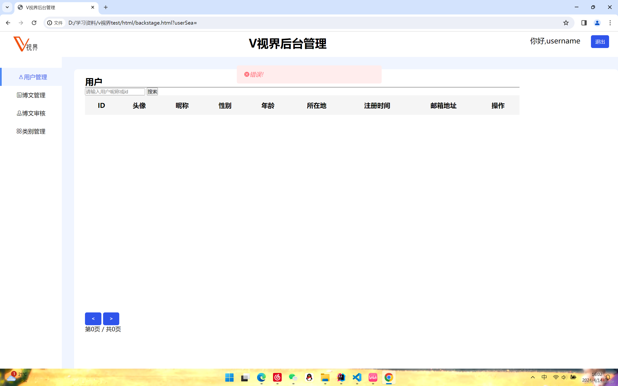
showCustomAlert("错误!",false)显示效果:
正确样式:

错误样式:
自定义的confirm:
js部分:
function customConfirm(msg, callback) {
  const confirmBox = document.createElement('div')
  confirmBox.classList.add('confirm-box')
  confirmBox.innerHTML = `
  <p>${msg}</p>
  <button id="confirmYes">确定</button>
  <button id="confirmNo">取消</button>
`
  document.body.appendChild(confirmBox)
  // 确认按钮点击事件
  const confirmYesBtn = confirmBox.querySelector('#confirmYes');
  confirmYesBtn.addEventListener('click', () => {
    document.body.removeChild(confirmBox)
    callback(true)
  })
  // 取消按钮点击事件
  const confirmNoBtn = confirmBox.querySelector('#confirmNo');
  confirmNoBtn.addEventListener('click', () => {
    document.body.removeChild(confirmBox)
    callback(false)
  })
}
因为要确定用户接下来会点击哪个按钮,所以使用了回调函数.点击对应的按钮,回调函数就会传递相对应的值,以确定接下来的操作.
css部分:
.confirm-box {
  border-radius: 8px;
  width: 300px;
  z-index: 60;
  position: fixed;
  top: 10%;
  left: 50%;
  transform: translate(-50%);
  background-color: #fff;
  padding: 20px;
  border: 1px solid #ccc;
}

.confirm-box h2 {
  margin: 0 0 10px;
}

.confirm-box p {
  text-align: center;
  margin: 0 0 20px;
}

.confirm-box button {
  border-radius: 10px;
  width: 80px;
  padding: 5px 10px;
  margin-left: 48px;
  cursor: pointer;
}

.confirm-box button#confirmYes {
  border: none;
  border-radius: 5px;
  background-color: rgb(255, 130, 0);
  color: #fff;
}

.confirm-box button#confirmNo {
  border: none;
  background-color: #f7f6f1;
  color: #1f1d1d;
}
同样让其显示在页面的中上方,并控制其按钮的颜色与样式.
使用方法:
customConfirm("你好",(result)=>{
    if(result){
        console.log("你好");
    }
})
因为使用了回调函数,所以使用方式与原生的confirm并不一样,需要确定result的值,并确定下一步应该进行的操作.
显示效果: 
点击确定后控制台输出"你好".点击取消将无事发生.
 总结:
总结:
在使用时我们也可以将两种的js代码与css代码分别放到同一个文件下,这时我们想要使用时就可以只引用对应的css文件和js文件,然后在页面对应的js文件下进行调用函数.


 3503
3503


 被折叠的 条评论
为什么被折叠?
被折叠的 条评论
为什么被折叠?
 到【灌水乐园】发言


